Boost your power with baseline covariates
Part 1 of the GLM and causal inference series.
By A. Solomon Kurz
April 12, 2023
Welcome to the beginning
This is the first post in a series on causal inference. Our ultimate goal is to learn how to analyze data from true experiments, such as RCT’s, with various likelihoods from the generalized linear model (GLM), and with techniques from the contemporary causal inference literature. We’ll do so both as frequentists and as Bayesians.
I’m writing this series because even though I learned a lot about data analysis and research design during my PhD, I did not receive training in the contemporary causal inference literature.1 Some of my recent data-analysis projects have made it very clear that I need to better understand this framework, and how it works within the broader GLM paradigm. As it turns out, there are some tricky twists and turns, and my hope is this series will help me better clarify this framework for myself, and help bring it to some of y’all’s attention, too. Parts of this blog series will also make their way into my forthcoming book on experimental design and the GLMM (see here).
Here’s the working table of contents for this series:
- Boost your power with baseline covariates
- Causal inference with potential outcomes bootcamp (link here)
- Causal inference with logistic regression (link here)
- Causal inference with Bayesian models (link here)
- Causal inference with count regression (link here)
- Causal inference with gamma regression (link here)
- Causal inference with ordinal regression (link here)
- Causal inference with change scores (link here)
- Causal inference with beta regression (link here)
- Causal inference with an analysis of heterogeneous covariance (ETA: July 2023)
- Causal inference with distributional models (ETA: July 2023)
In this first post, we’ll review a long-established insight from the RCT literature: Baseline covariates help us compare our experimental conditions.2
I make assumptions.
This series is an applied tutorial more so than an introduction. I’m presuming you have a passing familiarity with the following:
Experimental design.
You should have a basic grounding in group-based experimental design. Given my background in clinical psychology, I recommend Shadish et al. ( 2002) or Kazdin ( 2017). You might also check out Taback ( 2022), and its free companion website at https://designexptr.org/index.html.
Regression.
You’ll want to be familiar with single-level regression, from the perspective of the GLM. For frequentist resources, I recommend the texts by Ismay & Kim ( 2022) and Roback & Legler ( 2021). For the Bayesians in the room, I recommend the texts by Gelman and colleagues ( 2020), Kruschke ( 2015), or McElreath ( 2015, 2020).
Causal inference.
Though I don’t expect familiarity with contemporary causal inference from the outset, you’ll probably want to read up on the topic at some point. When you’re ready, consider texts like Brumback ( 2022), Hernán & Robins ( 2020), or Imbens & Rubin ( 2015). If you prefer freely-accessible ebooks, check out Cunningham ( 2021). But do keep in mind that even though a lot of the contemporary causal inference literature is centered around observational studies, we will only be considering causal inference for fully-randomized experiments in this blog series.
R.
All code will be in R ( R Core Team, 2022). Data wrangling and plotting will rely heavily on the tidyverse ( Wickham et al., 2019; Wickham, 2022) and ggdist ( Kay, 2021). Bayesian models will be fit with brms ( Bürkner, 2017, 2018, 2022). We will post process our models with help packages such as broom ( Robinson et al., 2022), marginaleffects ( Arel-Bundock, 2023), and tidybayes( Kay, 2023).
Load the primary R packages and adjust the global plotting theme.
# packages
library(tidyverse)
library(broom)

# adjust the global plotting theme
theme_set(theme_gray(base_size = 12) +
            theme(panel.grid = element_blank()))
What this series is and is not.
- This series will provide very little introduction to topics like experimental design, regression (frequentist or Bayesian), and R. You have the references listed above for that.
- This series will be deeply applied by focusing on:
- What does it mean to make causal inference with the potential outcomes framework? and
- How how does one do such a thing with regression models on data from randomized experiments?
- We will not be covering non-experimental data of any kind. That’s just not on my radar at this point in my professional development.
- Though we will cover some statistical theory, we will not get into technical issues like formal proofs. In other words, we won’t answer a lot of questions beginning with Why. Our focus is on What and How.
- We will not be covering DAG’s.
- Throughout this series, my primary estimand will be the average treatment effect (ATE), though we will pay the occasional lip service to the conditional average treatment effect (CATE). No hate on the CATE, though; I just like to keep things simple when I’m learning a new framework.
- Don’t worry if you don’t know what I’m talking about. You will very soon.
We need data
In this post, we’ll be borrowing data from Horan & Johnson (
1971), Coverant conditioning through a self-management application of the Premack principle: Its effect on weight reduction. We don’t have the original data file, being this paper was from the 1970’s and all. However, Horan and Johnson were open-data champions who listed all the values for their primary outcomes in their Table 2 (p. 246). Here we transcribe those data into a tibble called horan1971.
horan1971 <- tibble(
  sl = c(letters[1:22], letters[1:20], letters[1:19], letters[1:19]),
  sn = 1:80,
  treatment = factor(rep(1:4, times = c(22, 20, 19, 19))),
  pre = c(149.5, 131.25, 146.5, 133.25, 131, 141, 145.75, 146.75, 172.5, 156.5, 153, 136.25, 148.25, 152.25, 167.5, 169.5, 151.5, 165, 144.25, 167, 195, 179.5,
          127, 134, 163.5, 155, 157.25, 121, 161.25, 147.25, 134.5, 121, 133.5, 128.5, 151, 141.25, 164.25, 138.25, 176, 178, 183, 164,
          149, 134.25, 168, 116.25, 122.75, 122.5, 130, 139, 121.75, 126, 159, 134.75, 140.5, 174.25, 140.25, 133, 171.25, 198.25, 141.25,
          137, 157, 142.25, 123, 163.75, 168.25, 146.25, 174.75, 174.5, 179.75, 162.5, 145, 127, 146.75, 137.5, 179.75, 168.25, 187.5, 144.5),
  post = c(149, 130, 147.75, 139, 134, 145.25, 142.25, 147, 158.25, 155.25, 151.5, 134.5, 145.75, 153.5, 163.75, 170, 153, 178, 144.75, 164.25, 194, 183.25,
           121.75, 132.25, 166, 146.5, 154.5, 114, 148.25, 148.25, 133.5, 126.5, 137, 126.5, 148.5, 145.5, 151.5, 128.5, 176.5, 170.5, 181.5, 160.5,
           145.5, 122.75, 164, 118.5, 122, 125.5, 129.5, 137, 119.5, 123.5, 150.5, 125.75, 135, 164.25, 144.5, 135.5, 169.5, 194.5, 142.5,
           129, 146.5, 142.25, 114.5, 148.25, 161.25, 142.5, 174.5, 163, 160.5, 151.25, 144, 135.5, 136.5, 145.5, 185, 174.75, 179, 141.5)) %>%
  mutate(treatment = factor(treatment, labels = c("delayed", "placebo", "scheduled", "experimental")))

# what is this?
glimpse(horan1971)
## Rows: 80
## Columns: 5
## $ sl        <chr> "a", "b", "c", "d", "e", "f", "g", "h", "i", "j", "k", "l", …
## $ sn        <int> 1, 2, 3, 4, 5, 6, 7, 8, 9, 10, 11, 12, 13, 14, 15, 16, 17, 1…
## $ treatment <fct> delayed, delayed, delayed, delayed, delayed, delayed, delaye…
## $ pre       <dbl> 149.50, 131.25, 146.50, 133.25, 131.00, 141.00, 145.75, 146.…
## $ post      <dbl> 149.00, 130.00, 147.75, 139.00, 134.00, 145.25, 142.25, 147.…
Horan and Johnson randomly assigned 80 women who were between “20 per cent and 30 per cent overweight” into four groups for weight loss. In the horan1971 data, these four groups are differentiated in the treatment column, which is coded
delayed, a “delayed treatment control” (i.e., wait-list control), the members of which received an active treatment after the study;placebo, a minimalist intervention where participants were given basic information about nutrition and weight-loss strategies;scheduled, an active treatment that added a cognitive element to the information from theplacebogroup; andexperimental, which added a full behavioral element (based on the Premack principle3) to theplacebointervention.
Those of you who aren’t in clinical psychology might wonder how we can call an information-based intervention a placebo. As it turns out, information-based interventions aren’t great at prompting lasting behavior change. You need to do more than preach.
Anyway, the focal variable of this intervention is body weight, measured in pounds. The pre column has each woman’s pre-intervention body weight and the post column has their post-intervention weights. As is typical in a weigh-loss study, the goal is to have one or more active interventions show lower average weights at the end of the study (i.e., lower values for post).4
Subset.
Though we might eventually analyze the full data set with all four groups, it’ll be easier to cover the basics of this material if we focus on just two of the groups. Here we subset the data to only include the cases from the delayed and experimental groups.
horan1971 <- horan1971 %>%
  filter(treatment %in% c("delayed", "experimental"))
Now prove we’ve reduced the data properly.
horan1971 %>%
  count(treatment)
## # A tibble: 2 × 2
##   treatment        n
##   <fct>        <int>
## 1 delayed         22
## 2 experimental    19
Success!
Exploratory data analysis.
To get a sense of the data, here are what the post-intervention weights (post) look like for the two treatment groups in our data subset.
horan1971 %>%
  ggplot(aes(x = post)) +
  geom_histogram(binwidth = 5) +
  xlab("post-treatment weight (lbs)") +
  facet_wrap(~ treatment, labeller = label_both)
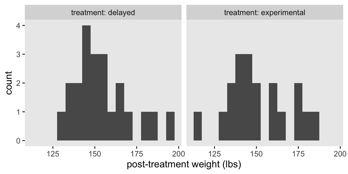
At a basic level, our primary research question is: Which group is better for weight loss? As we move along in this blog series, we’ll find ways to rephrase that question using terms from the contemporary causal inference paradigm. In the meantime, here are the basic descriptive statistics.
horan1971 %>%
  group_by(treatment) %>%
  summarise(mean = mean(post),
            sd = sd(post),
            n = n(),
            percent_missing = mean(is.na(post)) * 100)
## # A tibble: 2 × 5
##   treatment     mean    sd     n percent_missing
##   <fct>        <dbl> <dbl> <int>           <dbl>
## 1 delayed       154.  16.3    22               0
## 2 experimental  151.  18.3    19               0
Happily, we have no missing data.
Center the baseline covariate.
To make some of the models more interpretable, we’ll want to make a mean-centered version of pre-intervention weight (pre). We’ll name the new variable prec.
horan1971 <- horan1971 %>%
  # make a mean-centered version of pre
  mutate(prec = pre - mean(pre))
We need dummies.
We don’t technically have to do this, but it might help some readers if we break up the treatment factor variable into two dummy variables.
horan1971 <- horan1971 %>%
  mutate(delayed      = ifelse(treatment == "delayed", 1, 0),
         experimental = ifelse(treatment == "experimental", 1, 0))
Here’s how the two dummies relate to treatment.
horan1971 %>%
  distinct(treatment, delayed, experimental)
## # A tibble: 2 × 3
##   treatment    delayed experimental
##   <fct>          <dbl>        <dbl>
## 1 delayed            1            0
## 2 experimental       0            1
In the analyses to come, our focal variable will be the experimental dummy, which will make the delayed group the default or reference category.
Models
Our friends the methodologists and statisticians have spent the better part of the past 100 years in debate over how one might analyze data of this kind. We’re not going to cover all the issues and controversies, here, but you can find your way into the literature by looking through some of the more recent works, like Bodner & Bliese ( 2018), O’Connell et al. ( 2017), or van Breukelen ( 2013). A lot of the debate in this literature has been in the context of the ordinary least squares (OLS) framework, which will make for a handy place for us to start.
In this post, we’ll practice analyzing these data in two basic ways:
- the “ANOVA” model,5 and
- the “ANCOVA” model.
I hate these names, but they have historical precedents and I hate all the alternative names, too. As we’ll see, the so-called ANCOVA model is generally the way to go.
The simple ANOVA model.
A classical statistical approach to comparing the means of two groups is with a \(t\)-test or a one-way ANOVA. On this website we like regression, and it turns out the regression-model alternative to those classical approaches is
$$
\begin{align*} \text{post}_i & = \beta_0 + \beta_1 \text{experimental}_i + \epsilon_i \\ \epsilon_i & \sim \operatorname{Normal}(0, \sigma), \end{align*}
$$
where \(\beta_0\) is the mean for those on the control condition (i.e., delayed) and \(\beta_1\) is the difference in the mean for those in the treatment condition (i.e., experimental), relative to those in the control. The \(\epsilon_i\) term stands for the variation not accounted for by the \(\beta\) coefficients. As per the conventional OLS assumption, we model \(\epsilon_i\) as normally distributed with a mean at zero, and a standard deviation \(\sigma\), which is also sometimes parameterized as \(\sigma^2\)–the residual variance.
Though we’ll eventually analyze these data as Bayesians, I think it’ll be best if we start with the simpler frequentist OLS paradigm. Thus, here’s how to fit this model with the good-old lm() function.
# fit the ANOVA-type model with OLS
ols1 <- lm(
  data = horan1971,
  post ~ 1 + experimental
)

# summarize
summary(ols1)
##
## Call:
## lm(formula = post ~ 1 + experimental, data = horan1971)
##
## Residuals:
##     Min      1Q  Median      3Q     Max
## -36.829  -9.079  -4.818   9.932  40.182
##
## Coefficients:
##              Estimate Std. Error t value Pr(>|t|)
## (Intercept)   153.818      3.674  41.864   <2e-16 ***
## experimental   -2.489      5.397  -0.461    0.647
## ---
## Signif. codes:  0 '***' 0.001 '**' 0.01 '*' 0.05 '.' 0.1 ' ' 1
##
## Residual standard error: 17.23 on 39 degrees of freedom
## Multiple R-squared:  0.005424,	Adjusted R-squared:  -0.02008
## F-statistic: 0.2127 on 1 and 39 DF,  p-value: 0.6472
We can get a nice \(\beta\)-coefficient summary with 95% confidence intervals (CI’s) by using the broom::tidy() function. Here we’ll focus on the \(\beta_1\) parameter, which allows us to formally compare the means of the two groups.
tidy(ols1, conf.int = TRUE) %>%
  slice(2) %>%
  mutate_if(is.double, round, digits = 2)
## # A tibble: 1 × 7
##   term         estimate std.error statistic p.value conf.low conf.high
##   <chr>           <dbl>     <dbl>     <dbl>   <dbl>    <dbl>     <dbl>
## 1 experimental    -2.49       5.4     -0.46    0.65    -13.4      8.43
The 95% CI’s are wide and uncertain, as we’d expect from a study with such a modest sample size. But the point estimate is negative, suggesting the active treatment condition resulted in greater weight loss, on average, than the wait-list control condition. If only there was a way to help us make the comparison with greater precision…
The ANCOVA model.
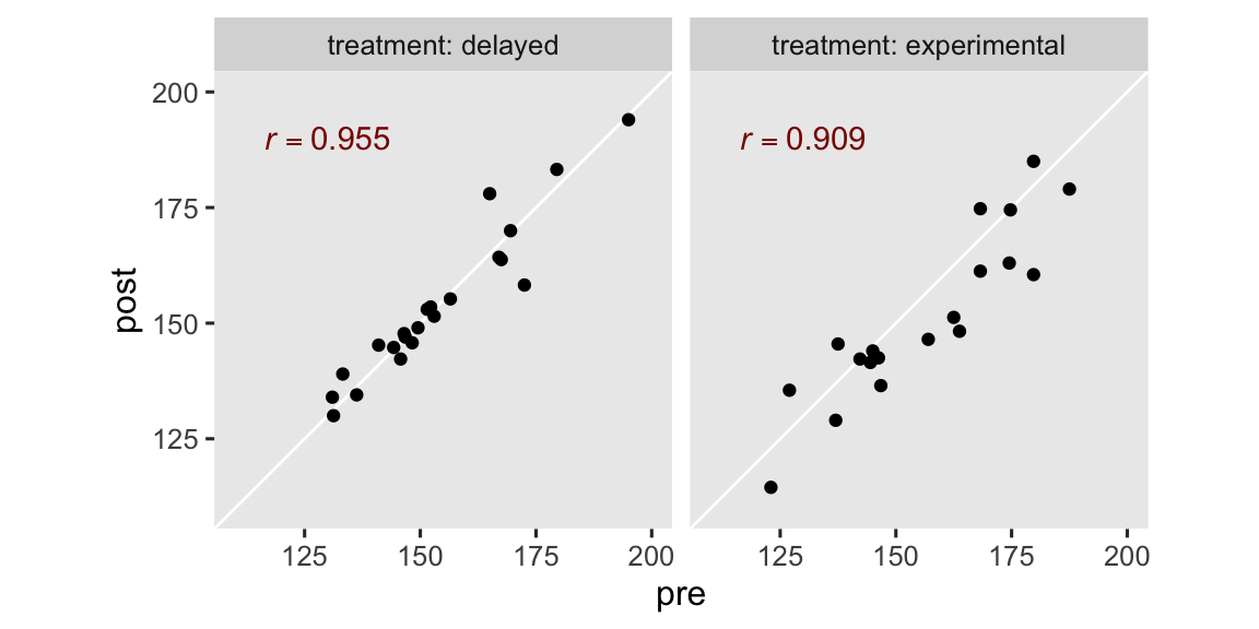
The ANCOVA approach adds important baseline covariates to the model. In the case of the horan1971 data, the only baseline covariate available is pre, which is the pre-treatment measure of weight. As it turns out, the pre-treatment measure of an outcome variable is often one of the best choices of covariates you could ask for, given that pre-treatment measurements tend to have strong correlations with post-treatment measurements.6 In our case, pre and post are correlated above .9 in both groups.
horan1971 %>%
  group_by(treatment) %>%
  summarise(r = cor(pre, post))
## # A tibble: 2 × 2
##   treatment        r
##   <fct>        <dbl>
## 1 delayed      0.955
## 2 experimental 0.909
The correlation is the same whether we use pre or the mean-centered version of the variable, prec. In case you’re curious, here’s what those strong correlations look like in a faceted scatter plot.
# for the annotation
r_text <- horan1971 %>%
  group_by(treatment) %>%
  summarise(r = cor(pre, post)) %>%
  mutate(pre  = 130,
         post = 190,
         text = str_c("italic(r)==", round(r, digits = 3)))

# plot!
horan1971 %>%
  ggplot(aes(x = pre, y = post)) +
  geom_abline(color = "white") +
  geom_point() +
  geom_text(data = r_text,
            aes(label = text),
            color = "red4", parse = TRUE) +
  coord_equal(xlim = c(110, 200),
              ylim = c(110, 200)) +
  facet_wrap(~ treatment, labeller = label_both)
Anyway, the ANCOVA model adds one or more baseline covariates to the ANOVA model. For our data, this results in the statistical formula
$$
\begin{align*} \text{post}_i & = \beta_0 + \beta_1 \text{experimental}_i + {\color{firebrick}{\beta_2 \text{pre}_i}} + \epsilon_i \\ \epsilon_i & \sim \operatorname{Normal}(0, \sigma), \end{align*}
$$
where \(\beta_2\) is the coefficient for our baseline covariate pre. Now if you’ve taken a good introductory course on linear regression, you’ll know simply adding pre to the model will have an adverse consequence for the intercept \(\beta_0\). This is because pre is how heavy the participants were at baseline, which tended to be around 155 pounds or so.
horan1971 %>%
  summarise(pre_mean = mean(pre),
            pre_sd = sd(pre),
            pre_min = min(pre))
## # A tibble: 1 × 3
##   pre_mean pre_sd pre_min
##      <dbl>  <dbl>   <dbl>
## 1     155.   17.5     123
Thus, the intercept \(\beta_0\) is now the expected value for those in the wait-list control condition, when they weigh 0 pounds. But none of our adult participants weigh zero pounds, or even close. So to make the intercept more meaningful, we can fit an alternative version of the model with the mean-centered of the covariate prec,
$$
\begin{align*} \text{post}_i & = \beta_0 + \beta_1 \text{experimental}_i + {\color{blueviolet}{\beta_2 \text{prec}_i}} + \epsilon_i \\ \epsilon_i & \sim \operatorname{Normal}(0, \sigma), \end{align*}
$$
where now the intercept \(\beta_0\) has the more meaningful interpretation of the expected value for those in the wait-list control group, who have a sample-average weight of about 154 pounds. For the sake of pedagogy, we’ll fit the model with the centered prec covariate (ols2), and the non-centered pre covariate (ols3).
# fit with the centered `prec` covariate
ols2 <- lm(
  data = horan1971,
  post ~ 1 + experimental + prec
)

# fit with the non-centered `pre` covariate
ols3 <- lm(
  data = horan1971,
  post ~ 1 + experimental + pre
)

# summarize the centered model
summary(ols2)
##
## Call:
## lm(formula = post ~ 1 + experimental + prec, data = horan1971)
##
## Residuals:
##      Min       1Q   Median       3Q      Max
## -12.5810  -3.3996  -0.4384   2.7288  13.9824
##
## Coefficients:
##               Estimate Std. Error t value Pr(>|t|)
## (Intercept)  154.78354    1.36142 113.693   <2e-16 ***
## experimental  -4.57237    2.00226  -2.284   0.0281 *
## prec           0.90845    0.05784  15.705   <2e-16 ***
## ---
## Signif. codes:  0 '***' 0.001 '**' 0.01 '*' 0.05 '.' 0.1 ' ' 1
##
## Residual standard error: 6.379 on 38 degrees of freedom
## Multiple R-squared:  0.8672,	Adjusted R-squared:  0.8602
## F-statistic: 124.1 on 2 and 38 DF,  p-value: < 2.2e-16
# summarize the non-centered model
summary(ols3)
##
## Call:
## lm(formula = post ~ 1 + experimental + pre, data = horan1971)
##
## Residuals:
##      Min       1Q   Median       3Q      Max
## -12.5810  -3.3996  -0.4384   2.7288  13.9824
##
## Coefficients:
##              Estimate Std. Error t value Pr(>|t|)
## (Intercept)  14.12281    8.99835   1.569   0.1248
## experimental -4.57237    2.00226  -2.284   0.0281 *
## pre           0.90845    0.05784  15.705   <2e-16 ***
## ---
## Signif. codes:  0 '***' 0.001 '**' 0.01 '*' 0.05 '.' 0.1 ' ' 1
##
## Residual standard error: 6.379 on 38 degrees of freedom
## Multiple R-squared:  0.8672,	Adjusted R-squared:  0.8602
## F-statistic: 124.1 on 2 and 38 DF,  p-value: < 2.2e-16
Other than the summary for the intercept \(\beta_0\), the results of the two versions of the ANCOVA model are identical. The ANCOVA point estimate for \(\beta_1\) changed a lot from what we saw in the simple ANOVA model ols1. Once again, we can use the tidy() function to return the 95% confidence intervals in a nice format. Here we’ll just focus on ols2.
tidy(ols2, conf.int = TRUE) %>%
  slice(2) %>%
  mutate_if(is.double, round, digits = 2)
## # A tibble: 1 × 7
##   term         estimate std.error statistic p.value conf.low conf.high
##   <chr>           <dbl>     <dbl>     <dbl>   <dbl>    <dbl>     <dbl>
## 1 experimental    -4.57         2     -2.28    0.03    -8.63     -0.52
Not only is the point estimate notably lower than in the simple ANOVA model, the confidence interval is much narrower, too. That change in the confidence interval width is a consequence of the much smaller standard error. It’ll probably be easier to see this all in a coefficient plot.
# wrangle
bind_rows(tidy(ols1, conf.int = TRUE), tidy(ols2, conf.int = TRUE)) %>%
  filter(term == "experimental") %>%
  mutate(model = factor(c("ANOVA", "ANCOVA"), levels = c("ANOVA", "ANCOVA"))) %>%

  # plot!
  ggplot(aes(x = estimate, xmin = conf.low, xmax = conf.high, y = model)) +
  geom_vline(xintercept = 0, color = "white") +
  geom_pointrange() +
  scale_x_continuous(expression(beta[1]~(mu[experimental]-mu[waitlist])), expand = expansion(add = 5)) +
  ylab(NULL)

Even though the point estimates differ a lot7 between the ANOVA and ANCOVA models, the 95% interval for the ANOVA model completely overlaps the interval for the ANCOVA model. Both the ANOVA and ANCOVA models are known to produce unbiased estimates of the population parameters, but the ANCOVA model tends to produce estimates that are more precise (e.g., O’Connell et al., 2017). Thus if you have a high-quality baseline covariate laying around, it’s a good idea to throw it into the model.8
But why (and other questions)?9
If you haven’t seen this before, you might wonder why adding covariates tends to make the \(\beta_1\) coefficient more precise. A common answer is the additional covariates “explain” more of the residual variance. However, I encourage y’all to hold this explanation lightly. This way of thinking will not generalize well to models using other likelihood functions, and one of the big goals of this blog series is showing a framework that will generalize to other likelihoods.
Instead, I recommend you just notice that this pattern will arise again and again when you use OLS models. Adding baseline covariates will generally shrink your standard errors. It’s like getting statistical power for free. Perhaps a more helpful line of inquiry is: How can I use this information to better design my studies?
Borm et al. (
2007) presented an approximate sample size formula for when you have measured the outcome variable before and after treatment, just as in the case of our horan1971 data. If we let \(\rho\) stand for the correlation between the outcome measured before and after the intervention, an ANCOVA on data with \((1 - \rho^2)N\) participants will have the same power as an ANOVA with \(N\) participants.
For example, here’s what the formula returns for our horan1971 data.
# compute the sample statistics
rho <- cor(horan1971$pre, horan1971$post)  # 0.9214141
n <- nrow(horan1971)                       # 41

# use the equation
(1 - rho^2) * n
## [1] 6.190842
In other words, our ANCOVA model would achieve about the same statistical power with \(N = 6\) cases as the ANOVA with all \(N = 41\) cases. Shocking, eh? Here’s what this equation implies over a broad range of \(\rho\) and \(N\) values.
crossing(n   = c(50, 100, 150, 200),
         rho = seq(from = 0, to = 1, by = 0.01)) %>%
  mutate(design_factor = 1 - rho^2) %>%
  mutate(n_ancova = design_factor * n,
         n_group = factor(n)) %>%
  mutate(n_group = fct_rev(n_group)) %>%

  ggplot(aes(x = rho, y = n_ancova, color = n_group, group = n)) +
  geom_line(linewidth = 1) +
  scale_color_viridis_d(expression(italic(N)~required~by~ANOVA),
                        option = "D", end = .75) +
  scale_x_continuous(expression(rho),
                     expand = expansion(mult = 0),
                     breaks = 0:5 / 5,
                     labels = c("0", ".2", ".4", ".6", ".8", "1")) +
  scale_y_continuous(expression(italic(N)~required~by~ANCOVA),
                     limits = c(0, 210),
                     expand = expansion(add = 0)) +
  ggtitle(expression("What can "*(1-rho^2)*italic(N)*" do for you?"))
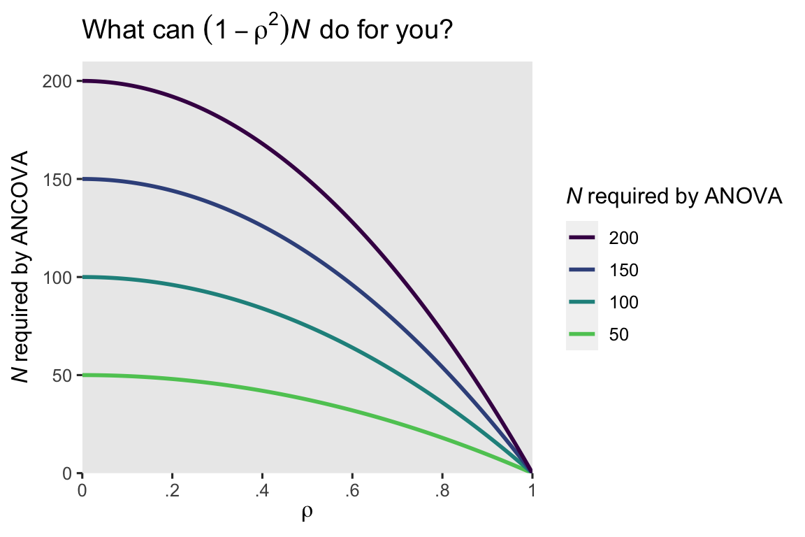
When the pre/post correlation \(\rho\) is weak, the ANCOVA doesn’t improve much above the ANOVA. But that baseline covariate really starts paying off around \(\rho \approx .4\) or so. Another way of putting this is the standard error for the \(\beta_1\) coefficient in the ANOVA will decrease by a factor of \(\sqrt{1 - \rho^2}\) when you switch to an ANCOVA. Here’s what that looks like for our models.
# display the standard errors for beta[1]
bind_rows(tidy(ols1, conf.int = TRUE), tidy(ols2, conf.int = TRUE)) %>%
  filter(term == "experimental") %>%
  mutate(parameter = "beta[1]",
         model = c("ANOVA", "ANCOVA")) %>%
  select(model, parameter, std.error)
## # A tibble: 2 × 3
##   model  parameter std.error
##   <chr>  <chr>         <dbl>
## 1 ANOVA  beta[1]        5.40
## 2 ANCOVA beta[1]        2.00
# use the formula
5.397404 * sqrt(1 - rho^2)
## [1] 2.097335
Thus using the standard error from \(\beta_1\) from the ANOVA model (5.397404), the equation predicted the standard error from the ANCOVA would be about 2.097335, which is just a little bit larger than the actual value (2.002256). As the authors said in the paper, their formulas are approximations, so don’t get all uppity about the small discrepancy. For more technical details, do check out Borm et al. (
2007). To my mind, the applied take-away message is clear: Use your baseline covariates!
Recap
In this post, some of the main points we covered were:
- Two of the classical methods for analyzing pre/post experimental data are
- the ANOVA approach, where only the only predictor is the experimental group, and
- the ANCOVA approach, where one adds one or more baseline covariates to the model.
- Although one could use a literal “analysis of [co]variance,” you can also use OLS regression for both ANOVA- and ANCOVA-type models.
- Both approach are unbiased estimators of the population parameters.
- The ANCOVA approach is often more efficient, which is to say it often results is smaller standard errors and narrower confidence intervals.
For many of my readers, I imagine most of the material in this post was a review. But this material is designed to set the stage for the posts to come, and I hope at least some of the subsequent material will be more informative. Speaking of which, in the next post we’ll learn about the potential-outcomes framework, and how we might analyze this data from a causal-inference perspective.
Thank the reviewers
Many of the technical issues in this blog series are new, to me. To help make sure I don’t mislead others (or myself), I asked on twitter who might be interested in reviewing my drafts (see here), and the statistics community came out in spades. I’d like to publicly acknowledge and thank
for their kind efforts reviewing the draft of this post. Go team!
Do note the final editorial decisions were my own, and I do not think it would be reasonable to assume my reviewers have given blanket endorsements of the current version of this post.
Session info
sessionInfo()
## R version 4.3.0 (2023-04-21)
## Platform: aarch64-apple-darwin20 (64-bit)
## Running under: macOS Ventura 13.4
##
## Matrix products: default
## BLAS:   /Library/Frameworks/R.framework/Versions/4.3-arm64/Resources/lib/libRblas.0.dylib
## LAPACK: /Library/Frameworks/R.framework/Versions/4.3-arm64/Resources/lib/libRlapack.dylib;  LAPACK version 3.11.0
##
## locale:
## [1] en_US.UTF-8/en_US.UTF-8/en_US.UTF-8/C/en_US.UTF-8/en_US.UTF-8
##
## time zone: America/Chicago
## tzcode source: internal
##
## attached base packages:
## [1] stats     graphics  grDevices utils     datasets  methods   base
##
## other attached packages:
##  [1] broom_1.0.5     lubridate_1.9.2 forcats_1.0.0   stringr_1.5.0
##  [5] dplyr_1.1.2     purrr_1.0.1     readr_2.1.4     tidyr_1.3.0
##  [9] tibble_3.2.1    ggplot2_3.4.2   tidyverse_2.0.0
##
## loaded via a namespace (and not attached):
##  [1] sass_0.4.6        utf8_1.2.3        generics_0.1.3    blogdown_1.17
##  [5] stringi_1.7.12    hms_1.1.3         digest_0.6.31     magrittr_2.0.3
##  [9] evaluate_0.21     grid_4.3.0        timechange_0.2.0  bookdown_0.34
## [13] fastmap_1.1.1     jsonlite_1.8.5    backports_1.4.1   fansi_1.0.4
## [17] viridisLite_0.4.2 scales_1.2.1      jquerylib_0.1.4   cli_3.6.1
## [21] rlang_1.1.1       ellipsis_0.3.2    munsell_0.5.0     withr_2.5.0
## [25] cachem_1.0.8      yaml_2.3.7        tools_4.3.0       tzdb_0.4.0
## [29] colorspace_2.1-0  vctrs_0.6.3       R6_2.5.1          lifecycle_1.0.3
## [33] pkgconfig_2.0.3   pillar_1.9.0      bslib_0.5.0       gtable_0.3.3
## [37] glue_1.6.2        highr_0.10        xfun_0.39         tidyselect_1.2.0
## [41] rstudioapi_0.14   knitr_1.43        farver_2.1.1      htmltools_0.5.5
## [45] rmarkdown_2.22    labeling_0.4.2    compiler_4.3.0
References
Arel-Bundock, V. (2023). marginaleffects: Predictions, Comparisons, Slopes, Marginal Means, and Hypothesis Tests [Manual]. [https://vincentarelbundock.github.io/ marginaleffects/ https://github.com/vincentarelbundock/ marginaleffects]( https://vincentarelbundock.github.io/ marginaleffects/ https://github.com/vincentarelbundock/ marginaleffects)
Bodner, T. E., & Bliese, P. D. (2018). Detecting and differentiating the direction of change and intervention effects in randomized trials. Journal of Applied Psychology, 103(1), 37. https://doi.org/10.1037/apl0000251
Borm, G. F., Fransen, J., & Lemmens, W. A. (2007). A simple sample size formula for analysis of covariance in randomized clinical trials. Journal of Clinical Epidemiology, 60(12), 1234–1238. https://doi.org/10.1016/j.jclinepi.2007.02.006
Brumback, B. A. (2022). Fundamentals of causal inference with R. Chapman & Hall/CRC. https://www.routledge.com/Fundamentals-of-Causal-Inference-With-R/Brumback/p/book/9780367705053
Bürkner, P.-C. (2017). brms: An R package for Bayesian multilevel models using Stan. Journal of Statistical Software, 80(1), 1–28. https://doi.org/10.18637/jss.v080.i01
Bürkner, P.-C. (2018). Advanced Bayesian multilevel modeling with the R package brms. The R Journal, 10(1), 395–411. https://doi.org/10.32614/RJ-2018-017
Bürkner, P.-C. (2022). brms: Bayesian regression models using ’Stan’. https://CRAN.R-project.org/package=brms
Cunningham, S. (2021). Causal inference: The mixtape. Yale University Press. https://mixtape.scunning.com/
Gelman, A., Hill, J., & Vehtari, A. (2020). Regression and other stories. Cambridge University Press. https://doi.org/10.1017/9781139161879
Hernán, M. A., & Robins, J. M. (2020). Causal inference: What if. Boca Raton: Chapman & Hall/CRC. https://www.hsph.harvard.edu/miguel-hernan/causal-inference-book/
Horan, J. J., & Johnson, R. G. (1971). Coverant conditioning through a self-management application of the Premack principle: Its effect on weight reduction. Journal of Behavior Therapy and Experimental Psychiatry, 2(4), 243–249. https://doi.org/10.1016/0005-7916(71)90040-1
Imbens, G. W., & Rubin, D. B. (2015). Causal inference in statistics, social, and biomedical sciences: An Introduction. Cambridge University Press. https://doi.org/10.1017/CBO9781139025751
Ismay, C., & Kim, A. Y. (2022). Statistical inference via data science; A moderndive into R and the tidyverse. https://moderndive.com/
Kay, M. (2021). ggdist: Visualizations of distributions and uncertainty [Manual]. https://CRAN.R-project.org/package=ggdist
Kay, M. (2023). tidybayes: Tidy data and ’geoms’ for Bayesian models. https://CRAN.R-project.org/package=tidybayes
Kazdin, A. E. (2017). Research design in clinical psychology, 5th Edition. Pearson. https://www.pearson.com/
Kruschke, J. K. (2015). Doing Bayesian data analysis: A tutorial with R, JAGS, and Stan. Academic Press. https://sites.google.com/site/doingbayesiandataanalysis/
Maxwell, S. E. (2010). Introduction to the special section on Campbell’s and Rubin’s conceptualizations of causality. Psychological Methods, 15(1), 1. https://doi.org/10.1037/a0018825
McElreath, R. (2015). Statistical rethinking: A Bayesian course with examples in R and Stan. CRC press. https://xcelab.net/rm/statistical-rethinking/
McElreath, R. (2020). Statistical rethinking: A Bayesian course with examples in R and Stan (Second Edition). CRC Press. https://xcelab.net/rm/statistical-rethinking/
O’Connell, N. S., Dai, L., Jiang, Y., Speiser, J. L., Ward, R., Wei, W., Carroll, R., & Gebregziabher, M. (2017). Methods for analysis of pre-post data in clinical research: A comparison of five common methods. Journal of Biometrics & Biostatistics, 8(1), 1–8. https://doi.org/10.4172/2155-6180.1000334
R Core Team. (2022). R: A language and environment for statistical computing. R Foundation for Statistical Computing. https://www.R-project.org/
Roback, P., & Legler, J. (2021). Beyond multiple linear regression: Applied generalized linear models and multilevel models in R. CRC Press. https://bookdown.org/roback/bookdown-BeyondMLR/
Robinson, D., Hayes, A., & Couch, S. (2022). broom: Convert statistical objects into tidy tibbles [Manual]. https://CRAN.R-project.org/package=broom
Shadish, W. R. (2010). Campbell and Rubin: A primer and comparison of their approaches to causal inference in field settings. Psychological Methods, 15(1), 3–17. https://doi.org/10.1037/a0015916
Shadish, W. R., Cook, T. D., & Campbell, D. T. (2002). Experimental and quasi-experimental designs for generalized causal inference. Houghton, Mifflin and Company.
Taback, N. (2022). Design and analysis of experiments and observational studies using R. Chapman and Hall/CRC. https://doi.org/10.1201/9781003033691
van Breukelen, G. J. (2013). ANCOVA versus CHANGE from baseline in nonrandomized studies: The difference. Multivariate Behavioral Research, 48(6), 895–922. https://doi.org/10.1080/00273171.2013.831743
Wickham, H. (2022). tidyverse: Easily install and load the ’tidyverse’. https://CRAN.R-project.org/package=tidyverse
Wickham, H., Averick, M., Bryan, J., Chang, W., McGowan, L. D., François, R., Grolemund, G., Hayes, A., Henry, L., Hester, J., Kuhn, M., Pedersen, T. L., Miller, E., Bache, S. M., Müller, K., Ooms, J., Robinson, D., Seidel, D. P., Spinu, V., … Yutani, H. (2019). Welcome to the tidyverse. Journal of Open Source Software, 4(43), 1686. https://doi.org/10.21105/joss.01686
-
For a historical overview of why I and other psychologists might not understand causal inference in the same way as those from other disciplines (e.g., economics, epidemiology), see Maxwell ( 2010) and the other articles in the Psychological Methods special section on Don Campbell’s and Don Rubin’s conceptualizations of causality. Psychologists tend to focus on Campbell, to the neglect of Rubin. For a nice overview of how Campbell’s and Rubin’s frameworks compare and contrast, take a look at Shadish ( 2010). ↩︎
-
Well, usually, anyway. As we will later see, there is at least one case where baseline covaraites do not help. But we’re getting way ahead of ourselves, and really, most of y’all should probably be using baseline covaraites as a default. ↩︎
-
I don’t expect all my readers to know about the Premack principle, but it’s well known among behaviorists and behavior therapists. In short, it states: You can use high-probability behaviors to increase the frequency of low-probability behaviors. Let’s say you’re a parent who’s trying to get a stubborn child to eat their yucky vegetables (low-probability behavior). If you tell them “You can eat ice cream [a high-probability behavior] IF you eat all your vegetables,” you have just used the Premack principle. If the child knows there’s ice cream on the line (and presuming they like ice cream), they’re more likely to eat those yucky vegetables. As you might imagine, there are all kinds of technical details I’m glossing over, here. If you’d like to learn more, a PhD in clinical psychology or behavior analysis might be a good fit for you. ↩︎
-
Note that the way I’ve described the research goal, here, is from a clinical perspective. Clinicians in this context want to see their weight-loss clients lose weight. This perfectly legitimate goal, however, is very different from what we’ll focus on when we start talking about causal inference, which you’ll learn all about in the next post. For the time being, just note that clinical perspectives and research perspectives aren’t always the same, and that’s okay. ↩︎
-
As discussed by O’Connell et al. ( 2017), the “ANOVA model” is a little ambiguous in that it can refer to using either
postorpost - preas the dependent variable. If we were to usepost - pre, this would be a change-score analysis. I’m not interested in going into a change-score discussion, here. In short, don’t analyze change scores. I can understand why substantive researchers might find them interesting, but there are better alternatives. ↩︎ -
There are some contexts in which this is not the case. For example, if you’re running a medical trial for which the primary outcome is mortality, all participants will necessarily be alive at baseline. So an important caveat is baseline measures tend to have strong correlations with post-intervention measures when they’re of a continuous variable. Indeed, the distinction between continuous and binary variables is an important part of the story, which we’ll start to explore in the third post of this series. ↩︎
-
I should clarify that though my point is these two point estimates are numerically different from one another, they aren’t necessarily statistically-significantly different from one another. Since they’re both estimators of the same population parameter, it would be weird if they were. I should acknowledge this point came from a DM exchange between Vincent Arel-Bundock and myself (2023-04-12). As a side point, we will rarely, if ever, use the statistical-significance framework in this blog series. I’m an effect-size man. ↩︎
-
Including baseline covariates is actually more than a “good idea.” If you’re running computer task experiments with undergrads, it probably doesn’t matter much. But if you’re running a clinical trial where lives are on the line, you want to use analytic strategies which are as unbiased and as precise as possible. When you’re in the study-planning phase, the ANCOVA method can help you design a well-powered study with fewer participants, which could mean you’d be putting fewer participants lives at risk. I owe this insight to the great Darren Dahly. ↩︎
-
I know I just said in the introduction that we wouldn’t be answering a lot of Why questions. But really, this is one of the few exceptions, and even here I’m not fully covering the Why. Why is for the statisticians and methodologists to worry about. We applied folks are here to get things done. ↩︎
- Posted on:
- April 12, 2023
- Length:
- 28 minute read, 5789 words