Causal inference with change scores
Part 8 of the GLM and causal inference series.
By A. Solomon Kurz
June 19, 2023
So far in this series, we have used the posttreatment scores as the dependent variables in our analyses. However, it’s not uncommon for researchers to frame their questions in terms of change from baseline with a change-score (aka gain score) analysis. The goal of this post is to investigate whether and when we can use change scores or change from baseline to make causal inferences. Spoiler: Yes, sometimes we can (with caveats).
We need (new) data
It’s time to introduce a new data set of continuous-outcome data. In an admirable and rare move among my fellow clinical psychologists, Hoorelbeke and colleagues made the data from their (
2021) paper, Preventing recurrence of depression: Long-term effects of a randomized controlled trial on cognitive control training for remitted depressed patients, publicly available on the OSF at
https://osf.io/6ptu5/. You can find multiple data files in their OSF project, but we’ll just be using their Baseline & FU rating.sav file. ⚠️ For this next code block to work on your computer, you will need to first download that Baseline & FU rating.sav file, and then save that file in a data subfolder in your working directory.
# packages
library(tidyverse)
library(broom)
library(flextable)

# adjust the global theme
theme_set(theme_gray(base_size = 12) +
            theme(panel.grid = element_blank()))

# load the data
hoorelbeke2021 <- haven::read_sav("data/Baseline & FU rating.sav")

# wrangle
hoorelbeke2021 <- hoorelbeke2021 %>%
  drop_na(Acc_naPASAT_FollowUp) %>%
  transmute(id     = ID,
            tx     = Group,
            pre    = Acc_naPASAT_Baseline,
            post   = Acc_naPASAT_FollowUp,
            change = Acc_naPASAT_FollowUp - Acc_naPASAT_Baseline)

# what?
glimpse(hoorelbeke2021)
## Rows: 82
## Columns: 5
## $ id     <dbl> 1, 2, 3, 4, 5, 6, 7, 8, 9, 10, 11, 12, 13, 14, 16, 17, 18, 19, 20, 21, 22, 24, 25, 26, 27, 28…
## $ tx     <dbl> 1, 0, 1, 0, 1, 0, 1, 0, 1, 0, 1, 0, 1, 0, 0, 1, 0, 1, 0, 1, 0, 0, 1, 0, 1, 0, 1, 0, 1, 1, 1, …
## $ pre    <dbl> 0.3444444, 0.5111111, 0.5833333, 0.6444444, 0.6944444, 0.3388889, 0.7833333, 0.5888889, 0.738…
## $ post   <dbl> 0.9166667, 0.7000000, 0.8166667, 0.7722222, 0.9000000, 0.3888889, 0.9833333, 0.6944444, 0.972…
## $ change <dbl> 0.57222222, 0.18888889, 0.23333333, 0.12777778, 0.20555556, 0.05000000, 0.20000000, 0.1055555…
These data were from a randomized controlled trial in Ghent (2017–2018), which was designed to assess the effectiveness of cognitive control training (CCT) for alleviating difficulties related to depression in adults with remitted depression.1 The \(N = 92\) participants were all between the ages of 23 and 65; reported a history of depression; owned smartphones with data plans; and did not currently meet criteria for a mood, substance, or psychotic disorder.
You can find the preregistration for the overall study at https://osf.io/g2k4w. Based on the preregistration, it’s not exactly clear to me which variable the research team intended as the primary outcome. But based on the paper and the preregistration, the adaptive paced auditory serial-addition task (aPASAT, Siegle et al., 2007) is one of the clear contenders, and it will be the variable we’ll focus on in this post. Since I’m not an aPASAT researcher, we’ll lean on Koster et al. ( 2017) for a description:
During the adaptive PASAT, a series of digits is presented and participants continuously add the currently presented digit to the previously presented digit. They need to provide a response to the sum of the last two presented digits which generates interference with updating the last heard digits in working memory. Task difficulty is tailored to participant’s performance by changing the inter-stimulus interval between each digit, causing the digits to follow faster or slower. Doing so, it is assumed that cognitive control is being trained in a challenging task context. (emphasis added)
So in a trial designed to train cognitive control, the aPASAT seems like a fine primary outcome variable. In our wrangled hoorelbeke2021 data frame, the pre column contains aPASAT scores at baseline, the post columns contains posttreatment aPASAT scores, and the posttreatment aPASAT scores minus the baseline aPASAT scores (i.e., the change scores) are saved in the change column. The data in the original Baseline & FU rating.sav file are much more extensive, but we don’t need all those distractions in this blog post.2
Here’s a look at those variables.
hoorelbeke2021 %>%
  pivot_longer(pre:change) %>%
  mutate(name = factor(name, levels = c("pre", "post", "change"))) %>%

  ggplot(aes(x = value)) +
  geom_rug(linewidth = 1/5) +
  geom_histogram(binwidth = 0.1, boundary = 0) +
  scale_x_continuous("aPASAT", breaks = -5:5 * 0.2) +
  facet_wrap(~ name, scales = "free_x")
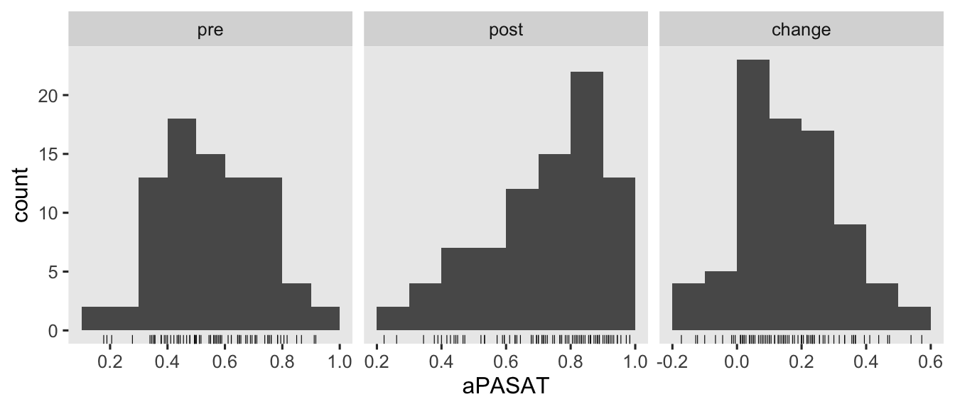
There are some missing values in the 1-year follow-up, \(n = 6\ (13.3\%)\) for those in the control condition and \(n = 4\ (8.5\%)\) for those in the treatment condition. Though I’m hoping we will eventually consider missing data methods for causal inference in this series, we’re not ready to focus on that issue yet. So for the sake of simplicity, we’ll restrict ourselves to complete case analyses for this post.
Models
Often times in the methods literature, you’ll see authors contrast the change-score models with ANCOVA’s (e.g.,
Vickers & Altman, 2001). This simple dichotomy obscures how one can model a change score with or without controlling for the baseline values of pre, and one can use either post or change as the criterion variable in an ANCOVA. Thus we can actually make a \(2 \times 2\) grid of the modeling choices available to use with our three variables pre, post, and change (
O’Connell et al., 2017).3
tibble(dv = rep(c("post", "change"), times = 2),
       model = rep(c("ANOVA", "ANCOVA"), each = 2),
       formula = c("post ~ tx", "change ~ tx", "post ~ tx + pre", "change ~ tx + pre")) %>%

  ggplot(aes(x = dv, y = model, label = formula)) +
  geom_tile(aes(fill = formula),
            alpha = 0.75, linewidth = 0, show.legend = F) +
  geom_text(size = 5) +
  scale_fill_viridis_d(begin = .4) +
  scale_x_discrete("outcome variable", position = "top", expand = c(0, 0)) +
  scale_y_discrete("model type", expand = c(0, 0)) +
  ggtitle("Yes, you can mix change scores with ANCOVA's") +
  theme(axis.text.y = element_text(hjust = 0))
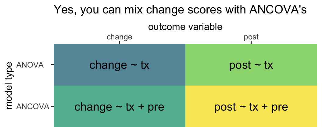
So even though people are often referring to the model in the upper left quadrant when they talk about a change-score model, that’s actually what you might call an ANOVA-change. This helps clarify you can model a change score with an ANOVA or an ANCOVA. Even though people are often referring to the model in the lower right quadrant when they talk about an ANCOVA, that’s what we might call an ANCOVA-post. That helps clarify you can model posttreatment scores or change scores in an ANCOVA.
Here’s how to fit all four models with OLS via the good old lm() function.
# ANOVA-post
fit1 <- lm(
  data = hoorelbeke2021,
  post ~ 1 + tx
)

# ANOCVA-post
fit2 <- lm(
  data = hoorelbeke2021,
  post ~ 1 + tx + pre
)

# ANOVA-change
fit3 <- lm(
  data = hoorelbeke2021,
  change ~ 1 + tx
)

# ANOCVA-change
fit4 <- lm(
  data = hoorelbeke2021,
  change ~ 1 + tx + pre
)
You’ll note that we used the change ~ 1 ... syntax for the two change-score models. We could have also used the syntax of post - pre ~ 1 ... and the results for those models would have been identical. This is all a matter of preference.
As to the results, instead of cluttering up this post with the summary() output for all 4 models, let’s extract the summary information for the \(\beta\) coefficients of each with the tidy() function, and save the results in a nice data frame called betas.
# extract
betas <- bind_rows(
  tidy(fit1, conf.int = T) %>% mutate(fit = "fit1", model = "ANOVA",  dv = "post"),
  tidy(fit2, conf.int = T) %>% mutate(fit = "fit2", model = "ANCOVA", dv = "post"),
  tidy(fit3, conf.int = T) %>% mutate(fit = "fit3", model = "ANOVA",  dv = "change"),
  tidy(fit4, conf.int = T) %>% mutate(fit = "fit4", model = "ANCOVA", dv = "change")
  )  %>%
  # wrangle
  mutate(beta = case_match(
    term,
    "(Intercept)" ~ "beta[0]",
    "tx"          ~ "beta[1]",
    "pre"         ~ "beta[2]"
  )) %>%
  select(fit, model, dv, beta, everything())

# what?
betas
## # A tibble: 10 × 11
##    fit   model  dv     beta    term        estimate std.error statistic  p.value conf.low conf.high
##    <chr> <chr>  <chr>  <chr>   <chr>          <dbl>     <dbl>     <dbl>    <dbl>    <dbl>     <dbl>
##  1 fit1  ANOVA  post   beta[0] (Intercept)   0.624     0.0255     24.5  7.04e-39   0.573     0.674
##  2 fit1  ANOVA  post   beta[1] tx            0.189     0.0352      5.37 7.55e- 7   0.119     0.259
##  3 fit2  ANCOVA post   beta[0] (Intercept)   0.208     0.0414      5.02 3.16e- 6   0.125     0.290
##  4 fit2  ANCOVA post   beta[1] tx            0.209     0.0224      9.33 2.25e-14   0.165     0.254
##  5 fit2  ANCOVA post   beta[2] pre           0.726     0.0665     10.9  1.91e-17   0.593     0.858
##  6 fit3  ANOVA  change beta[0] (Intercept)   0.0506    0.0177      2.85 5.56e- 3   0.0153    0.0859
##  7 fit3  ANOVA  change beta[1] tx            0.217     0.0245      8.85 1.69e-13   0.168     0.266
##  8 fit4  ANCOVA change beta[0] (Intercept)   0.208     0.0414      5.02 3.16e- 6   0.125     0.290
##  9 fit4  ANCOVA change beta[1] tx            0.209     0.0224      9.33 2.25e-14   0.165     0.254
## 10 fit4  ANCOVA change beta[2] pre          -0.274     0.0665     -4.12 9.11e- 5  -0.407    -0.142
\(\beta\) coefficients.
First let’s take a look at the point estimates and standard errors for \(\beta_1\), the coefficient for tx.
betas %>%
  filter(beta == "beta[1]") %>%
  select(fit, model, dv, estimate, std.error) %>%
  flextable()
fit | model | dv | estimate | std.error |
|---|---|---|---|---|
fit1 | ANOVA | post | 0.1890280 | 0.03520700 |
fit2 | ANCOVA | post | 0.2093301 | 0.02244671 |
fit3 | ANOVA | change | 0.2170013 | 0.02450634 |
fit4 | ANCOVA | change | 0.2093301 | 0.02244671 |
It will help if we interpret these results in light of the simulation study by O’Connell et al. (
2017). Even though we see minor numeric differences, the \(\hat \beta_1\) values for all four models may all be interpreted as valid point estimates of the average treatment effect \(\tau_\text{ATE}\). From a statistical power perspective–or otherwise put, from the perspective of precision as expressed by the size of the standard error–, the ANOVA-change model tends to show a little more power than the ANOVA-post model, particularly as the correlation between pre and post approaches 1. As the correlation between pre and post was about .62, it should be no surprise that the standard error for the ANOVA-change model (0.0245) is indeed noticeably smaller than the standard error for the alternative ANOVA-post model (0.0352). However, both ANCOVA versions of the model showed the smallest standard errors, which was also consistent with the simulation study by O’Connell and friends.
If you look close, you’ll see the point estimates and standard errors for both ANCOVA versions of the model are identical. That’s not a fluke. Whether it’s from ANCOVA-post or ANCOVA-change, \(\hat \tau_\text{ATE}\) should always be the same when using OLS. O’Connell and colleagues observed this in their (
2017) simulation study, as have others in the methodological literature (e.g.,
Laird, 1983). Thus from an estimator perspective, there is no advantage to using ANCOVA-post versus ANCOVA-change when using OLS for simple pre/post RCT’s.
Now let’s take a look at the results for the \(\beta_2\) parameter from the two ANCOVA models.
betas %>%
 filter(beta == "beta[2]") %>%
  select(fit, model, dv, estimate, std.error) %>%
  flextable()
fit | model | dv | estimate | std.error |
|---|---|---|---|---|
fit2 | ANCOVA | post | 0.725769 | 0.06648411 |
fit4 | ANCOVA | change | -0.274231 | 0.06648411 |
What may not be immediately obvious is the point estimate for ANCOVA-change is the same as the point estimate for ANCOVA-post minus 1. Let’s see that in code.
coef(fit4)[3] %>% as.double() # beta[2] for ANCOVA-change
## [1] -0.274231
coef(fit2)[3] %>% as.double() - 1 # beta[2] for ANCOVA-post minus 1
## [1] -0.274231
This isn’t a fluke, and it has also been observed by scholars within the methodological literature (e.g.,
Clifton & Clifton, 2019;
Laird, 1983). Note that the precision with which we’ve estimated those \(\hat \beta_2\) values is the same in the two ANCOVA models, too; they have the same standard error.
vcov(fit4)[3, 3] %>% sqrt() # ANCOVA-change
## [1] 0.06648411
vcov(fit2)[3, 3] %>% sqrt() # ANCOVA-post
## [1] 0.06648411
So far in this blog series, we have avoided interpreting the \(\beta\) coefficients for any of our baseline covariates. In the case of the ANCOVA-change model, I strongly recommend against interpreting \(\beta_2\), too. It turns out the correlation between a change score and baseline has no substantive meaning, and therefore the partial correlation among the two as expressed by \(\beta_2\) has no substantive meaning either. Clifton & Clifton (
2019) showed this correlation is purely a statistical artifact, and it is a deterministic function of the standard deviation of pre \((s_\text{pre})\), the standard deviation of post \((s_\text{post})\), and their correlation \((r)\):
$$ r_\text{[change, pre]} = \frac{r s_\text{post} - s_\text{pre}}{\sqrt{s_\text{pre}^2 + s_\text{post}^2 - 2 r s_\text{pre} s_\text{post}}}. $$
Here we compute those values from our hoorelbeke2021 data.
# compute and save
spre <- sd(hoorelbeke2021$pre)
spost <- sd(hoorelbeke2021$post)
r <- cor(hoorelbeke2021$post, hoorelbeke2021$pre)

# what are these values?
spre; spost; r
## [1] 0.1696492

## [1] 0.1845499

## [1] 0.6199481
Apply the formula.
(r * spost - spre) / sqrt(spre^2 + spost^2 - 2 * r * spre * spost)
## [1] -0.356411
Check the predicted value with the Pearson’s correlation coefficient computed with cor().
hoorelbeke2021 %>%
  summarise(r_change_pre = cor(change, pre))
## # A tibble: 1 × 1
##   r_change_pre
##          <dbl>
## 1       -0.356
The formula works; the values are the same.
The ratio of \(s_\text{post}\) to \(s_\text{pre}\) is an important driver of the equation. To give you a sense, here’s a plot with three different ratios across the range of \(r\) values.
tibble(spre = 1,
       spost = c(0.5, 1, 2)) %>%
  expand_grid(r = seq(from = -0.999, to = 0.999, by = 0.001)) %>%
  mutate(r1 = (r * spost - spre) / sqrt(spre^2 + spost^2 - 2 * r * spre * spost)) %>%
  mutate(ratio = factor(spost / spre) %>% fct_rev()) %>%

  ggplot(aes(x = r, y = r1, color = ratio)) +
  geom_hline(yintercept = 0, color = "white") +
  geom_vline(xintercept = 0, color = "white") +
  geom_line(linewidth = 1.5) +
  scale_color_brewer(expression(italic(s)[post]/italic(s)[pre]), palette = "Set1") +
  scale_x_continuous(expression(italic(r)["[post, pre]"]),
                     labels = c("-1", "-.5", "0", ".5", "1"),
                     limits = c(-1, 1), expand = expansion(mult = 0.001)) +
  scale_y_continuous(expression(italic(r)["[change, pre]"]),
                     labels = c("-1", "-.5", "0", ".5", "1"),
                     limits = c(-1, 1), expand = expansion(mult = 0.001)) +
  coord_equal() +
  ggtitle(expression(italic(r)["[change, pre]"]~is~a~statistical~artifact),
          subtitle = "It has no substantive meaning.")
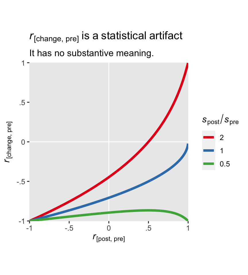
In the case of our hoorelbeke2021 data, the \(s_\text{post} / s_\text{pre}\) ratio is about 1.1.
spost / spre
## [1] 1.087832
Change scores and regression to the mean
Change-scores have a special connection to regression to the mean (RTM). If you need a refresher, RTM comes to us from the work of Sir Francis Galton. Happily, the UsingR package (
Verzani, 2022) contains a copy of the height data Galton presented in his (
1886) paper, and those data will give us a fine example of RTM. The data file been saved as galton, which we’ll go ahead and load.
data(galton, package = "UsingR")

# what?
glimpse(galton)
## Rows: 928
## Columns: 2
## $ child  <dbl> 61.7, 61.7, 61.7, 61.7, 61.7, 62.2, 62.2, 62.2, 62.2, 62.2, 62.2, 62.2, 63.2, 63.2, 63.2, 63.…
## $ parent <dbl> 70.5, 68.5, 65.5, 64.5, 64.0, 67.5, 67.5, 67.5, 66.5, 66.5, 66.5, 64.5, 70.5, 69.5, 68.5, 68.…
The values in the child column are heights of children, measured in inches. The parent columns contains the average height of the parents of each child. We might get a sense of the data in a plot (with the values jittered a little to reduce overplotting).
galton %>%
  ggplot(aes(x = parent, y = child)) +
  geom_hline(yintercept = 31:37 * 2, color = "white", linewidth = 1/3) +
  geom_vline(xintercept = 31:37 * 2, color = "white", linewidth = 1/3) +
  geom_jitter(width = 0.2, height = 0.2, size = 1/4) +
  stat_smooth(method = "lm", formula = 'y ~ x', se = F, fullrange = T) +
  scale_x_continuous("average height of parents (in)",
                     breaks = 31:37 * 2, limits = c(61.5, 74)) +
  scale_y_continuous("height of children (in)",
                     breaks = 31:37 * 2, limits = c(61.5, 74)) +
  coord_equal() +
  labs(title = "Strong relation, but not perfect",
       caption = "Note. OLS regression line in blue.")
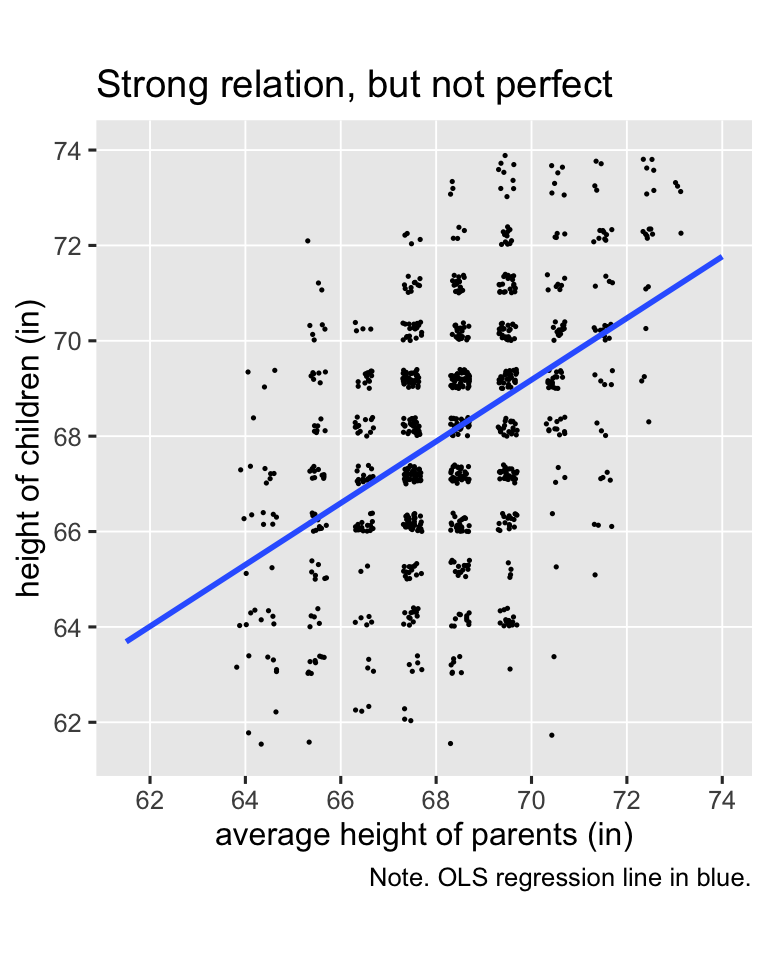
Galton’s basic insight was even though children’s heights are strongly positively correlated with the average heights of their parents, the correlation isn’t perfect (it’s about .46), and thus the slope of the regression line is a positive value smaller than 1 (it’s about 0.65). Let’s go ahead and fit the regression model so we can compute the exact predictions.
fit5 <- lm(
  data = galton,
  child ~ 1 + parent
)
If you round, the average parent value is 68, and the values 2 standard deviations below and above the mean are 65 and 72. We’ll use the predict() function to compute the corresponding \(\widehat{\text{child}}_i\) values, and then showcase them in an updated version of the scatter plot.
# define the prediction grid
nd <- tibble(parent = c(65, 68, 72))

# compute the fitted values
p <- nd %>%
  mutate(child = predict(fit5, newdata = nd))

# update the plot!
galton %>%
  ggplot(aes(x = parent, y = child)) +
  geom_jitter(width = 0.2, height = 0.2, size = 1/4, color = "grey67") +
  stat_smooth(method = "lm", formula = 'y ~ x', se = F, fullrange = T) +
  geom_linerange(data = p,
                 aes(ymin = -Inf, ymax = child),
                 color = "blue", linetype = 2) +
  geom_linerange(data = p,
                 aes(xmin = -Inf, xmax = parent),
                 color = "blue", linetype = 2) +
  scale_x_continuous("average height of parents (in)",
                     breaks = 31:37 * 2, limits = c(61.5, 74)) +
  scale_y_continuous("height of children (in)",
                     breaks = 31:37 * 2, limits = c(61.5, 74)) +
  ggtitle("Behold: Regression to the mean") +
  coord_equal()
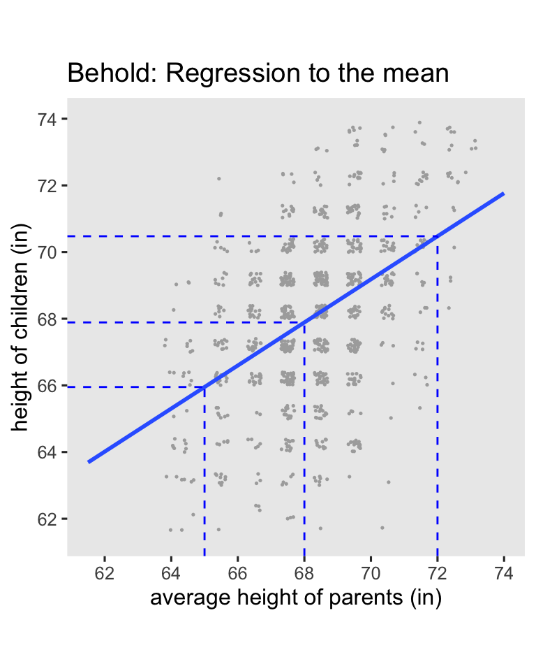
Here’s the breakdown:
- When you use the average value for
parent(68), the predicted value forchildis almost identical (67.9). - When use the short value for
paraent(65), the predicted value forchildis also short (66), but it has increased a little towards the mean. - In the opposite way, when use the tall value for
paraent(72), the predicted value forchildis also tall (70.5), but it decreased a little towards the mean.
This is the essence of RTM. Extremely large values predict large values which are less extreme, and extremely small values predict small values which are less extreme. By now you may find yourself asking: What’s the point of all this? The answer comes from Clifton & Clifton ( 2019), who discussed how RTM applies to randomized experiments:
If an extreme measure is observed at baseline, then its value is likely to be less extreme in the post-intervention measure, even if the intervention has no effect. (p. 2)
Under simple random assignment, you will occasionally see large average differences among the experimental groups on the baseline score, even though they will be zero in the population.4 Due to RTM, a simple ANOVA-change model can show an upward or downward bias, depending on the direction of the baseline imbalance and so on. This means that even though the baseline score is included in the computation of the change score, ANOVA-change models do not control for baseline imbalance, and thus they do not protect against RTM. However, the ANCOVA-change model explicitly controls for baseline imbalance, and does protect against RTM, which Clifton and Clifton spelled out in greater detail in their paper. Thus if you want to use a change score to make your causal inferences, use the ANCOVA-change model, not the weaker ANOVA-change model. In the words of Clifton and Clifton:
ANCOVA has the advantages of being unaffected by baseline imbalance ( Vickers & Altman, 2001), and it has greater statistical power than other methods ( Vickers, 2001). An RCT reduces RTM at the design stage, but one should still use ANCOVA to adjust for baseline in the analysis stage ( Barnett et al., 2005). (p. 3)
Change scores and potential outcomes theory
Don Rubin has written on how to change-scores fit within his potential-outcomes framework, but to my knowledge the theory is scattered in little bits in his work over the past several decades. If you’re ever lit searching on the topic, note that whereas I tend to use the language of “change scores,” Rubin seems to prefer the language of “gain scores.” Adjust your search terms accordingly.
\((y_i^1 - x_i) - (y_i^0 - x_i)\).
In Jin and Rubin (
2009, p. 29), we learn the contrast of a person’s posttest potential outcome values is equivalent to the contrast of difference scores of potential outcomes. Using a slightly modified version of their notation, let \(x_i\) be a pretest score for the \(i\)th person, let \(y_i^1\) be their potential outcome for the posttest score in the experimental condition, and let \(y_i^0\) be their potential outcome for the posttest score in the control condition. We can write the person-level contrast as
$$(y_i^1 - x_i) - (y_i^0 - x_i),$$
and it turns out that
$$ {\color{blue}{(y_i^1 - x_i) - (y_i^0 - x_i)}} = {\color{red}{y_i^1 - y_i^0}} = {\color{blueviolet}{\tau_i}}. $$
I found it helpful to verify this with a little algebra. Just like in middle school, I’ll show you my work:
$$
\begin{align*} {\color{blueviolet}{\tau_i}} & = {\color{blue}{(y_i^1 - x_i) - (y_i^0 - x_i)}} \\ & = y_i^1 - x_i - y_i^0 + x_i \\ & = y_i^1 - y_i^0 - x_i + x_i \\ & = y_i^1 - y_i^0 - (x_i - x_i) \\ & = y_i^1 - y_i^0 - (0) \\ & = {\color{red}{y_i^1 - y_i^0}}. \end{align*}
$$
Since we’re subtracting the same \(x_i\) value from the potential outcomes \(y_i^1\) and \(y_i^0\), the \(x_i\) value just gets canceled out.5 Whereas substantive researchers may find it conceptually meaningful to frame their analyses in terms of change, it doesn’t make a difference for the math.
Though we won’t cover the material here, you can also find a discussion of person-level change scores for causal inference within the context of null-hypothesis significance testing in Section 5.9 of Imbens & Rubin ( 2015).
\(\mathbb E(y_i^1 - x_i) - \mathbb E(y_i^0 - x_i)\).
In Rubin ( 1974), we learn that within the context of a pre/post RCT, the simple mean difference in gain scores,
$$\mathbb E(y_i^1 - x_i) - \mathbb E(y_i^0 - x_i),$$
“remains an unbiased estimate of \(\tau\) [what we typically call \(\tau_\text{ATE}\)] over the randomization set” (p. 696). Again, Rubin used different notation which emphasized the sample statistics, as hinted at in his language of “the randomization set,” but I see no reason not to generalize to population inference. In case it’s not clear, this equation is just a fancy way of expressing what we’ve called the ANOVA-change model. Thus Rubin anticipated the basic findings in Clifton and colleagues’s (
2019) simulation that ANOVA-change is an unbiased estimator of \(\tau_\text{ATE}\), but the simulation did help clarify we get greater efficiency by using the ANCOVA-change version of model.6
\([\mathbb E(y_i^1) - \mathbb E(x_i)] - [\mathbb E(y_i^0) - \mathbb E(x_i)]\).
Extrapolating, when we’re talking about group averages,
$$ \mathbb E(y_i^1) - \mathbb E(y_i^0) = [\mathbb E(y_i^1) - \mathbb E(x_i)] - [\mathbb E(y_i^0) - \mathbb E(x_i)], $$
which is a mathy way of saying that the differences in posttreatment group averages is the same as the difference in posttreatment group average changes from baseline. Let’s do a quick little demonstration using algebra and \(z\) scores. Say the pretreatment mean is 0, the posttretment mean for the control condition is 0.1, and the posttreatment mean for the treatment condition is 1. First, we save the sample statistics as objects in code.
m_x <- 0     # pretreatment mean
m_y0 <- 0.1  # posttretment mean for control
m_y1 <- 1    # posttretment mean for treatment

# what are these values?
m_x; m_y0; m_y1
## [1] 0

## [1] 0.1

## [1] 1
Here is the posttreatment difference, \(\mathbb E(y_i^1) - \mathbb E(y_i^0)\).
m_y1 - m_y0
## [1] 0.9
Here is the difference in posttreatment group average changes from baseline, \([\mathbb E(y_i^1) - \mathbb E(x_i)] - [\mathbb E(y_i^0) - \mathbb E(x_i)]\).
(m_y1 - m_x) - (m_y0 - m_x)
## [1] 0.9
From a mathematical perspective, the values are the same. Let’s even do this by hand with the hoorelbeke2021 data from the beginning of the post.
# pretreatment mean
m_x <- hoorelbeke2021 %>%
  summarise(m_x = mean(pre)) %>%
  pull()

# posttretment mean for control
m_y0 <- hoorelbeke2021 %>%
  filter(tx == 0) %>%
  summarise(m_y0 = mean(post)) %>%
  pull()

# posttretment mean for treatment
m_y1 <- hoorelbeke2021 %>%
  filter(tx == 1) %>%
  summarise(m_y1 = mean(post)) %>%
  pull()

# what are these values?
m_x; m_y0; m_y1
## [1] 0.5582656

## [1] 0.6235043

## [1] 0.8125323
Now we use those sample statistics to compute the posttreatment difference, \(\mathbb E(y_i^1) - \mathbb E(y_i^0)\), and the posttreatment difference as expressed in terms of change from baseline, \([\mathbb E(y_i^1) - \mathbb E(x_i)] - [\mathbb E(y_i^0) - \mathbb E(x_i)]\).
# the posttreatment difference
m_y1 - m_y0
## [1] 0.189028
# the difference in posttreatment group average changes from baseline
(m_y1 - m_x) - (m_y0 - m_x)
## [1] 0.189028
These point estimates are identical with one another, and they’re both the same as \(\hat \beta_1\) from our ANOVA-post model from above.
betas %>%
  filter(beta == "beta[1]") %>%
  filter(fit == "fit1") %>%
  select(fit, model, dv, estimate, std.error) %>%
  flextable()
fit | model | dv | estimate | std.error |
|---|---|---|---|---|
fit1 | ANOVA | post | 0.189028 | 0.035207 |
But note that the limitation of ANOVA-post, and also of ANOVA-change, is that ANOVA models do not control for baseline. Without that control, ANOVA’s do not protect from RTM and they are less precise than they could be. So don’t compute your effect sizes by hand with sample statistics, and don’t use ANOVA’s, friends. Use some version of the ANCOVA.
Speaking of which, what if we wanted to express the ANCOVA-post as a difference in change from baseline? Let’s practice with point estimates.
# pretreatment mean (same as above)
m_x <- hoorelbeke2021 %>%
  summarise(m_x = mean(pre)) %>%
  pull()

# define the predictor grid
nd <- tibble(pre = 0.5,
             tx = 0:1)

# posttretment mean for control, adjusted for pre
m_y0 <- predict(fit2, newdata = nd)[1] %>% as.double()

# posttretment mean for treatment, adjusted for pre
m_y1 <- predict(fit2, newdata = nd)[2] %>% as.double()

# what are these values?
m_x; m_y0; m_y1
## [1] 0.5582656

## [1] 0.5705707

## [1] 0.7799008
Now use those point estimates to compute the posttreatment difference, and the posttreatment difference as expressed in terms of change from baseline, both in light of the pre values as seen through the lens of the ANCOVA-post.
# the posttreatment difference
m_y1 - m_y0
## [1] 0.2093301
# the difference in posttreatment group average changes from baseline
(m_y1 - m_x) - (m_y0 - m_x)
## [1] 0.2093301
Again, the effect size (the ATE) is the same value, whether expressed as a simple posttreatment difference, or as a difference in changes from baseline. And indeed, both these values are the same as the \(\hat \beta_1\) value from the ANCOVA-post.
betas %>%
  filter(beta == "beta[1]") %>%
  filter(fit == "fit2") %>%
  select(fit, model, dv, estimate, std.error) %>%
  flextable()
fit | model | dv | estimate | std.error |
|---|---|---|---|---|
fit2 | ANCOVA | post | 0.2093301 | 0.02244671 |
So when you compute \(\hat{\tau}_\text{ATE}\) from an ANCOVA-post model, you can interpret it as the posttreatment causal effect, as is conventional among the those in the potential-outcomes crowd, but you can also interpret it as the causal effect for posttreatment change from baseline, which is the language sometimes preferred by clinicians. As we’ve seen with a little algebra, they’re the same value.
Observational studies and difference-in-differences
Economists have long used a very close variant of this framework with what they call difference-in-differences (DiD) analyses. I have not waded deeply into the DiD literature, and my current impression is it’s primarily oriented around observational or quasi-experimental data, which is outside of the scope of this blog series. But one thing to note is that in the DiD framework, analysts don’t typically use the unconditional score at baseline \(x_i\), but rather they separate baseline by group into what we might call \(x_i^1\) and \(x_i^0\)–all of which would typically be expressed in different notation in the DiD literature. Thus when focusing on the group-mean perspective, we might express the causal effect as something like
$$ \tau_\text{ATT} = [\mathbb{E}(y_i^1) - \mathbb{E}(x_i^1)] - [\mathbb{E}(y_i^0) - \mathbb{E}(x_i^0)], $$
where the causal estimand of interest is often called the average treatment effect for the treated (ATT; \(\tau_\text{ATT}\)),7 8 and the equation emphasizes potential differences at baseline based on condition.9 When you are working with data from a randomized experiment, this estimand, the ATT, is not a great idea. Because of the randomization, we know that in the population
$$ \mathbb{E}(x_i^1) = \mathbb{E}(x_i^0), $$
which is why we have used \(x_i\) up to this point, rather than \(x_i^1\) and \(x_i^0\). By extension, this is why we compute the ATE, rather than the ATT. When you randomize after baseline in a randomized experiment, you have methodologically ensured all your participants are from the same population at baseline, rendering separation by \(x_i^1\) and \(x_i^0\) nonsensical and inefficient. But anyways, this is one of the many reasons this blog series is exclusively focused on randomized experiments. Observational and quasi-experimental designs introduce many more complications, which would render an already very long blog series much much longer.
That’s as far as we’re going down this rabbit hole, here. But if you would like a proper introduction to DiD analyses from an economist, I recommend Chapter 9 in Cunningham’s ( 2021) text, a free ebook version of which you can find at https://mixtape.scunning.com/09-difference_in_differences. For a DiD introduction aimed at epidemiologists, see Caniglia & Murray ( 2020).
What about Lord’s paradox?
With all this talk about change-scores and ANCOVA’s, the whole controversy around Lord’s paradox might come to mind. Rubin has indeed written about Lord’s paradox from the perspective of causal inference in “On Lord’s paradox” ( Holland & Rubin, 1983). For those new to the topic, Lord’s paradox originates from Lord’s brief ( 1967) article, and Lord later expanded on the topic in Lord ( 1968) and Lord ( 1973).10 Holland and Rubin helped clarify that in all cases, Lord expressed his paradox in terms of study designs that were not fully randomized experiments,11 and consequentially the issues Lord raised aren’t of central concern in this blog series. We’re here to discuss causal inference with RCT-type data. But if you do love Lord’s paradox and the potential outcomes framework, I recommend reading through Holland & Rubin ( 1983) for some nice insights. Study design aside, I think a big part of the paradox is it’s easy to miss how a simple change-score analysis (what we’ve been calling ANOVA-change) does not actually condition on the baseline scores. You need to use the ANCOVA-change model for that.
Change scores for non-Gaussian data
The issue of whether you want to express your ATE in terms of change from baseline is distinct from whether you want to analyze your data with change scores. For example, we already showed how you can use the point estimates from the ANCOVA-post model fit2 to express the ATE in terms of change, so no change scores were needed. But if you really did want to use change scores, as with the change column in the hoorelbeke2021 data, the ANCOVA-change model is perfectly fine, too. But with caveats…
In case it’s been a while, the difference between two normal distributions is itself normally distributed. Thus when you’re analyzing data you believe are appropriate for the simple OLS-type paradigm, it’s fine to use ANCOVA-change. I personally don’t like it, but we can have different preferences and still remain friends, and I wouldn’t even bring it up if I’m ever your Reviewer #2.
This nice property does not hold for other distributions, though. For example, change scores from an 0/1 binary variable can take on values of -1, 0, and 1, which means you can no longer model the change score of binary data with the binomial likelihood function. I think you’d have to model such a variable as multinomial. As an other example, if you make a change score from two Poisson distributions, which describe non-negative integer values, you can end up with a distribution of integers which are positive or negative. As it turns out, you can model such data with the Skellam distribution,12 but not another Poisson. Now just think of the odd mess you’d make computing a change score from ordinal data. If you want to go down a deep stats-internet rabbit hole on all the arcane distributions for non-Gaussian differences, you have fun with that, and have fun trying to defend your obscure likelihood function in peer review. To me, this seems like a big headache. Since change-scores alter the likelihood function for non-Gaussian variables, I recommend avoiding them on those contexts.
But but why, though?
In the geeky stats/methods corners of social media, I occasionally see people ask why one would ever want a causal estimand expressed in terms of a change score. To my eye, the change-score haters usually aren’t clinicians. I’m a trained therapist, and when I’m wearing my clinical hat, change from pre-treatment baseline is the most natural way to assess the progress of a real-world client. I’m fully aware of the important methodological differences between an RCT and applied clinical work, but that doesn’t negate how working clinicians tend to think in terms of change from the start of treatment. If your scientific goal is to summarize the results of your fancy experiment to other egghead scientists, feel free to avoid the language of change from baseline. But if your goal is to communicate your results to a group of clinicians, you’d be a fool not to at least consider the language of differences in pre/post change. This is what many of the clinicians want to hear. Know your crowd. If you can give them what they want, just do it.
Recap
In this post, some of the main points we covered were:
- If we ask the question Do we adjust for baseline? along with the question Do we model posttreatment scores or change scores?, we end up with four kinds of models:
- ANOVA-post,
- ANOVA-change,
- ANCOVA-post, and
- ANCOVA-change.
- For all those four models, the
\(\hat \beta\)value for the experimental condition is an unbiased estimator of the average treatment effect,\(\tau_\text{ATE}\). However, the ANCOVA models give you greater precision, or statistical power. - In a conventional Gaussian model, the
\(\hat \beta\)value for the experimental condition, along with its standard error, is identical in ANCOVA-post and ANCOVA-change. - The ANOVA-change model does not control for pretreatment baseline, and it does not protect against regression to the mean (RTM).
- The correlation between baseline pretreatment scores and change scores is a pure statistical artifact, and it has no substantive meaning.
- Rubin’s potential outcomes framework is not usually expressed in terms of change scores, but it does allow for them, and Rubin has explicitly written about causal inference with change scores in several papers, though usually in the language of “gain scores.”
- When you compute
\(\hat{\tau}_\text{ATE}\)from an ANCOVA-post model, it can also be described as the causal effect for the differences from baseline. - The DiD framework used by economists to analyze non-experimental data is not the same as the change-score methods recommended in this post. Because we’re focused on experimental data, you should not decompose the pretreatment score
\(x\)into separate scores by treatment, which would be\(x^0\)for control and\(x_1\)for treatment. This is because random assignment after baseline methodologically guarantees\(\mathbb E(x_i^0) = \mathbb E(x_i^1)\)in the population. - Given its inefficiency and vulnerability to RTM, I would never recommend using the ANOVA-change model. If you have measurements at pre and post, I would always recommend either ANCOVA-post or ANCOVA-change. These offer greater statistical precision, and they protect against RTM.
- I would only recommend the ANCOVA-change model if you are analyzing data appropriate for the Gaussian likelihood. When you compute change scores from other data types, such as counts or ordinal variables, you end up changing the likelihood function, and I can’t imagine why you’d want to bring that kind of extra burden upon yourself.13
As to next steps, some of my eagle-eyed readers may have noticed the primary outcome variable in the hoorelbeke2021 data is bounded between 0 and 1, which makes our use of OLS–and thus the Gaussian likelihood by mathematical equivalence–dubious. In the
next post, we’ll address this shortcoming by exploring causal inference with beta regression.
No more pre-release peer review
The first seven posts in this blog series have enjoyed pre-release peer review from a generous group of experts in statistical methods. I originally asked for peer review because some of this material was very new to me, and I was not confident my interpretations were sound. At this point, I’m more familiar with the material, and I have benefited from many helpful comments from the review team and from other interested readers. From this post onward, I am no longer asking for pre-release peer review. But if you, dear reader, have any comments or questions, you are most welcome to post them down below in the comments section, or raise a discussion on social media. I’ve seen this kind of engagement described as post-publication peer review, and I think it’s a great option for the online scientific discourse.
Session info
sessionInfo()
## R version 4.3.0 (2023-04-21)
## Platform: aarch64-apple-darwin20 (64-bit)
## Running under: macOS Ventura 13.4
##
## Matrix products: default
## BLAS:   /Library/Frameworks/R.framework/Versions/4.3-arm64/Resources/lib/libRblas.0.dylib
## LAPACK: /Library/Frameworks/R.framework/Versions/4.3-arm64/Resources/lib/libRlapack.dylib;  LAPACK version 3.11.0
##
## locale:
## [1] en_US.UTF-8/en_US.UTF-8/en_US.UTF-8/C/en_US.UTF-8/en_US.UTF-8
##
## time zone: America/Chicago
## tzcode source: internal
##
## attached base packages:
## [1] stats     graphics  grDevices utils     datasets  methods   base
##
## other attached packages:
##  [1] flextable_0.9.1 broom_1.0.5     lubridate_1.9.2 forcats_1.0.0   stringr_1.5.0   dplyr_1.1.2
##  [7] purrr_1.0.1     readr_2.1.4     tidyr_1.3.0     tibble_3.2.1    ggplot2_3.4.2   tidyverse_2.0.0
##
## loaded via a namespace (and not attached):
##  [1] tidyselect_1.2.0        viridisLite_0.4.2       farver_2.1.1            fastmap_1.1.1
##  [5] blogdown_1.17           fontquiver_0.2.1        promises_1.2.0.1        digest_0.6.31
##  [9] timechange_0.2.0        mime_0.12               lifecycle_1.0.3         gfonts_0.2.0
## [13] ellipsis_0.3.2          magrittr_2.0.3          compiler_4.3.0          rlang_1.1.1
## [17] sass_0.4.6              tools_4.3.0             utf8_1.2.3              yaml_2.3.7
## [21] data.table_1.14.8       knitr_1.43              askpass_1.1             emo_0.0.0.9000
## [25] labeling_0.4.2          curl_5.0.1              xml2_1.3.4              RColorBrewer_1.1-3
## [29] httpcode_0.3.0          withr_2.5.0             grid_4.3.0              fansi_1.0.4
## [33] gdtools_0.3.3           xtable_1.8-4            colorspace_2.1-0        scales_1.2.1
## [37] crul_1.4.0              cli_3.6.1               rmarkdown_2.22          crayon_1.5.2
## [41] ragg_1.2.5              generics_0.1.3          rstudioapi_0.14         tzdb_0.4.0
## [45] katex_1.4.1             cachem_1.0.8            splines_4.3.0           assertthat_0.2.1
## [49] vctrs_0.6.3             Matrix_1.5-4            V8_4.3.0                jsonlite_1.8.5
## [53] fontBitstreamVera_0.1.1 bookdown_0.34           hms_1.1.3               systemfonts_1.0.4
## [57] xslt_1.4.4              jquerylib_0.1.4         glue_1.6.2              equatags_0.2.0
## [61] stringi_1.7.12          gtable_0.3.3            later_1.3.1             munsell_0.5.0
## [65] pillar_1.9.0            htmltools_0.5.5         openssl_2.0.6           R6_2.5.1
## [69] textshaping_0.3.6       lattice_0.21-8          evaluate_0.21           shiny_1.7.4
## [73] haven_2.5.2             highr_0.10              backports_1.4.1         fontLiberation_0.1.0
## [77] httpuv_1.6.11           bslib_0.5.0             Rcpp_1.0.10             zip_2.3.0
## [81] uuid_1.1-0              nlme_3.1-162            mgcv_1.8-42             officer_0.6.2
## [85] xfun_0.39               pkgconfig_2.0.3
References
Barnett, A. G., Van Der Pols, J. C., & Dobson, A. J. (2005). Regression to the mean: What it is and how to deal with it. International Journal of Epidemiology, 34(1), 215–220. https://doi.org/10.1093/ije/dyh299
Caniglia, E. C., & Murray, E. J. (2020). Difference-in-difference in the time of cholera: A gentle introduction for epidemiologists. Current Epidemiology Reports, 7, 203–211. https://doi.org/10.1007/s40471-020-00245-2
Clifton, L., & Clifton, D. A. (2019). The correlation between baseline score and post-intervention score, and its implications for statistical analysis. Trials, 20(43). https://doi.org/10.1186/s13063-018-3108-3
Cunningham, S. (2021). Causal inference: The mixtape. Yale University Press. https://mixtape.scunning.com/
Galton, F. (1886). Regression towards mediocrity in hereditary stature. The Journal of the Anthropological Institute of Great Britain and Ireland, 15, 246–263. https://doi.org/10.2307/2841583
Holland, P. W., & Rubin, D. B. (1983). On Lord’s paradox. In H. Wainer & S. Messick (Eds.), Principals of modern psychological measurement (pp. 3–25). Erlbaum Hillsdale.
Hoorelbeke, K., Van den Bergh, N., De Raedt, R., Wichers, M., & Koster, E. H. (2021). Preventing recurrence of depression: Long-term effects of a randomized controlled trial on cognitive control training for remitted depressed patients. Clinical Psychological Science, 9(4), 615–633. https://doi.org/10.1177/21677026209797
Imbens, G. W., & Rubin, D. B. (2015). Causal inference in statistics, social, and biomedical sciences: An Introduction. Cambridge University Press. https://doi.org/10.1017/CBO9781139025751
Jin, H., & Rubin, D. B. (2009). Public schools versus private schools: Causal inference with partial compliance. Journal of Educational and Behavioral Statistics, 34(1), 24–45. https://doi.org/10.3102/1076998607307475
Karlis, D., & Ntzoufras, I. (2009). Bayesian modelling of football outcomes: Using the Skellam’s distribution for the goal difference. IMA Journal of Management Mathematics, 20(2), 133–145. https://doi.org/10.1093/imaman/dpn026
Koster, E. H., Hoorelbeke, K., Onraedt, T., Owens, M., & Derakshan, N. (2017). Cognitive control interventions for depression: A systematic review of findings from training studies. Clinical Psychology Review, 53, 79–92. https://doi.org/10.1016/j.cpr.2017.02.002
Laird, N. (1983). Further comparative analyses of pretest-posttest research designs. The American Statistician, 37(4a), 329–330. https://doi.org/10.1080/00031305.1983.10483133
Lord, F. M. (1967). A paradox in the interpretation of group comparisons. Psychological Bulletin, 68(5), 304–305. https://doi.org/10.1037/h0025105
Lord, F. M. (1968). Statistical adjustments when comparing preexisting groups. ETS Research Bulletin Series, 1968(2), i–4. https://doi.org/10.1002/j.2333-8504.1968.tb00724.x
Lord, F. M. (1973). Lord’s paradox. In S. B. Anderson, S. Ball, & R. T. Murphy (Eds.), Encyclopedia of educational evaluation. Jossey-Bass.
O’Connell, N. S., Dai, L., Jiang, Y., Speiser, J. L., Ward, R., Wei, W., Carroll, R., & Gebregziabher, M. (2017). Methods for analysis of pre-post data in clinical research: A comparison of five common methods. Journal of Biometrics & Biostatistics, 8(1), 1–8. https://doi.org/10.4172/2155-6180.1000334
Raab, G. M., Day, S., & Sales, J. (2000). How to select covariates to include in the analysis of a clinical trial. Controlled Clinical Trials, 21(4), 330–342. https://doi.org/10.1016/S0197-2456(00)00061-1
Rubin, D. B. (1974). Estimating causal effects of treatments in randomized and nonrandomized studies. Journal of Educational Psychology, 66(5), 688–701. https://doi.org/10.1037/h0037350
Rubin, D. B., Stuart, E. A., & Zanutto, E. L. (2004). A potential outcomes view of value-added assessment in education. Journal of Educational and Behavioral Statistics, 29(1), 103–116. https://doi.org/10.3102/10769986029001103
Siegle, G. J., Ghinassi, F., & Thase, M. E. (2007). Neurobehavioral therapies in the 21st century: Summary of an emerging field and an extended example of cognitive control training for depression. Cognitive Therapy and Research, 31, 235–262. https://doi.org/10.1007/s10608-006-9118-6
van Breukelen, G. J. (2013). ANCOVA versus CHANGE from baseline in nonrandomized studies: The difference. Multivariate Behavioral Research, 48(6), 895–922. https://doi.org/10.1080/00273171.2013.831743
Verzani, J. (2022). UsingR: Data sets, etc. For the text “Using R for Introductory Statistics”, second edition [Manual]. https://CRAN.R-project.org/package=UsingR
Vickers, A. J. (2001). The use of percentage change from baseline as an outcome in a controlled trial is statistically inefficient: A simulation study. BMC Medical Research Methodology, 1(6). https://doi.org/10.1186/1471-2288-1-6
Vickers, A. J., & Altman, D. G. (2001). Analysing controlled trials with baseline and follow up measurements. BMJ (Clinical Research Ed.), 323(7321), 1123–1124. https://doi.org/10.1136/bmj.323.7321.1123
-
That is, persons who were once diagnosed with major depression, or similar, but who no longer meet the formal diagnostic criteria. For all you non-clinicians, this is good; it means they got better. ↩︎
-
In all fairness, included among those “distractions” are some potentially interesting and useful baseline covariates one could use in addition to the baseline aPASAT scores. If you were analyzing these data for a real publication, I’d seriously consider adding a few of them in the ANCOVA analyses. But for the sake of conceptual simplicity, we’ll forgo those here. ↩︎
-
In addition to the four model types we focus on in this blog post, O’Connell et al. ( 2017) also examined a multilevel version of the ANOVA-post model. We haven’t mentioned that version of the model here because I’m trying to avoid multilevel models in this series; we already have enough complications on our hands. If you are interested in multilevel approaches to pre/post experimental data, you should check out van Breukelen ( 2013), who covered multilevel versions of both the ANOVA-post and the ANCOVA-post model, the second of which I think is pretty dang cool. ↩︎
-
If you were using observational data, you could not just assume an exact zero difference in the baseline means in the population. This is why we like to randomize in situations when it’s possible and ethical. ↩︎
-
Using very different notation, Rubin et al. ( 2004) made the same point in Section 2.4. ↩︎
-
In fairness, Rubin ( 1974) went on to caution against carelessly including covariates in an ANCOVA-style analysis (pp. 696–697), particularly from the perspective of sample inference, and some of these concerns were echoed in Raab et al. ( 2000). However, my current read of the methodological literature is that, from a population-inference perspective, the ANCOVA is always an unbiased estimator of
\(\tau_\text{ATE}\), no matter what covariates you throw into the hopper. Also, bear in mind the focus in this blog series is on population-level inference, not sample inference (see footnote #4 here). ↩︎ -
We haven’t focused on estimands like the ATT at all in the blog series because, well, we don’t have to. Within the randomized experiment paradigm, we’re good to focus on the ATE. Now the ATE does require stronger methodological/theoretical assumptions than estimands like the ATT, but our randomized experimental methodology justifies those assumptions to the point that I haven’t even felt the need to mention them until now. When it’s ethical and feasible, randomization is a powerful technology, friends. ↩︎
-
We might also note that the ATT can be expressed as a difference in posttreatment scores, rather than as a differences in differences. My impression is this is all well covered by our friends in the DiD literature. ↩︎
-
These potential differences at baseline would be very important when dealing with observational or quasi-experimental data. Huge. “Bigly.” ↩︎
-
I haven’t been able to locate a copy of Lord ( 1973), so I’m leaning on the scholarship in Holland & Rubin ( 1983) for the validity of the citation. If you have a PDF of the article, though, I’d love to see it! ↩︎
-
For example, the very first line in Lord ( 1967) reads: “It is common practice in behavior research, and in other areas, to apply analysis of covariance in the investigation of preexisting natural groups.” Try as you may, one cannot randomly assign human participants into “preexisting natural groups.” ↩︎
-
Apparently the Skellam distribution can be handy in sports analytics, like modeling differences in goals (see Karlis & Ntzoufras, 2009). Who knew!? ↩︎
-
However, I recognize analysis and reporting practices can vary widely across disciplines. If the people in your discipline like using exotic change-score distributions (e.g., the Skellam), then that’s totally cool with me. I still reserve the right to think y’all are a bunch of a weirdos, though. ↩︎
- Posted on:
- June 19, 2023
- Length:
- 36 minute read, 7612 words