Sexy up your logistic regression model with logit dotplots
By A. Solomon Kurz
September 22, 2021
What
When you fit a logistic regression model, there are a lot of ways to display the results. One of the least inspiring ways is to report a summary of the coefficients in prose or within a table. A more artistic approach is to show the fitted line in a plot, which often looks nice due to the curvy nature of logistic regression lines. The major shortcoming in typical logistic regression line plots is they usually don’t show the data due to overplottong across the \(y\)-axis. Happily, new developments with Matthew Kay’s (
2021)
ggdist package make it easy to show your data when you plot your logistic regression curves. In this post I’ll show you how.
I make assumptions.
For this post, I’m presuming some background knowledge:
-
You should be familiar with logistic regression. For introductions, I recommend Roback and Legler’s ( 2021) online text or James, Witten, Hastie, and Tibshirani’s ( 2021) online text. Both texts are written from a frequentist perspective, which is also the framework we’ll be using in this blog post. For Bayesian introductions to logistic regression, I recommend either edition of McElreath’s text ( 2015, 2020); Kruschke’s ( 2015) text; or Gelman, Hill, and Vehtari’s ( 2020) text.
-
All code is in R ( R Core Team, 2022). Data wrangling and plotting were done with help from the tidyverse ( Wickham et al., 2019; Wickham, 2022) and broom ( Robinson et al., 2022). The data are from the fivethirtyeight package ( Kim et al., 2018, 2020).
Here we load our primary R packages.
library(tidyverse)
library(fivethirtyeight)
library(broom)
library(ggdist)
We need data.
In this post, we’ll be working with the bechdel data set. From the documentation, we read these are “the raw data behind the story ‘
The Dollar-And-Cents Case Against Hollywood’s Exclusion of Women.’”
data(bechdel)

glimpse(bechdel)
## Rows: 1,794
## Columns: 15
## $ year          <int> 2013, 2012, 2013, 2013, 2013, 2013, 2013, 2013, 2013, 20…
## $ imdb          <chr> "tt1711425", "tt1343727", "tt2024544", "tt1272878", "tt0…
## $ title         <chr> "21 & Over", "Dredd 3D", "12 Years a Slave", "2 Guns", "…
## $ test          <chr> "notalk", "ok-disagree", "notalk-disagree", "notalk", "m…
## $ clean_test    <ord> notalk, ok, notalk, notalk, men, men, notalk, ok, ok, no…
## $ binary        <chr> "FAIL", "PASS", "FAIL", "FAIL", "FAIL", "FAIL", "FAIL", …
## $ budget        <int> 13000000, 45000000, 20000000, 61000000, 40000000, 225000…
## $ domgross      <dbl> 25682380, 13414714, 53107035, 75612460, 95020213, 383624…
## $ intgross      <dbl> 42195766, 40868994, 158607035, 132493015, 95020213, 1458…
## $ code          <chr> "2013FAIL", "2012PASS", "2013FAIL", "2013FAIL", "2013FAI…
## $ budget_2013   <int> 13000000, 45658735, 20000000, 61000000, 40000000, 225000…
## $ domgross_2013 <dbl> 25682380, 13611086, 53107035, 75612460, 95020213, 383624…
## $ intgross_2013 <dbl> 42195766, 41467257, 158607035, 132493015, 95020213, 1458…
## $ period_code   <int> 1, 1, 1, 1, 1, 1, 1, 1, 1, 1, 1, 1, 1, 1, 1, 1, 1, 1, 1,…
## $ decade_code   <int> 1, 1, 1, 1, 1, 1, 1, 1, 1, 1, 1, 1, 1, 1, 1, 1, 1, 1, 1,…
The data were collected on Hollywood movies made between 1970 and 2013.
bechdel %>%
  pull(year) %>%
  range()
## [1] 1970 2013
Our focal variable will be binary, which indicates whether a given movie passed the Bechdel test. Of the \(1{,}794\) movies in the data set, just under half of them passed.
bechdel %>%
  count(binary) %>%
  mutate(percent = 100 * n / sum(n))
## # A tibble: 2 × 3
##   binary     n percent
##   <chr>  <int>   <dbl>
## 1 FAIL     991    55.2
## 2 PASS     803    44.8
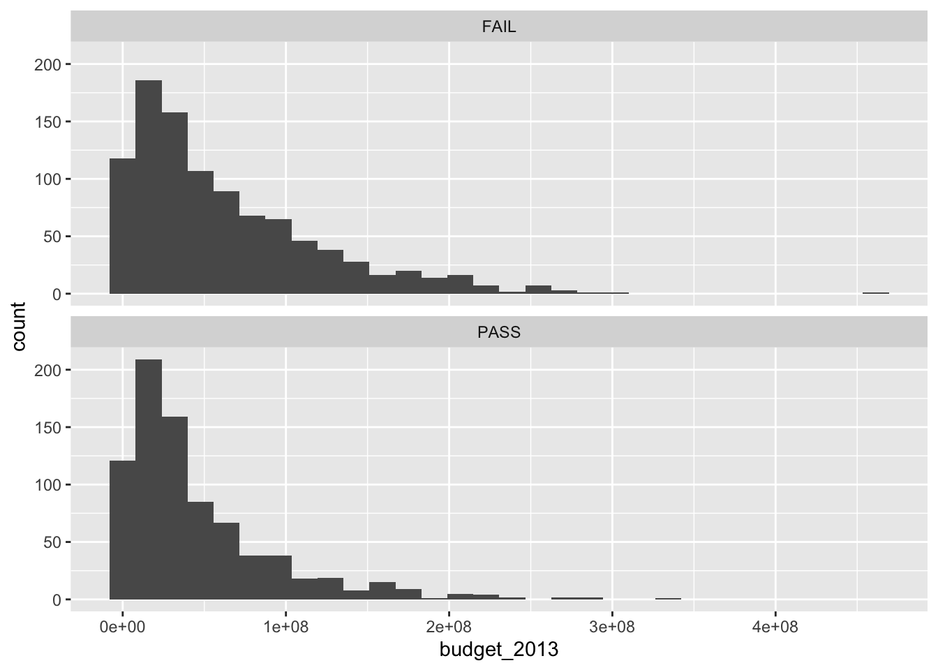
Our sole predictor variable will be budget_2013, each movie’s budget as expressed in 2013 dollars.
bechdel %>%
  ggplot(aes(x = budget_2013)) +
  geom_histogram() +
  facet_wrap(~ binary, ncol = 1)
To make our lives a little easier, we’ll convert the character variable binary into a conventional \(0/1\) numeric variable called pass.
# compute
bechdel <- bechdel  %>%
  mutate(pass = ifelse(binary == "FAIL", 0, 1))

# compare
bechdel %>%
  select(binary, pass) %>%
  head()
## # A tibble: 6 × 2
##   binary  pass
##   <chr>  <dbl>
## 1 FAIL       0
## 2 PASS       1
## 3 FAIL       0
## 4 FAIL       0
## 5 FAIL       0
## 6 FAIL       0
Model
We can express our statistical model in formal notation as
$$
\begin{align*} \text{pass}_i & \sim \operatorname{Binomial}(n = 1, p_i) \\ \operatorname{logit}(p_i) & = \beta_0 + \beta_1 \text{budget_2013}_i, \end{align*}
$$
where we use the conventional logit link to ensure the binomial probabilities are restricted within the bounds of zero and one. We can fit such a model with the base R glm() function like so.
fit <- glm(
  data = bechdel,
  family = binomial,
  pass ~ 1 + budget_2013)
A conventional way to present the results would in a coefficient table, the rudiments of which we can get from the broom::tidy() function.
tidy(fit) %>%
  knitr::kable()
| term | estimate | std.error | statistic | p.value |
|---|---|---|---|---|
| (Intercept) | 0.1113148 | 0.0689661 | 1.614051 | 0.1065163 |
| budget_2013 | 0.0000000 | 0.0000000 | -6.249724 | 0.0000000 |
Because of the scale of the budget_2013 variable, its point estimate and standard errors are both very small. To give a little perspective, here is the expected decrease in log-odds for a budget increase in $$100{,}000{,}000$.
c(coef(fit)[2], confint(fit)[2, ]) * 1e8
## budget_2013       2.5 %      97.5 %
##  -0.5972374  -0.7875178  -0.4126709
Note how we added in the 95% confidence intervals for good measure.
Line plots
Now we have interpreted the model in the dullest way possible, with a table and in prose, let’s practice plotting the results. First, we’ll use the widely-used method of displaying only the fitted line.
Fitted line w/o data.
We can use the predict() function along with some post-processing strategies from
Gavin Simpson’s fine blog post,
Confidence intervals for GLMs, to prepare the data necessary for making our plot.
# define the new data
nd <- tibble(budget_2013 = seq(from = 0, to = 500000000, length.out = 100))

p <-
  # compute the fitted lines and SE's
  predict(fit,
          newdata = nd,
          type = "link",
          se.fit = TRUE) %>%
  # wrangle
  data.frame() %>%
  mutate(ll = fit - 1.96 * se.fit,
         ul = fit + 1.96 * se.fit) %>%
  select(-residual.scale, -se.fit) %>%
  mutate_all(plogis) %>%
  bind_cols(nd)

# what have we done?
glimpse(p)
## Rows: 100
## Columns: 4
## $ fit         <dbl> 0.5278000, 0.5202767, 0.5127442, 0.5052059, 0.4976652, 0.4…
## $ ll          <dbl> 0.4940356, 0.4881515, 0.4821772, 0.4760998, 0.4699043, 0.4…
## $ ul          <dbl> 0.5613120, 0.5522351, 0.5432161, 0.5342767, 0.5254405, 0.5…
## $ budget_2013 <dbl> 0, 5050505, 10101010, 15151515, 20202020, 25252525, 303030…
Here’s a conventional line plot for our logistic regression model.
p %>%
  ggplot(aes(x = budget_2013, y = fit)) +
  geom_ribbon(aes(ymin = ll, ymax = ul),
              alpha = 1/2) +
  geom_line() +
  scale_y_continuous("probability of passing",
                     expand = c(0, 0), limits = 0:1)
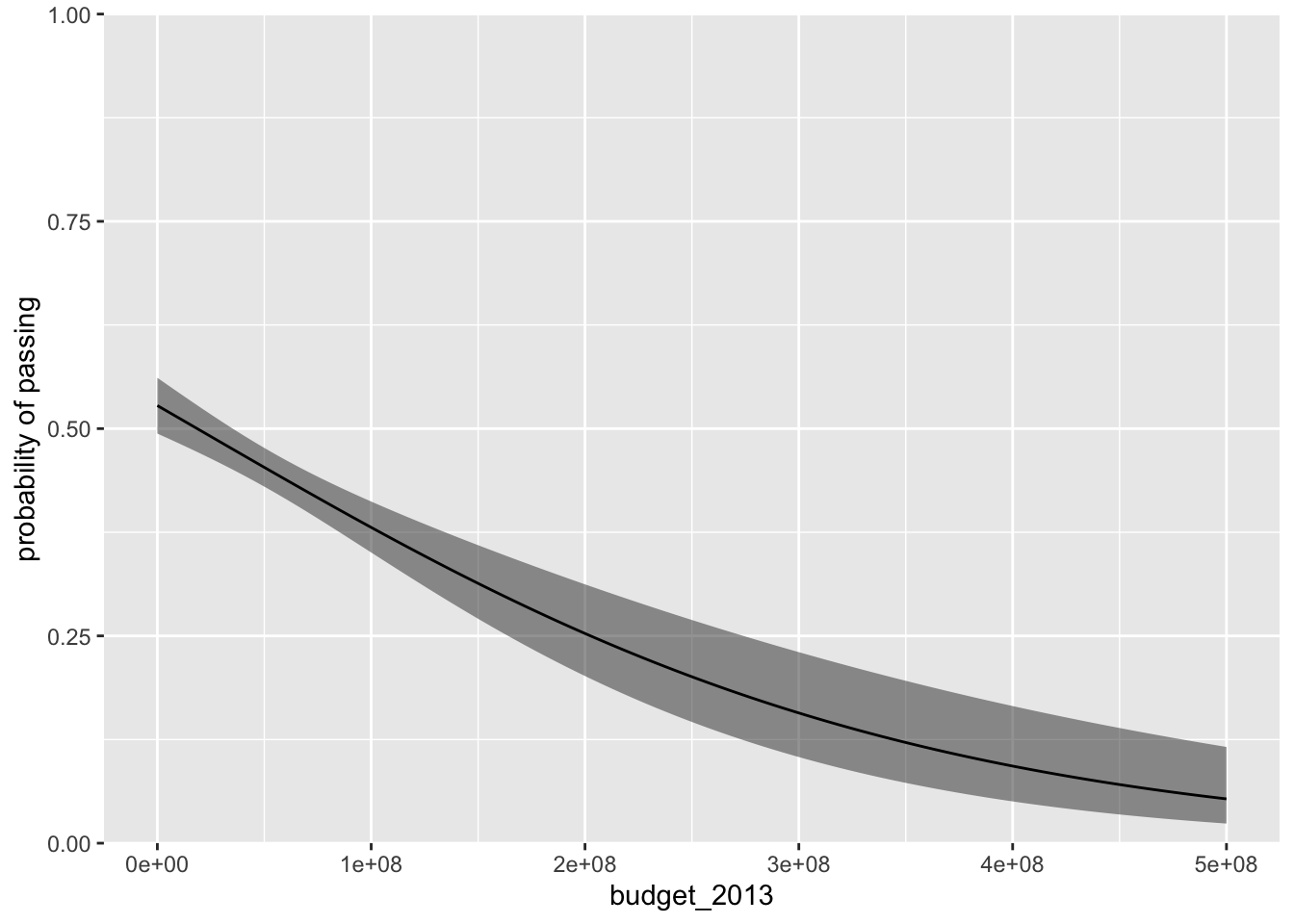
The fitted line is in black and the semitransparent grey ribbon marks of the 95% confidence intervals. The plot does a nice job showing how movies with larger budgets tend to do a worse job passing the Bechdel test.
Improve the visualization by adding data.
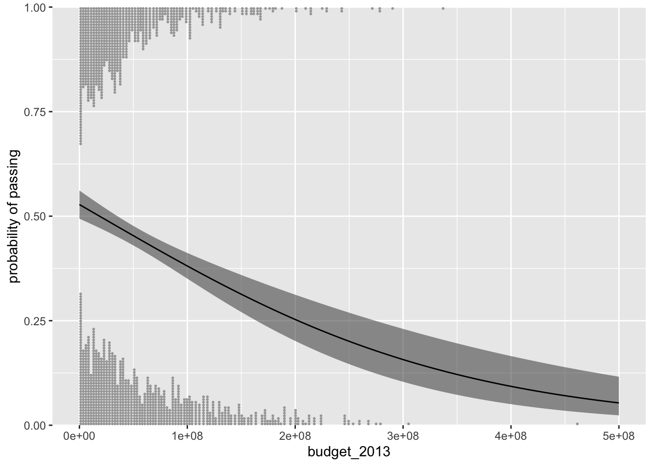
If you wanted to add the data to our plot, a naïve approach might be to use geom_point().
p %>%
  ggplot(aes(x = budget_2013, y = fit)) +
  geom_ribbon(aes(ymin = ll, ymax = ul),
              alpha = 1/2) +
  geom_line() +
  geom_point(data = bechdel,
             aes(y = pass),
             alpha = 1/2) +
  scale_y_continuous("probability of passing",
                     expand = expansion(mult = 0.01))
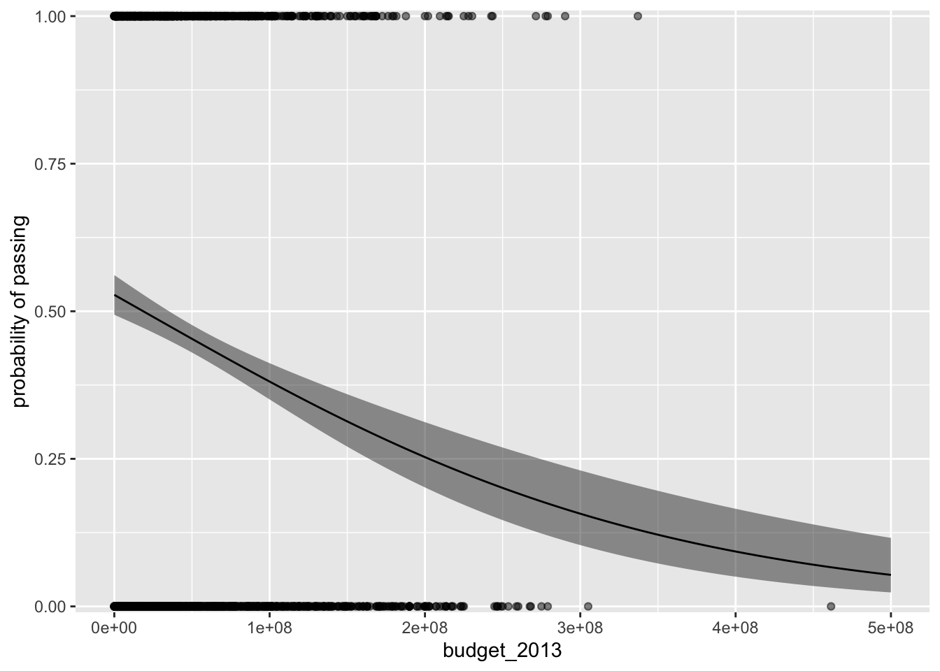
Even by making the dots semitransparent with the alpha parameter, the overplotting issue makes it very difficult to make sense of the data. One of the approaches favored by Gelman and colleagues (
2020) is to add a little vertical jittering. We can do that with geom_jitter().
p %>%
  ggplot(aes(x = budget_2013, y = fit)) +
  geom_ribbon(aes(ymin = ll, ymax = ul),
              alpha = 1/2) +
  geom_line() +
  geom_jitter(data = bechdel,
              aes(y = pass),
              size = 1/4, alpha = 1/2, height = 0.05) +
  scale_y_continuous("probability of passing",
                     expand = c(0, 0))
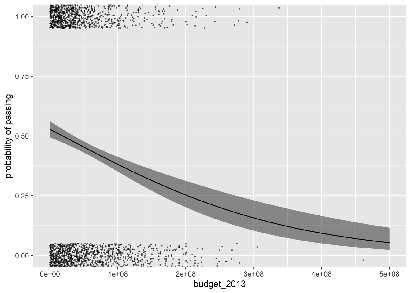
Though a big improvement, this approach still doesn’t do the best job depicting the distribution of the budget_2013 values. If possible, it would be better to explicitly depict the budget_2013 distributions for each level of pass with something more like histograms. In his blogpost,
Using R to make sense of the generalised linear model,
Ladislas Nalborczyk showed how you could do so with a custom function he named logit_dotplot(), the source code for which you can find
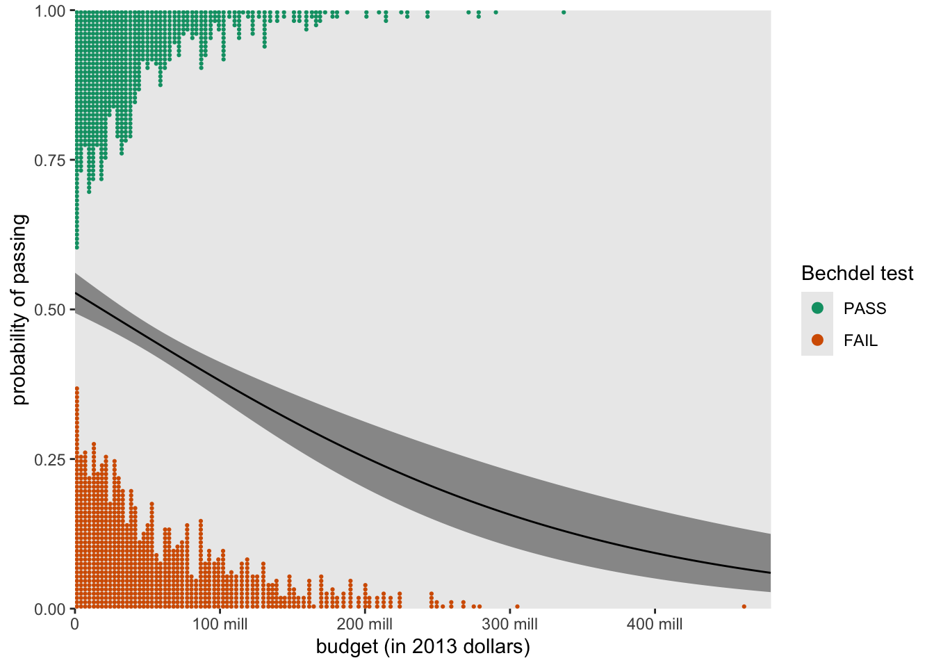
here on his GitHub. Since Nalborczyk’s post, this kind of functionality has since been built into Kay’s ggdist package. Here’s what it looks like.
p %>%
  ggplot(aes(x = budget_2013)) +
  geom_ribbon(aes(ymin = ll, ymax = ul),
              alpha = 1/2) +
  geom_line(aes(y = fit)) +
  stat_dots(data = bechdel,
            aes(y = pass, side = ifelse(pass == 0, "top", "bottom")),
            scale = 1/3) +
  scale_y_continuous("probability of passing",
                     expand = c(0, 0))
With the stat_dots() function, we added dotplots, which are nifty alternatives to histograms which display each data value as an individual dot. With the side argument, we used a conditional statement to tell stat_dots() we wanted some of the budget_2013 to be displayed on the bottom and other of those values to be displayed on the top. With the scale argument, we indicated how much of the total space within the range of the \(y\)-axis we wanted the dot plot distributions to take up.
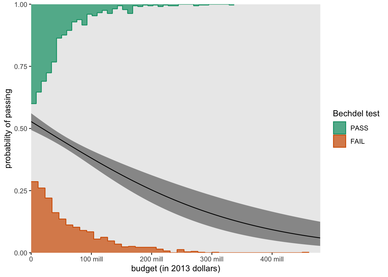
For kicks and giggles, here’s a more polished version of what such a plot could look like.
p %>%
  ggplot(aes(x = budget_2013)) +
  geom_ribbon(aes(ymin = ll, ymax = ul),
              alpha = 1/2) +
  geom_line(aes(y = fit)) +
  stat_dots(data = bechdel %>%
              mutate(binary = factor(binary, levels = c("PASS", "FAIL"))),
            aes(y = pass,
                side = ifelse(pass == 0, "top", "bottom"),
                color = binary),
            scale = 0.4, shape = 19) +
  scale_color_manual("Bechdel test", values = c("#009E73", "#D55E00")) +
  scale_x_continuous("budget (in 2013 dollars)",
                     breaks = c(0, 1e8, 2e8, 3e8, 4e8),
                     labels = c(0, str_c(1:4 * 100, " mill")),
                     expand = c(0, 0), limits = c(0, 48e7)) +
  scale_y_continuous("probability of passing",
                     expand = c(0, 0)) +
  theme(panel.grid = element_blank())
Other distributional forms are possible, too. For example, here we set slab_type = "histogram" within the stat_slab() function to swap out the dotplots for histograms.
p %>%
  ggplot(aes(x = budget_2013)) +
  geom_ribbon(aes(ymin = ll, ymax = ul),
              alpha = 1/2) +
  geom_line(aes(y = fit)) +
  # the magic lives here
  stat_slab(data = bechdel %>%
              mutate(binary = factor(binary, levels = c("PASS", "FAIL"))),
            aes(y = pass,
                side = ifelse(pass == 0, "top", "bottom"),
                fill = binary, color = binary),
            slab_type = "histogram",
            scale = 0.4, breaks = 40, size = 1/2) +
  scale_fill_manual("Bechdel test", values = c(alpha("#009E73", .7), alpha("#D55E00", .7))) +
  scale_color_manual("Bechdel test", values = c("#009E73", "#D55E00")) +
  scale_x_continuous("budget (in 2013 dollars)",
                     breaks = c(0, 1e8, 2e8, 3e8, 4e8),
                     labels = c(0, str_c(1:4 * 100, " mill")),
                     expand = c(0, 0), limits = c(0, 48e7)) +
  scale_y_continuous("probability of passing",
                     expand = c(0, 0)) +
  theme(panel.grid = element_blank())
That’s a wrap, friends. No more lonely logistic curves absent data. Flaunt those sexy data with ggdist.
Session info
sessionInfo()
## R version 4.4.2 (2024-10-31)
## Platform: aarch64-apple-darwin20
## Running under: macOS Ventura 13.4
##
## Matrix products: default
## BLAS:   /Library/Frameworks/R.framework/Versions/4.4-arm64/Resources/lib/libRblas.0.dylib
## LAPACK: /Library/Frameworks/R.framework/Versions/4.4-arm64/Resources/lib/libRlapack.dylib;  LAPACK version 3.12.0
##
## locale:
## [1] en_US.UTF-8/en_US.UTF-8/en_US.UTF-8/C/en_US.UTF-8/en_US.UTF-8
##
## time zone: America/Chicago
## tzcode source: internal
##
## attached base packages:
## [1] stats     graphics  grDevices utils     datasets  methods   base
##
## other attached packages:
##  [1] ggdist_3.3.2          broom_1.0.7           fivethirtyeight_0.6.2
##  [4] lubridate_1.9.3       forcats_1.0.0         stringr_1.5.1
##  [7] dplyr_1.1.4           purrr_1.0.2           readr_2.1.5
## [10] tidyr_1.3.1           tibble_3.2.1          ggplot2_3.5.1
## [13] tidyverse_2.0.0
##
## loaded via a namespace (and not attached):
##  [1] sass_0.4.9           utf8_1.2.4           generics_0.1.3
##  [4] blogdown_1.20        stringi_1.8.4        hms_1.1.3
##  [7] digest_0.6.37        magrittr_2.0.3       evaluate_1.0.1
## [10] grid_4.4.2           timechange_0.3.0     bookdown_0.40
## [13] fastmap_1.1.1        jsonlite_1.8.9       backports_1.5.0
## [16] scales_1.3.0         jquerylib_0.1.4      cli_3.6.3
## [19] rlang_1.1.4          munsell_0.5.1        withr_3.0.2
## [22] cachem_1.0.8         yaml_2.3.8           tools_4.4.2
## [25] tzdb_0.4.0           colorspace_2.1-1     vctrs_0.6.5
## [28] R6_2.5.1             lifecycle_1.0.4      pkgconfig_2.0.3
## [31] pillar_1.10.1        bslib_0.7.0          gtable_0.3.6
## [34] glue_1.8.0           Rcpp_1.0.13-1        xfun_0.49
## [37] tidyselect_1.2.1     rstudioapi_0.16.0    knitr_1.49
## [40] farver_2.1.2         htmltools_0.5.8.1    labeling_0.4.3
## [43] rmarkdown_2.29       compiler_4.4.2       quadprog_1.5-8
## [46] distributional_0.5.0
References
Gelman, A., Hill, J., & Vehtari, A. (2020). Regression and other stories. Cambridge University Press. https://doi.org/10.1017/9781139161879
James, G., Witten, D., Hastie, T., & Tibshirani, R. (2021). An introduction to statistical learning with applications in R (Second Edition). Springer. https://web.stanford.edu/~hastie/ISLRv2_website.pdf
Kay, M. (2021). ggdist: Visualizations of distributions and uncertainty [Manual]. https://CRAN.R-project.org/package=ggdist
Kim, A. Y., Ismay, C., & Chunn, J. (2018). The fivethirtyeight R package: ’Tame data’ principles for introductory statistics and data science courses. Technology Innovations in Statistics Education, 11(1). https://escholarship.org/uc/item/0rx1231m
Kim, A. Y., Ismay, C., & Chunn, J. (2020). fivethirtyeight: Data and code behind the stories and interactives at FiveThirtyEight [Manual]. https://github.com/rudeboybert/fivethirtyeight
Kruschke, J. K. (2015). Doing Bayesian data analysis: A tutorial with R, JAGS, and Stan. Academic Press. https://sites.google.com/site/doingbayesiandataanalysis/
McElreath, R. (2015). Statistical rethinking: A Bayesian course with examples in R and Stan. CRC press. https://xcelab.net/rm/statistical-rethinking/
McElreath, R. (2020). Statistical rethinking: A Bayesian course with examples in R and Stan (Second Edition). CRC Press. https://xcelab.net/rm/statistical-rethinking/
R Core Team. (2022). R: A language and environment for statistical computing. R Foundation for Statistical Computing. https://www.R-project.org/
Roback, P., & Legler, J. (2021). Beyond multiple linear regression: Applied generalized linear models and multilevel models in R. CRC Press. https://bookdown.org/roback/bookdown-BeyondMLR/
Robinson, D., Hayes, A., & Couch, S. (2022). broom: Convert statistical objects into tidy tibbles [Manual]. https://CRAN.R-project.org/package=broom
Wickham, H. (2022). tidyverse: Easily install and load the ’tidyverse’. https://CRAN.R-project.org/package=tidyverse
Wickham, H., Averick, M., Bryan, J., Chang, W., McGowan, L. D., François, R., Grolemund, G., Hayes, A., Henry, L., Hester, J., Kuhn, M., Pedersen, T. L., Miller, E., Bache, S. M., Müller, K., Ooms, J., Robinson, D., Seidel, D. P., Spinu, V., … Yutani, H. (2019). Welcome to the tidyverse. Journal of Open Source Software, 4(43), 1686. https://doi.org/10.21105/joss.01686
- Posted on:
- September 22, 2021
- Length:
- 11 minute read, 2256 words