Example power analysis report
By A. Solomon Kurz
July 2, 2021
Context
In one of my recent Twitter posts, I got pissy and complained about a vague power-analysis statement I saw while reviewing a manuscript submitted to a scientific journal.
If you submit a manuscript for publication that involves HLMs and SEMs of longitudinal data and you vaguely summarize your power analysis in one sentence, I, as your friendly neighborhood Reviewer #2, am requesting a full power-analysis write-up as a supplementary material.
— Solomon Kurz (@SolomonKurz) June 28, 2021
It wasn’t my best moment and I ended up apologizing for my tone.
Okay, I apologize for getting a little pissy with the tweet. Yet the issue is real and it leads to a natural question: What would go into a good power analysis report? I’ve done a few for work and I promise to morph one into a blog post, by the end of the week.
— Solomon Kurz (@SolomonKurz) June 28, 2021
However, the broader issue remains. If you plan to analyze your data with anything more complicated than a \(t\)-test, the power analysis phase gets tricky. The manuscript I was complaining about used a complicated multilevel model as its primary analysis. I’m willing to bet that most applied researchers (including the authors of that manuscript) have never done a power analysis for a multilevel model and probably have never seen what one might look like, either. The purpose of this post is to give a real-world example of just such an analysis.
Over the past couple years, I’ve done a few multilevel power analyses as part of my day job. In this post, I will reproduce one of them. For the sake of confidentiality, some of the original content will be omitted or slightly altered. But the overall workflow will be about 90% faithful to the original report I submitted to my boss. To understand this report, you should know:
- my boss has some experience fitting multilevel models, but they’re not a stats jock;
- we had pilot data from two different sources, each with its strengths and weaknesses; and
- this document was meant for internal purposes only, though I believe some of its contents did make it into other materials.
At the end, I’ll wrap this post up with a few comments. Here’s the report:
Executive summary
A total sample size of 164 is the minimum number to detect an effect size similar to that in the pilot data (i.e., Cohen’s \(d = 0.3\)). This recommendation assumes
- a study design of three time points,
- random assignment of participants into two equal groups, and
- 20% dropout on the second time point and another 20% dropout by the third time point.
If we presume a more conservative effect size of \(0.2\) and a larger dropout rate of 30% the second and third time points, the minimum recommended total sample size is 486.
The remainder of this report details how I came to these conclusions. For full transparency, I will supplement prose with figures, tables, and the statistical code used used for all computations. By default, the code is hidden is this document. However, if you are interested in the code, you should be able to make it appear by selecting “Show All Code” in the dropdown menu from the “Code” button on the upper-right corner.
Cohen’s \(d\)
In this report, Cohen’s \(d\) is meant to indicate a standardized mean difference. The \(d = 0.3\) from above is based on the some_file.docx file you shared with me last week. In Table 1, you provided the following summary information for the intervention group:
library(tidyverse)

tibble(summary = c("mean", "sd"),
       baseline = c(1.29, 1.13),
       followup = c(0.95, 1.09)) %>%
  knitr::kable()
| summary | baseline | followup |
|---|---|---|
| mean | 1.29 | 0.95 |
| sd | 1.13 | 1.09 |
With that information, we can compute a within-subject’s \(d\) by hand. With this formula, we will be using the pooled standard deviation in the denominator.
d <- (1.29 - .95) / sqrt((1.13^2 + 1.09^2) / 2)
d
## [1] 0.3062566
However, 0.306 is just a point estimate. We can express the uncertainty in that point estimate with 95% confidence intervals.
ci <-
  MBESS::ci.smd(smd = d,
                n.1 = 50,
                n.2 = 26)

ci %>%
  data.frame() %>%
  glimpse()
## Rows: 1
## Columns: 3
## $ Lower.Conf.Limit.smd <dbl> -0.1712149
## $ smd                  <dbl> 0.3062566
## $ Upper.Conf.Limit.smd <dbl> 0.7816834
In this output, smd refers to “standardized mean difference,” what what we have been referring to as Cohen’s \(d\). The output indicates the effect size for the experimental group from the pilot study was \(d\) of 0.31 [-0.17, .78]. The data look promising for a small/moderate effect. But those confidence intervals swing from small negative to large.
For reference, here are the 50% intervals.
MBESS::ci.smd(smd = d,
              n.1 = 50,
              n.2 = 26,
              conf.level = .5) %>%
  data.frame() %>%
  glimpse()
## Rows: 1
## Columns: 3
## $ Lower.Conf.Limit.smd <dbl> 0.1412595
## $ smd                  <dbl> 0.3062566
## $ Upper.Conf.Limit.smd <dbl> 0.4691839
The 50% CIs range from 0.14 to 0.47.
Power analyses can be tailor made.
Whenever possible, it is preferable to tailor a power analysis to the statistical models researchers plan to use to analyze the data they intend to collect. Based on your previous analyses, I suspect you intend to fit a series of hierarchical models. I would have done the same thing with those data and I further recommend you analyze the data you intend to collect within a hierarchical growth model paradigm. With that in mind, the power analyses in the report are all based on the following model:
$$
\begin{align*} y_{ij} & = \beta_{0i} + \beta_{1i} \text{time}_{ij} + \epsilon_{ij} \\ \beta_{0i} & = \gamma_{00} + \gamma_{01} \text{treatment}_i + u_{0i} \\ \beta_{1i} & = \gamma_{10} + \gamma_{11} \text{treatment}_i + u_{1i}, \end{align*}
$$
where \(y\) is the dependent variable of interest, which varies across \(i\) participants and \(j\) measurement occasions. The model is linear with an intercept \(\beta_{0i}\) and slope \(\beta_{1i}\). As indicated by the \(i\) subscripts, both intercepts and slopes vary across participants with grand means \(\gamma_{00}\) and \(\gamma_{10}\), respectively, and participant-specific deviations around those means \(u_{0i}\) and \(u_{1i}\), respectively. There is a focal between-participant predictor in the model, \(\text{treatment}_i\), which is coded 0 = control 1 = treatment. Rearranging the the formulas into the composite form will make it clear this is an interaction model:
$$
\begin{align*} y_{ij} & = \gamma_{00} + \gamma_{01} \text{treatment}_i \\ & \;\;\; + \gamma_{10} \text{time}_{ij} + \gamma_{11} \text{treatment}_i \times \text{time}_{ij} \\ & \;\;\; + u_{0i} + u_{1i} \text{time}_{ij} + \epsilon_{ij}, \end{align*}
$$
where the parameter of primary interest for the study is \(\gamma_{11} \text{treatment}_i \times \text{time}_{ij}\), the difference between the two \(\text{treatment}\) conditions in their change in \(y\) over \(\text{time}\). As such, the focus of the power analyses reported above are on the power to reject the null hypothesis the \(\text{treatment}\) conditions do not differ in their change over \(\text{time}\),
$$H_0: \gamma_{11} = 0.$$
To finish out the equations, this approach makes the typical assumptions the within-participant residual term, \(\epsilon_{ij}\), is normally distributed around zero,
$$\epsilon_{ij} \sim \operatorname{Normal} (0, \sigma_\epsilon^2),$$
and the between-participant variances \(u_{0i}\) and \(u_{1i}\) have a multivariate normal distribution with a mean vector of zeros,
$$ {\begin{bmatrix} u_{0i} \ u_{1i} \end{bmatrix}} \sim \operatorname{Normal} \Bigg ( {\begin{bmatrix} 0 \ 0 \end{bmatrix}}, {\begin{bmatrix} \sigma_0^2 & \sigma_{01} \ \sigma_{01} & \sigma_1^2 \end{bmatrix}} \Bigg ). $$
Following convention, the within-participant residuals \(\epsilon_{ij}\) are orthogonal to the between-participant variances \(u_{0i}\) and \(u_{1i}\).
For simplicity, another assumption of this model that the control condition will remain constant over time.
Main results: Power curves.
I computed a series of power curves to examine the necessary sample size given different assumptions. Due to the uncertainty in the effect size from the pilot data, \(d = 0.31 [-0.17, .78]\), varied the effect size from 0.1 to 0.3. I also examined different levels of missing data via dropout. These followed four patterns of dropout and were extensions of the missing data pattern described in the some_other_file.docx file. They were:
tibble(`dropout rate` = str_c(c(0, 10, 20, 30), "%"),
       baseline = "100%",
       `1st followup` = str_c(c(100, 90, 80, 70), "%"),
       `2nd followup` = str_c(c(100, 80, 60, 40), "%")) %>%
  knitr::kable()
| dropout rate | baseline | 1st followup | 2nd followup |
|---|---|---|---|
| 0% | 100% | 100% | 100% |
| 10% | 100% | 90% | 80% |
| 20% | 100% | 80% | 60% |
| 30% | 100% | 70% | 40% |
The row with the 20% dropout rate, for example, corresponds directly to the dropout rate entertained in the some_other_file.docx file.
The power simulations of this kind required two more bits of information. The first was that we specify an expected intraclass correlation coefficient (ICC). I used ICC = .9, which is the ICC value you reported in your previous work (p. 41).
The second value needed is the ratio of \(u_{1i}/ \epsilon_{ij}\), sometimes called the “variance ratio.” I was not able to determine that value from the some_file.docx or the some_other_file.docx. However, I was able to compute one based on data from a different project on participants from a similar population. The data are from several hundred participants in a longitudinal survey study. The data do not include your primary variable of interest. Instead, I took the \(u_{1i}/ \epsilon_{ij}\) from recent hierarchical analyses of two related measures. These left me with two values: 0.018 on the low end and 0.281 on the high end. Thus, I performed the power curves using both.
Here is the code for the simulations:
library(powerlmm)

t <- 3
n <- 100

# variance ratio 0.018
icc0.9_vr_0.018_d0.1 <-
  study_parameters(n1 = t,
                 n2 = n,
                 icc_pre_subject = 0.9,
                  var_ratio = 0.018,
                  effect_size = cohend(-0.2,
                                       standardizer = "pretest_SD"),
                 dropout = dropout_manual(0, 0.1, 0.2)) %>%
  get_power_table(n2 = 25:500,
                  effect_size = cohend(c(.1, .15, .2, .25, .3),
                                       standardizer = "pretest_SD"))

icc0.9_vr_0.018_d0.2 <-
  study_parameters(n1 = t,
                 n2 = n,
                 icc_pre_subject = 0.9,
                  var_ratio = 0.018,
                  effect_size = cohend(-0.2,
                                       standardizer = "pretest_SD"),
                 dropout = dropout_manual(0, 0.2, 0.4)) %>%
  get_power_table(n2 = 25:500,
                  effect_size = cohend(c(.1, .15, .2, .25, .3),
                                       standardizer = "pretest_SD"))

icc0.9_vr_0.018_d0.3 <-
  study_parameters(n1 = t,
                 n2 = n,
                 icc_pre_subject = 0.9,
                  var_ratio = 0.018,
                  effect_size = cohend(-0.2,
                                       standardizer = "pretest_SD"),
                 dropout = dropout_manual(0, 0.3, 0.6)) %>%
  get_power_table(n2 = 25:500,
                  effect_size = cohend(c(.1, .15, .2, .25, .3),
                                       standardizer = "pretest_SD"))

# variance ratio 0.281
icc0.9_vr_0.281_d0.1 <-
  study_parameters(n1 = t,
                 n2 = n,
                 icc_pre_subject = 0.9,
                  var_ratio = 0.281,
                  effect_size = cohend(-0.2,
                                       standardizer = "pretest_SD"),
                 dropout = dropout_manual(0, 0.1, 0.2)) %>%
  get_power_table(n2 = 25:500,
                  effect_size = cohend(c(.1, .15, .2, .25, .3),
                                       standardizer = "pretest_SD"))

icc0.9_vr_0.281_d0.2 <-
  study_parameters(n1 = t,
                 n2 = n,
                 icc_pre_subject = 0.9,
                  var_ratio = 0.281,
                  effect_size = cohend(-0.2,
                                       standardizer = "pretest_SD"),
                 dropout = dropout_manual(0, 0.2, 0.4)) %>%
  get_power_table(n2 = 25:500,
                  effect_size = cohend(c(.1, .15, .2, .25, .3),
                                       standardizer = "pretest_SD"))

icc0.9_vr_0.281_d0.3 <-
  study_parameters(n1 = t,
                 n2 = n,
                 icc_pre_subject = 0.9,
                  var_ratio = 0.281,
                  effect_size = cohend(-0.2,
                                       standardizer = "pretest_SD"),
                 dropout = dropout_manual(0, 0.3, 0.6)) %>%
  get_power_table(n2 = 25:500,
                  effect_size = cohend(c(.1, .15, .2, .25, .3),
                                       standardizer = "pretest_SD"))
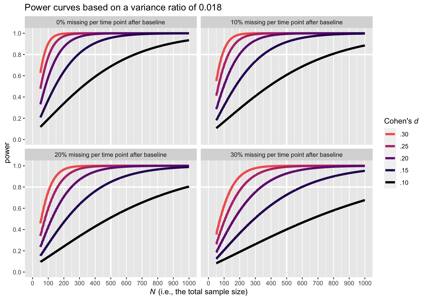
Here are the power curve plots, beginning with the plot for the smaller variance ratio of 0.018.
bind_rows(
  icc0.9_vr_0.018_d0.1 %>% filter(dropout == "with missing"),
  icc0.9_vr_0.018_d0.2 %>% filter(dropout == "with missing"),
  icc0.9_vr_0.018_d0.3
) %>%
  mutate(missing = c(rep(str_c(c(10, 20, 30, 00), "% missing per time point after baseline"), each = n() / 4))) %>%

  mutate(d = factor(effect_size,
                    levels = c("0.1", "0.15", "0.2", "0.25", "0.3"),
                    labels = c(".10", ".15", ".20", ".25", ".30"))) %>%
  mutate(d = fct_rev(d)) %>%

  ggplot(aes(x = tot_n, y = power, color = d)) +
  geom_vline(xintercept = 500, color = "white", linewidth = 1) +
  geom_hline(yintercept = .8, color = "white", linewidth = 1) +
  geom_line(linewidth = 1.5) +
  scale_color_viridis_d(expression(paste("Cohen's ", italic(d))),
                        option = "A", end = .67, direction = -1) +
  scale_x_continuous(expression(paste(italic(N), " (i.e., the total sample size)")),
                     breaks = seq(from = 0, to = 1000, by = 100), limits = c(0, 1000)) +
  scale_y_continuous(breaks = c(0, .2, .4, .6, .8, 1), limits = c(0, 1)) +
  ggtitle("Power curves based on a variance ratio of 0.018") +
  theme(panel.grid.major.y = element_blank(),
        panel.grid.minor.y = element_blank()) +
  facet_wrap(~missing)
Here is the power curve plot for the larger variance ratio of 0.281.
bind_rows(
  icc0.9_vr_0.281_d0.1 %>% filter(dropout == "with missing"),
  icc0.9_vr_0.281_d0.2 %>% filter(dropout == "with missing"),
  icc0.9_vr_0.281_d0.3
) %>%
  mutate(missing = c(rep(str_c(c(10, 20, 30, 00), "% missing per time point after baseline"), each = n() / 4))) %>%

  mutate(d = factor(effect_size,
                    levels = c("0.1", "0.15", "0.2", "0.25", "0.3"),
                    labels = c(".10", ".15", ".20", ".25", ".30"))) %>%
  mutate(d = fct_rev(d)) %>%

  ggplot(aes(x = tot_n, y = power, color = d)) +
  geom_vline(xintercept = 500, color = "white", linewidth = 1) +
  geom_hline(yintercept = .8, color = "white", linewidth = 1) +
  geom_line(linewidth = 1.5) +
  scale_color_viridis_d(expression(paste("Cohen's ", italic(d))),
                        option = "A", end = .67, direction = -1) +
  scale_x_continuous(expression(paste(italic(N), " (i.e., the total sample size)")),
                     breaks = seq(from = 0, to = 1000, by = 100), limits = c(0, 1000)) +
  scale_y_continuous(breaks = c(0, .2, .4, .6, .8, 1), limits = c(0, 1)) +
  ggtitle("Power curves based on a variance ratio of 0.281") +
  theme(panel.grid.major.y = element_blank(),
        panel.grid.minor.y = element_blank()) +
  facet_wrap(~missing)
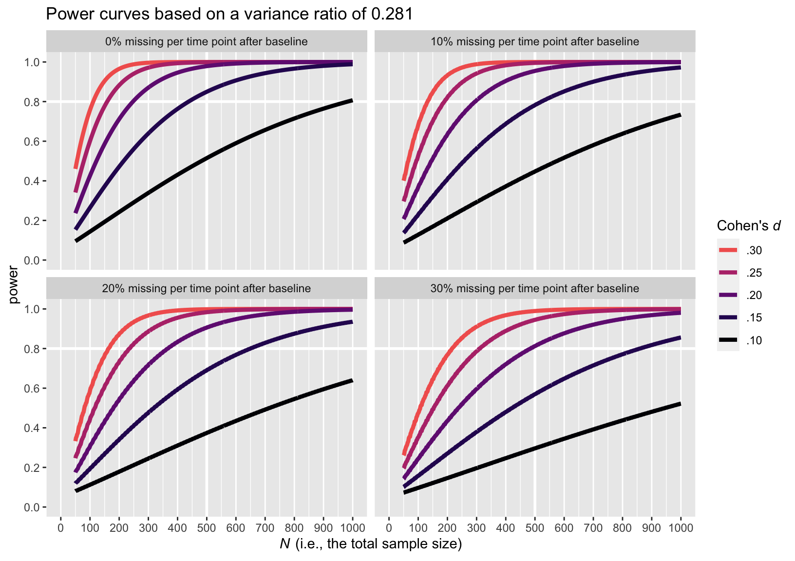
The upshot of the variance ratio issue is that a higher variance ratio led to lower power. To be on the safe side, I recommend leaning on the more conservative power curve estimates from the simulations based on the larger variance ratio, 0.281.
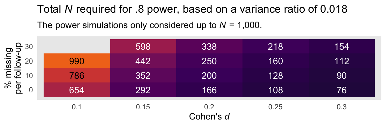
A more succinct way to summarize the information in the power curves in with two tables. Here is the minimum total sample size required to reach a power of .8 based on the smaller evidence ratio of 0.018 and the various combinations of Cohen’s \(d\) and dropout:
bind_rows(
  icc0.9_vr_0.018_d0.1 %>% filter(dropout == "with missing"),
  icc0.9_vr_0.018_d0.2 %>% filter(dropout == "with missing"),
  icc0.9_vr_0.018_d0.3
) %>%
  mutate(missing = c(rep(c(10, 20, 30, 00), each = n() / 4))) %>%

  filter(power > .8) %>%
  group_by(missing, effect_size) %>%
  top_n(-1, power) %>%
  select(-n2, -power, -dropout) %>%
  ungroup() %>%
  mutate(`Cohen's d` = effect_size) %>%

  ggplot(aes(x = `Cohen's d`, y = missing)) +
  geom_tile(aes(fill = tot_n),
            show.legend = F) +
  geom_text(aes(label = tot_n, color = tot_n < 700),
            show.legend = F) +
  scale_fill_viridis_c(option = "B", begin = .1, end = .70 ,limits = c(0, 1000)) +
  scale_color_manual(values = c("black", "white")) +
  labs(title = expression(paste("Total ", italic(N), " required for .8 power, based on a variance ratio of 0.018")),
       subtitle = expression(paste("The power simulations only considered up to ", italic(N), " = 1,000.")),
       x = expression(paste("Cohen's ", italic(d))),
       y = "% missing\nper follow-up") +
  theme(axis.ticks = element_blank(),
        panel.grid = element_blank())
Here is an alternative version of that plot, this time based on the more conservative variance ratio of 0.281.
bind_rows(
  icc0.9_vr_0.281_d0.1 %>% filter(dropout == "with missing"),
  icc0.9_vr_0.281_d0.2 %>% filter(dropout == "with missing"),
  icc0.9_vr_0.281_d0.3
) %>%
  mutate(missing = c(rep(c(10, 20, 30, 00), each = n() / 4))) %>%

  filter(power > .8) %>%
  group_by(missing, effect_size) %>%
  top_n(-1, power) %>%
  select(-n2, -power, -dropout) %>%
  ungroup() %>%
  mutate(`Cohen's d` = effect_size) %>%

  ggplot(aes(x = `Cohen's d`, y = missing)) +
  geom_tile(aes(fill = tot_n),
            show.legend = F) +
  geom_text(aes(label = tot_n, color = tot_n < 700),
            show.legend = F) +
  scale_fill_viridis_c(option = "B", begin = .1, end = .70 ,limits = c(0, 1000)) +
  scale_color_manual(values = c("black", "white")) +
  labs(title = expression(paste("Total ", italic(N), " required for .8 power, based on variance ratio of 0.281")),
       subtitle = expression(paste("The power simulations only considered up to ", italic(N), " = 1,000.")),
       x = expression(paste("Cohen's ", italic(d))),
       y = "% missing\nper follow-up") +
  theme(axis.ticks = element_blank(),
        panel.grid = element_blank())
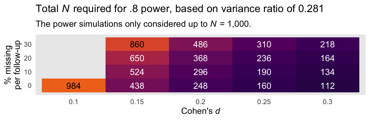
Again, I recommend playing it safe and relying on the power estimates based on the larger variance ratio of 0.281. Those power curves indicate that even with rather large dropout (i.e., 30% at the second time point and another 30% at the final time point), \(N = 486\) is sufficient to detect a small effect size (i.e., \(d = 0.2\)) at the conventional .8 power threshold. Note that because we cut off the power simulations at \(N = 1{,}000\), we never reached .8 power in the conditions where \(d = 0.1\) and there was missingness at or greater than 0% dropout at each follow-up time point.
To clarify, \(N\) in each cell is the total sample size presuming both the control and experimental conditions have equal numbers in each. Thus, \(n_\text{control} = n_\text{experimental} = N/2\).
Wrap up
I presented the original report with an HTML document, which used the R Markdown code folding option, which hid my code, by default. Since I’m not aware of a good way to use code folding with blogdown blog posts, here you see the code in all its glory.
All you Bayesian freaks may have noticed that this was a conventional frequentist power analysis. I’m not always a Bayesian. 🤷 When you intend to analyze experimental RCT-like data with frequentist software, the powerlmm package ( Magnusson, 2018) can come in really handy.
Had I intended to share a report like this for a broader audience, possibly as supplemental material for a paper, I might have explained the powerlmm code a bit more. Since this was originally meant for internal use, my main goal was to present the results with an extra bit of transparency for the sake of building trust with a new collaborator. It worked, by the way. This person’s grant money now pays for part of my salary.
If this was supplementary material, I would have also spent more time explicitly showing where I got the Cohen’s \(d\), ICC, and variance ratio values.
If you didn’t notice, the context for this power analysis wasn’t ideal. Even though I pulled information from two different data sources, neither was ideal and their combination wasn’t, either. Though my collaborator’s pilot data let me compute the Cohen’s \(d\) and the ICC, I didn’t have access to the raw data, themselves. Without that, I had no good way to compute the variance ratio. As it turns out, that was a big deal. Though I was able to compute variance ratios from different data from a similar population, it wasn’t on the same criterion variable. The best place to be in is if you have pilot data from the same population and on the same criterion variable. Outside of that, you’re making assumptions about model parameters you might not have spent a lot of time pondering, before. Welcome to the world of multilevel power analyses, friends. Keep your chins up. It’s rough, out there.
Session info
sessionInfo()
## R version 4.2.0 (2022-04-22)
## Platform: x86_64-apple-darwin17.0 (64-bit)
## Running under: macOS Big Sur/Monterey 10.16
##
## Matrix products: default
## BLAS:   /Library/Frameworks/R.framework/Versions/4.2/Resources/lib/libRblas.0.dylib
## LAPACK: /Library/Frameworks/R.framework/Versions/4.2/Resources/lib/libRlapack.dylib
##
## locale:
## [1] en_US.UTF-8/en_US.UTF-8/en_US.UTF-8/C/en_US.UTF-8/en_US.UTF-8
##
## attached base packages:
## [1] stats     graphics  grDevices utils     datasets  methods   base
##
## other attached packages:
## [1] forcats_0.5.1   stringr_1.4.1   dplyr_1.0.10    purrr_0.3.4
## [5] readr_2.1.2     tidyr_1.2.1     tibble_3.1.8    ggplot2_3.4.0
## [9] tidyverse_1.3.2
##
## loaded via a namespace (and not attached):
##  [1] lubridate_1.8.0     assertthat_0.2.1    digest_0.6.30
##  [4] utf8_1.2.2          R6_2.5.1            cellranger_1.1.0
##  [7] backports_1.4.1     reprex_2.0.2        evaluate_0.18
## [10] httr_1.4.4          highr_0.9           blogdown_1.15
## [13] pillar_1.8.1        rlang_1.0.6         googlesheets4_1.0.1
## [16] readxl_1.4.1        rstudioapi_0.13     jquerylib_0.1.4
## [19] rmarkdown_2.16      labeling_0.4.2      googledrive_2.0.0
## [22] munsell_0.5.0       broom_1.0.1         compiler_4.2.0
## [25] modelr_0.1.8        xfun_0.35           pkgconfig_2.0.3
## [28] htmltools_0.5.3     tidyselect_1.1.2    bookdown_0.28
## [31] emo_0.0.0.9000      viridisLite_0.4.1   fansi_1.0.3
## [34] crayon_1.5.2        tzdb_0.3.0          dbplyr_2.2.1
## [37] withr_2.5.0         grid_4.2.0          jsonlite_1.8.3
## [40] gtable_0.3.1        lifecycle_1.0.3     DBI_1.1.3
## [43] magrittr_2.0.3      scales_1.2.1        cli_3.4.1
## [46] stringi_1.7.8       cachem_1.0.6        farver_2.1.1
## [49] fs_1.5.2            xml2_1.3.3          bslib_0.4.0
## [52] ellipsis_0.3.2      generics_0.1.3      vctrs_0.5.0
## [55] tools_4.2.0         glue_1.6.2          hms_1.1.1
## [58] fastmap_1.1.0       yaml_2.3.5          colorspace_2.0-3
## [61] gargle_1.2.0        MBESS_4.9.1         rvest_1.0.2
## [64] knitr_1.40          haven_2.5.1         sass_0.4.2
References
Magnusson, K. (2018). powerlmm: Power analysis for longitudinal multilevel models [Manual]. https://github.com/rpsychologist/powerlmm
- Posted on:
- July 2, 2021
- Length:
- 16 minute read, 3220 words