Make model diagrams, Kruschke style
By A. Solomon Kurz
March 9, 2020
tl;dr
You too can make model diagrams with the tidyverse and patchwork packages. Here’s how.
Diagrams can help us understand statistical models.
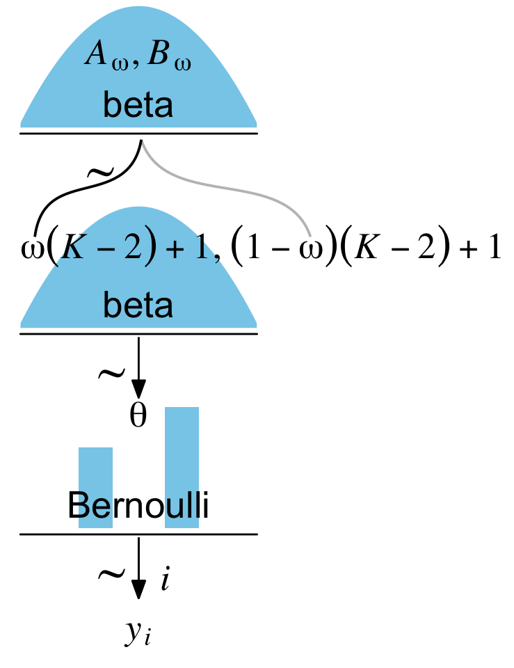
I’ve been working through John Kruschke’s Doing Bayesian data analysis, Second Edition: A tutorial with R, JAGS, and Stan and translating it into brms and tidyverse-style workflow. At this point, the bulk of the work is done and you can check it out at https://bookdown.org/content/3686/. One of Kruschke’s unique contributions was the way he used diagrams to depict his statistical models. Here’s an example from the text (Figure 8.2 on page 196):
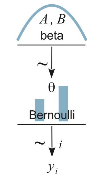
In the figure’s caption, we read:
Diagram of model with Bernoulli likelihood and beta prior. The pictures of the distributions are intended as stereotypical icons, and are not meant to indicate the exact forms of the distributions. Diagrams like this should be scanned from the bottom up, starting with the data
\(y_i\)and working upward through the likelihood function and prior distribution. Every arrow in the diagram has a corresponding line of code in a JAGS model specification.
Making diagrams like this is a bit of a challenge because even Kruchke, who is no R slouch, used other software to make his diagrams. In the comments section from his blog post, Graphical model diagrams in Doing Bayesian Data Analysis versus traditional convention, Kruschke remarked he made these “‘by hand’ in OpenOffice.” If you look over to the How to produce John Kruschke’s Bayesian model diagrams using TikZ or similar tools? thread in StackExchange, you’ll find a workflow to make plots like this with TikZ. In a related GitHub repo, the great Rasmus Bååth showed how to make diagrams like this with a combination of base R and Libre Office Draw.
It’d be nice, however, if one could make plots like this entirely within R, preferably with a tidyverse-style workflow. With help from the handy new patchwork package, I believe we can make it work. In this post, I’ll walk through a few attempts.
My assumptions.
For the sake of this post, I’m presuming you’re familiar with R, aware of the tidyverse, and have fit a Bayesian model or two.
Figure 8.2: Keep it simple.
One way to conceptualize Figure 8.2, above, is to break it down into discrete parts. To my mind, there are five. Starting from the top and going down, we have
- a plot of a beta density,
- an annotated arrow,
- a bar plot of Bernoulli data,
- another annotated arrow, and
- some text.
If we make and save each component separately with ggplot2, we can then combine them with patchwork syntax. First we’ll load the necessary packages.
library(tidyverse)
library(patchwork)
library(ggforce)
We won’t need ggforce for this first diagram, but it’ll come in handy in the next section. Before we start making our subplots, we can use the ggplot2::theme_set() function to adjust the global theme.
theme_set(theme_grey() +
            theme_void() +
            theme(plot.margin = margin(0, 5.5, 0, 5.5)))
Here we’ll make the 5 subplots, saving them as p1, p2, and so on. Since I’m presuming a working fluency with ggplot2 and tidyverse basics, I’m not going to explain the plot code in detail. If you’re new to plotting like this, execute the code for a given plot line by line to see how each layer builds on the last.
# plot of a beta density
p1 <-
  tibble(x = seq(from = .01, to = .99, by = .01),
         d = (dbeta(x, 2, 2)) / max(dbeta(x, 2, 2))) %>%

  ggplot(aes(x = x, y = d)) +
  geom_area(fill = "skyblue", size = 0) +
  annotate(geom = "text",
           x = .5, y = .2,
           label = "beta",
           size = 7) +
  annotate(geom = "text",
           x = .5, y = .6,
           label = "italic(A)*', '*italic(B)",
           size = 7, family = "Times", parse = TRUE) +
  scale_x_continuous(expand = c(0, 0)) +
  theme(axis.line.x = element_line(size = 0.5))

## an annotated arrow
# save our custom arrow settings
my_arrow <- arrow(angle = 20, length = unit(0.35, "cm"), type = "closed")
p2 <-
  tibble(x    = .5,
         y    = 1,
         xend = .5,
         yend = 0) %>%

  ggplot(aes(x = x, xend = xend,
             y = y, yend = yend)) +
  geom_segment(arrow = my_arrow) +
  annotate(geom = "text",
           x = .375, y = 1/3,
           label = "'~'",
           size = 10, family = "Times", parse = T) +
  xlim(0, 1)

# bar plot of Bernoulli data
p3 <-
  tibble(x = 0:1,
         d = (dbinom(x, size = 1, prob = .6)) / max(dbinom(x, size = 1, prob = .6))) %>%

  ggplot(aes(x = x, y = d)) +
  geom_col(fill = "skyblue", width = .4) +
  annotate(geom = "text",
           x = .5, y = .2,
           label = "Bernoulli",
           size = 7) +
  annotate(geom = "text",
           x = .5, y = .94,
           label = "theta",
           size = 7, family = "Times", parse = T) +
  xlim(-.75, 1.75) +
  theme(axis.line.x = element_line(size = 0.5))

# another annotated arrow
p4 <-
  tibble(x     = c(.375, .625),
         y     = c(1/3, 1/3),
         label = c("'~'", "italic(i)")) %>%

  ggplot(aes(x = x, y = y, label = label)) +
  geom_text(size = c(10, 7), parse = T, family = "Times") +
  geom_segment(x = .5, xend = .5,
               y = 1, yend = 0,
               arrow = my_arrow) +
  xlim(0, 1)

# some text
p5 <-
  tibble(x     = 1,
         y     = .5,
         label = "italic(y[i])") %>%

  ggplot(aes(x = x, y = y, label = label)) +
  geom_text(size = 7, parse = T, family = "Times") +
  xlim(0, 2)
Now we’ve saved each of the components as subplots, we can combine them with a little patchwork syntax.
layout <- c(
  area(t = 1, b = 2, l = 1, r = 1),
  area(t = 3, b = 3, l = 1, r = 1),
  area(t = 4, b = 5, l = 1, r = 1),
  area(t = 6, b = 6, l = 1, r = 1),
  area(t = 7, b = 7, l = 1, r = 1)
)

(p1 + p2 + p3 + p4 + p5) +
  plot_layout(design = layout) &
  ylim(0, 1)
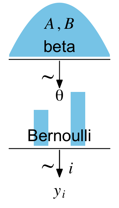
For that plot, the settings in the R Markdown code chunk were fig.width = 2, fig.height = 3.5. An obvious difference between our plot and Kruschke’s is whereas he depicted the beta density with a line, we used geom_area() to make the shape a solid blue. If you prefer Kruschke’s approach, just use something like geom_line() instead.
Within some of the annotate() and geom_text() functions, above, you may have noticed we set parse = T. Though it wasn’t always necessary, it helps streamline the workflow. I found this particularly helpful when setting the coordinates for the tildes (i.e., the \(\sim\) signs).
The main thing to focus on is the patchwork syntax from that last code block. We combined the five subplots with the (p1 + p2 + p3 + p4 + p5) code. It was the plot_layout(design = layout) part and the associated code defining layout that helped us arrange the subplots in the right order and according to the desired size ratios. For each subplot, we used the t, b, l, and r parameters to define the four bounds (top, bottom, left, and right) in overall plot grid. You can learn more about how this works from Thomas Lin Pedersen’s
Controlling Layouts and
Specify a plotting area in a layout vignettes.
Now we’ve covered the basics, it’s time to build.
Figure 9.1: Add an offset formula and some curvy lines.
For our next challenge, we’ll tackle Kruschke’s Figure 9.1:
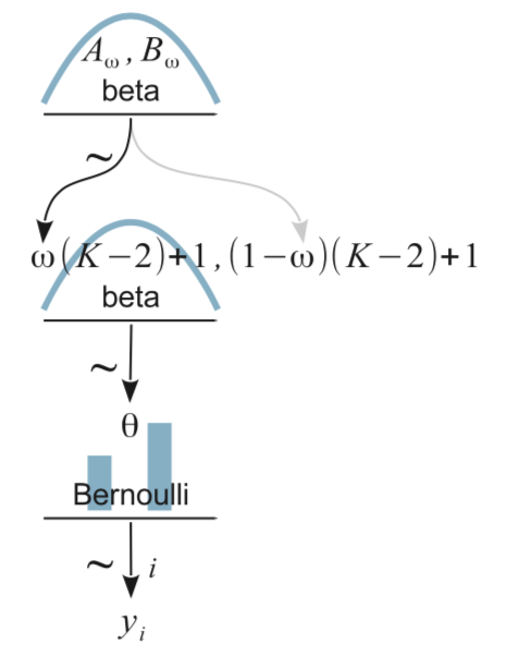
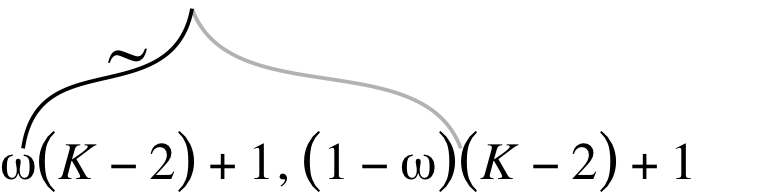
From a statistical perspective, this model is interesting in that it uses a hierarchical prior specification wherein the lower-level beta density is parameterized in terms \(\omega\) (mode) and \(K\) (concentration). From a plotting perspective, adding more density and arrow subplots isn’t a big deal. But see how the \(\omega(K-2)+1, (1-\omega)(K-2)+1\) formula extends way out past the right bound of that second beta density? Also, check those wavy arrows right above. These require an amended workflow. Let’s go step by step. The top subplot is fairly simple.
p1 <-
  tibble(x = seq(from = .01, to = .99, by = .01),
       d = (dbeta(x, 2, 2)) / max(dbeta(x, 2, 2))) %>%
  ggplot(aes(x = x, y = d)) +
  geom_area(fill = "skyblue", size = 0) +
  annotate(geom = "text",
           x = .5, y = .2,
           label = "beta",
           size = 7) +
  annotate(geom = "text",
           x = .5, y = .6,
           label = "italic(A[omega])*', '*italic(B[omega])",
           size = 7, family = "Times", parse = TRUE) +
  scale_x_continuous(expand = c(0, 0)) +
  theme(axis.line.x = element_line(size = 0.5))

p1
Now things get wacky.
We are going to make the formula and the wavy lies in one subplot. We can define the basic coordinates for the wavy lines with the ggforce::geom_bspline() function (learn more
here). For each line segment, we just need about 5 pairs of \(x\) and \(y\) coordinates. There’s no magic solution to these coordinates. I came to them by trial and error. As far as the formula goes, it isn’t much more complicated from what we’ve been doing. It’s all just a bunch of
plotmath syntax. The main deal is to notice how we set the limits in the scale_x_continuous() function to (0, 2). In the other plots, those are restricted to 0, 1.
p2 <-
  tibble(x = c(.5, .475, .26, .08, .06,
               .5, .55, .85, 1.15, 1.2),
         y = c(1, .7, .6, .5, .2,
               1, .7, .6, .5, .2),
         line = rep(letters[2:1], each = 5)) %>%

  ggplot(aes(x = x, y = y)) +
  geom_bspline(aes(color = line),
               size = 2/3, show.legend = F) +
  annotate(geom = "text",
           x = 0, y = .125,
           label = "omega(italic(K)-2)+1*', '*(1-omega)(italic(K)-2)+1",
           size = 7, parse = T, family = "Times", hjust = 0) +
  annotate(geom = "text",
           x = 1/3, y = .7,
           label = "'~'",
           size = 10, parse = T, family = "Times") +
  scale_color_manual(values = c("grey75", "black")) +
  scale_x_continuous(expand = c(0, 0), limits = c(0, 2)) +
  ylim(0, 1) +
  theme_void()

p2
You’ll see how this will works when we combine all the subplots, below. The rest of the subplots are similar or identical to the ones from the first section. Here we’ll make them in bulk.
# another beta density
p3 <-
  tibble(x = seq(from = .01, to = .99, by = .01),
         d = (dbeta(x, 2, 2)) / max(dbeta(x, 2, 2))) %>%
  ggplot(aes(x = x, y = d)) +
  geom_area(fill = "skyblue", size = 0) +
  annotate(geom = "text",
           x = .5, y = .2,
           label = "beta",
           size = 7) +
  scale_x_continuous(expand = c(0, 0)) +
  theme(axis.line.x = element_line(size = 0.5))

# an annotated arrow
p4 <-
  tibble(x    = .5,
         y    = 1,
         xend = .5,
         yend = 0) %>%

  ggplot(aes(x = x, xend = xend,
             y = y, yend = yend)) +
  geom_segment(arrow = my_arrow) +
  annotate(geom = "text",
           x = .375, y = 1/3,
           label = "'~'",
           size = 10, family = "Times", parse = T) +
  xlim(0, 1)

# bar plot of Bernoulli data
p5 <-
  tibble(x = 0:1,
         d = (dbinom(x, size = 1, prob = .6)) / max(dbinom(x, size = 1, prob = .6))) %>%

  ggplot(aes(x = x, y = d)) +
  geom_col(fill = "skyblue", width = .4) +
  annotate(geom = "text",
           x = .5, y = .2,
           label = "Bernoulli",
           size = 7) +
  annotate(geom = "text",
           x = .5, y = .94,
           label = "theta",
           size = 7, family = "Times", parse = T) +
  xlim(-.75, 1.75) +
  theme(axis.line.x = element_line(size = 0.5))

# another annotated arrow
p6 <-
  tibble(x     = c(.375, .625),
         y     = c(1/3, 1/3),
         label = c("'~'", "italic(i)")) %>%

  ggplot(aes(x = x, y = y, label = label)) +
  geom_text(size = c(10, 7), parse = T, family = "Times") +
  geom_segment(x = .5, xend = .5,
               y = 1, yend = 0,
               arrow = my_arrow) +
  xlim(0, 1)

# some text
p7 <-
  tibble(x     = .5,
         y     = .5,
         label = "italic(y[i])") %>%

  ggplot(aes(x = x, y = y, label = label)) +
  geom_text(size = 7, parse = T, family = "Times") +
  xlim(0, 1)
Now combine the subplots with patchwork.
layout <- c(
  area(t = 1, b = 2, l = 1, r = 1),
  area(t = 4, b = 5, l = 1, r = 1),
  area(t = 3, b = 4, l = 1, r = 2),
  area(t = 6, b = 6, l = 1, r = 1),
  area(t = 7, b = 8, l = 1, r = 1),
  area(t = 9, b = 9, l = 1, r = 1),
  area(t = 10, b = 10, l = 1, r = 1)
)

(p1 + p3 + p2 + p4 + p5 + p6 + p7) +
  plot_layout(design = layout) &
  ylim(0, 1)
There are a few reasons why this worked. First, we superimposed the subplot with the formula and wavy lines (p2) atop of the second density (p3) by ordering the plots as (p1 + p3 + p2 + p4 + p5 + p6 + p7). Placing one plot atop another was made easy by our use of theme_void(), which made the backgrounds for all the subplots transparent. But also look at how we set the r argument to 2 within the area() function for our p2. That’s what bought us that extra space for the formula.
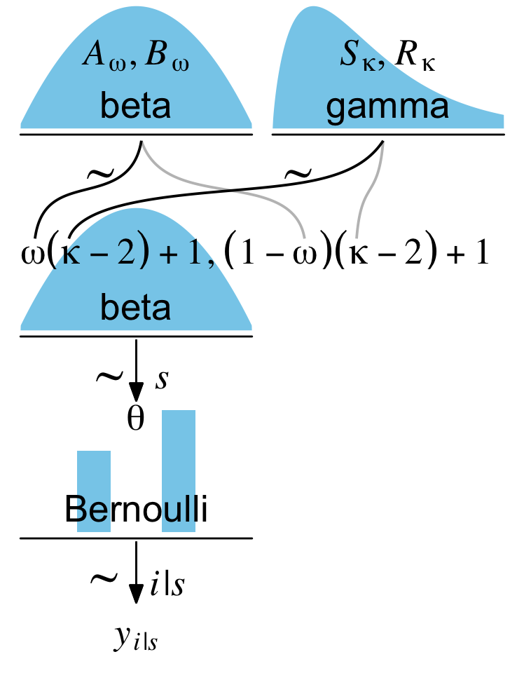
Figure 9.7: Add more curvy lines and a second density to the top row.
For our next challenge, we’ll tackle Kruschke’s Figure 9.7:
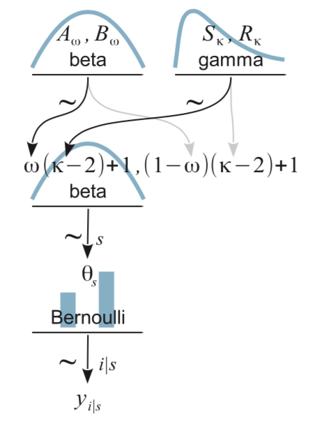
This is a mild extension of the previous one. From a plotting perspective, the noteworthy new features are we have two density plots on the top row and now we have to juggle two pairs of wiggly lines in the subplot with the formula. The two subplots in the top row are no big deal. To make the gamma density, just use the dgamma() function in place of dbeta().
# a beta density
p1 <-
  tibble(x = seq(from = .01, to = .99, by = .01),
         d = (dbeta(x, 2, 2)) / max(dbeta(x, 2, 2))) %>%
  ggplot(aes(x = x, y = d)) +
  geom_area(fill = "skyblue", size = 0) +
  annotate(geom = "text",
           x = .5, y = .2,
           label = "beta",
           size = 7) +
  annotate(geom = "text",
           x = .5, y = .6,
           label = "italic(A[omega])*', '*italic(B[omega])",
           size = 7, family = "Times", parse = TRUE) +
  scale_x_continuous(expand = c(0, 0)) +
  theme(axis.line.x = element_line(size = 0.5))

# a gamma density
p2 <-
  tibble(x = seq(from = 0, to = 5, by = .01),
         d = (dgamma(x, 1.75, .85) / max(dgamma(x, 1.75, .85)))) %>%
  ggplot(aes(x = x, y = d)) +
  geom_area(fill = "skyblue", size = 0) +
  annotate(geom = "text",
           x = 2.5, y = .2,
           label = "gamma",
           size = 7) +
  annotate(geom = "text",
           x = 2.5, y = .6,
           label = "list(italic(S)[kappa], italic(R)[kappa])",
           size = 7, family = "Times", parse = TRUE) +
  scale_x_continuous(expand = c(0, 0)) +
  theme(axis.line.x = element_line(size = 0.5))
The third subplot contains our offset formula and two sets of wiggly lines.
p3 <-
  tibble(x = c(.5, .475, .26, .08, .06,
               .5, .55, .85, 1.15, 1.175,
               1.5, 1.4, 1, .25, .2,
               1.5, 1.49, 1.445, 1.4, 1.39),
         y = c(1, .7, .6, .5, .2,
               1, .7, .6, .5, .2,
               1, .7, .6, .5, .2,
               1, .75, .6, .45, .2),
         line = rep(letters[2:1], each = 5) %>% rep(., times = 2),
         plot = rep(1:2, each = 10)) %>%

  ggplot(aes(x = x, y = y, group = interaction(plot, line))) +
  geom_bspline(aes(color = line),
               size = 2/3, show.legend = F) +
  annotate(geom = "text",
           x = 0, y = .1,
           label = "omega(kappa-2)+1*', '*(1-omega)(kappa-2)+1",
           size = 7, parse = T, family = "Times", hjust = 0) +
  annotate(geom = "text",
           x = c(1/3, 1.15), y = .7,
           label = "'~'",
           size = 10, parse = T, family = "Times") +
  scale_color_manual(values = c("grey75", "black")) +
  scale_x_continuous(expand = c(0, 0), limits = c(0, 2)) +
  ylim(0, 1)

p3
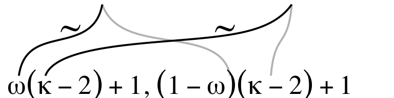
The rest of the subplots are similar or identical to the ones from the last section. Here we’ll make them in bulk.
# another beta density
p4 <-
  tibble(x = seq(from = .01, to = .99, by = .01),
         d = (dbeta(x, 2, 2)) / max(dbeta(x, 2, 2))) %>%
  ggplot(aes(x = x, y = d)) +
  geom_area(fill = "skyblue", size = 0) +
  annotate(geom = "text",
           x = .5, y = .2,
           label = "beta",
           size = 7) +
  scale_x_continuous(expand = c(0, 0)) +
  theme(axis.line.x = element_line(size = 0.5))

# an annotated arrow
p5 <-
  tibble(x     = c(.375, .625),
         y     = c(1/3, 1/3),
         label = c("'~'", "italic(s)")) %>%

  ggplot(aes(x = x, y = y, label = label)) +
  geom_text(size = c(10, 7), parse = T, family = "Times") +
  geom_segment(x = 0.5, xend = 0.5,
               y = 1, yend = 0,
               arrow = my_arrow) +
  xlim(0, 1)

# bar plot of Bernoulli data
p6 <-
  tibble(x = 0:1,
         d = (dbinom(x, size = 1, prob = .6)) / max(dbinom(x, size = 1, prob = .6))) %>%

  ggplot(aes(x = x, y = d)) +
  geom_col(fill = "skyblue", width = .4) +
  annotate(geom = "text",
           x = .5, y = .2,
           label = "Bernoulli",
           size = 7) +
  annotate(geom = "text",
           x = .5, y = .94,
           label = "theta",
           size = 7, family = "Times", parse = T) +
  xlim(-.75, 1.75) +
  theme(axis.line.x = element_line(size = 0.5))

# another annotated arrow
p7 <-
  tibble(x     = c(.35, .65),
         y     = c(1/3, 1/3),
         label = c("'~'", "italic(i)*'|'*italic(s)")) %>%

  ggplot(aes(x = x, y = y, label = label)) +
  geom_text(size = c(10, 7), parse = T, family = "Times") +
  geom_segment(x = .5, xend = .5,
               y = 1, yend = 0,
               arrow = my_arrow) +
  xlim(0, 1)

# some text
p8 <-
  tibble(x     = .5,
         y     = .5,
         label = "italic(y[i])['|'][italic(s)]") %>%

  ggplot(aes(x = x, y = y, label = label)) +
  geom_text(size = 7, parse = T, family = "Times") +
  xlim(0, 1)
Now combine the subplots with patchwork.
layout <- c(
  area(t = 1, b = 2, l = 1, r = 1),
  area(t = 1, b = 2, l = 2, r = 2),
  area(t = 4, b = 5, l = 1, r = 1),
  area(t = 3, b = 4, l = 1, r = 2),
  area(t = 6, b = 6, l = 1, r = 1),
  area(t = 7, b = 8, l = 1, r = 1),
  area(t = 9, b = 9, l = 1, r = 1),
  area(t = 10, b = 10, l = 1, r = 1)
)

(p1 + p2 + p4 + p3 + p5 + p6 + p7 + p8) +
  plot_layout(design = layout) &
  ylim(0, 1)
Boom; we did it!
Limitations
Though I’m overall pleased with this workflow, it’s not without limitations. To keep the values in our area() functions simple, we scaled the density plots to be twice the size of the arrow plots. With simple ratios like 1/2, this works well but it can be a bit of a pain with more exotic ratios. The size and proportions of the fonts are quite sensitive to the overall height and width values for the final plot. You’ll find similar issues with the coordinates for the wiggly geom_bspline() lines. Getting these right will likely take a few iterations. Speaking of geom_bspline(), I’m also not happy that there doesn’t appear to be an easy way to have them end with arrow heads. Perhaps you could hack some in with another layer of geom_segment().
Limitations aside, I hope this helps makes it one step easier for applied researchers to create their own Kruschke-type model diagrams. Happy plotting!
Session info
sessionInfo()
## R version 4.2.0 (2022-04-22)
## Platform: x86_64-apple-darwin17.0 (64-bit)
## Running under: macOS Big Sur/Monterey 10.16
##
## Matrix products: default
## BLAS:   /Library/Frameworks/R.framework/Versions/4.2/Resources/lib/libRblas.0.dylib
## LAPACK: /Library/Frameworks/R.framework/Versions/4.2/Resources/lib/libRlapack.dylib
##
## locale:
## [1] en_US.UTF-8/en_US.UTF-8/en_US.UTF-8/C/en_US.UTF-8/en_US.UTF-8
##
## attached base packages:
## [1] stats     graphics  grDevices utils     datasets  methods   base
##
## other attached packages:
##  [1] ggforce_0.3.4   patchwork_1.1.2 forcats_0.5.1   stringr_1.4.1
##  [5] dplyr_1.0.10    purrr_0.3.4     readr_2.1.2     tidyr_1.2.1
##  [9] tibble_3.1.8    ggplot2_3.4.0   tidyverse_1.3.2
##
## loaded via a namespace (and not attached):
##  [1] Rcpp_1.0.9          lubridate_1.8.0     assertthat_0.2.1
##  [4] digest_0.6.30       utf8_1.2.2          R6_2.5.1
##  [7] cellranger_1.1.0    backports_1.4.1     reprex_2.0.2
## [10] evaluate_0.18       highr_0.9           httr_1.4.4
## [13] blogdown_1.15       pillar_1.8.1        rlang_1.0.6
## [16] googlesheets4_1.0.1 readxl_1.4.1        rstudioapi_0.13
## [19] jquerylib_0.1.4     rmarkdown_2.16      labeling_0.4.2
## [22] googledrive_2.0.0   polyclip_1.10-0     munsell_0.5.0
## [25] broom_1.0.1         compiler_4.2.0      modelr_0.1.8
## [28] xfun_0.35           pkgconfig_2.0.3     htmltools_0.5.3
## [31] tidyselect_1.1.2    bookdown_0.28       fansi_1.0.3
## [34] crayon_1.5.2        tzdb_0.3.0          dbplyr_2.2.1
## [37] withr_2.5.0         MASS_7.3-58.1       grid_4.2.0
## [40] jsonlite_1.8.3      gtable_0.3.1        lifecycle_1.0.3
## [43] DBI_1.1.3           magrittr_2.0.3      scales_1.2.1
## [46] cli_3.4.1           stringi_1.7.8       cachem_1.0.6
## [49] farver_2.1.1        fs_1.5.2            xml2_1.3.3
## [52] bslib_0.4.0         ellipsis_0.3.2      generics_0.1.3
## [55] vctrs_0.5.0         tools_4.2.0         glue_1.6.2
## [58] tweenr_2.0.0        hms_1.1.1           fastmap_1.1.0
## [61] yaml_2.3.5          colorspace_2.0-3    gargle_1.2.0
## [64] rvest_1.0.2         knitr_1.40          haven_2.5.1
## [67] sass_0.4.2
- Posted on:
- March 9, 2020
- Length:
- 17 minute read, 3443 words