Individuals are not small groups, II: The ecological fallacy
By A. Solomon Kurz
October 14, 2019
tl;dr
When people conclude results from group-level data will tell you about individual-level processes, they commit the ecological fallacy. This is true even of the individuals whose data contributed to those group-level results. This phenomenon can seem odd and counterintuitive. Keep reading to improve your intuition.
We need history.
The ecological fallacy is closely related to Simpson’s paradox1. It is often attributed to sociologist William S. Robinson’s (1950) paper Ecological Correlations and the Behavior of Individuals. My fellow psychologists might be happy to learn the idea goes back at least as far as E. L. Thorndike’s (1939) paper, On the fallacy of imputing the correlations found for groups to the individuals or smaller groups composing them. Yet as far as I can tell, the term “ecological fallacy” itself first appeared in sociologist Hanan C. Selvin’s (1958) paper, Durkheim’s suicide and problems of empirical research.
The central point of Robinson’s seminal paper can be summed up in this quote: “There need be no correspondence between the individual correlation and the ecological correlation” (p. 339, emphasis added)2. Both Robinson and Thorndike framed their arguments in terms of correlations. In more general and contemporary terms, their insight was that results from between-person analyses will not necessarily match up with results from within-person analyses. When we assume the results from a between-person analysis will tell us about within-person processes, we commit the ecological fallacy.
An example might help.
Though Thorndike, Robinson, and Selvin all worked through examples of the ecological fallacy, I’m a fan of contemporary methodologist Ellen L. Hamaker’s way of explaining it. We’ll quote from her (2012) chapter, Why researchers should think “within-person”: A paradigmatic rationale, in bulk:
Suppose we are interested in the relationship between typing speed (i.e., number of words typed per minute) and the percentage of typos that are made. If we look at the cross-sectional relationship (i.e., the population level), we may well find a negative relationship, in that people who type faster make fewer mistakes (this may be reflective of the fact that people with better developed typing skills and more experience both type faster and make fewer mistakes). (p. 44)
Based on a figure in Hamaker’s chapter, that cross-sectional relationship might look something like this.
library(tidyverse)

d %>%
  filter(j == 1) %>%

  ggplot(aes(x = x, y = y)) +
  geom_point(alpha = 2/3) +
  stat_ellipse(size = 1/4) +
  scale_x_continuous("typing speed", breaks = NULL, limits = c(-3, 3)) +
  scale_y_continuous("number of typos", breaks = NULL, limits = c(-3, 3)) +
  coord_equal() +
  theme(panel.grid = element_blank())
## Warning: Using `size` aesthetic for lines was deprecated in ggplot2 3.4.0.
## ℹ Please use `linewidth` instead.
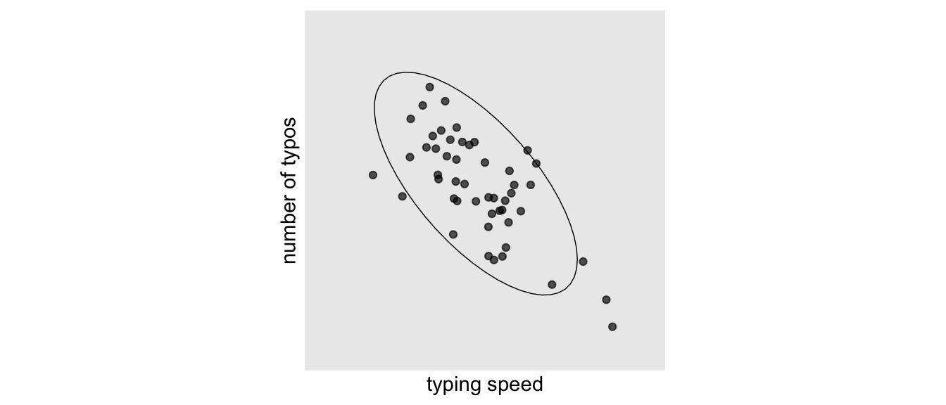
Since these data were from one time point, they only allow us to make a between-person analysis.
[I’m not going to show you how I made these data just yet. It’d break up the flow. For the curious, the statistical formula and code are at the end of the post. I should point out, though, that the scale is arbitrary.]
Anyway, here’s that cross-sectional correlation.
d %>%
  filter(j == 1) %>%
  summarise(correlation_between_participants = cor(x, y))
## # A tibble: 1 × 1
##   correlation_between_participants
##                              <dbl>
## 1                           -0.696
Like Hamaker suggested, it’s large and negative. Hamaker continued:
If we were to generalize this result to the within-person level, we would conclude that if a particular person types faster, he or she will make fewer mistakes. Clearly, this is not what we expect: In fact, we are fairly certain that for any particular individual, the number of typos will increase if he or she tries to type faster. This implies a positive–rather than a negative–relationship at the within-person level. (p. 44)
The simulated data I just showed were from 50 participants at one measurement occasion. However, the full data set contains 50 measurement occasions for each of the 50 participants. In the next plot, we’ll show all 50 measurement occasions for just 5 participants. The \(n\) is reduced in the plot to avoid cluttering.
d %>%
  filter(i %in% c(1, 10, 25, 47, 50)) %>%
  mutate(i = factor(i)) %>%

  ggplot() +
  geom_point(aes(x = x, y = y, color = i),
             size = 1/3) +
  stat_ellipse(aes(x = x, y = y, color = i),
               size = 1/5) +
  geom_point(data = d %>%
               filter(j == 1 &
                        i %in% c(1, 10, 25, 47, 50)),
             aes(x = x0, y = y0),
             size = 2, color = "grey50") +
  scale_color_viridis_d(option = "B", begin = .25, end = .85) +
  scale_x_continuous("typing speed", breaks = NULL, limits = c(-3, 3)) +
  scale_y_continuous("number of typos", breaks = NULL, limits = c(-3, 3)) +
  coord_equal() +
  theme(panel.grid = element_blank(),
        legend.position = "none")
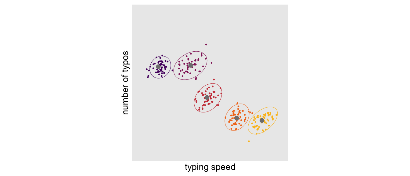
The points are colored by participant. The gray points in each data cloud are the participant-level means. Although we still see a clear negative relationship between participants, we now also see a mild positive relationship within participants. If we compute the correlation separately for each of our 50 participants, we can summarize the results in a histogram.
d %>%
  group_by(i) %>%
  summarise(r = cor(x, y) %>% round(digits = 2)) %>%

  ggplot(aes(x = r)) +
  geom_histogram(binwidth = .1) +
  xlab("correlations within participants") +
  theme(panel.grid = element_blank())
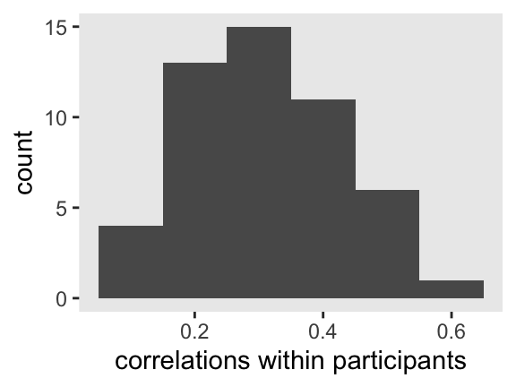
In this case, the within-person correlations all clustered together around .3. That won’t necessarily be the case in other contexts.
Hopefully this gives you a sense of how meaningless a question like What is the correlation between typing speed and typo rates? is. The question is poorly specified because it makes no distinction between the between- and within-person frameworks. As it turns out, the answer could well be different depending on which one you care about and which one you end up studying. I suspect poorly-specified questions of this kind are scattered throughout the literature. For example, I’m a clinical psychologist. Have you ever heard a clinical psychologist talk about how highly anxiety is correlated with depression? And yet much of that evidence is from cross-sectional data (e.g., correlations between the anxiety and depression subscales of the DASS; Lovibond & Lovibond, 1995). But what about within specific people? Do you really believe anxiety and depression are highly-correlated in all people? Maybe. But more cross-sectional analyses will not answer that question.
Robinson finished with a bang.
Our typing data are just one example of how between- and within-person analyses can differ. To see Hamaker walk out the example herself, check out her talk on the subject from a few years ago. I think you’ll find her an engaging speaker. But to sum this topic up, it’s worth considering the Conclusion section from Robinson’s (1950) paper in full:
The relation between ecological and individual correlations which is discussed in this paper provides a definite answer as to whether ecological correlations can validly be used as substitutes for individual correlations. They cannot. While it is theoretically possible for the two to be equal, the conditions under which this can happen are far removed from those ordinarily encountered in data. From a practical standpoint, therefore, the only reasonable assumption is that an ecological correlation is almost certainly not equal to its corresponding individual correlation.
I am aware that this conclusion has serious consequences, and that its effect appears wholly negative because it throws serious doubt upon the validity of a number of important studies made in recent years. The purpose of this paper will have been accomplished, however, if it prevents the future computation of meaningless correlations and stimulates the study of similar problems with the use of meaningful correlations between the properties of individuals. (pp. 340–341)
Regroup and look ahead.
Let’s review what we’ve covered so far. With Simpson’s paradox, we learned that the apparent association between two variables can be attenuated after conditioning on a relevant third variable. In the literature, that third variable is often a grouping variable like gender or college department.
The ecological fallacy demonstrated something similar, but from a different angle. That literature showed us that the results from a between-person analysis will not necessarily inform us of within-person processes. The converse is true, too. Indeed, the ecological fallacy is something of a special case of Simpson’s paradox. With the ecological fallacy, the grouping variable is participant id which, when accounted for, yields a different level of analysis3.
With both validity threats, the results of a given analysis can attenuate, go to zero, or even switch sign. With the Berkeley example in the previous post, the relation went to zero. With our simulated data inspired by Hamaker’s example, the effect size went from a large negative cross-sectional correlation to a bundle of small/medium positive within-person correlations. These are non-trivial changes.
If at this point you find yourself fatigued and your head hurts a little, don’t worry. You’re probably normal. In a series of experiments, Fiedler, Walther, Freytag, and Nickel (2003) showed it’s quite normal to struggle with these concepts. For more practice, check out Kievit, Frankenhuis, Waldorp, and Borsboom’s nice (2013) paper, Simpson’s paradox in psychological science: a practical guide. Kuppens and Pollet (2014) covered more examples of the ecological fallacy in their Mind the level: problems with two recent nation-level analyses in psychology. I’ve also worked out and posted the example of the ecological fallacy from Thorndike’s (1939) paper, which you can find here.
In the next post, we’ll continue developing this material with a discussion of traits versus states.
Afterward: How might one simulate those typing speed data?
In those simulated data, we generically named the “typing speed” variable x and the “error count” variable y. If you let the index \(i\) stand for the \(i^\text{th}\) case and \(j\) stand for the \(j^\text{th}\) measurement occasion, the data-generating formula is as follows:
Because the variances for the \(\zeta\)s were 1, that put them in a standardized metric. As such \(-0.8\) is both a covariance and a correlation. I came to the values in the variance/covariance matrix for the \(\epsilon\)s by trial and error, which I cover in more detail, below. In words, this model is a bivariate intercepts-only multilevel model. For an introduction to these kinds of models, check out
Baldwin, Imel, Braithwaite, and Atkins (2014).
The approach I used to generate the data is an extension of the one I used in chapter 13 of my project recoding McElreath’s (2015) text. You can find that code,
here. There are two big changes to the original. First, setting the random effects for the mean structure to a \(z\)-score metric simplified that part of the code quite a bit. Second, I defined the residuals, which were correlated, in a separate data object from the one containing the mean structure. In the final step, we combined the two and simulated the x and y values.
First, define the mean structure.
n     <- 50  # choose the n
x0   <-  0   # population mean for x
y0   <-  0   # population mean for x
v_x0 <-  1   # variance around x
v_y0 <-  1   # variance around y
cov  <- -.8  # covariance for the variances

# the next three lines of code simply combine the terms, above
mu     <- c(x0, y0)
sigma  <- matrix(c(v_x0, cov,
                   cov, v_y0), ncol = 2)
set.seed(1)
m <-
  MASS::mvrnorm(n, mu, sigma) %>%
  data.frame() %>%
  set_names("x0", "y0") %>%
  arrange(x0) %>%
  mutate(i = 1:n) %>%
  expand(nesting(i, x0, y0),
         j = 1:n)
Second, define the residual structure.
# note how these values initially place the epsilons in a standardized metric
sigma  <- matrix(c(v_x0, .3,
                   .3, v_y0), ncol = 2)
set.seed(1)
r <-
  MASS::mvrnorm(n * n, mu, sigma) %>%
  data.frame() %>%
  set_names("e_x", "e_y") %>%
  # you do not need this step.
  # it's something I experimented with to rescale
  # the residual variances to a workable level for the plots.
  mutate_all(.funs = ~. * .25)
Combine the two data structures and save.
d <-
  bind_cols(m, r) %>%
  mutate(x = x0 + e_x,
         y = y0 + e_y)
Because we used the set.seed() function before each simulation step, you will be able to reproduce the results exactly.
Session info
sessionInfo()
## R version 4.2.0 (2022-04-22)
## Platform: x86_64-apple-darwin17.0 (64-bit)
## Running under: macOS Big Sur/Monterey 10.16
##
## Matrix products: default
## BLAS:   /Library/Frameworks/R.framework/Versions/4.2/Resources/lib/libRblas.0.dylib
## LAPACK: /Library/Frameworks/R.framework/Versions/4.2/Resources/lib/libRlapack.dylib
##
## locale:
## [1] en_US.UTF-8/en_US.UTF-8/en_US.UTF-8/C/en_US.UTF-8/en_US.UTF-8
##
## attached base packages:
## [1] stats     graphics  grDevices utils     datasets  methods   base
##
## other attached packages:
## [1] forcats_0.5.1   stringr_1.4.1   dplyr_1.0.10    purrr_0.3.4
## [5] readr_2.1.2     tidyr_1.2.1     tibble_3.1.8    ggplot2_3.4.0
## [9] tidyverse_1.3.2
##
## loaded via a namespace (and not attached):
##  [1] lubridate_1.8.0     assertthat_0.2.1    digest_0.6.30
##  [4] utf8_1.2.2          R6_2.5.1            cellranger_1.1.0
##  [7] backports_1.4.1     reprex_2.0.2        evaluate_0.18
## [10] highr_0.9           httr_1.4.4          blogdown_1.15
## [13] pillar_1.8.1        rlang_1.0.6         googlesheets4_1.0.1
## [16] readxl_1.4.1        rstudioapi_0.13     jquerylib_0.1.4
## [19] rmarkdown_2.16      labeling_0.4.2      googledrive_2.0.0
## [22] munsell_0.5.0       broom_1.0.1         compiler_4.2.0
## [25] modelr_0.1.8        xfun_0.35           pkgconfig_2.0.3
## [28] htmltools_0.5.3     tidyselect_1.1.2    bookdown_0.28
## [31] viridisLite_0.4.1   fansi_1.0.3         crayon_1.5.2
## [34] tzdb_0.3.0          dbplyr_2.2.1        withr_2.5.0
## [37] MASS_7.3-58.1       grid_4.2.0          jsonlite_1.8.3
## [40] gtable_0.3.1        lifecycle_1.0.3     DBI_1.1.3
## [43] magrittr_2.0.3      scales_1.2.1        cli_3.4.1
## [46] stringi_1.7.8       cachem_1.0.6        farver_2.1.1
## [49] fs_1.5.2            xml2_1.3.3          bslib_0.4.0
## [52] ellipsis_0.3.2      generics_0.1.3      vctrs_0.5.0
## [55] tools_4.2.0         glue_1.6.2          hms_1.1.1
## [58] fastmap_1.1.0       yaml_2.3.5          colorspace_2.0-3
## [61] gargle_1.2.0        rvest_1.0.2         knitr_1.40
## [64] haven_2.5.1         sass_0.4.2
Footnotes
-
Do you need a refresher on Simpson’s paradox? Click here. ↩︎
-
The page numbers in this section might could use some clarifications. It’s a bit of a pain to locate a PDF of Robinson’s original 1950 paper. If you do a casual online search, it’s more likely you’ll come across this 2009 reprint of the paper. To the best of my knowledge, the reprint is faithful. For all the Robinson quotes in this post, the page numbers are based on the 2009 reprint. ↩︎
-
Some readers may see the multilevel model lurking in the shadows, here. You’re right. When we think of the relationship between Simpson’s paradox and the ecological fallacy, I find it particularly instructive to recall how the multilevel model can be thought of as a high-rent interaction model. I’m not making that point directly in the prose, yet, for the sake of keeping the content more general and conceptual. But yes, the multilevel model will move out of the shadows into the light of day as we press forward in this series. ↩︎
- Posted on:
- October 14, 2019
- Length:
- 11 minute read, 2343 words