Bayesian power analysis: Part III.a. Counts are special.
By A. Solomon Kurz
August 11, 2019
Version 1.2.0
Edited on December 11, 2022, to use the new as_draws_df() workflow.
Orientation
So far we’ve covered Bayesian power simulations from both a null hypothesis orientation (see part I) and a parameter width perspective (see part II). In both instances, we kept things simple and stayed with Gaussian (i.e., normally distributed) data. But not all data follow that form, so it might do us well to expand our skill set a bit. In the next few posts, we’ll cover how we might perform power simulations with other kinds of data. In this post, we’ll focus on how to use the Poisson likelihood to model counts. In follow-up posts, we’ll explore how to model binary and Likert-type data.
The Poisson distribution is handy for counts.
In the social sciences, count data arise when we ask questions like:
- How many sexual partners have you had?
- How many pets do you have at home?
- How many cigarettes did you smoke, yesterday?
The values these data will take are discrete 1 in that you’ve either slept with 9 or 10 people, but definitely not 9.5. The values cannot go below zero in that even if you quit smoking cold turkey 15 years ago and have been a health nut since, you still could not have smoked -3 cigarettes, yesterday. Zero is as low as it goes.
The canonical distribution for data of this type–non-negative integers–is the Poisson. It’s named after the French mathematician Siméon Denis Poisson,
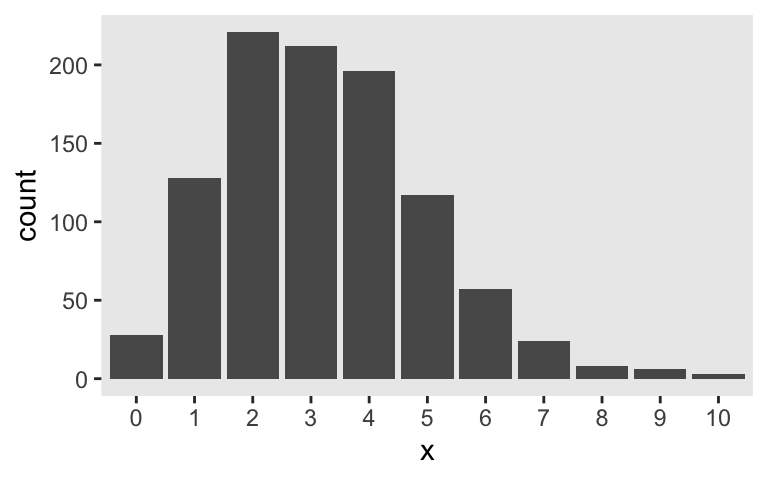
who had quite the confident stare in his youth. The Poisson distribution has one parameter, \(\lambda\), which controls both its mean and variance. Although the numbers the Poisson describes are counts, the \(\lambda\) parameter does not need to be an integer. For example, here’s the plot of 1,000 draws from a Poisson for which \(\lambda = 3.2\).
library(tidyverse)

theme_set(theme_gray() + theme(panel.grid = element_blank()))

tibble(x = rpois(n = 1e3, lambda = 3.2)) %>%
  mutate(x = factor(x)) %>%

  ggplot(aes(x = x)) +
  geom_bar()
In case you missed it, the key function for generating those data was rpois() (see ?rpois). I’m not going to go into a full-blown tutorial on the Poisson distribution or on count regression. For more thorough introductions, check out Atkins et al’s (
2013)
A tutorial on count regression and zero-altered count models for longitudinal substance use data, chapters 9 through 11 in McElreath’s (
2015)
Statistical Rethinking, or, if you really want to dive in, Agresti’s (
2015)
Foundations of linear and generalized linear models.
For our power example, let’s say you were interested in drinking. Using data from the National Epidemiologic Survey on Alcohol and Related Conditions ( {{National Institute on Alcohol Abuse and Alcoholism}}, 2006), Christopher Ingraham ( 2014) presented a data visualization of the average number of alcoholic drinks American adults consume, per week. By decile, the numbers were:
- 0.00
- 0.00
- 0.00
- 0.02
- 0.14
- 0.63
- 2.17
- 6.25
- 15.28
- 73.85
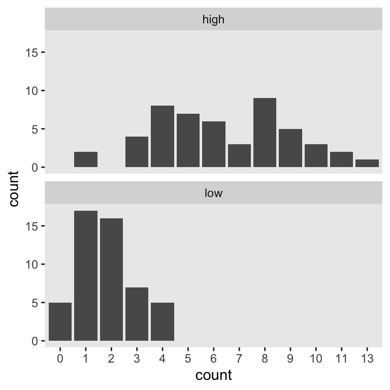
Let’s say you wanted to run a study where you planned on comparing two demographic groups by their weekly drinking levels. Let’s further say you suspected one of those groups drank like the American adults in the 7th decile and the other drank like American adults in the 8th. We’ll call them low and high drinkers, respectively. For convenience, let’s further presume you’ll be able to recruit equal numbers of participants from both groups. The objective for our power analysis–or sample size analysis if you prefer to avoid the language of power–is to determine how many you’d need per group to detect reliable differences. Using \(n = 50\) as a starting point, here’s what the data for our hypothetical groups might look like.
mu_7 <- 2.17
mu_8 <- 6.25

n <- 50

set.seed(3)

d <-
  tibble(low  = rpois(n = n, lambda = mu_7),
         high = rpois(n = n, lambda = mu_8)) %>%
  gather(group, count)

d %>%
  mutate(count = factor(count)) %>%

  ggplot(aes(x = count)) +
  geom_bar() +
  facet_wrap(~group, ncol = 1)
This will be our primary data type. Our next step is to determine how to express our research question as a regression model. Like with our two-group Gaussian models, we can predict counts in terms of an intercept (i.e., standing for the expected value on the reference group) and slope (i.e., standing for the expected difference between the reference group and the comparison group). If we coded our two groups by a high variable for which 0 stood for low drinkers and 1 stood for high drinkers, the basic model would follow the form
$$
\begin{align*} \text{drinks per week}_i & \sim \operatorname{Poisson}(\lambda_i) \\ \log(\lambda_i) & = \beta_0 + \beta_1 \text{high}_i. \end{align*}
$$
Here’s how to set the data up for that model.
d <-
  d %>%
  mutate(high = ifelse(group == "low", 0, 1))
If you were attending closely to our model formula, you noticed we ran into a detail. Count regression, such as with the Poisson likelihood, tends to use the log link. Why? you ask. Recall that counts need to be 0 and above. Same deal for our \(\lambda\) parameter. In order to make sure our models don’t yield silly estimates for \(\lambda\), like -2 or something, we typically use the log link. You don’t have to, of course. The world is your playground. But this is the method most of your colleagues are likely to use and it’s the one I suggest you use until you have compelling reasons to do otherwise.
So then since we’re now fitting a model with a log link, it might seem challenging to pick good priors. As a place to start, we can use the brms::get_prior() function to see the brms defaults.
library(brms)

get_prior(data = d,
          family = poisson,
          count ~ 0 + Intercept + high)
##   prior class      coef group resp dpar nlpar lb ub       source
##  (flat)     b                                            default
##  (flat)     b      high                             (vectorized)
##  (flat)     b Intercept                             (vectorized)
Hopefully two things popped out. First, there’s no prior of class = sigma. Since the Poisson distribution only has one parameter \(\lambda\), we don’t need to set a prior for \(\sigma\). Our model won’t have one. Second, because we’re continuing to use the 0 + Intercept syntax for our model intercept, both our intercept and slope are of prior class = b and those currently have default flat priors with brms. To be sure, flat priors aren’t the best. But maybe if this was your first time playing around with a Poisson model, default flat priors might seem like a safe place to start.
Feel free to disagree. In the meantime, here’s how to fit that default Poisson model with brms::brm().
fit1 <-
  brm(data = d,
      family = poisson,
      count ~ 0 + Intercept + high,
      seed = 3)
print(fit1)
##  Family: poisson
##   Links: mu = log
## Formula: count ~ 0 + Intercept + high
##    Data: d (Number of observations: 100)
##   Draws: 4 chains, each with iter = 2000; warmup = 1000; thin = 1;
##          total post-warmup draws = 4000
##
## Population-Level Effects:
##           Estimate Est.Error l-95% CI u-95% CI Rhat Bulk_ESS Tail_ESS
## Intercept     0.59      0.11     0.38     0.79 1.01      917     1133
## high          1.27      0.12     1.03     1.51 1.01      935     1182
##
## Draws were sampled using sampling(NUTS). For each parameter, Bulk_ESS
## and Tail_ESS are effective sample size measures, and Rhat is the potential
## scale reduction factor on split chains (at convergence, Rhat = 1).
Since we used the log link, our model results are in the log metric, too. If you’d like them in the metric of the data, you’d work directly with the poster samples and exponentiate.
draws <-
  as_draws_df(fit1) %>%
  mutate(`beta_0 (i.e., low)`                       = exp(b_Intercept),
         `beta_1 (i.e., difference score for high)` = exp(b_high))
We can then just summarize our parameters of interest.
draws %>%
  select(starts_with("beta_")) %>%
  gather() %>%
  group_by(key) %>%
  summarise(mean  = mean(value),
            lower = quantile(value, prob = .025),
            upper = quantile(value, prob = .975))
## # A tibble: 2 × 4
##   key                                       mean lower upper
##   <chr>                                    <dbl> <dbl> <dbl>
## 1 beta_0 (i.e., low)                        1.81  1.46  2.21
## 2 beta_1 (i.e., difference score for high)  3.58  2.81  4.53
For the sake of simulation, it’ll be easier if we press on with evaluating the parameters on the log metric, though. If you’re working within a null-hypothesis oriented power paradigm, you’ll be happy to know zero is still the number to beat for evaluating our 95% intervals for \(\beta_1\), even when that parameter is in the log metric. Here it is, again.
fixef(fit1)["high", ]
##  Estimate Est.Error      Q2.5     Q97.5
## 1.2690437 0.1211455 1.0330613 1.5108894
So our first fit suggests we’re on good footing to run a quick power simulation holding \(n = 50\). As in the prior blog posts, our lives will be simpler if we set up a custom simulation function. Since we’ll be using it to simulate the data and fit the model in one step, let’s call it sim_data_fit().
sim_data_fit <- function(seed, n) {

  # define our mus in the function
  mu_7 <- 2.17
  mu_8 <- 6.25

  # make your results reproducible
  set.seed(seed)

  # simulate the data
  d <-
    tibble(high  = rep(0:1, each = n),
           count = c(rpois(n = n, lambda = mu_7),
                     rpois(n = n, lambda = mu_8)))

  # fit and summarize
  update(fit1,
         newdata = d,
         seed = seed) %>%
    fixef() %>%
    data.frame() %>%
    rownames_to_column("parameter") %>%
    filter(parameter == "high") %>%
    select(Q2.5:Q97.5 )

}
Here’s the simulation for a simple 100 iterations.
sim1 <-
  tibble(seed = 1:100) %>%
  mutate(ci = map(seed, sim_data_fit, n = 50)) %>%
  unnest(ci)
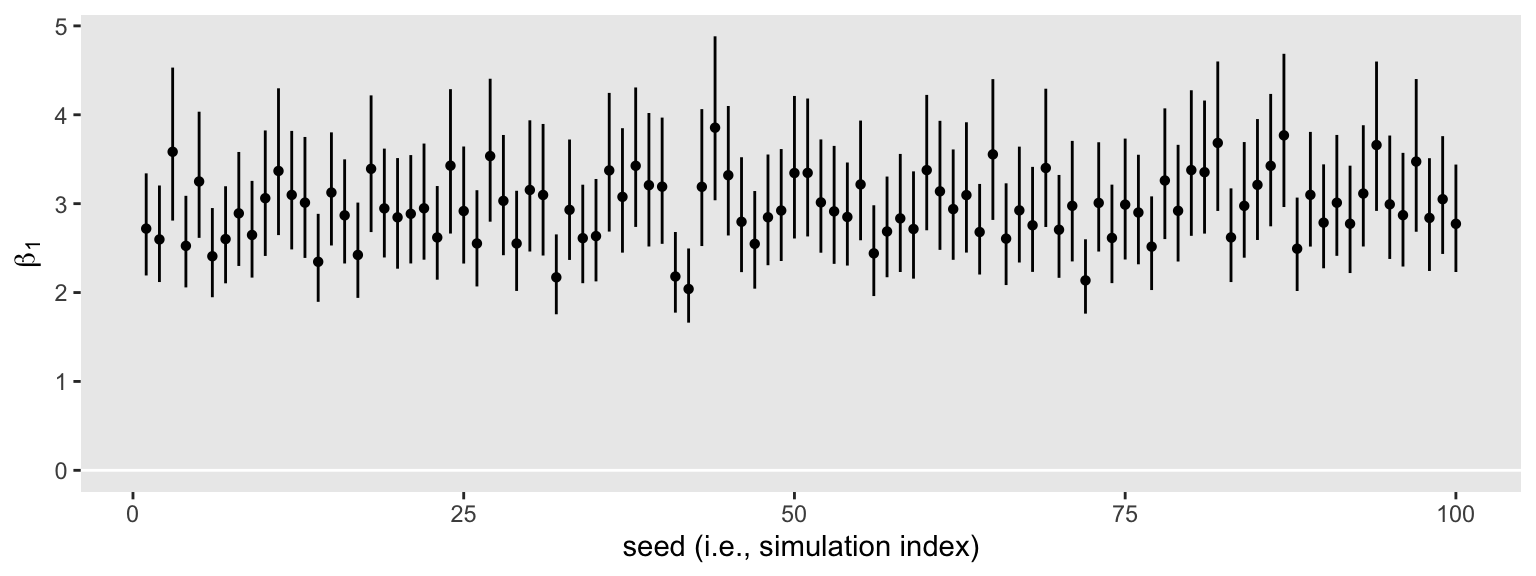
That went quick–just a little over a minute on my laptop. Here’s what those 100 \(\beta_1\) intervals look like in bulk.
sim1 %>%
  ggplot(aes(x = seed, ymin = Q2.5, ymax = Q97.5)) +
  geom_hline(yintercept = 0, color = "white") +
  geom_linerange() +
  labs(x = "seed (i.e., simulation index)",
       y = expression(beta[1]))
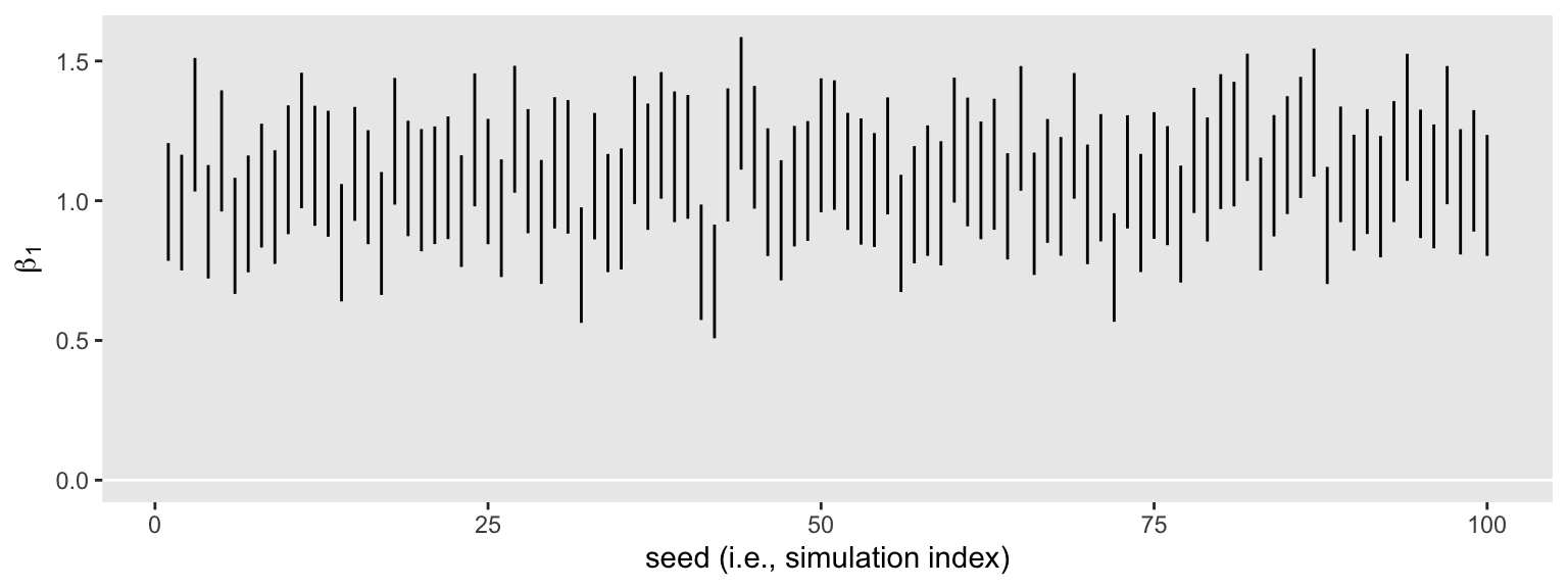
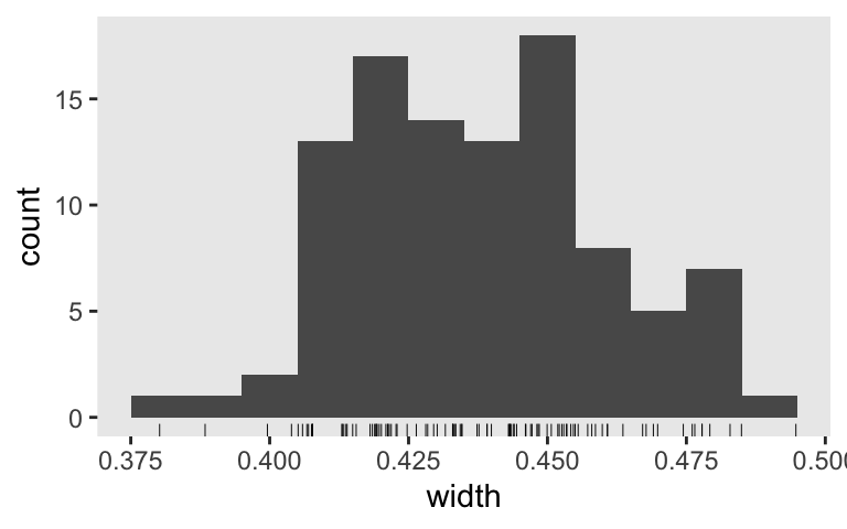
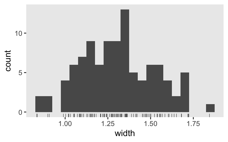
None of them are anywhere near the null value 0. So it appears we’re well above .8 power to reject the typical \(H_0\) with \(n = 50\). Switching to the precision orientation, here’s the distribution of their widths.
sim1 %>%
  mutate(width = Q97.5 - Q2.5) %>%

  ggplot(aes(x = width)) +
  geom_histogram(binwidth = 0.01) +
  geom_rug(linewidth = 1/6)
What if we wanted a mean width of 0.25 on the log scale? We might try the simulation with \(n = 150\).
sim2 <-
  tibble(seed = 1:100) %>%
  mutate(ci = map(seed, sim_data_fit, n = 150)) %>%
  unnest(ci)
Here we’ll summarize the widths both in terms of their mean and what proportion were smaller than 0.25.
sim2 %>%
  mutate(width = Q97.5 - Q2.5) %>%
  summarise(`mean width` = mean(width),
            `below 0.25` = mean(width < 0.25))
## # A tibble: 1 × 2
##   `mean width` `below 0.25`
##          <dbl>        <dbl>
## 1        0.252         0.43
If we wanted to focus on the mean, we did pretty good. Perhaps set the \(n = 155\) and simulate a full 1,000+ iterations for a serious power analysis. But if we wanted to make the stricter criteria of all below 0.25, we’d need to up the \(n\) quite a bit more. And of course, once you have a little experience working with Poisson models, you might do the power simulations with more ambitious priors. For example, if your count values are lower than like 1,000, there’s a good chance a normal(0, 6) prior on your \(\beta\) parameters will be nearly flat within the reasonable neighborhoods of the parameter space.
But logs are hard.
If we approach our Bayesian power analysis from a precision perspective, it can be difficult to settle on a reasonable interval width when they’re on the log scale. So let’s modify our simulation flow so it converts the width summaries back into the natural metric. Before we go big, let’s practice with a single iteration.
seed <- 0
set.seed(seed)

# simulate the data
d <-
  tibble(high  = rep(0:1, each = n),
         count = c(rpois(n = n, lambda = mu_7),
                   rpois(n = n, lambda = mu_8)))

# fit the model
fit2 <-
  update(fit1,
         newdata = d,
         seed = seed)
Now summarize.
library(tidybayes)

fit2 %>%
  as_draws_df() %>%
  transmute(`beta_1` = exp(b_high)) %>%
  mean_qi()
## # A tibble: 1 × 6
##   beta_1 .lower .upper .width .point .interval
##    <dbl>  <dbl>  <dbl>  <dbl> <chr>  <chr>
## 1   2.71   2.17   3.34   0.95 mean   qi
Before we used the fixef() function to extract our intervals, which took the brms fit object as input. Here we took a different approach. Because we are transforming \(\beta_1\), we used the as_draws_df() function to work directly with the posterior draws. We then exponentiated within transmute(), which returned a single-column tibble, not a brms fit object. So instead of fixef(), it’s easier to get our summary statistics with the tidybayes::mean_qi() function. Do note that now our lower and upper levels are named .lower and .upper, respectively.
Now we’ve practiced with the new flow, let’s redefine our simulation function.
sim_data_fit <- function(seed, n) {

  # define our mus in the function
  mu_7 <- 2.17
  mu_8 <- 6.25

  # make your results reproducible
  set.seed(seed)

  # simulate the data
  d <-
    tibble(high  = rep(0:1, each = n),
           count = c(rpois(n = n, lambda = mu_7),
                     rpois(n = n, lambda = mu_8)))

  # fit and summarize
  update(fit1,
         newdata = d,
         seed = seed) %>%
  as_draws_df() %>%
  transmute(`beta_1` = exp(b_high)) %>%
  mean_qi()

}
Simulate.
sim3 <-
  tibble(seed = 1:100) %>%
  mutate(ci = map(seed, sim_data_fit, n = 50)) %>%
  unnest(ci)
Here’s what those 100 \(\beta_1\) intervals look like in bulk.
sim3 %>%
  ggplot(aes(x = seed, y = beta_1, ymin = .lower, ymax = .upper)) +
  geom_hline(yintercept = 0, color = "white") +
  geom_pointrange(fatten = 1) +
  labs(x = "seed (i.e., simulation index)",
       y = expression(beta[1]))
Inspect the distribution of their widths.
sim3 %>%
  mutate(width = .upper - .lower) %>%

  ggplot(aes(x = width)) +
  geom_histogram(binwidth = 0.05) +
  geom_rug(linewidth = 1/6)
What if we wanted a mean 95% interval width of 1? Let’s run the simulation again, this time with \(n = 100\).
sim4 <-
  tibble(seed = 1:100) %>%
  mutate(ci = map(seed, sim_data_fit, n = 100)) %>%
  unnest(ci) %>%
  mutate(width = .upper - .lower)
Here’s the new width distribution.
sim4 %>%
  ggplot(aes(x = width)) +
  geom_histogram(binwidth = 0.05) +
  geom_rug(linewidth = 1/6)
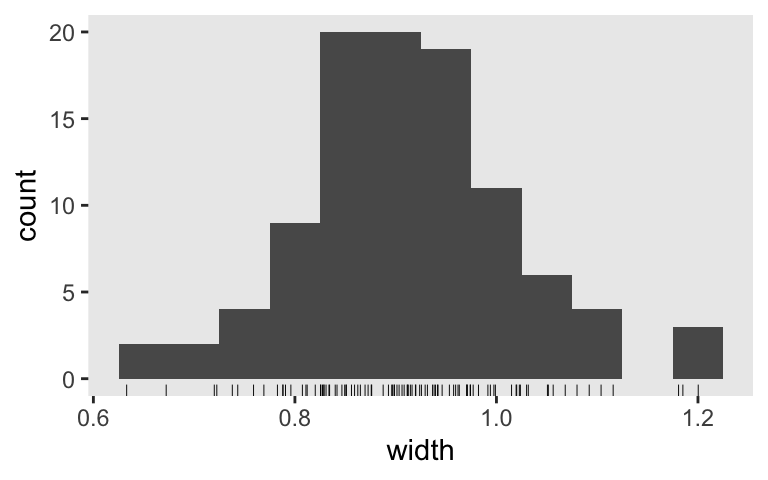
And the mean width is:
sim4 %>%
  summarise(mean_width = mean(width))
## # A tibble: 1 × 1
##   mean_width
##        <dbl>
## 1      0.913
Nice! If we want a mean width of 1, it looks like we’re a little overpowered with \(n = 100\). The next step would be to up your iterations to 1,000 or so to run a properly-sized simulation.
Now you’ve got a sense of how to work with the Poisson likelihood, next time we’ll play with binary data.
Session info
sessionInfo()
## R version 4.2.2 (2022-10-31)
## Platform: x86_64-apple-darwin17.0 (64-bit)
## Running under: macOS Big Sur ... 10.16
##
## Matrix products: default
## BLAS:   /Library/Frameworks/R.framework/Versions/4.2/Resources/lib/libRblas.0.dylib
## LAPACK: /Library/Frameworks/R.framework/Versions/4.2/Resources/lib/libRlapack.dylib
##
## locale:
## [1] en_US.UTF-8/en_US.UTF-8/en_US.UTF-8/C/en_US.UTF-8/en_US.UTF-8
##
## attached base packages:
## [1] stats     graphics  grDevices utils     datasets  methods   base
##
## other attached packages:
##  [1] tidybayes_3.0.2 brms_2.18.0     Rcpp_1.0.9      forcats_0.5.1
##  [5] stringr_1.4.1   dplyr_1.1.0     purrr_1.0.1     readr_2.1.2
##  [9] tidyr_1.2.1     tibble_3.1.8    ggplot2_3.4.0   tidyverse_1.3.2
##
## loaded via a namespace (and not attached):
##   [1] readxl_1.4.1         backports_1.4.1      plyr_1.8.7
##   [4] igraph_1.3.4         svUnit_1.0.6         splines_4.2.2
##   [7] crosstalk_1.2.0      TH.data_1.1-1        rstantools_2.2.0
##  [10] inline_0.3.19        digest_0.6.31        htmltools_0.5.3
##  [13] fansi_1.0.4          magrittr_2.0.3       checkmate_2.1.0
##  [16] googlesheets4_1.0.1  tzdb_0.3.0           modelr_0.1.8
##  [19] RcppParallel_5.1.5   matrixStats_0.63.0   xts_0.12.1
##  [22] sandwich_3.0-2       prettyunits_1.1.1    colorspace_2.1-0
##  [25] rvest_1.0.2          ggdist_3.2.1.9000    haven_2.5.1
##  [28] xfun_0.35            callr_3.7.3          crayon_1.5.2
##  [31] jsonlite_1.8.4       lme4_1.1-31          survival_3.4-0
##  [34] zoo_1.8-10           glue_1.6.2           gtable_0.3.1
##  [37] gargle_1.2.0         emmeans_1.8.0        distributional_0.3.1
##  [40] pkgbuild_1.3.1       rstan_2.21.8         abind_1.4-5
##  [43] scales_1.2.1         mvtnorm_1.1-3        DBI_1.1.3
##  [46] miniUI_0.1.1.1       xtable_1.8-4         stats4_4.2.2
##  [49] StanHeaders_2.21.0-7 DT_0.24              htmlwidgets_1.5.4
##  [52] httr_1.4.4           threejs_0.3.3        arrayhelpers_1.1-0
##  [55] posterior_1.3.1      ellipsis_0.3.2       pkgconfig_2.0.3
##  [58] loo_2.5.1            farver_2.1.1         sass_0.4.2
##  [61] dbplyr_2.2.1         utf8_1.2.2           labeling_0.4.2
##  [64] tidyselect_1.2.0     rlang_1.0.6          reshape2_1.4.4
##  [67] later_1.3.0          munsell_0.5.0        cellranger_1.1.0
##  [70] tools_4.2.2          cachem_1.0.6         cli_3.6.0
##  [73] generics_0.1.3       broom_1.0.2          evaluate_0.18
##  [76] fastmap_1.1.0        yaml_2.3.5           processx_3.8.0
##  [79] knitr_1.40           fs_1.5.2             nlme_3.1-160
##  [82] mime_0.12            projpred_2.2.1       xml2_1.3.3
##  [85] compiler_4.2.2       bayesplot_1.10.0     shinythemes_1.2.0
##  [88] rstudioapi_0.13      gamm4_0.2-6          reprex_2.0.2
##  [91] bslib_0.4.0          stringi_1.7.8        highr_0.9
##  [94] ps_1.7.2             blogdown_1.15        Brobdingnag_1.2-8
##  [97] lattice_0.20-45      Matrix_1.5-1         nloptr_2.0.3
## [100] markdown_1.1         shinyjs_2.1.0        tensorA_0.36.2
## [103] vctrs_0.5.2          pillar_1.8.1         lifecycle_1.0.3
## [106] jquerylib_0.1.4      bridgesampling_1.1-2 estimability_1.4.1
## [109] httpuv_1.6.5         R6_2.5.1             bookdown_0.28
## [112] promises_1.2.0.1     gridExtra_2.3        codetools_0.2-18
## [115] boot_1.3-28          colourpicker_1.1.1   MASS_7.3-58.1
## [118] gtools_3.9.4         assertthat_0.2.1     withr_2.5.0
## [121] shinystan_2.6.0      multcomp_1.4-20      mgcv_1.8-41
## [124] parallel_4.2.2       hms_1.1.1            grid_4.2.2
## [127] coda_0.19-4          minqa_1.2.5          rmarkdown_2.16
## [130] googledrive_2.0.0    shiny_1.7.2          lubridate_1.8.0
## [133] base64enc_0.1-3      dygraphs_1.1.1.6
References
Agresti, A. (2015). Foundations of linear and generalized linear models. John Wiley & Sons. https://www.wiley.com/en-us/Foundations+of+Linear+and+Generalized+Linear+Models-p-9781118730034
Atkins, D. C., Baldwin, S. A., Zheng, C., Gallop, R. J., & Neighbors, C. (2013). A tutorial on count regression and zero-altered count models for longitudinal substance use data. Psychology of Addictive Behaviors, 27(1), 166. https://doi.org/10.1037/a0029508
Ingraham, C. (2014). Think you drink a lot? This chart will tell you. Wonkblog. The Washington Post. https://www.washingtonpost.com/news/wonk/wp/2014/09/25/think-you-drink-a-lot-this-chart-will-tell-you/?utm_term=.b81599bbbe25
McElreath, R. (2015). Statistical rethinking: A Bayesian course with examples in R and Stan. CRC press. https://xcelab.net/rm/statistical-rethinking/
{{National Institute on Alcohol Abuse and Alcoholism}}. (2006). National epidemiologic survey on alcohol and related conditions. https://pubs.niaaa.nih.gov/publications/AA70/AA70.htm
-
Yes, one can smoke half a cigarette or drink 1/3 of a drink. Ideally, we’d have the exact amount of nicotine in your blood at a given moment and over time and the same for the amount of alcohol in your system relative to your blood volume and such. But in practice, substance use researchers just don’t tend to have access to data of that quality. Instead, we’re typically stuck with simple counts. And I look forward to the day the right team of engineers, computer scientists, and substance use researchers (and whoever else I forgot to mention) release the cheap, non-invasive technology we need to passively measure these things. Until then: How many standard servings of alcohol did you drink, last night? ↩︎
- Posted on:
- August 11, 2019
- Length:
- 14 minute read, 2952 words