Robust Linear Regression with Student’s `\(t\)`-Distribution
By A. Solomon Kurz
February 2, 2019
[edited Nov 30, 2020]
The purpose of this post is to demonstrate the advantages of the Student’s \(t\)-distribution for regression with outliers, particularly within a
Bayesian framework.
I make assumptions
I’m presuming you are familiar with linear regression, familiar with the basic differences between frequentist and Bayesian approaches to fitting regression models, and have a sense that the issue of outlier values is a pickle worth contending with. All code in is R, with a heavy use of the tidyverse ( Wickham et al., 2019; Wickham, 2022), about which you might learn a lot more from Grolemund & Wickham ( 2017), especially chapter 5. The Bayesian models are fit with Paul Bürkner’s ( 2017, 2018, 2022) brms package.
The problem
Simple regression models typically use the Gaussian likelihood. Say you have some criterion variable \(y\), which you can reasonably describe with a mean \(\mu\) and standard deviation \(\sigma\). Further, you’d like to describe \(y\) with a predictor \(x\). Using the Gaussian likelihood, we can describe the model as
$$
\begin{align*} y_i & \sim \operatorname{Normal}(\mu_i, \sigma) \\ \mu_i & = \beta_0 + \beta_1 x_i. \end{align*}
$$
With this formulation, we use \(x\) to model the mean of \(y\). The \(\beta_0\) parameter is the intercept of the regression model and \(\beta_1\) is its slope with respect to \(x\). After accounting for \(y\)’s relation with \(x\), the leftover variability in \(y\) is described by \(\sigma\), often called error or residual variance. The reason we describe the model in terms of \(\mu\) and \(\sigma\) is because those are the two parameters by which we define the Normal distribution, the Gaussian likelihood.
The Gaussian is a sensible default choice for many data types. You might say it works unreasonably well. Unfortunately, the normal (i.e., Gaussian) distribution is sensitive to outliers.
The normal distribution is a special case of Student’s \(t\)-distribution with the \(\nu\) parameter (i.e., the degree of freedom) set to infinity. However, when \(\nu\) is small, Student’s \(t\)-distribution is more robust to multivariate outliers. See Gelman & Hill (
2006, Chapter 6), Kruschke (
2015, Chapter 16), or McElreath (
2020, Chapter 7) for textbook treatments on the topic.
In this post, we demonstrate how vulnerable the Gaussian likelihood is to outliers and then compare it to different ways of using Student’s \(t\)-likelihood for the same data.
First, we’ll get a sense of the distributions with a plot.
library(tidyverse)

tibble(x = seq(from = -6, to = 6, by = .01)) %>%
  expand(x, nu = c(1, 2.5, 5, 10, Inf)) %>%
  mutate(density = dt(x = x, df = nu),
         nu      = factor(nu, levels = c("Inf", "10", "5", "2.5", "1"))) %>%

  ggplot(aes(x = x, y = density, group = nu, color = nu)) +
  geom_line() +
  scale_color_viridis_d(expression(nu),
                        direction = 1, option = "C", end = .85) +
  scale_y_continuous(NULL, breaks = NULL) +
  coord_cartesian(xlim = c(-5, 5)) +
  xlab(NULL) +
  theme(panel.grid = element_blank())
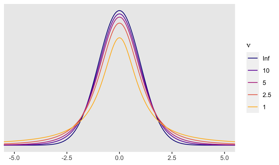
So the difference is that a Student’s \(t\)-distribution with a low \(\nu\) will have notably heavier tails than the conventional Gaussian distribution. It’s easiest to see the difference when \(\nu\) approaches 1. Even then, the difference can be subtle when looking at a plot. Another way is to compare how probable relatively extreme values are in a Student’s \(t\)-distribution relative to the Gaussian. For the sake of demonstration, here we’ll compare Gauss with Student’s \(t\) with a \(\nu\) of 5. In the plot above, they are clearly different, but not shockingly so. However, that difference is very notable in the tails.
Let’s look more closely with a table. Below, we compare the probability of a given \(z\)-score or lower within the Gaussian and a \(\nu = 5\) Student’s \(t\). In the rightmost column, we compare the probabilities in a ratio.
# here we pic our nu
nu <- 5

tibble(z_score               = 0:-5,
       p_Gauss               = pnorm(z_score, mean = 0, sd = 1),
       p_Student_t           = pt(z_score, df = nu),
       `Student/Gauss ratio` = p_Student_t/p_Gauss) %>%
  mutate_if(is.double, round, digits = 5) %>%
  knitr::kable()
| z_score | p_Gauss | p_Student_t | Student/Gauss ratio |
|---|---|---|---|
| 0 | 0.50000 | 0.50000 | 1.00000 |
| -1 | 0.15866 | 0.18161 | 1.14468 |
| -2 | 0.02275 | 0.05097 | 2.24042 |
| -3 | 0.00135 | 0.01505 | 11.14871 |
| -4 | 0.00003 | 0.00516 | 162.97775 |
| -5 | 0.00000 | 0.00205 | 7159.76534 |
Note how low \(z\)-scores are more probable in this Student’s \(t\) than in the Gaussian. This is most apparent in the Student/Gauss ratio column on the right. A consequence of this is that extreme scores are less influential to your solutions when you use a small-$\nu$ Student’s \(t\)-distribution in place of the Gaussian. That is, the small-$\nu$ Student’s \(t\) is more robust than the Gaussian to unusual and otherwise influential observations.
In order to demonstrate, let’s simulate our own. We’ll start by creating multivariate normal data.
Let’s create our initial
tibble of well-behaved data, d
First, we’ll need to define our variance/covariance matrix.
s <- matrix(c(1, .6,
              .6, 1),
             nrow = 2, ncol = 2)
By the two .6s on the off-diagonal positions, we indicated we’d like our two variables to have a correlation of .6.
Second, our variables also need means, which we’ll define with a mean vector.
m <- c(0, 0)
With means of 0 and variances of 1, our data are in a standardized metric.
Third, we’ll use the mvrnorm() function from the
MASS package (
Ripley, 2022) to simulate our data.
set.seed(3)

d <- MASS::mvrnorm(n = 100, mu = m, Sigma = s) %>%
  data.frame() %>%
  set_names(c("y", "x"))
The first few rows look like so:
head(d)
##             y          x
## 1 -1.13646674 -0.5842921
## 2 -0.08048679 -0.4427991
## 3 -0.23949510  0.7024295
## 4 -1.29984779 -0.7611484
## 5 -0.27990899  0.6301360
## 6 -0.24503702  0.2989244
As an aside, check out this nice r-bloggers post for more information on simulating data with this method.
Anyway, this line reorders our data by x, placing the smallest values on top.
d <-
  d %>%
  arrange(x)

head(d)
##            y         x
## 1 -2.2085518 -1.843921
## 2 -1.2739390 -1.707142
## 3 -0.1678317 -1.599651
## 4 -0.2916410 -1.460155
## 5 -0.7849189 -1.395440
## 6 -0.1566674 -1.370689
Let’s create our outlier tibble, o
Here we’ll make two outlying and unduly influential values.
o <- d
o[c(1:2), 1] <- c(6, 5)

head(o)
##            y         x
## 1  6.0000000 -1.843921
## 2  5.0000000 -1.707142
## 3 -0.1678317 -1.599651
## 4 -0.2916410 -1.460155
## 5 -0.7849189 -1.395440
## 6 -0.1566674 -1.370689
With the code, above, we replaced the first two values of our first variable, y. They both started out quite negative. Now they are positive values of a large magnitude within the standardized metric.
Frequentist OLS models
To get a quick sense of what we’ve done, we’ll first fit two models with OLS regression via the lm() function. The first model, ols0, is of the multivariate normal data, d. The second model, ols1, is on the otherwise identical data with the two odd and influential values, o. Here is our model code.
ols0 <- lm(data = d, y ~ 1 + x)
ols1 <- lm(data = o, y ~ 1 + x)
We’ll use the broom package ( Robinson et al., 2022) to assist with model summaries and other things. Here are the parameter estimates for the first model.
library(broom)

tidy(ols0) %>% mutate_if(is.double, round, digits = 2)
## # A tibble: 2 × 5
##   term        estimate std.error statistic p.value
##   <chr>          <dbl>     <dbl>     <dbl>   <dbl>
## 1 (Intercept)    -0.01      0.09     -0.08    0.94
## 2 x               0.45      0.1       4.55    0
And now the parameters for the second model, the one based on the o outlier data.
tidy(ols1) %>% mutate_if(is.double, round, digits = 2)
## # A tibble: 2 × 5
##   term        estimate std.error statistic p.value
##   <chr>          <dbl>     <dbl>     <dbl>   <dbl>
## 1 (Intercept)     0.14      0.12      1.21    0.23
## 2 x               0.1       0.14      0.77    0.44
Just two odd and influential values dramatically changed the model parameters, particularly the slope. Let’s plot the data and the models to get a visual sense of what happened.
# the well-behaved data
p1 <-
  ggplot(data = d, aes(x = x, y = y)) +
  stat_smooth(method = "lm", color = "grey92", fill = "grey67", alpha = 1, fullrange = T) +
  geom_point(size = 1, alpha = 3/4) +
  scale_x_continuous(limits = c(-4, 4)) +
  coord_cartesian(xlim = c(-3, 3),
                  ylim = c(-3, 6)) +
  labs(title = "No Outliers") +
  theme(panel.grid = element_blank())

# the data with two outliers
p2 <-
  ggplot(data = o, aes(x = x, y = y, color = y > 3)) +
  stat_smooth(method = "lm", color = "grey92", fill = "grey67", alpha = 1, fullrange = T) +
  geom_point(size = 1, alpha = 3/4) +
  scale_color_viridis_d(option = "A", end = 4/7) +
  scale_x_continuous(limits = c(-4, 4)) +
  coord_cartesian(xlim = c(-3, 3),
                  ylim = c(-3, 6)) +
  labs(title = "Two Outliers") +
  theme(panel.grid = element_blank(),
        legend.position = "none")

# combine the ggplots with patchwork syntax
library(patchwork)

p1 + p2
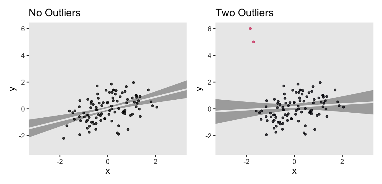
The two outliers were quite influential on the slope. It went from a nice clear diagonal to almost horizontal. You’ll also note how the 95% intervals (i.e., the bowtie shapes) were a bit wider when based on the o data.
One of the popular ways to quantify outlier status is with Mahalanobis’ distance. However, the Mahalanobis distance is primarily valid for multivariate normal data. Though the data in this example are indeed multivariate normal–or at least they were before we injected two outlying values into them–I am going to resist relying on Mahalanobis’ distance. There are other more general approaches that will be of greater use when you need to explore other variants of the generalized linear model. The broom::augment() function will give us access to one.
aug0 <- augment(ols0)
aug1 <- augment(ols1)

glimpse(aug1)
## Rows: 100
## Columns: 8
## $ y          <dbl> 6.00000000, 5.00000000, -0.16783167, -0.29164105, -0.784918…
## $ x          <dbl> -1.8439208, -1.7071418, -1.5996509, -1.4601550, -1.3954395,…
## $ .fitted    <dbl> -0.0488348407, -0.0345079366, -0.0232488171, -0.0086373304,…
## $ .resid     <dbl> 6.04883484, 5.03450794, -0.14458286, -0.28300372, -0.783060…
## $ .hat       <dbl> 0.05521164, 0.04881414, 0.04412882, 0.03849763, 0.03605748,…
## $ .sigma     <dbl> 1.015175, 1.074761, 1.195658, 1.195393, 1.193007, 1.195641,…
## $ .cooksd    <dbl> 7.995525e-01, 4.831377e-01, 3.566968e-04, 1.178310e-03, 8.4…
## $ .std.resid <dbl> 5.23106903, 4.33920660, -0.12430915, -0.24260679, -0.670433…
Here we can compare the observations with Cook’s distance, \(D_i\) (i.e., .cooksd). Cook’s \(D_i\) is a measure of the influence of a given observation on the model. To compute \(D_i\), the model is fit once for each \(n\) case, after first dropping that case. Then the difference in the model with all observations and the model with all observations but the \(i\)th observation, as defined by the Euclidean distance between the estimators. Fahrmeir et al (
2013, p. 166) suggest that within the OLS framework “as a rule of thumb, observations with \(D_i > 0.5\) are worthy of attention, and observations with \(D_i > 1\) should always be examined.” Here we plot \(D_i\) against our observation index, \(i\), for both models.
bind_rows(
  aug0 %>% mutate(i = 1:n()),  # the well-behaved data
  aug1 %>% mutate(i = 1:n())   # the data with two outliers
) %>%
  mutate(fit = rep(c("fit b0", "fit b1"), each = n()/2)) %>%
  ggplot(aes(x = i, y = .cooksd)) +
  geom_hline(yintercept = .5, color = "white") +
  geom_point(alpha = .5) +
  geom_text(data = tibble(i = 46,
                          .cooksd = .53,
                          fit = "fit b0"),
            label = "Fahrmeir et al said we might worry around here",
            color = "grey50") +
  coord_cartesian(ylim = c(0, .8)) +
  theme(panel.grid = element_blank(),
        axis.title.x = element_text(face = "italic", family = "Times")) +
    facet_wrap(~ fit)
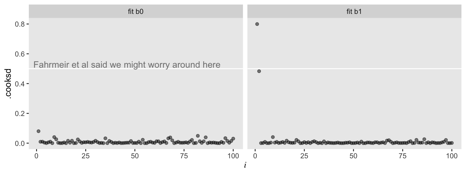
For the model of the well-behaved data, ols0, we have \(D_i\) values all hovering near zero. However, the plot for ols1 shows one \(D_i\) value well above the 0.5 level and another not quite that high but deviant relative to the rest. Our two outlier values look quite influential for the results of ols1.
Switch to a Bayesian framework
It’s time to fire up brms, the package with which we’ll be fitting our Bayesian models. As with all Bayesian models, we’ll need to us use priors. To keep things simple, we’ll use weakly-regularizing priors of the sort discussed by the Stan team. For more thoughts on how to set priors, check out Kruschke’s ( 2015) text or either edition of McElreath’s text ( 2020, 2015).
library(brms)
Stick with Gauss.
For our first two Bayesian models, b0 and b1, we’ll use the conventional Gaussian likelihood (i.e., family = gaussian in the brm() function). Like with ols0, above, the first model is based on the nice d data. The second, b1, is based on the more-difficult o data.
b0 <-
  brm(data = d,
      family = gaussian,
      y ~ 1 + x,
      prior = c(prior(normal(0, 10), class = Intercept),
                prior(normal(0, 10), class = b),
                prior(cauchy(0, 1),  class = sigma)),
      seed = 1)
b1 <-
  update(b0,
         newdata = o,
         seed = 1)
Here are the model summaries.
posterior_summary(b0)[1:3, ] %>% round(digits = 2)
##             Estimate Est.Error  Q2.5 Q97.5
## b_Intercept    -0.01      0.09 -0.17  0.16
## b_x             0.44      0.10  0.25  0.63
## sigma           0.86      0.06  0.75  0.99
posterior_summary(b1)[1:3, ] %>% round(digits = 2)
##             Estimate Est.Error  Q2.5 Q97.5
## b_Intercept     0.15      0.12 -0.08  0.38
## b_x             0.10      0.13 -0.16  0.35
## sigma           1.20      0.09  1.04  1.38
We summarized our model parameters with brms::posterior_summary() rather than broom::tid(). Otherwise, these should look familiar. They’re very much like the results from the OLS models. Hopefully this isn’t surprising. Our priors were quite weak, so there’s no reason to suspect the results would differ much.
The LOO and other goodies help with diagnostics.
With the loo() function, we’ll extract loo objects, which contain some handy output.
loo_b0 <- loo(b0)
loo_b1 <- loo(b1)
We’ll use str() to get a sense of what’s all in there, using loo_b1 as an example.
str(loo_b1)
## List of 10
##  $ estimates  : num [1:3, 1:2] -164.58 8.29 329.15 18.73 5.21 ...
##   ..- attr(*, "dimnames")=List of 2
##   .. ..$ : chr [1:3] "elpd_loo" "p_loo" "looic"
##   .. ..$ : chr [1:2] "Estimate" "SE"
##  $ pointwise  : num [1:100, 1:5] -16.91 -11.44 -1.13 -1.15 -1.34 ...
##   ..- attr(*, "dimnames")=List of 2
##   .. ..$ : NULL
##   .. ..$ : chr [1:5] "elpd_loo" "mcse_elpd_loo" "p_loo" "looic" ...
##  $ diagnostics:List of 2
##   ..$ pareto_k: num [1:100] 1.003 0.7015 0.0754 0.0984 0.0428 ...
##   ..$ n_eff   : num [1:100] 18.4 118.1 3148.4 3365.7 3936.6 ...
##  $ psis_object: NULL
##  $ elpd_loo   : num -165
##  $ p_loo      : num 8.29
##  $ looic      : num 329
##  $ se_elpd_loo: num 18.7
##  $ se_p_loo   : num 5.21
##  $ se_looic   : num 37.5
##  - attr(*, "dims")= int [1:2] 4000 100
##  - attr(*, "class")= chr [1:3] "psis_loo" "importance_sampling_loo" "loo"
##  - attr(*, "yhash")= chr "e4b6969bbea438964db2060fc4f2eb1f5dcaaa1f"
##  - attr(*, "model_name")= chr "b1"
For a detailed explanation of all those elements, see the
loo reference manual (
Vehtari et al., 2020). For our purposes, we’ll focus on the pareto_k. Here’s a glimpse of what it contains for the b1 model.
loo_b1$diagnostics$pareto_k %>% as_tibble()
## # A tibble: 100 × 1
##        value
##        <dbl>
##  1  1.00
##  2  0.701
##  3  0.0754
##  4  0.0984
##  5  0.0428
##  6  0.00891
##  7 -0.0465
##  8 -0.000989
##  9  0.0176
## 10  0.0110
## # … with 90 more rows
We’ve got us a numeric vector of as many values as our data had observations–100 in this case. The pareto_k values can be used to examine overly-influential cases. See, for example
this discussion on stackoverflow.com in which several members of the
Stan team weighed in. The issue is also discussed in Vehtari et al. (
2017), in the
loo reference manual, and in
this presentation by Aki Vehtari, himself. If we explicitly open the
loo package (
Vehtari et al., 2022), we can use a few convenience functions to leverage pareto_k for diagnostic purposes. The pareto_k_table() function will categorize the pareto_k values and give us a sense of how many values are in problematic ranges.
library(loo)

pareto_k_table(loo_b1)
## Pareto k diagnostic values:
##                          Count Pct.    Min. n_eff
## (-Inf, 0.5]   (good)     98    98.0%   2944
##  (0.5, 0.7]   (ok)        0     0.0%   <NA>
##    (0.7, 1]   (bad)       1     1.0%   118
##    (1, Inf)   (very bad)  1     1.0%   18
Happily, most of our cases were in the “good” range. One pesky case was in the “very bad” range [can you guess which one?] and another case was “bad” [and can you guess that one, too?]. The pareto_k_ids() function will tell exactly us which cases we’ll want to look at.
pareto_k_ids(loo_b1)
## [1] 1 2
Those numbers correspond to the row numbers in the data, o. These are exactly the cases that plagued our second OLS model, fit1, and are also the ones we hand coded to be outliers. With the simple plot() function, we can get a diagnostic plot for the pareto_k values.
plot(loo_b1)
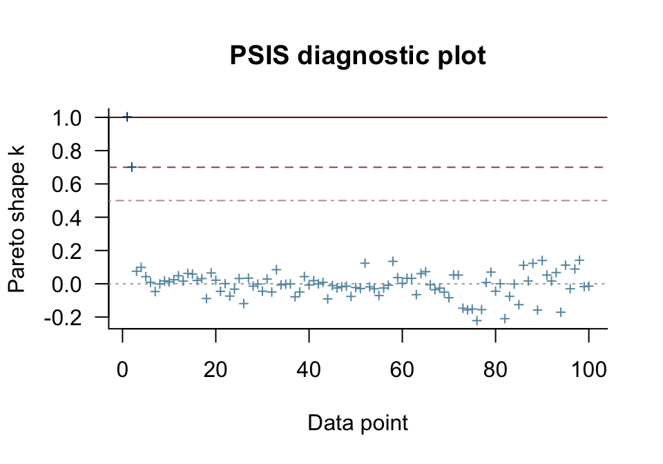
There they are, cases 1 and 2, lurking in the “very bad” and “bad” ranges. We can also make a similar plot with ggplot2. Though it takes a little more work, ggplot2 makes it easy to compare pareto_k plots across models with a little faceting.
# for the annotation
text <-
  tibble(i     = 1,
         k     = c(.45, .65, .95),
         label = c("good", "[just] ok", "bad"),
         fit   = "fit b0")

# extract the diagnostics
tibble(k   = c(loo_b0$diagnostics$pareto_k, loo_b1$diagnostics$pareto_k),
       i   = rep(1:100, times = 2),
       fit = rep(str_c("fit b", 0:1), each = 100)) %>%

  # plot!
  ggplot(aes(x = i, y = k)) +
  geom_hline(yintercept = c(.5, .7, 1), color = "white") +
  geom_point(alpha = .5) +
  geom_text(data = text,
            aes(label = label),
            color = "grey50", hjust = 0) +
  scale_y_continuous(expression(Pareto~italic(k)), breaks = c(0, .5, .7, 1)) +
  theme(panel.grid = element_blank(),
        axis.title.x = element_text(face = "italic", family = "Times")) +
  facet_wrap(~ fit)
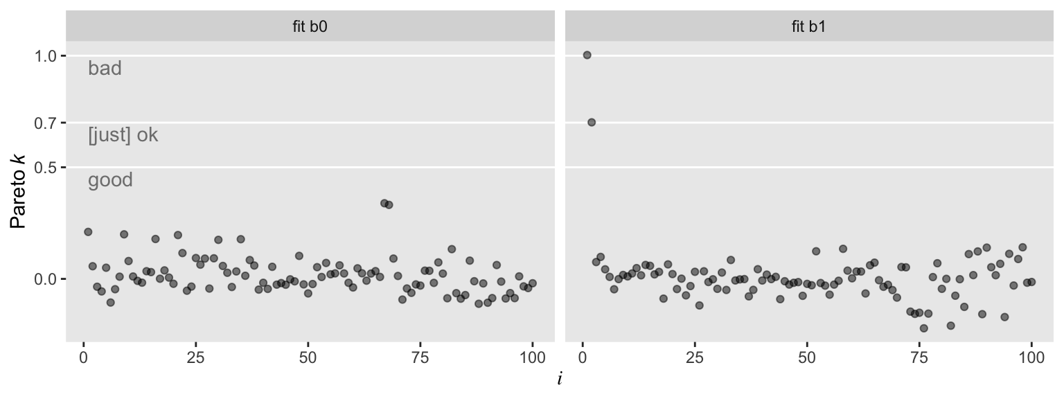
So with b0–the model based on the well-behaved multivariate normal data, d–, all the pareto_k values hovered around zero in the “good” range. Things got concerning with model b1. But we know all that. Let’s move forward.
What do we do with those overly-influential outlying values?
A typical way to handle outlying values is to delete them based on some criterion, such as the Mahalanobis distance, Cook’s \(D_i\), or our new friend the pareto_k. In our next two models, we’ll do that. In our data arguments, we can use the slice() function to omit cases. In model b1.1, we simply omit the first and most influential case. In model b1.2, we omitted both unduly-influential cases, the values from rows 1 and 2.
b1.1 <-
  update(b1,
         newdata = o %>% slice(2:100),
         seed = 1)
b1.2 <-
  update(b1,
         newdata = o %>% slice(3:100),
         seed = 1)
Here are the summaries for our models based on the slice[d] data.
posterior_summary(b1.1)[1:3, ] %>% round(digits = 2)
##             Estimate Est.Error  Q2.5 Q97.5
## b_Intercept     0.08      0.10 -0.12  0.28
## b_x             0.26      0.12  0.03  0.49
## sigma           1.02      0.08  0.88  1.18
posterior_summary(b1.2)[1:3, ] %>% round(digits = 2)
##             Estimate Est.Error  Q2.5 Q97.5
## b_Intercept     0.02      0.09 -0.16  0.19
## b_x             0.40      0.10  0.20  0.60
## sigma           0.86      0.06  0.75  1.00
They are closer to the true data generating model (i.e., the code we used to make d), especially b1.2. However, there are other ways to handle the influential cases without dropping them. Finally, we’re ready to switch to Student’s \(t\)!
Time to leave Gauss for the more general Student’s \(t\)
Recall that the normal distribution is equivalent to a Student’s \(t\) with the degrees of freedom parameter, \(\nu\), set to infinity. That is, \(\nu\) is fixed. Here we’ll relax that assumption and estimate \(\nu\) from the data just like we estimate \(\mu\) with the linear model and \(\sigma\) as the residual spread. Since \(\nu\)’s now a parameter, we’ll have to give it a prior. For our first Student’s \(t\) model, we’ll estimate \(\nu\) with the brms default gamma(2, 0.1) prior.
b2 <-
  brm(data = o, family = student,
      y ~ 1 + x,
      prior = c(prior(normal(0, 10), class = Intercept),
                prior(normal(0, 10), class = b),
                prior(gamma(2, 0.1), class = nu),
                prior(cauchy(0, 1),  class = sigma)),
      seed = 1)
For the next model, we’ll switch out that weak gamma(2, 0.1) for a stronger gamma(4, 1). In some disciplines, the gamma distribution is something of an exotic bird. So before fitting the model, it might be useful to take a peek at what these gamma priors looks like. In the plot, below, the orange density in the background is the default gamma(2, 0.1) and the purple density in the foreground is the stronger gamma(4, 1).
# data
tibble(x = seq(from = 0, to = 60, by = .1)) %>%
  expand(x, nesting(alpha = c(2, 4),
                    beta  = c(0.1, 1))) %>%
  mutate(density = dgamma(x, alpha, beta),
         group   = rep(letters[1:2], times = n() / 2)) %>%

  # plot
  ggplot(aes(x = x, y = density,
             group = group, fill = group)) +
  geom_area(linewidth = 0, alpha = 3/4, position = "identity") +
  scale_fill_viridis_d(option = "B", direction = -1,
                       begin = 1/3, end = 2/3) +
  scale_x_continuous(expand = expansion(mult = c(0, 0.05))) +
  scale_y_continuous(NULL, breaks = NULL) +
  coord_cartesian(xlim = c(0, 50)) +
  theme(panel.grid = element_blank(),
        legend.position = "none")
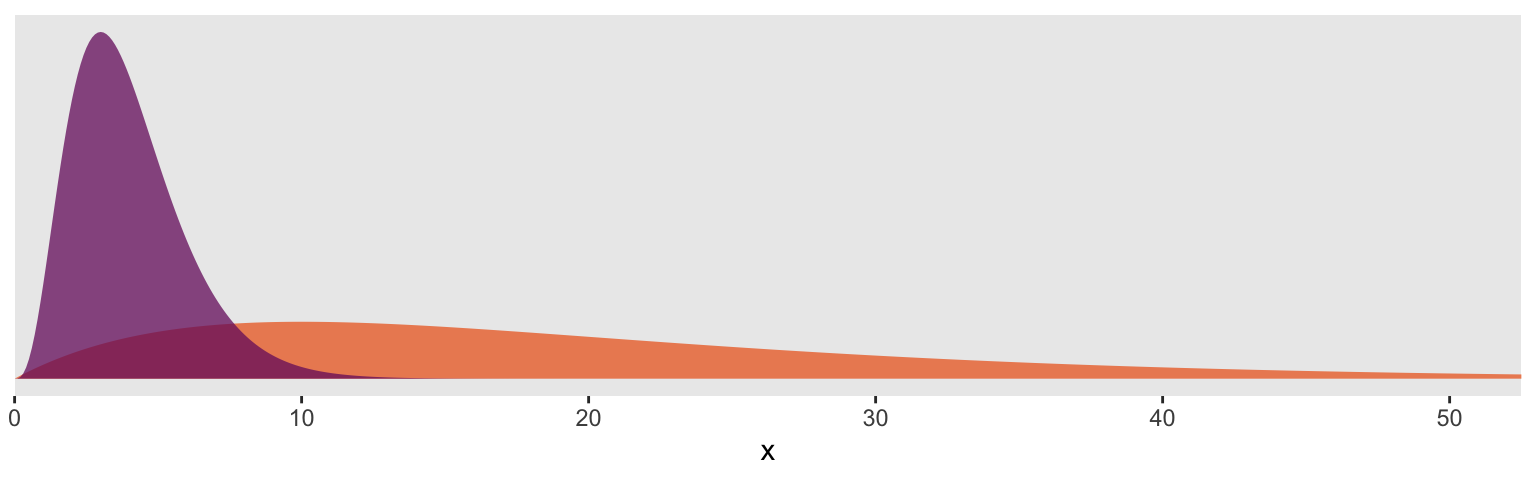
So the default prior is centered around values in the 2 to 30 range, but has a long gentle-sloping tail, allowing the model to yield much larger values for \(\nu\), as needed. The prior we use below is almost entirely concentrated in the single-digit range. In this case, that will preference Student’s \(t\) likelihoods with very small \(\nu\) parameters and correspondingly thick tails–easily allowing for extreme values.
b3 <-
  update(b2,
         prior = c(prior(normal(0, 10), class = Intercept),
                   prior(normal(0, 10), class = b),
                   prior(gamma(4, 1),   class = nu),
                   prior(cauchy(0, 1),  class = sigma)),
         seed = 1)
For our final model, we’ll fix the \(\nu\) parameter in a bf() statement.
b4 <-
  brm(data = o, family = student,
      bf(y ~ 1 + x, nu = 4),
      prior = c(prior(normal(0, 100), class = Intercept),
                prior(normal(0, 10),  class = b),
                prior(cauchy(0, 1),   class = sigma)),
         seed = 1)
Now we’ve got all those models, we can gather their results into a single tibble.
b_estimates <-
  tibble(model = c("b0", "b1", "b1.1", "b1.2", "b2", "b3", "b4")) %>%
  mutate(fit = map(model, get)) %>%
  mutate(posterior_summary = map(fit, ~posterior_summary(.) %>%
                                   data.frame() %>%
                                   rownames_to_column("term"))) %>%
  unnest(posterior_summary) %>%
  select(-fit) %>%
  filter(term %in% c("b_Intercept", "b_x")) %>%
  arrange(term)
To get a sense of what we’ve done, let’s take a peek at our models tibble.
b_estimates %>%
  mutate_if(is.double, round, digits = 2)  # this is just to round the numbers
## # A tibble: 14 × 6
##    model term        Estimate Est.Error  Q2.5 Q97.5
##    <chr> <chr>          <dbl>     <dbl> <dbl> <dbl>
##  1 b0    b_Intercept    -0.01      0.09 -0.17  0.16
##  2 b1    b_Intercept     0.15      0.12 -0.08  0.38
##  3 b1.1  b_Intercept     0.08      0.1  -0.12  0.28
##  4 b1.2  b_Intercept     0.02      0.09 -0.16  0.19
##  5 b2    b_Intercept     0.04      0.09 -0.14  0.22
##  6 b3    b_Intercept     0.03      0.09 -0.15  0.22
##  7 b4    b_Intercept     0.04      0.09 -0.14  0.22
##  8 b0    b_x             0.44      0.1   0.25  0.63
##  9 b1    b_x             0.1       0.13 -0.16  0.35
## 10 b1.1  b_x             0.26      0.12  0.03  0.49
## 11 b1.2  b_x             0.4       0.1   0.2   0.6
## 12 b2    b_x             0.36      0.1   0.15  0.56
## 13 b3    b_x             0.37      0.1   0.17  0.56
## 14 b4    b_x             0.37      0.1   0.17  0.57
The models differ by their intercepts, slopes, sigmas, and \(\nu\)s. For the sake of this post, we’ll focus on the slopes. Here we compare the different Bayesian models’ slopes by their posterior means and 95% intervals in a coefficient plot.
b_estimates %>%
  filter(term == "b_x") %>% # b_Intercept b_x

  ggplot(aes(x = model)) +
  geom_pointrange(aes(y    = Estimate,
                      ymin = Q2.5,
                      ymax = Q97.5),
                  shape = 20) +
  coord_flip(ylim = c(-.2, 1)) +
  labs(title    = "The x slope, varying by model",
       subtitle = "The dots are the posterior means and the lines the percentile-based 95% intervals.",
       x        = NULL,
       y        = NULL) +
  theme(panel.grid   = element_blank(),
        axis.ticks.y = element_blank(),
        axis.text.y  = element_text(hjust = 0))
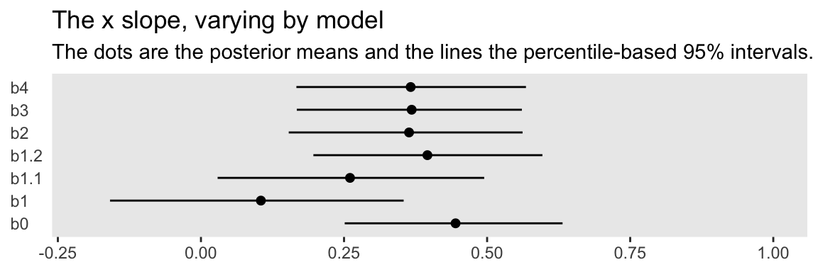
You might think of the b0 slope as the “true” slope. That’s the one estimated from the well-behaved multivariate normal data, d. That estimate’s just where we’d want it to be. The b1 slope is a disaster–way lower than the others. The slopes for b1.1 and b1.2 get better, but at the expense of deleting data. All three of our Student’s \(t\) models produced slopes that were pretty close to the b0 slope. They weren’t perfect, but, all in all, Student’s \(t\)-distribution did pretty okay.
We need more LOO and more pareto_k.
We already have loo objects for our first two models, b0 and b1. Let’s get some for models b2 through b4.
loo_b2 <- loo(b2)
loo_b3 <- loo(b3)
loo_b4 <- loo(b4)
With a little data wrangling, we can compare our models by how they look in our custom pareto_k diagnostic plots.
# make a custom function to work with the loo objects in bulk
get_pareto_k <- function(l) {
  l$diagnostics$pareto_k %>%
    as_tibble() %>%
    mutate(i = 1:n()) %>%
    rename(pareto_k = value)
}

# wrangle
tibble(name = str_c("loo_b", 1:4)) %>%
  mutate(loo_object = map(name, get)) %>%
  mutate(pareto_k = map(loo_object, get_pareto_k)) %>%
  unnest(pareto_k) %>%
  mutate(fit = rep(c("fit b1", "fit b2", "fit b3", "fit b4"), each = n() / 4)) %>%

  # plot
  ggplot(aes(x = i, y = pareto_k)) +
  geom_hline(yintercept = c(.5, .7),
             color = "white") +
  geom_point(alpha = .5) +
  scale_y_continuous(expression(Pareto~italic(k)), breaks = c(0, .5, .7)) +
  theme(panel.grid = element_blank(),
        axis.title.x = element_text(face = "italic", family = "Times")) +
    facet_wrap(~ fit)
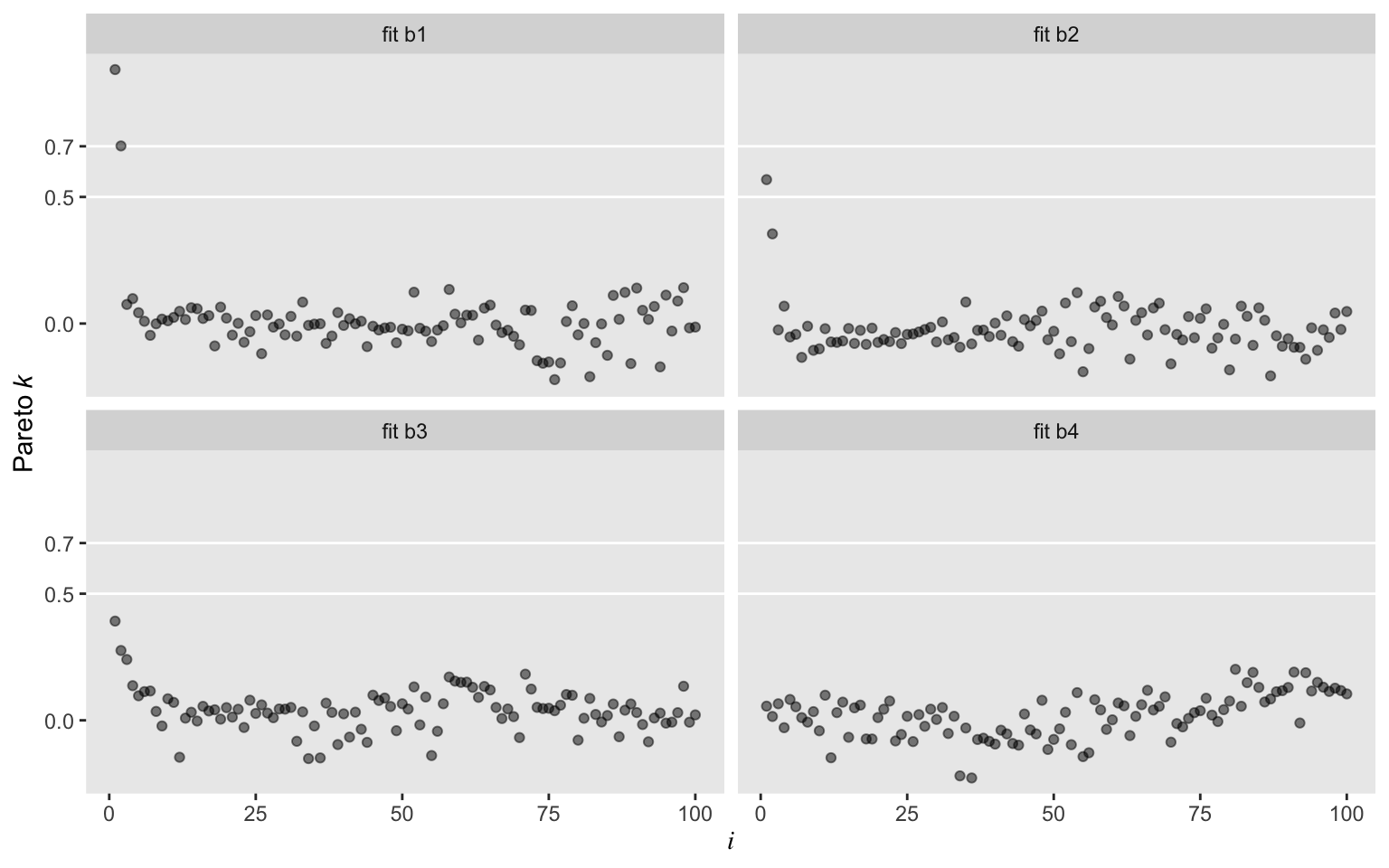
Oh man, those Student’s \(t\) models worked sweet! In a succession from b2 through b4, each model looked better by pareto_k. All were way better than the typical Gaussian model, b1. While we’re at it, we might compare those by their LOO values.
loo_compare(loo_b1, loo_b2, loo_b3, loo_b4) %>% print(simplify = F)
##    elpd_diff se_diff elpd_loo se_elpd_loo p_loo  se_p_loo looic  se_looic
## b4    0.0       0.0  -144.7     11.0         2.7    0.2    289.4   22.1
## b3   -1.0       0.3  -145.7     11.3         3.8    0.9    291.4   22.6
## b2   -2.0       1.5  -146.7     12.2         4.8    1.6    293.3   24.4
## b1  -19.9      10.0  -164.6     18.7         8.3    5.2    329.2   37.5
In terms of the LOO, b2 through b4 were about the same, but all looked better than b1. In fairness, though, the standard errors for the difference scores were a bit on the wide side.
If you’re new to using information criteria to compare models, you might sit down and soak in
one of McElreath’s lectures on the topic or the (
2020) vignette by Vehtari and Gabry,
Using the loo package (version >= 2.0.0). For a more technical introduction, you might check out the references in the loo package’s
reference manual.
For one final LOO-related comparison, we can use the brms::model_weights() function to see how much relative weight we might put on each of those four models if we were to use a model averaging approach. Here we use the default method, which is model averaging via posterior predictive stacking.
model_weights(b1, b2, b3, b4)
##           b1           b2           b3           b4
## 9.847585e-09 3.177941e-06 3.148646e-06 9.999937e-01
If you’re not a fan of scientific notation, just tack on round(digits = 2). The stacking method suggests that we should place virtually all the weight on b4, the model in which we fixed our Student-$t$ \(\nu\) parameter at 4. To learn more about model stacking, check out Yao, Vehtari, Simpson, and Gelman’s (
2018) paper,
Using stacking to average Bayesian predictive distributions.
Let’s compare a few Bayesian models.
That’s enough with coefficients, pareto_k, and the LOO. Let’s get a sense of the implications of the models by comparing a few in plots. Here we use convenience functions from
Matthew Kay’s (
2022)
tidybayes package to streamline the data wrangling and plotting. The method came from a
kind twitter suggesion from Kay.
library(tidybayes)

# these are the values of x we'd like model-implied summaries for
nd <- tibble(x = seq(from = -4, to = 4, length.out = 50))

# here's another way to arrange the models
list(b0 = b0, b1 = b1, b3 = b3) %>%
  # with help from `tidybayes::add_fitted_draws()`, here we use `fitted()` in bulk
  map_dfr(add_fitted_draws, newdata = nd, .id = "model") %>%

  # plot
  ggplot(aes(x = x)) +
  stat_lineribbon(aes(y = .value),
                  .width = .95,
                  color = "grey92", fill = "grey67") +
  geom_point(data = d %>%
               bind_rows(o, o) %>%
               mutate(model = rep(c("b0", "b1", "b3"), each = 100)),
             aes(y = y, color = y > 3),
             size = 1, alpha = 3/4) +
  scale_color_viridis_d(option = "A", end = 4/7) +
  coord_cartesian(xlim = c(-3, 3),
                  ylim = c(-3, 6)) +
  ylab(NULL) +
  theme(panel.grid = element_blank(),
        legend.position = "none") +
  facet_wrap(~ model)
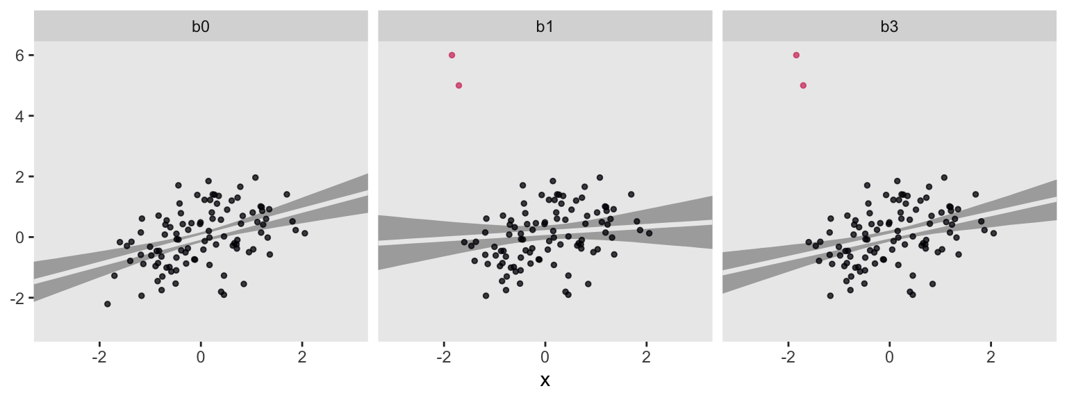
For each subplot, the gray band is the 95% interval band and the overlapping light gray line is the posterior mean. Model b0, recall, is our baseline comparison model. This is of the well-behaved no-outlier data, d, using the good old Gaussian likelihood. Model b1 is of the outlier data, o, but still using the non-robust Gaussian likelihood. Model b3 uses a robust Student’s \(t\) likelihood with \(\nu\) estimated with the fairly narrow gamma(4, 1) prior. For my money, b3 did a pretty good job.
sessionInfo()
## R version 4.2.0 (2022-04-22)
## Platform: x86_64-apple-darwin17.0 (64-bit)
## Running under: macOS Big Sur/Monterey 10.16
##
## Matrix products: default
## BLAS:   /Library/Frameworks/R.framework/Versions/4.2/Resources/lib/libRblas.0.dylib
## LAPACK: /Library/Frameworks/R.framework/Versions/4.2/Resources/lib/libRlapack.dylib
##
## locale:
## [1] en_US.UTF-8/en_US.UTF-8/en_US.UTF-8/C/en_US.UTF-8/en_US.UTF-8
##
## attached base packages:
## [1] stats     graphics  grDevices utils     datasets  methods   base
##
## other attached packages:
##  [1] tidybayes_3.0.2 loo_2.5.1       brms_2.18.0     Rcpp_1.0.9
##  [5] patchwork_1.1.2 broom_1.0.1     forcats_0.5.1   stringr_1.4.1
##  [9] dplyr_1.0.10    purrr_0.3.4     readr_2.1.2     tidyr_1.2.1
## [13] tibble_3.1.8    ggplot2_3.4.0   tidyverse_1.3.2
##
## loaded via a namespace (and not attached):
##   [1] readxl_1.4.1         backports_1.4.1      plyr_1.8.7
##   [4] igraph_1.3.4         svUnit_1.0.6         splines_4.2.0
##   [7] crosstalk_1.2.0      TH.data_1.1-1        rstantools_2.2.0
##  [10] inline_0.3.19        digest_0.6.30        htmltools_0.5.3
##  [13] fansi_1.0.3          magrittr_2.0.3       checkmate_2.1.0
##  [16] googlesheets4_1.0.1  tzdb_0.3.0           modelr_0.1.8
##  [19] RcppParallel_5.1.5   matrixStats_0.62.0   xts_0.12.1
##  [22] sandwich_3.0-2       prettyunits_1.1.1    colorspace_2.0-3
##  [25] rvest_1.0.2          ggdist_3.2.0         haven_2.5.1
##  [28] xfun_0.35            callr_3.7.3          crayon_1.5.2
##  [31] jsonlite_1.8.3       lme4_1.1-31          survival_3.4-0
##  [34] zoo_1.8-10           glue_1.6.2           gtable_0.3.1
##  [37] gargle_1.2.0         emmeans_1.8.0        distributional_0.3.1
##  [40] pkgbuild_1.3.1       rstan_2.21.7         abind_1.4-5
##  [43] scales_1.2.1         mvtnorm_1.1-3        DBI_1.1.3
##  [46] miniUI_0.1.1.1       viridisLite_0.4.1    xtable_1.8-4
##  [49] stats4_4.2.0         StanHeaders_2.21.0-7 DT_0.24
##  [52] htmlwidgets_1.5.4    httr_1.4.4           threejs_0.3.3
##  [55] arrayhelpers_1.1-0   posterior_1.3.1      ellipsis_0.3.2
##  [58] pkgconfig_2.0.3      farver_2.1.1         sass_0.4.2
##  [61] dbplyr_2.2.1         utf8_1.2.2           labeling_0.4.2
##  [64] tidyselect_1.1.2     rlang_1.0.6          reshape2_1.4.4
##  [67] later_1.3.0          munsell_0.5.0        cellranger_1.1.0
##  [70] tools_4.2.0          cachem_1.0.6         cli_3.4.1
##  [73] generics_0.1.3       ggridges_0.5.3       evaluate_0.18
##  [76] fastmap_1.1.0        yaml_2.3.5           processx_3.8.0
##  [79] knitr_1.40           fs_1.5.2             nlme_3.1-159
##  [82] mime_0.12            projpred_2.2.1       xml2_1.3.3
##  [85] compiler_4.2.0       bayesplot_1.9.0      shinythemes_1.2.0
##  [88] rstudioapi_0.13      gamm4_0.2-6          reprex_2.0.2
##  [91] bslib_0.4.0          stringi_1.7.8        highr_0.9
##  [94] ps_1.7.2             blogdown_1.15        Brobdingnag_1.2-8
##  [97] lattice_0.20-45      Matrix_1.4-1         nloptr_2.0.3
## [100] markdown_1.1         shinyjs_2.1.0        tensorA_0.36.2
## [103] vctrs_0.5.0          pillar_1.8.1         lifecycle_1.0.3
## [106] jquerylib_0.1.4      bridgesampling_1.1-2 estimability_1.4.1
## [109] httpuv_1.6.5         R6_2.5.1             bookdown_0.28
## [112] promises_1.2.0.1     gridExtra_2.3        codetools_0.2-18
## [115] boot_1.3-28          colourpicker_1.1.1   MASS_7.3-58.1
## [118] gtools_3.9.3         assertthat_0.2.1     withr_2.5.0
## [121] shinystan_2.6.0      multcomp_1.4-20      mgcv_1.8-40
## [124] parallel_4.2.0       hms_1.1.1            grid_4.2.0
## [127] coda_0.19-4          minqa_1.2.5          rmarkdown_2.16
## [130] googledrive_2.0.0    shiny_1.7.2          lubridate_1.8.0
## [133] base64enc_0.1-3      dygraphs_1.1.1.6
References
Bürkner, P.-C. (2017). brms: An R package for Bayesian multilevel models using Stan. Journal of Statistical Software, 80(1), 1–28. https://doi.org/10.18637/jss.v080.i01
Bürkner, P.-C. (2018). Advanced Bayesian multilevel modeling with the R package brms. The R Journal, 10(1), 395–411. https://doi.org/10.32614/RJ-2018-017
Bürkner, P.-C. (2022). brms: Bayesian regression models using ’Stan’. https://CRAN.R-project.org/package=brms
Fahrmeir, L., Kneib, T., Lang, S., & Marx, B. (2013). Regression: Models, methods and applications. Springer-Verlag. https://doi.org/10.1007/978-3-642-34333-9
Gelman, A., & Hill, J. (2006). Data analysis using regression and multilevel/hierarchical models. Cambridge University Press. https://doi.org/10.1017/CBO9780511790942
Grolemund, G., & Wickham, H. (2017). R for data science. O’Reilly. https://r4ds.had.co.nz
Kay, M. (2022). tidybayes: Tidy data and ’geoms’ for Bayesian models. https://CRAN.R-project.org/package=tidybayes
Kruschke, J. K. (2015). Doing Bayesian data analysis: A tutorial with R, JAGS, and Stan. Academic Press. https://sites.google.com/site/doingbayesiandataanalysis/
McElreath, R. (2020). Statistical rethinking: A Bayesian course with examples in R and Stan (Second Edition). CRC Press. https://xcelab.net/rm/statistical-rethinking/
McElreath, R. (2015). Statistical rethinking: A Bayesian course with examples in R and Stan. CRC press. https://xcelab.net/rm/statistical-rethinking/
Ripley, B. (2022). MASS: Support functions and datasets for venables and Ripley’s MASS. https://CRAN.R-project.org/package=MASS
Robinson, D., Hayes, A., & Couch, S. (2022). broom: Convert statistical objects into tidy tibbles [Manual]. https://CRAN.R-project.org/package=broom
Vehtari, A., & Gabry, J. (2020, July 14). Using the loo package (version $>$= 2.0.0). https://CRAN.R-project.org/package=loo/vignettes/loo2-example.html
Vehtari, A., Gabry, J., Magnusson, M., Yao, Y., Bürkner, P.-C., Paananen, T., & Gelman, A. (2020). loo reference manual, Version 2.3.1. https://CRAN.R-project.org/package=loo/loo.pdf
Vehtari, A., Gabry, J., Magnusson, M., Yao, Y., & Gelman, A. (2022). loo: Efficient leave-one-out cross-validation and WAIC for bayesian models. https://CRAN.R-project.org/package=loo/
Vehtari, A., Gelman, A., & Gabry, J. (2017). Practical Bayesian model evaluation using leave-one-out cross-validation and WAIC. Statistics and Computing, 27(5), 1413–1432. https://doi.org/10.1007/s11222-016-9696-4
Wickham, H. (2022). tidyverse: Easily install and load the ’tidyverse’. https://CRAN.R-project.org/package=tidyverse
Wickham, H., Averick, M., Bryan, J., Chang, W., McGowan, L. D., François, R., Grolemund, G., Hayes, A., Henry, L., Hester, J., Kuhn, M., Pedersen, T. L., Miller, E., Bache, S. M., Müller, K., Ooms, J., Robinson, D., Seidel, D. P., Spinu, V., … Yutani, H. (2019). Welcome to the tidyverse. Journal of Open Source Software, 4(43), 1686. https://doi.org/10.21105/joss.01686
Yao, Y., Vehtari, A., Simpson, D., & Gelman, A. (2018). Using stacking to average Bayesian predictive distributions (with discussion). Bayesian Analysis, 13(3), 917–1007. https://doi.org/10.1214/17-BA1091
- Posted on:
- February 2, 2019
- Length:
- 26 minute read, 5475 words