Make rotated Gaussians, Kruschke style
By A. Solomon Kurz
December 20, 2018
[edited Dec 11, 2022]
tl;dr
You too can make sideways Gaussian density curves within the tidyverse. Here’s how.
Here’s the deal: I like making pictures.
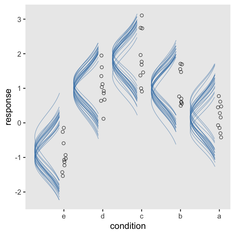
Over the past several months, I’ve been slowly chipping away1 at John Kruschke’s Doing Bayesian data analysis, Second Edition: A tutorial with R, JAGS, and Stan. Kruschke has a unique plotting style. One of the quirks is once in a while he likes to express the results of his analyses in plots where he shows the data alongside density curves of the model-implied data-generating distributions. Here’s an example from chapter 19 (p. 563).
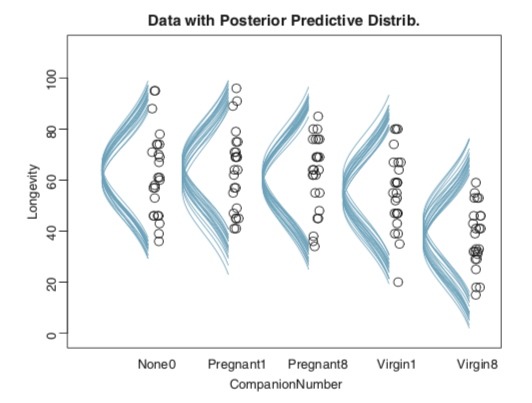
In this example, he has lifespan data (i.e., Longevity) for fruit flies from five experimental conditions (i.e., CompanionNumber). Those are the black circles. In this section of the chapter, he used a Gaussian multilevel model in which the mean value for Longevity had a grand mean in addition to random effects for the five experimental conditions. Those sideways-turned blue Gaussians are his attempt to express the model-implied data generating distributions for each group.
If you haven’t gone through Kruschke’s text, you should know he relies on base R and all its
loopy glory. If you carefully go through his code, you can reproduce his plots in that fashion. I’m a
tidyverse man and prefer to avoid writing a for() loop at all costs. At first, I tried to work with convenience functions within ggplot2 and friends, but only had limited success. After staring long and hard at Kruschke’s base code, I came up with a robust solution, which I’d like to share here.
In this post, we’ll practice making sideways Gaussians in the Kruschke style. We’ll do so with a simple intercept-only single-level model and then expand our approach to an intercept-only multilevel model like the one in the picture, above.
My assumptions
For the sake of this post, I’m presuming you’re familiar with R, aware of the tidyverse, and have fit a Bayesian model or two. Yes. I admit that’s a narrow crowd. Sometimes the target’s a small one.
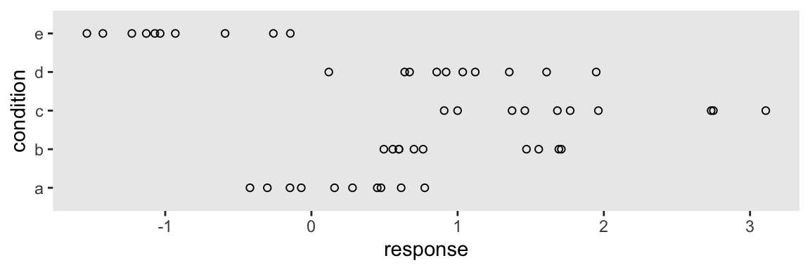
We need data.
First, we need data. Here we’ll borrow code from Matthew Kay’s nice tutorial on how to use his great tidybayes package.
library(tidyverse)

set.seed(5)
n           <- 10
n_condition <- 5

abc <-
  tibble(condition = rep(letters[1:5], times = n),
         response  = rnorm(n * 5, mean = c(0, 1, 2, 1, -1), sd = 0.5))
The data structure looks like so.
str(abc)
## tibble [50 × 2] (S3: tbl_df/tbl/data.frame)
##  $ condition: chr [1:50] "a" "b" "c" "d" ...
##  $ response : num [1:50] -0.42 1.692 1.372 1.035 -0.144 ...
With Kay’s code, we have response values for five conditions. All follow the normal distribution and share a common standard deviation. However, they differ in their group means.
abc %>%
  group_by(condition) %>%
  summarise(mean = mean(response) %>% round(digits = 2))
## # A tibble: 5 × 2
##   condition  mean
##   <chr>     <dbl>
## 1 a          0.18
## 2 b          1.01
## 3 c          1.87
## 4 d          1.03
## 5 e         -0.94
Altogether, the data look like this.
theme_set(theme_grey() +
            theme(panel.grid = element_blank()))

abc %>%
  ggplot(aes(y = condition, x = response)) +
  geom_point(shape = 1)
Let’s get ready to model.
Just one intercept
If you’ve read this far, you know we’re going Bayesian. Let’s open up our favorite Bayesian modeling package, Bürkner’s brms.
library(brms)
For our first model, we’ll ignore the groups and just estimate a grand mean and a standard deviation. Relative to the scale of the abc data, our priors are modestly
regularizing.
fit1 <-
  brm(data = abc,
      response ~ 1,
      prior = c(prior(normal(0, 1), class = Intercept),
                prior(student_t(3, 0, 1), class = sigma)))
Extract the posterior draws and save them as a data frame we’ll call draws.
draws <- as_draws_df(fit1)

glimpse(draws)
## Rows: 4,000
## Columns: 7
## $ b_Intercept <dbl> 0.7062645, 0.5213162, 0.7794359, 0.7474422, 0.7201486, 0.6574975, 0.6752040, 0…
## $ sigma       <dbl> 1.1179866, 1.0165283, 1.1253066, 1.2801548, 1.2717189, 0.9867557, 1.0966239, 0…
## $ lprior      <dbl> -2.172648, -1.954526, -2.234717, -2.377700, -2.348369, -2.004996, -2.128805, -…
## $ lp__        <dbl> -77.11872, -77.33834, -77.51430, -78.49459, -78.29629, -77.38506, -76.98011, -…
## $ .chain      <int> 1, 1, 1, 1, 1, 1, 1, 1, 1, 1, 1, 1, 1, 1, 1, 1, 1, 1, 1, 1, 1, 1, 1, 1, 1, 1, …
## $ .iteration  <int> 1, 2, 3, 4, 5, 6, 7, 8, 9, 10, 11, 12, 13, 14, 15, 16, 17, 18, 19, 20, 21, 22,…
## $ .draw       <int> 1, 2, 3, 4, 5, 6, 7, 8, 9, 10, 11, 12, 13, 14, 15, 16, 17, 18, 19, 20, 21, 22,…
If all you want is a quick and dirty way to plot a few of the model-implied Gaussians from the simple model, you can just nest stat_function() within mapply() and tack on the original data in a geom_jitter().
# How many Gaussians would you like?
n_iter <- 20

tibble(response = c(-4, 4)) %>%
  ggplot(aes(x = response)) +
  mapply(function(mean, sd) {
    stat_function(fun   = dnorm,
                  args  = list(mean = mean, sd = sd),
                  alpha = 1/2,
                  color = "steelblue")
    },
    # Enter means and standard deviations here
    mean = draws %>% slice(1:n_iter) %>% pull(b_Intercept),
    sd   = draws %>% slice(1:n_iter) %>% pull(sigma)
    ) +
  geom_jitter(data = abc, aes(y = -0.02),
              height = .025, shape = 1, alpha = 2/3) +
  scale_y_continuous(NULL, breaks = NULL)
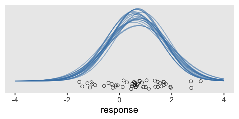
This works pretty okay. But notice the orientation is the usual horizontal. Kruschke’s Gaussians were on their sides. If we switch out our scale_y_continuous() line with scale_y_reverse() and add in coord_flip(), we’ll have it.
tibble(response = c(-4, 4)) %>%
  ggplot(aes(x = response)) +
  mapply(function(mean, sd) {
    stat_function(fun   = dnorm,
                  args  = list(mean = mean, sd = sd),
                  alpha = 1/2,
                  color = "steelblue")
    },
    mean = draws %>% slice(1:n_iter) %>% pull(b_Intercept),
    sd   = draws %>% slice(1:n_iter) %>% pull(sigma)
    ) +
  geom_jitter(data = abc, aes(y = -0.02),
              height = .025, shape = 1, alpha = 2/3) +
  scale_y_reverse(NULL, breaks = NULL) +
  coord_flip()
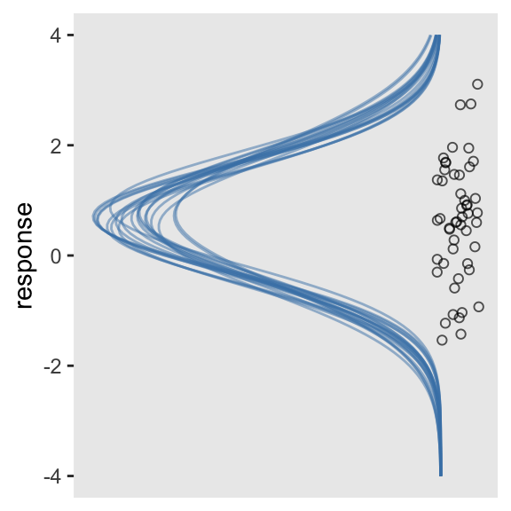
Boom. It won’t always be this easy, though.
Multiple intercepts
Since the response values are from a combination of five condition groups, we can fit a multilevel model to compute both the grand mean and the group-level deviations from the grand mean.
fit2 <-
  brm(data = abc,
      response ~ 1 + (1 | condition),
      prior = c(prior(normal(0, 1), class = Intercept),
                prior(student_t(3, 0, 1), class = sigma),
                prior(student_t(3, 0, 1), class = sd)),
      cores = 4)
“Wait. Whoa. I’m so confused”—you say. “What’s a multilevel model, again?” Read this book, or this book; start here on this lecture series; or even check out my ebook, starting with Chapter 12.
Once again, extract the posterior draws and save them as a data frame, draws.
draws <- as_draws_df(fit2)

str(draws)
## draws_df [4,000 × 13] (S3: draws_df/draws/tbl_df/tbl/data.frame)
##  $ b_Intercept             : num [1:4000] 0.731 0.719 0.549 0.54 0.689 ...
##  $ sd_condition__Intercept : num [1:4000] 0.624 0.584 0.568 0.774 0.64 ...
##  $ sigma                   : num [1:4000] 0.582 0.656 0.55 0.582 0.535 ...
##  $ r_condition[a,Intercept]: num [1:4000] -0.6218 -0.3214 -0.3521 0.0315 -0.4176 ...
##  $ r_condition[b,Intercept]: num [1:4000] 0.3694 -0.0787 0.3863 0.3223 0.2087 ...
##  $ r_condition[c,Intercept]: num [1:4000] 0.624 1.011 1.001 1.304 1.139 ...
##  $ r_condition[d,Intercept]: num [1:4000] 0.282 0.102 0.491 0.647 0.469 ...
##  $ r_condition[e,Intercept]: num [1:4000] -1.54 -1.13 -1.3 -1.66 -1.51 ...
##  $ lprior                  : num [1:4000] -2.26 -2.28 -2.08 -2.26 -2.21 ...
##  $ lp__                    : num [1:4000] -55.4 -58 -53.6 -54.1 -52 ...
##  $ .chain                  : int [1:4000] 1 1 1 1 1 1 1 1 1 1 ...
##  $ .iteration              : int [1:4000] 1 2 3 4 5 6 7 8 9 10 ...
##  $ .draw                   : int [1:4000] 1 2 3 4 5 6 7 8 9 10 ...
This is where our task becomes difficult. Now each level of condition has its own mean estimate, which is a combination of the grand mean b_Intercept and the group-specific deviation, r_condition[a,Intercept] through r_condition[e,Intercept]. If all we wanted to do was show the model-implied Gaussians for, say, condition == a, we can extend our last approach by first making a new column in draws.
# first wrangle the draws data frame
draws <- draws %>%
mutate(a = b_Intercept + `r_condition[a,Intercept]`)
tibble(response = c(-4, 4)) %>%
ggplot(aes(x = response)) +
mapply(function(mean, sd) {
stat_function(fun = dnorm,
args = list(mean = mean, sd = sd),
alpha = 1/2,
color = "steelblue")
},
# pull a instead of the intercept
mean = draws %>% slice(1:n_iter) %>% pull(a),
sd = draws %>% slice(1:n_iter) %>% pull(sigma)
) +
# subset the abc data
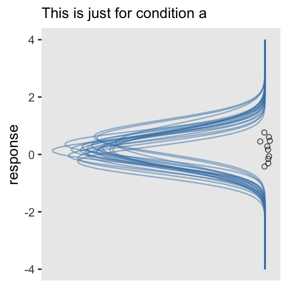
geom_jitter(data = abc %>% filter(condition == "a"), aes(y = 0),
height = .025, shape = 1, alpha = 2/3) +
scale_y_reverse(NULL, breaks = NULL) +
coord_flip() +
labs(subtitle = "This is just for condition a")
This approach is simple enough. However, it’s more of a pickle if we want multiple densities stacked atop/next to one another within the same plot.
Unfortunately, we can’t extend our mapply(stat_function()) method to simultaneously show all the group-level estimates–at least not that I’m aware. But there are other ways. We’ll need a little help from tidybayes::spread_draws(), about which you can learn more
here.
library(tidybayes)

sd <-
  fit2 %>%
  spread_draws(b_Intercept, sigma, r_condition[condition,]) %>%
  ungroup()

head(sd)
## # A tibble: 6 × 7
##   .chain .iteration .draw b_Intercept sigma condition r_condition
##    <int>      <int> <int>       <dbl> <dbl> <chr>           <dbl>
## 1      1          1     1       0.731 0.582 a              -0.622
## 2      1          1     1       0.731 0.582 b               0.369
## 3      1          1     1       0.731 0.582 c               0.624
## 4      1          1     1       0.731 0.582 d               0.282
## 5      1          1     1       0.731 0.582 e              -1.54
## 6      1          2     2       0.719 0.656 a              -0.321
In our sp
tibble, we have much of the same information we’d get from brms::posterior_samples(), but in the long format with respect to the random effects for condition. Also notice that each row is indexed by the chain, iteration, and draw number. Among those, .draw is the column that corresponds to a unique row like what we’d get from brms::posterior_samples(). This is the index that ranges from 1 to the number of chains multiplied by the number of post-warmup iterations (i.e., default 4000 in our case).
But we need to wrangle a bit. Within the expand() function, we’ll select the columns we’d like to keep within the nesting() function and then expand the tibble by adding a sequence of response values ranging from -4 to 4, for each. This sets us up to use the dnorm() function in the next line to compute the density for each of those response values based on 20 unique normal distributions for each of the five condition groups. “Why 20?” Because we need some reasonably small number and 20’s the one Kruschke tended to use in his text and because, well, we set filter(.draw < 21). But choose whatever number you like.
The difficulty, however, is that all of these densities will have a minimum value of around 0 and all will be on the same basic scale. So we need a way to serially shift the density values up the y-axis in such a way that they’ll be sensibly separated by group. As far as I can figure, this’ll take us a couple steps. For the first step, we’ll create an intermediary variable, g, with which we’ll arbitrarily assign each of our five groups an integer index ranging from 0 to 4.
The second step is tricky. There we use our g integers to sequentially shift the density values up. Since our g value for a == 0, those we’ll keep 0 as their baseline. As our g value for b == 1, the baseline for those will now increase by 1. And so on for the other groups. But we still need to do a little more fiddling. What we want is for the maximum values of the density estimates to be a little lower than the baselines of the ones one grouping variable up. That is, we want the maximum values for the a densities to fall a little bit below 1 on the y-axis. It’s with the * .75 / max(density) part of the code that we accomplish that task. If you want to experiment with more or less room between the top and bottom of each density, play around with increasing/decreasing that .75 value.
sd <-
  sd %>%
  filter(.draw < 21) %>%
  expand(nesting(.draw, b_Intercept, sigma, condition, r_condition),
         response = seq(from = -4, to = 4, length.out = 200)) %>%
  mutate(density = dnorm(response, mean = b_Intercept + r_condition, sd = sigma),
         g       = recode(condition,
                          a = 0,
                          b = 1,
                          c = 2,
                          d = 3,
                          e = 4)) %>%
  mutate(density = g + density * .75 / max(density))

glimpse(sd)
## Rows: 20,000
## Columns: 8
## $ .draw       <int> 1, 1, 1, 1, 1, 1, 1, 1, 1, 1, 1, 1, 1, 1, 1, 1, 1, 1, 1, 1, 1, 1, 1, 1, 1, 1, …
## $ b_Intercept <dbl> 0.7308423, 0.7308423, 0.7308423, 0.7308423, 0.7308423, 0.7308423, 0.7308423, 0…
## $ sigma       <dbl> 0.581617, 0.581617, 0.581617, 0.581617, 0.581617, 0.581617, 0.581617, 0.581617…
## $ condition   <chr> "a", "a", "a", "a", "a", "a", "a", "a", "a", "a", "a", "a", "a", "a", "a", "a"…
## $ r_condition <dbl> -0.6217708, -0.6217708, -0.6217708, -0.6217708, -0.6217708, -0.6217708, -0.621…
## $ response    <dbl> -4.000000, -3.959799, -3.919598, -3.879397, -3.839196, -3.798995, -3.758794, -…
## $ density     <dbl> 8.602216e-12, 1.398455e-11, 2.262622e-11, 3.643347e-11, 5.838674e-11, 9.312218…
## $ g           <dbl> 0, 0, 0, 0, 0, 0, 0, 0, 0, 0, 0, 0, 0, 0, 0, 0, 0, 0, 0, 0, 0, 0, 0, 0, 0, 0, …
Since we’ll now be using the same axis for both the densities and the five condition groups, we’ll need to add a density column to our abc data.
abc <-
  abc %>%
  mutate(density = recode(condition,
                          a = 0,
                          b = 1,
                          c = 2,
                          d = 3,
                          e = 4))
Time to plot.
sd %>%
  ggplot(aes(x = response, y = density)) +
  # here we make our density lines
  geom_line(aes(group = interaction(.draw, g)),
            alpha = 1/2, linewidth = 1/3, color = "steelblue") +
  # use the original data for the jittered points
  geom_jitter(data = abc,
              height = .05, shape = 1, alpha = 2/3) +
  scale_y_continuous("condition",
                     breaks = 0:4,
                     labels = letters[1:5])
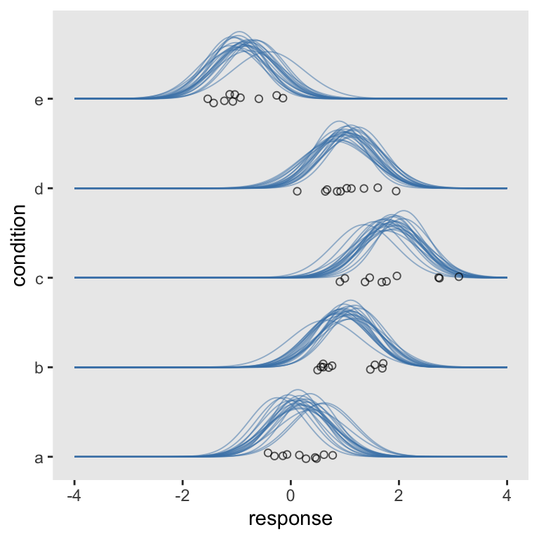
Now we’re rolling. Let’s make a cosmetic adjustment. Recall that the full range of the normal distribution spans from \(-\infty\) to \(\infty\). At a certain point, it’s just not informative to show the left and right tails. If you look back up at our motivating example, you’ll note Kruschke’s densities stopped well before trailing off into the tails. If you look closely to the code from his text, you’ll see he’s just showing the inner 95-percentile range for each. To follow suit, we can compute those ranges with qnorm().
sd <-
  sd %>%
  mutate(ll = qnorm(.025, mean = b_Intercept + r_condition, sd = sigma),
         ul = qnorm(.975, mean = b_Intercept + r_condition, sd = sigma))
Now we have our lower- and upper-level points for each iteration, we can limit the ranges of our Gaussians with filter().
sd %>%
  filter(response > ll,
         response < ul) %>%

  ggplot(aes(x = response, y = density)) +
  geom_line(aes(group = interaction(.draw, g)),
            alpha = 1/2, linewidth = 1/3, color = "steelblue") +
  geom_jitter(data = abc,
              height = .05, shape = 1, alpha = 2/3) +
  scale_y_continuous("condition",
                     breaks = 0:4,
                     labels = letters[1:5])
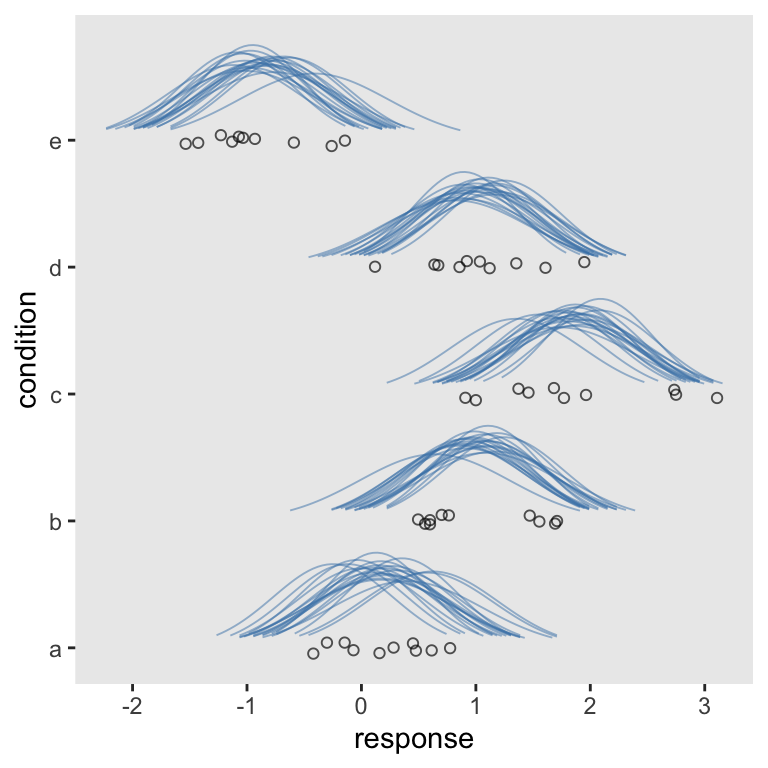
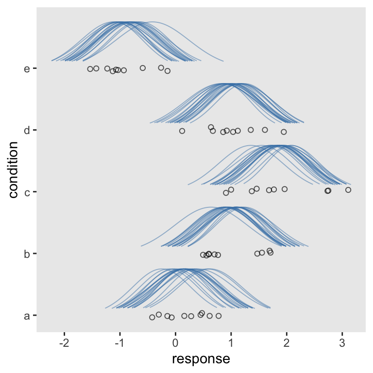
Oh man, just look how sweet that is. Although I prefer our current method, another difference between it and Kruschke’s example is all of his densities are the same relative height. In all our plots so far, though, the densities differ by their heights. We’ll need a slight adjustment in our sd workflow for that. All we need to do is insert a group_by() statement between the two mutate() lines.
sd <-
  sd %>%
  mutate(density = dnorm(response, mean = b_Intercept + r_condition, sd = sigma),
         g       = recode(condition,
                          a = 0,
                          b = 1,
                          c = 2,
                          d = 3,
                          e = 4)) %>%
  # here's the new line
  group_by(.draw) %>%
  mutate(density = g + density * .75 / max(density))

# now plot
sd %>%
  filter(response > ll,
         response < ul) %>%
  ggplot(aes(x = response, y = density)) +
  geom_line(aes(group = interaction(.draw, g)),
            alpha = 1/2, linewidth = 1/3, color = "steelblue") +
  geom_jitter(data = abc,
              height = .05, shape = 1, alpha = 2/3) +
  scale_y_continuous("condition",
                     breaks = 0:4,
                     labels = letters[1:5])
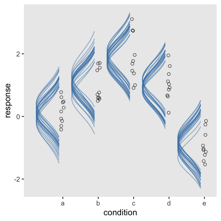
Nice. “But wait!”, you say. “We wanted our Gaussians to be on their sides.” We can do that in at least two ways. At this point, the quickest way is to use our scale_y_reverse() + coord_flip() combo from before.
sd %>%
  filter(response > ll,
         response < ul) %>%

  ggplot(aes(x = response, y = density)) +
  geom_line(aes(group = interaction(.draw, g)),
            alpha = 1/2, linewidth = 1/3, color = "steelblue") +
  geom_jitter(data = abc,
              height = .05, shape = 1, alpha = 2/3) +
  scale_y_reverse("condition",
                  breaks = 0:4,
                  labels = letters[1:5]) +
  coord_flip()
Another way to get those sideways Gaussians is to alter our sd data workflow. The main difference is this time we change the original mutate(density = g + density * .75 / max(density)) line to mutate(density = g - density * .75 / max(density)). In case you missed it, the only difference is we changed the + to a -.
sd <-
  sd %>%
  # step one: starting fresh
  mutate(density = dnorm(response, mean = b_Intercept + r_condition, sd = sigma)) %>%
  group_by(.draw) %>%
  # step two: now SUBTRACTING density from g within the equation
  mutate(density = g - density * .75 / max(density))
Now in our global aes() statement in the plot, we put density on the x and response on the y. We need to take a few other subtle steps:
- Switch out
geom_line()forgeom_path()(see here). - Drop the
heightargument withingeom_jitter()forwidth. - Switch out
scale_y_continuous()forscale_x_continuous().
Though totally not necessary, we’ll add a little something extra by coloring the Gaussians by their means.
sd %>%
  filter(response > ll,
         response < ul) %>%

  ggplot(aes(x = density, y = response)) +
  geom_path(aes(group = interaction(.draw, g),
                color = b_Intercept + r_condition),
            alpha = 1/2, linewidth = 1/3, show.legend = F) +
  geom_jitter(data = abc,
              width = .05, shape = 1, alpha = 2/3) +
  scale_x_continuous("condition",
                     breaks = 0:4,
                     labels = letters[1:5]) +
  scale_color_viridis_c(option = "A", end = .92)
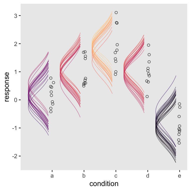
There you have it–Kruschke-style sideways Gaussians for your model plots.
Afterward
After releasing the initial version of this post, some of us had a lively twitter discussion on how to improve the code.
New blog up. If you’re a Bayesian model visualization geek, this one’s for you. https://t.co/PoJhow11nc #brms #tidyverse #rstats
— Solomon Kurz (@SolomonKurz) December 21, 2018
Part of that discussion had to do with the possibility of using functions from Claus Wilke’s great ggridges package. After some great efforts, especially from Matthew Kay, we came up with solutions. In this section, we’ll cover them in some detail.
First, here’s a more compact way to prepare the data for the plot.
abc %>%
  distinct(condition) %>%
  add_fitted_draws(fit2, n = 20, dpar = c("mu", "sigma")) %>%
  mutate(lower    = qnorm(.025, mean = mu, sd = sigma),
         upper    = qnorm(.975, mean = mu, sd = sigma)) %>%
  mutate(response = map2(lower, upper, seq, length.out = 200)) %>%
  mutate(density  = pmap(list(response, mu, sigma), dnorm)) %>%
  unnest(response, density) %>%
  group_by(.draw) %>%
  mutate(density  = density * .75 / max(density)) %>%

  glimpse()
## Rows: 20,000
## Columns: 12
## Groups: .draw [20]
## $ condition  <chr> "a", "a", "a", "a", "a", "a", "a", "a", "a", "a", "a", "a", "a", "a", "a", "a",…
## $ .row       <int> 1, 1, 1, 1, 1, 1, 1, 1, 1, 1, 1, 1, 1, 1, 1, 1, 1, 1, 1, 1, 1, 1, 1, 1, 1, 1, 1…
## $ .chain     <int> NA, NA, NA, NA, NA, NA, NA, NA, NA, NA, NA, NA, NA, NA, NA, NA, NA, NA, NA, NA,…
## $ .iteration <int> NA, NA, NA, NA, NA, NA, NA, NA, NA, NA, NA, NA, NA, NA, NA, NA, NA, NA, NA, NA,…
## $ .draw      <int> 1, 1, 1, 1, 1, 1, 1, 1, 1, 1, 1, 1, 1, 1, 1, 1, 1, 1, 1, 1, 1, 1, 1, 1, 1, 1, 1…
## $ .value     <dbl> 0.313783, 0.313783, 0.313783, 0.313783, 0.313783, 0.313783, 0.313783, 0.313783,…
## $ mu         <dbl> 0.313783, 0.313783, 0.313783, 0.313783, 0.313783, 0.313783, 0.313783, 0.313783,…
## $ sigma      <dbl> 0.507755, 0.507755, 0.507755, 0.507755, 0.507755, 0.507755, 0.507755, 0.507755,…
## $ lower      <dbl> -0.6813985, -0.6813985, -0.6813985, -0.6813985, -0.6813985, -0.6813985, -0.6813…
## $ upper      <dbl> 1.308964, 1.308964, 1.308964, 1.308964, 1.308964, 1.308964, 1.308964, 1.308964,…
## $ response   <dbl> -0.6813985, -0.6713966, -0.6613948, -0.6513930, -0.6413912, -0.6313893, -0.6213…
## $ density    <dbl> 0.1098804, 0.1141834, 0.1186089, 0.1231581, 0.1278322, 0.1326322, 0.1375591, 0.…
This could use some walking out. With the first two lines, we made a \(5 \times 1\) tibble containing the five levels of condition, a through f. The add_fitted_draws() function comes from tidybayes. The first argument took our brms model fit, fit2. With the n argument, we indicated we just wanted 20 draws. With dpar, we requested distributional regression parameters in the output. In our case, those were the \(\mu\) and \(\sigma\) values for each level of condition. Here’s what that looks like.
abc %>%
  distinct(condition) %>%
  add_fitted_draws(fit2, n = 20, dpar = c("mu", "sigma")) %>%

  head()
## # A tibble: 6 × 8
## # Groups:   condition, .row [1]
##   condition  .row .chain .iteration .draw   .value       mu sigma
##   <chr>     <int>  <int>      <int> <int>    <dbl>    <dbl> <dbl>
## 1 a             1     NA         NA     1 -0.0532  -0.0532  0.441
## 2 a             1     NA         NA     2  0.0360   0.0360  0.512
## 3 a             1     NA         NA     3  0.478    0.478   0.615
## 4 a             1     NA         NA     4 -0.00762 -0.00762 0.639
## 5 a             1     NA         NA     5  0.113    0.113   0.495
## 6 a             1     NA         NA     6 -0.0851  -0.0851  0.570
Next, we established the lower- and upper-bounds bounds for the density lines, which were 95% intervals in this example. Within the second mutate() function, we used the
purrr::map2() function to feed those two values into the first two arguments of the seq() function. Those arguments, recall, are from and to. We then hard coded 200 into the length.out argument. As a result, we turned our regular old tibble into a
nested tibble. In each row of our new response column, we now have a \(200 \times 1\) data frame containing the seq() output. If you’re new to nested data structures, I recommend checking out Hadley Wickham’s
Managing many models with R.
abc %>%
  distinct(condition) %>%
  add_fitted_draws(fit2, n = 20, dpar = c("mu", "sigma")) %>%
  mutate(lower    = qnorm(.025, mean = mu, sd = sigma),
         upper    = qnorm(.975, mean = mu, sd = sigma)) %>%
  mutate(response = map2(lower, upper, seq, length.out = 200)) %>%

  head()
## # A tibble: 6 × 11
## # Groups:   condition, .row [1]
##   condition  .row .chain .iteration .draw  .value      mu sigma  lower upper response
##   <chr>     <int>  <int>      <int> <int>   <dbl>   <dbl> <dbl>  <dbl> <dbl> <list>
## 1 a             1     NA         NA     1  0.586   0.586  0.534 -0.460  1.63 <dbl [200]>
## 2 a             1     NA         NA     2  0.0225  0.0225 0.535 -1.03   1.07 <dbl [200]>
## 3 a             1     NA         NA     3  0.0936  0.0936 0.483 -0.854  1.04 <dbl [200]>
## 4 a             1     NA         NA     4 -0.0846 -0.0846 0.560 -1.18   1.01 <dbl [200]>
## 5 a             1     NA         NA     5  0.170   0.170  0.500 -0.809  1.15 <dbl [200]>
## 6 a             1     NA         NA     6  0.551   0.551  0.639 -0.702  1.80 <dbl [200]>
Much as the purrr::map2() function allowed us to iterate over two arguments, the purrr::pmap() function will allow us to iterate over an arbitrary number of arguments. In the case of our third mutate() function, we’ll iterate over the first three arguments of the dnorm() function. In case you forgot, those arguments are x, mean, and sd, respectively. Within our list(), we indicated we wanted to insert into them the response, mu, and sigma values. This returns the desired density values. Since our map2() and pmap() operations returned a nested tibble, we then followed them up with the unnest() function to make it easier to access the results.
Before unnesting, our nested tibble had 100 observations. After unnest(), we converted it to the long format, resulting in \(100 \times 200 = 20,000\) observations.
abc %>%
  distinct(condition) %>%
  add_fitted_draws(fit2, n = 20, dpar = c("mu", "sigma")) %>%
  mutate(lower    = qnorm(.025, mean = mu, sd = sigma),
         upper    = qnorm(.975, mean = mu, sd = sigma)) %>%
  mutate(response = map2(lower, upper, seq, length.out = 200)) %>%
  mutate(density  = pmap(list(response, mu, sigma), dnorm)) %>%
  unnest(response, density) %>%

  glimpse()
## Rows: 20,000
## Columns: 12
## Groups: condition, .row [5]
## $ condition  <chr> "a", "a", "a", "a", "a", "a", "a", "a", "a", "a", "a", "a", "a", "a", "a", "a",…
## $ .row       <int> 1, 1, 1, 1, 1, 1, 1, 1, 1, 1, 1, 1, 1, 1, 1, 1, 1, 1, 1, 1, 1, 1, 1, 1, 1, 1, 1…
## $ .chain     <int> NA, NA, NA, NA, NA, NA, NA, NA, NA, NA, NA, NA, NA, NA, NA, NA, NA, NA, NA, NA,…
## $ .iteration <int> NA, NA, NA, NA, NA, NA, NA, NA, NA, NA, NA, NA, NA, NA, NA, NA, NA, NA, NA, NA,…
## $ .draw      <int> 1, 1, 1, 1, 1, 1, 1, 1, 1, 1, 1, 1, 1, 1, 1, 1, 1, 1, 1, 1, 1, 1, 1, 1, 1, 1, 1…
## $ .value     <dbl> 0.03797719, 0.03797719, 0.03797719, 0.03797719, 0.03797719, 0.03797719, 0.03797…
## $ mu         <dbl> 0.03797719, 0.03797719, 0.03797719, 0.03797719, 0.03797719, 0.03797719, 0.03797…
## $ sigma      <dbl> 0.5197353, 0.5197353, 0.5197353, 0.5197353, 0.5197353, 0.5197353, 0.5197353, 0.…
## $ lower      <dbl> -0.9806853, -0.9806853, -0.9806853, -0.9806853, -0.9806853, -0.9806853, -0.9806…
## $ upper      <dbl> 1.05664, 1.05664, 1.05664, 1.05664, 1.05664, 1.05664, 1.05664, 1.05664, 1.05664…
## $ response   <dbl> -0.9806853, -0.9704475, -0.9602096, -0.9499718, -0.9397340, -0.9294962, -0.9192…
## $ density    <dbl> 0.1124516, 0.1168553, 0.1213844, 0.1260401, 0.1308235, 0.1357359, 0.1407780, 0.…
Hopefully, our last two lines look familiar. We group_by(.draw) just like in previous examples. However, our final mutate() line is a little simpler than in previous versions. Before we had to make that intermediary variable, g. Because we intend to plot these data with help from ggridges, we no longer have need for g. You’ll see. But the upshot is the only reason we’re adding this last mutate() line is to scale all the Gaussians to have the same maximum height the way Kruschke did.
afd <-
  abc %>%
  distinct(condition) %>%
  add_fitted_draws(fit2, n = 20, dpar = c("mu", "sigma")) %>%
  mutate(lower    = qnorm(.025, mean = mu, sd = sigma),
         upper    = qnorm(.975, mean = mu, sd = sigma)) %>%
  mutate(response = map2(lower, upper, seq, length.out = 200)) %>%
  mutate(density  = pmap(list(response, mu, sigma), dnorm)) %>%
  unnest(response, density) %>%
  group_by(.draw) %>%
  mutate(density  = density * .75 / max(density))

glimpse(afd)
## Rows: 20,000
## Columns: 12
## Groups: .draw [20]
## $ condition  <chr> "a", "a", "a", "a", "a", "a", "a", "a", "a", "a", "a", "a", "a", "a", "a", "a",…
## $ .row       <int> 1, 1, 1, 1, 1, 1, 1, 1, 1, 1, 1, 1, 1, 1, 1, 1, 1, 1, 1, 1, 1, 1, 1, 1, 1, 1, 1…
## $ .chain     <int> NA, NA, NA, NA, NA, NA, NA, NA, NA, NA, NA, NA, NA, NA, NA, NA, NA, NA, NA, NA,…
## $ .iteration <int> NA, NA, NA, NA, NA, NA, NA, NA, NA, NA, NA, NA, NA, NA, NA, NA, NA, NA, NA, NA,…
## $ .draw      <int> 1, 1, 1, 1, 1, 1, 1, 1, 1, 1, 1, 1, 1, 1, 1, 1, 1, 1, 1, 1, 1, 1, 1, 1, 1, 1, 1…
## $ .value     <dbl> 0.02586513, 0.02586513, 0.02586513, 0.02586513, 0.02586513, 0.02586513, 0.02586…
## $ mu         <dbl> 0.02586513, 0.02586513, 0.02586513, 0.02586513, 0.02586513, 0.02586513, 0.02586…
## $ sigma      <dbl> 0.6035545, 0.6035545, 0.6035545, 0.6035545, 0.6035545, 0.6035545, 0.6035545, 0.…
## $ lower      <dbl> -1.15708, -1.15708, -1.15708, -1.15708, -1.15708, -1.15708, -1.15708, -1.15708,…
## $ upper      <dbl> 1.20881, 1.20881, 1.20881, 1.20881, 1.20881, 1.20881, 1.20881, 1.20881, 1.20881…
## $ response   <dbl> -1.1570799, -1.1451910, -1.1333021, -1.1214132, -1.1095243, -1.0976354, -1.0857…
## $ density    <dbl> 0.1098804, 0.1141834, 0.1186089, 0.1231581, 0.1278322, 0.1326322, 0.1375591, 0.…
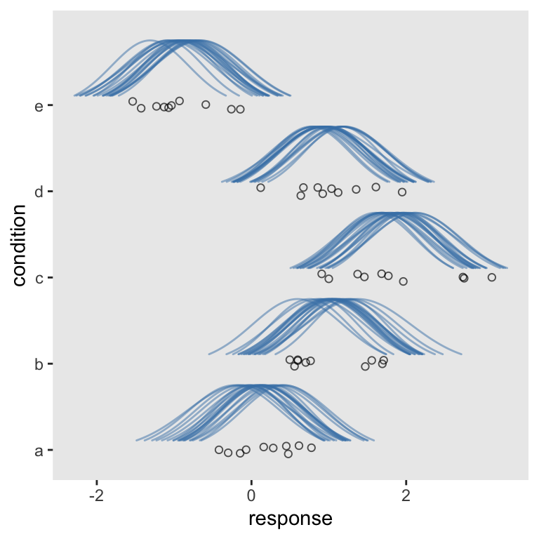
Let’s open ggridges
library(ggridges)
Note how contrary to before, we set the global y axis to our condition grouping variable. It’s within the geom_ridgeline() function that we now specify height = density. Other than that, the main thing to point out is you might want to adjust the ylim parameters. Otherwise the margins aren’t the best.
afd %>%

  ggplot(aes(x = response, y = condition)) +
  geom_ridgeline(aes(height = density, group = interaction(condition, .draw)),
                 fill = NA, size = 1/3, color = adjustcolor("steelblue", alpha.f = 1/2)) +
  geom_jitter(data = abc,
              height = .05, shape = 1, alpha = 2/3) +
  coord_cartesian(ylim = c(1.25, 5.5))
## Warning in geom_ridgeline(aes(height = density, group = interaction(condition, : Ignoring unknown
## parameters: `size`
“But I wanted my Gaussians tipped to the left!”, you say. Yep, we can do that, too. Three things: First, we’ll want to adjust the height parameter to -density. We want our Gaussians to extend under their baselines. Along with that, we need to include min_height = NA. Finally, we’ll switch out coord_cartesian() for good old coord_flip(). And you can adjust your ylim parameters as desired.
afd %>%

  ggplot(aes(x = response, y = condition)) +
  geom_ridgeline(aes(height = -density, group = interaction(condition, .draw)),
                 fill = NA, size = 1/3, color = adjustcolor("steelblue", alpha.f = 1/2),
                 min_height = NA) +
  geom_jitter(data = abc,
              height = .05, shape = 1, alpha = 2/3) +
  coord_flip(ylim = c(0.5, 4.75))
## Warning in geom_ridgeline(aes(height = -density, group = interaction(condition, : Ignoring unknown
## parameters: `size`
I think it’s important to note that I’ve never met any of the people who helped me with this project. Academic twitter, man–it’s a good place to be.
Session info
sessionInfo()
## R version 4.4.2 (2024-10-31)
## Platform: aarch64-apple-darwin20
## Running under: macOS Ventura 13.4
##
## Matrix products: default
## BLAS:   /Library/Frameworks/R.framework/Versions/4.4-arm64/Resources/lib/libRblas.0.dylib
## LAPACK: /Library/Frameworks/R.framework/Versions/4.4-arm64/Resources/lib/libRlapack.dylib;  LAPACK version 3.12.0
##
## locale:
## [1] en_US.UTF-8/en_US.UTF-8/en_US.UTF-8/C/en_US.UTF-8/en_US.UTF-8
##
## time zone: America/Chicago
## tzcode source: internal
##
## attached base packages:
## [1] stats     graphics  grDevices utils     datasets  methods   base
##
## other attached packages:
##  [1] ggridges_0.5.6  tidybayes_3.0.7 brms_2.22.0     Rcpp_1.0.13-1   lubridate_1.9.3 forcats_1.0.0
##  [7] stringr_1.5.1   dplyr_1.1.4     purrr_1.0.2     readr_2.1.5     tidyr_1.3.1     tibble_3.2.1
## [13] ggplot2_3.5.1   tidyverse_2.0.0
##
## loaded via a namespace (and not attached):
##  [1] svUnit_1.0.6         tidyselect_1.2.1     viridisLite_0.4.2    farver_2.1.2
##  [5] loo_2.8.0            fastmap_1.1.1        TH.data_1.1-2        tensorA_0.36.2.1
##  [9] blogdown_1.20        digest_0.6.37        estimability_1.5.1   timechange_0.3.0
## [13] lifecycle_1.0.4      StanHeaders_2.32.10  survival_3.7-0       magrittr_2.0.3
## [17] posterior_1.6.0      compiler_4.4.2       rlang_1.1.4          sass_0.4.9
## [21] tools_4.4.2          utf8_1.2.4           yaml_2.3.8           knitr_1.49
## [25] labeling_0.4.3       bridgesampling_1.1-2 pkgbuild_1.4.4       curl_6.0.1
## [29] multcomp_1.4-26      abind_1.4-8          withr_3.0.2          grid_4.4.2
## [33] stats4_4.4.2         xtable_1.8-4         colorspace_2.1-1     inline_0.3.19
## [37] emmeans_1.10.3       scales_1.3.0         MASS_7.3-61          cli_3.6.3
## [41] mvtnorm_1.2-5        rmarkdown_2.29       generics_0.1.3       RcppParallel_5.1.7
## [45] rstudioapi_0.16.0    tzdb_0.4.0           cachem_1.0.8         rstan_2.32.6
## [49] splines_4.4.2        bayesplot_1.11.1     parallel_4.4.2       matrixStats_1.4.1
## [53] vctrs_0.6.5          V8_4.4.2             Matrix_1.7-1         sandwich_3.1-1
## [57] jsonlite_1.8.9       bookdown_0.40        arrayhelpers_1.1-0   hms_1.1.3
## [61] ggdist_3.3.2         jquerylib_0.1.4      glue_1.8.0           codetools_0.2-20
## [65] distributional_0.5.0 stringi_1.8.4        gtable_0.3.6         QuickJSR_1.1.3
## [69] munsell_0.5.1        pillar_1.10.1        htmltools_0.5.8.1    Brobdingnag_1.2-9
## [73] R6_2.5.1             evaluate_1.0.1       lattice_0.22-6       backports_1.5.0
## [77] bslib_0.7.0          rstantools_2.4.0     coda_0.19-4.1        gridExtra_2.3
## [81] nlme_3.1-166         checkmate_2.3.2      xfun_0.49            zoo_1.8-12
## [85] pkgconfig_2.0.3
- Posted on:
- December 20, 2018
- Length:
- 25 minute read, 5213 words