Matching, missing data, a quasi-experiment, and causal inference--Oh my!
By A. Solomon Kurz
February 2, 2025
Context
I have a project for work where the goal is to compare two non-randomized groups. One group received an experimental intervention, and we’d like to compare those folks to their peers who were not offered that same intervention. We have easy access to data from folks from the broader population during the same time period, so the goal isn’t so bad as far as quasi-experiments go.1 The team would like to improve the comparisons by using matching, and we have some missing data issues in the matching covariate set. I haven’t done an analysis quite like this before, so this post is a walk-through of the basic statistical procedure as I see it.
You are welcome to give feedback in the comments section.
I make assumptions.
For this post, I’m presuming readers have a passing familiarity with the following:
Regression.
You’ll want to be familiar with single-level regression, from the perspective of the generalized linear model. For frequentist resources, I recommend the texts by Ismay & Kim ( 2022) and Roback & Legler ( 2021). For the Bayesians in the room, I recommend the texts by Gelman and colleagues ( 2020), Kruschke ( 2015), or McElreath ( 2015, 2020). In this post, we’ll mainly rely on the frequentist paradigm.
Missing data.
You should be familiar with contemporary missing data theory, particularly multiple imputation (MI). You can find brief overviews in the texts by McElreath and Gelman et al, above. For a deeper dive, I recommend Enders ( 2022), Little & Rubin ( 2019), or van Buuren ( 2018). I will walk through the imputation steps in some detail, but this will not be a full-blown MI tutorial.
Experimental design.
I’m assuming readers have a basic background in experimental design. At a minimum, you’ll want to have a sense of why it’s harder to make comparisons between non-randomized groups than it is between those formed by random assignment. If these ideas are new, I recommend Shadish et al. ( 2002) or Kazdin ( 2017). You might also check out Taback ( 2022), and its free companion website at https://designexptr.org/index.html.
Matching for causal inference.
Of the various skills required for these analysis, causal inference with matching is the new part for me, which means I’ll walk through those parts of the analysis with more attention to detail and pedagogy than others. For the basic matching workflow, I’ll be relying heavily on the documentation for the MatchIt ( Ho et al., 2011) and MatchThem ( Pishgar et al., 2021) packages. I also found the papers by Stuart ( 2010) and Greifer & Stuart ( 2021b) were helpful introductions to the paradigm. For general introductions to causal inference, consider texts like Brumback ( 2022), Cunningham ( 2021), Hernán & Robins ( 2020), or Imbens & Rubin ( 2015).
R.
All code will be in R ( R Core Team, 2022). Data wrangling and plotting will rely heavily on the tidyverse ( Wickham et al., 2019; Wickham, 2022). We multiply impute the missing values with the mice package ( van Buuren & Groothuis-Oudshoorn, 2011, 2021). The MI data sets are matched with propensity scores with the MatchThem package, and we assess matching balance with functions from cobalt ( Greifer, 2024). Finally, we compute the causal estimand itself with help from marginaleffects ( Arel-Bundock, 2023).
Load the packages.
# Load
library(tidyverse)
library(mice)
library(MatchThem)
library(cobalt)
library(marginaleffects)

# Remove ggplot gridlines
theme_set(
  theme_gray() +
    theme(panel.grid = element_blank())
  )
We need data.
The structure of our workflow will largely follow the extend example from Pishgar et al. (
2021). As did they, here we load the osteoarthritis data. If you’d like to dive deeply into the data documentation, execute ?osteoarthritis in your console.
data("osteoarthritis")

# What?
glimpse(osteoarthritis)
## Rows: 2,585
## Columns: 7
## $ AGE <int> 69, 71, 72, 75, 72, 61, 76, 79, 68, 77, 77, 63, 64, 64, 72, 62, 70…
## $ SEX <fct> 1, 2, 2, 2, 1, 1, 1, 1, 1, 2, 2, 2, 1, 1, 1, 2, 2, 1, 1, 2, 1, 2, …
## $ BMI <dbl> 29.8, 22.7, 30.7, 23.5, 25.9, 36.5, 25.1, 31.8, 27.4, 32.0, 22.9, …
## $ RAC <fct> 1, 1, 1, 1, 1, 2, 1, 1, 1, 1, 1, 1, 2, 1, 1, 1, 1, 1, 2, 1, 1, 2, …
## $ SMK <fct> 1, 1, 0, 0, 0, 1, 1, 0, 1, 0, 1, 1, 1, 1, 1, 1, 0, 1, 1, 1, 1, 0, …
## $ OSP <fct> 0, 1, 1, 0, 0, 0, 0, 0, 0, 1, 1, 1, 0, 0, 0, 0, 0, 0, 0, 1, 0, 0, …
## $ KOA <fct> 1, 0, 0, 0, 1, 1, 0, 1, 1, NA, 1, 0, 0, 0, 0, 0, 1, 0, 0, NA, 0, 1…
Here we make a few adjustments to the data. First, I generally prefer the tidyverse style of lower-case variable names (see
Wickham, 2020). Second, I generally like my lower-case names to use whole words such as race, rather than abbreviations like rac. Third, I prefer my 2-level nominal variables in a dummy-code format. Here we make those changes and save the results as d.
d <- osteoarthritis |>
  rename_all(.funs = str_to_lower) |>
  rename(male = sex,
         race = rac,
         smoker = smk) |>
  mutate(male   = as.integer(male)   - 1,
         smoker = as.integer(smoker) - 1,
         koa    = as.integer(koa)    - 1)

# What?
head(d)
##   age male  bmi race smoker osp koa
## 2  69    0 29.8    1      1   0   1
## 3  71    1 22.7    1      1   1   0
## 5  72    1 30.7    1      0   1   0
## 6  75    1 23.5    1      0   0   0
## 8  72    0 25.9    1      0   0   1
## 9  61    0 36.5    2      1   0   1
As in Pishgar et al. (
2021), the criterion variable is knee osteoarthritis in the follow-up time period, koa. The focal treatment variable2 is osteoporosis at baseline, osp. The remaining variables are potential confounders. Thus the research question for this blog is: What is the causal effect of baseline osteoporosis status on follow-up knee osteoarthritis status? For my real-world use case, the research question is more like: What is the causal effect of our new treatment, relative to business as usual?
Missing data
When you have missing data, you might get a high-level summary of the missing data patterns with the md.pattern() function.
md.pattern(d)

##      age male osp bmi race smoker koa
## 2363   1    1   1   1    1      1   1   0
## 191    1    1   1   1    1      1   0   1
## 27     1    1   1   1    1      0   1   1
## 1      1    1   1   1    1      0   0   2
## 1      1    1   1   1    0      1   1   1
## 1      1    1   1   1    0      1   0   2
## 1      1    1   1   0    1      1   1   1
##        0    0   0   1    2     28 193 224
The top row indicates most cases (2,363 out of 2,585) had no missing data. Though we have no missingness in the focal exposure osp–arguably the most important variable from a missing data perspective–, we have missingness on the criterion koa and on some of the potential confounders. Importantly, some of these variables are categorical, which means multiple imputation is the go-to solution here. There has also been some discussion of how one might best handle missing data for matching methods in the methods literature, and it appears the methodologists have been recommending the MI approach in recent years (e.g.,
Leyrat et al., 2019;
Nguyen & Stuart, 2024;
Zhao et al., 2021).
Impute with mice()
We’ll start the imputation discussion with an initial default3 call to mice(), the primary function from the mice package, and we save the results as imputed.datasets.4
imputed.datasets <- mice(d, print = FALSE)
The default imputation method for mice() is generally predictive mean matching (execute imputed.datasets$method), which is attractive in how simple and general it is. If you’re not familiar with predictive mean matching, see
Section 3.4 in van Buuren (
2018) for an introduction. I believe there are some concerns predictive mean matching doesn’t work as well with smaller sample sizes, but I think the \(N = 2{,}585\) data set here is large enough to discard those worries. Note though, the mice() function used multinomial logistic regression (method = "polyreg") for the factor variable race, which I think is a great choice.
I might also explicitly mention that, yes, we are imputing the missing data for the criterion variable koa. Personally, I find this natural and sensible. But there has been some concern about imputing missing criterion values in some areas of the literature. If you share that concern, see the nice simulation study by Kontopantelis et al. (
2017). In short, it’s fine.
By default, all variables are used to predict the missingness of all other variables in a linear model (execute imputed.datasets$predictorMatrix). However, there is some concern in the RCT literature that such an imputation model may be inappropriate in that it would not be robust to possible treatment-by-covariate interactions, which could bias the results (
Sullivan et al., 2018;
Zhang et al., 2023).5 This leaves us with two basic solutions: expand the predictor matrix to include all possible osp-by-covariate interactions, or impute the data sets separately by the two levels of osp. With a small number of rows, the second option might be worrisome, but I think splitting the data set into \(n_{{\text{osp}} = 0} = 2{,}106\) and \(n_{{\text{osp}} = 1} = 479\) should be fine.6
Toward that end, we first make two new versions of the d data set. The new d0 subset only contains the cases for which osp == 0; the d1 subset only contains the remaining cases for which osp == 1.
d0 <- d |>
  filter(osp == 0)

d1 <- d |>
  filter(osp == 1)

# Sample sizes
nrow(d0)
## [1] 2106
nrow(d1)
## [1] 479
Now we make two new imputed.datasets objects, one for each of the new data subsets.
imputed.datasets0 <- mice(d0, print = FALSE)
imputed.datasets1 <- mice(d1, print = FALSE)
If you look at the new predictorMatrix for either, you’ll note that the osp column has changed to a vector of 0’s. As an example, here we look at the matrix for imputed.datasets0.
imputed.datasets0$predictorMatrix
##        age male bmi race smoker osp koa
## age      0    1   1    1      1   0   1
## male     1    0   1    1      1   0   1
## bmi      1    1   0    1      1   0   1
## race     1    1   1    0      1   0   1
## smoker   1    1   1    1      0   0   1
## osp      1    1   1    1      1   0   1
## koa      1    1   1    1      1   0   0
The mice() function noticed that osp was now a constant within each data subset, and it correctly removed that “variable” from the predictor matrix of the other variables. This is exactly what one would hope for, and it’s a testament to the foresight of the mice package team.
To combine the two imputed.datasets0 and imputed.datasets1 objects, you can use the rbind() function.
imputed.datasets <- rbind(imputed.datasets0, imputed.datasets1)

# What?
imputed.datasets |>
  str(max.level = 1, give.attr = FALSE)
## List of 22
##  $ data           :'data.frame':	2585 obs. of  7 variables:
##  $ imp            :List of 7
##  $ m              : num 5
##  $ where          : logi [1:2585, 1:7] FALSE FALSE FALSE FALSE FALSE FALSE ...
##  $ blocks         :List of 7
##  $ call           :List of 2
##  $ nmis           : Named int [1:7] 0 0 1 2 28 0 193
##  $ method         : Named chr [1:7] "" "" "pmm" "polyreg" ...
##  $ predictorMatrix: num [1:7, 1:7] 0 1 1 1 1 1 1 1 0 1 ...
##  $ visitSequence  : chr [1:7] "age" "male" "bmi" "race" ...
##  $ formulas       :List of 7
##  $ post           : Named chr [1:7] "" "" "" "" ...
##  $ blots          :List of 7
##  $ ignore         : logi [1:2585] FALSE FALSE FALSE FALSE FALSE FALSE ...
##  $ seed           : logi NA
##  $ iteration      : num 5
##  $ lastSeedValue  : int [1:626] 10403 155 -242446451 -627107695 -672339559 1812760014 -270073178 -993355726 1587780659 -561137375 ...
##  $ chainMean      : num [1:7, 1:5, 1:5] NaN NaN NaN NaN 0.571 ...
##  $ chainVar       : num [1:7, 1:5, 1:5] NA NA NA NA 0.232 ...
##  $ loggedEvents   :'data.frame':	1 obs. of  5 variables:
##  $ version        :Classes 'package_version', 'numeric_version'  hidden list of 1
##  $ date           : Date[1:1], format: "2025-02-04"
In the str() output, you’ll note how the data frame in the data section now has 2,585 rows (i.e., the full sample size), and that correct number of cases is also echoed in the where and ignore sections. rbind() worked!
By default, mice() only imputes five data sets (i.e., m = 5). In my use case, it’d be better if we had a larger number like 20 or 100. For the sake of practice in this post, we’ll use m = 10.
Notice the iteration section. By default, mice() used 5 MCMC iterations when using multiple imputation. It’s a good idea to increase that number, which here we do by setting maxit = 50.
I’d also like to make my results more reproducible by setting my seed value by way of the seed argument. Finally, I continue setting print = FALSE for silent printing.
Here’s the full updated workflow.
# Impute separately by `osp`
imputed.datasets0 <- mice(d0, m = 10, maxit = 50, print = FALSE, seed = 0)
imputed.datasets1 <- mice(d1, m = 10, maxit = 50, print = FALSE, seed = 1)

# Combine
imputed.datasets <- rbind(imputed.datasets0, imputed.datasets1)
It can be wise to check the trace plots for the imputed variables with plot().
plot(imputed.datasets)
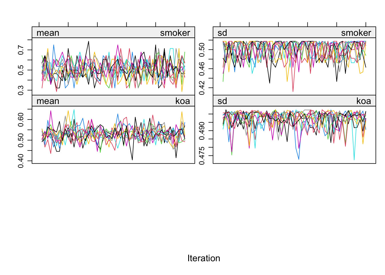
To my eye, these look pretty good. For tips on how to interpret trace plots like this from mice(), see
Section 6.5.2 from van Buuren (
2018).
Once you’ve imputed the data sets, it’s also a good idea to take a look at the results with summary statistics and/or plots. As a first step, you can extract the MI data sets with the complete() function. By setting action = "long", all MI data sets will be returned in a long format with respect to the imputation number (.imp). Setting include = TRUE returns the results for the original un-imputed data set (.imp == 0), too.
imputed.datasets |>
  complete(action = "long", include = TRUE) |>
  glimpse()
## Rows: 28,435
## Columns: 9
## $ .imp   <int> 0, 0, 0, 0, 0, 0, 0, 0, 0, 0, 0, 0, 0, 0, 0, 0, 0, 0, 0, 0, 0, …
## $ .id    <int> 1, 2, 3, 4, 5, 6, 7, 8, 9, 10, 11, 12, 13, 14, 15, 16, 17, 18, …
## $ age    <int> 69, 75, 72, 61, 76, 79, 68, 64, 64, 72, 62, 70, 72, 68, 73, 66,…
## $ male   <dbl> 0, 1, 0, 0, 0, 0, 0, 0, 0, 0, 1, 1, 0, 0, 0, 1, 0, 1, 1, 0, 0, …
## $ bmi    <dbl> 29.8, 23.5, 25.9, 36.5, 25.1, 31.8, 27.4, 36.0, 33.1, 30.0, 29.…
## $ race   <fct> 1, 1, 1, 2, 1, 1, 1, 2, 1, 1, 1, 1, 1, 2, 1, 2, 1, 1, 1, 1, 1, …
## $ smoker <dbl> 1, 0, 0, 1, 1, 0, 1, 1, 1, 1, 1, 0, 1, 1, 1, 0, 0, 1, 0, 0, 0, …
## $ osp    <fct> 0, 0, 0, 0, 0, 0, 0, 0, 0, 0, 0, 0, 0, 0, 0, 0, 0, 0, 0, 0, 0, …
## $ koa    <dbl> 1, 0, 1, 1, 0, 1, 1, 0, 0, 0, 0, 1, 0, 0, 0, 1, 1, NA, NA, 0, 0…
Now you can summarize each variable with missingness, as desired. For example, here are the counts for the criterion koa, by imputation.
imputed.datasets |>
  complete(action = "long", include = TRUE) |>
  count(koa, .imp) |>
  pivot_wider(names_from = koa, values_from = n)
## # A tibble: 11 × 4
##     .imp   `0`   `1`  `NA`
##    <int> <int> <int> <int>
##  1     0  1197  1195   193
##  2     1  1280  1305    NA
##  3     2  1280  1305    NA
##  4     3  1292  1293    NA
##  5     4  1277  1308    NA
##  6     5  1287  1298    NA
##  7     6  1290  1295    NA
##  8     7  1289  1296    NA
##  9     8  1294  1291    NA
## 10     9  1292  1293    NA
## 11    10  1295  1290    NA
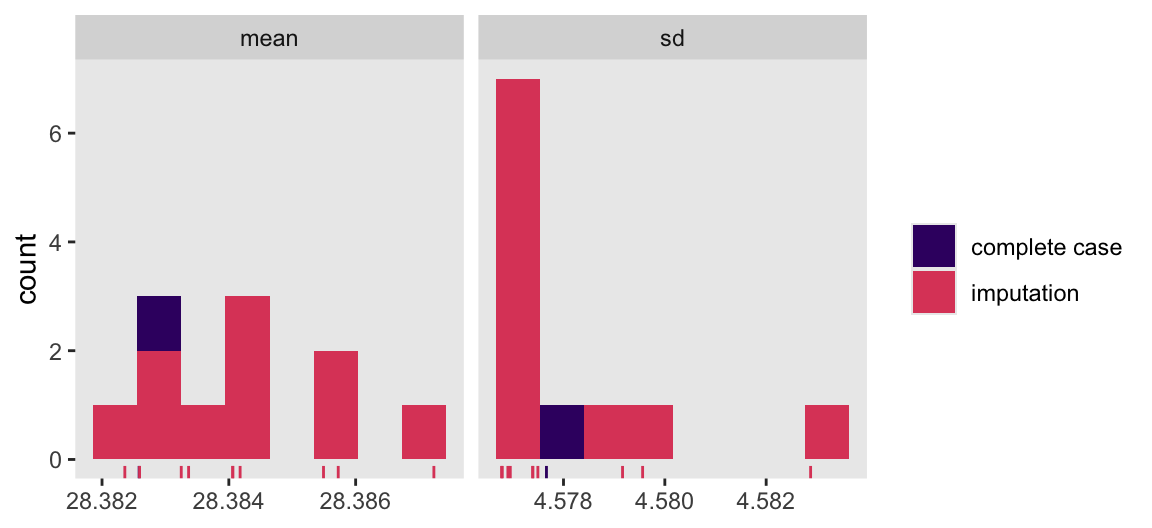
Here we compute the means of the standard deviations for bmi across the imputations, and then compare those statistics with the statistics for the complete cases in a faceted histogram.
imputed.datasets |>
  complete(action = "long", include = TRUE) |>
  group_by(.imp) |>
  summarise(mean = mean(bmi, na.rm = TRUE),
            sd = sd(bmi, na.rm = TRUE)) |>
  pivot_longer(cols = mean:sd) |>
  mutate(type = ifelse(.imp == 0, "complete case", "imputation")) |>

  ggplot(aes(x = value)) +
  geom_histogram(aes(fill = type),
                 bins = 8) +
  geom_rug(aes(color = type)) +
  scale_color_viridis_d(NULL, option = "A", begin = 0.2, end = 0.6) +
  scale_fill_viridis_d(NULL, option = "A", begin = 0.2, end = 0.6) +
  xlab(NULL) +
  facet_wrap(~ name, scales = "free_x")
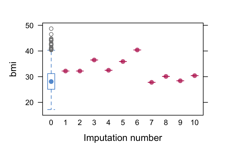
You might also want to plot the imputed data themselves. The mice package has a few plotting functions to aid with this, such as bwplot(), densityplot(), and xyplot(). The densityplot() function is good for displaying continuous variables, though it won’t work well in our case because bmi is the only continuous variable with missingness, and with a single missing case densityplot() won’t be able to select the bandwidth appropriately.
The bwplot() method, however, can be of use for bmi in our example. The blue blox and whisker plot on the left is for the complete cases only. Had we had more missing values, we would have had 10 red box and whisker plots to its right for the remaining levels of .imp. But in this case because we have a single case with missingness for bmi, its exact value gets displayed by a red colored dot.
bwplot(imputed.datasets, bmi ~ .imp )
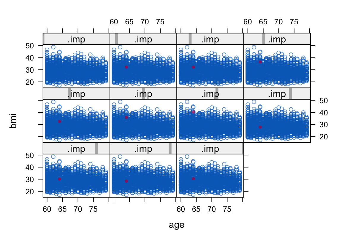
The xyplot() function is good for bivariate plots. For example, here we plot the distribution of the imputed bmi values on the y axis by their distribution of age values on the x axis. The case with the imputed bmi value is color coded red. Note how the upper left panel is for .imp == 0, the complete cases only.
xyplot(imputed.datasets, bmi ~ age | .imp, pch = c(1, 20))
You could also always make your own custom missing data visualizations with the output from complete(imputed.datasets, action = "long", include = TRUE) and the ggplot2 functions of your choosing.
Parting thoughts.
For a modest \(N\) data set with so few columns, it’s not a big deal to just use all variables to predict all other variables for the imputation step, and we’ll be using all variables in the matching procedure to come, too. In my real-world use case, we’ll have many more columns to choose from. In the abstract, the more data the better! But as your columns increase, the predictor matrix for the imputation step increases, too, and you might find yourself running into computation problems. If and when that arises, it might be wise to think about reducing the columns in your data set, and/or manually adjusting the predictor matrix. From a purely missing data perspective, you can find a lot of guidance in Enders (
2022), particularly from his discussion of Collins et al’s (
2001) typology.
Match
Now we match. Were we using a single data set, we might match with the matchit() function from MatchIt. But since we have MI data sets, we instead use the matchthem() function from MatchThem. Note the name of the datasets argument (typically data in most functions) further indicates matchthem() is designed for MI data sets.
In the formula argument, we use the confounder variables to predict the treatment variable osp. Here I use a simple approach where all confounders only have lower-order terms. But you might also consider adding interactions among the confounders, or even adding polynomial terms (see
Zhao et al., 2021 for an extended example).
The default for the method argument is "nearest" for nearest neighbor matching. In a personal consultation, Noah Greifer recommended I use the genetic matching approach for my use case, and so we use it here. You can learn about the various matching methods in Greifer’s (
2025a) vignette
Matching Methods, and about the genetic algorithm in specific in Greifer’s (
2022) blog post
Genetic Matching, from the Ground Up. In short, the genetic algorithm optimizes balance among the confounders using the scaled generalized Mahalanobis distance via functions from the Matching package (
Sekhon, 2011).
Note the pop.size argument. If you run the code without that argument, you’ll get a warning message from Matching that the optimization parameters are at their default values, and that pop.size in particular might should be increased from its default setting of 100. At the moment, I do not have a deep grasp of this setting, but for the sake of practice I have increased it to 200.
So far, my experience is the genetic algorithm with an increased pop.size setting is computationally expensive. Execute code like this with care.
t0 <- Sys.time()

matched.datasets <- matchthem(
  datasets = imputed.datasets,
  osp ~ age + male + bmi + race + smoker,
  method = "genetic",
  pop.size = 200)

t1 <- Sys.time()
t1 - t0
## Time difference of 8.658647 mins
Note the Sys.time() calls and the t1 - t0 algebra at the bottom of the code block. This is a method I often use to keep track of the computation time for longer operations. In this case this code block took just under nine minutes to complete on my laptop.7 YMMV.
The output of matchthem() is an object of class mimids, which is a list of 4.
class(matched.datasets)
## [1] "mimids"
str(matched.datasets, max.level = 1, give.attr = FALSE)
## List of 4
##  $ call    : language matchthem(formula = osp ~ age + male + bmi + race + smoker, datasets = imputed.datasets,      method = "genetic",| __truncated__
##  $ object  :List of 22
##  $ models  :List of 10
##  $ approach: chr "within"
Assess balance.
We match data from quasi-experiments to better balance the confounder sets in a way that would ideally mimic the kind of balance you’d get by random assignment in an RCT. Therefore we might inspect the degree of balance after the matching step to get a sense of how well we did. Here we do so with tables and plots. We start with tables.
Tables.
One way to assess how well the matching step balanced the data is simply with the summary() function. If you set improvement = TRUE, you will also get information about how more more balanced the adjusted data set is compares to the original unadjusted data. However, this produces a lot of output and we will take a more focused approach instead.
# Execute this on your own
summary(matched.datasets, improvement = TRUE)
The bal.tab() function from cobalt returns a focused table of contrasts for each covariate. These are computed across all MI data sets, and then summarized in three columns: one for the minimum, mean, and maximum value of the statistic.
bal.tab(matched.datasets)
## Balance summary across all imputations
##              Type Min.Diff.Adj Mean.Diff.Adj Max.Diff.Adj
## distance Distance       0.0173        0.0434       0.0543
## age       Contin.       0.0037        0.0178       0.0507
## male       Binary       0.0000        0.0000       0.0000
## bmi       Contin.      -0.0527       -0.0386      -0.0083
## race_0     Binary       0.0000        0.0000       0.0000
## race_1     Binary       0.0000        0.0000       0.0000
## race_2     Binary       0.0000        0.0000       0.0000
## race_3     Binary       0.0000        0.0000       0.0000
## smoker     Binary      -0.0355       -0.0040       0.0021
##
## Average sample sizes across imputations
##              0   1
## All       2106 479
## Matched    479 479
## Unmatched 1627   0
Notice the Type column differentiates between continuous and binary predictors (and further note how the race predictor is broken into categories). The Type column is important because the metrics for the contrasts in the remaining three columns depend on the type of predictor. The contrasts for the continuous predictors are standardized mean differences (SMD, i.e., Cohen’s \(d\)’s). The binary variables are raw differences in proportion (i.e., “risk” differences in the jargon often used in biostatistics and the medical literatures).
I don’t love the mixing of these metrics, and an alternative is to make separate tables by type. When you’re working with matched MI data sets, the only way to do that is to use the alternative formula syntax in bal.tab(). The trick is to input the imputed.datasets object to the data argument, and to input the matched.datasets object to the weights argument.
# Continuous (SMD contrasts)
bal.tab(osp ~ age + bmi,
        data = imputed.datasets,
        weights = matched.datasets)
## Balance summary across all imputations
##        Type Min.Diff.Adj Mean.Diff.Adj Max.Diff.Adj
## age Contin.       0.0037        0.0178       0.0507
## bmi Contin.      -0.0527       -0.0386      -0.0083
##
## Average effective sample sizes across imputations
##               0   1
## Unadjusted 2106 479
## Adjusted    479 479
# Binary (raw proportion contrasts)
bal.tab(osp ~ male + race + smoker,
        data = imputed.datasets,
        weights = matched.datasets)
## Balance summary across all imputations
##          Type Min.Diff.Adj Mean.Diff.Adj Max.Diff.Adj
## male   Binary       0.0000         0.000       0.0000
## race_0 Binary       0.0000         0.000       0.0000
## race_1 Binary       0.0000         0.000       0.0000
## race_2 Binary       0.0000         0.000       0.0000
## race_3 Binary       0.0000         0.000       0.0000
## smoker Binary      -0.0355        -0.004       0.0021
##
## Average effective sample sizes across imputations
##               0   1
## Unadjusted 2106 479
## Adjusted    479 479
In this case all the contrasts look great. The SMD’s are all below the conventional threshold for a small difference,8 and the proportion contrasts are about as close to zero as you could hope for.
Also note in the secondary tables we can see that whereas the total sample size for the osp == 0 cases was 2,106, only 479 cases were matched with with the 479 available cases in the osp == 1. This is as expected.
Plots.
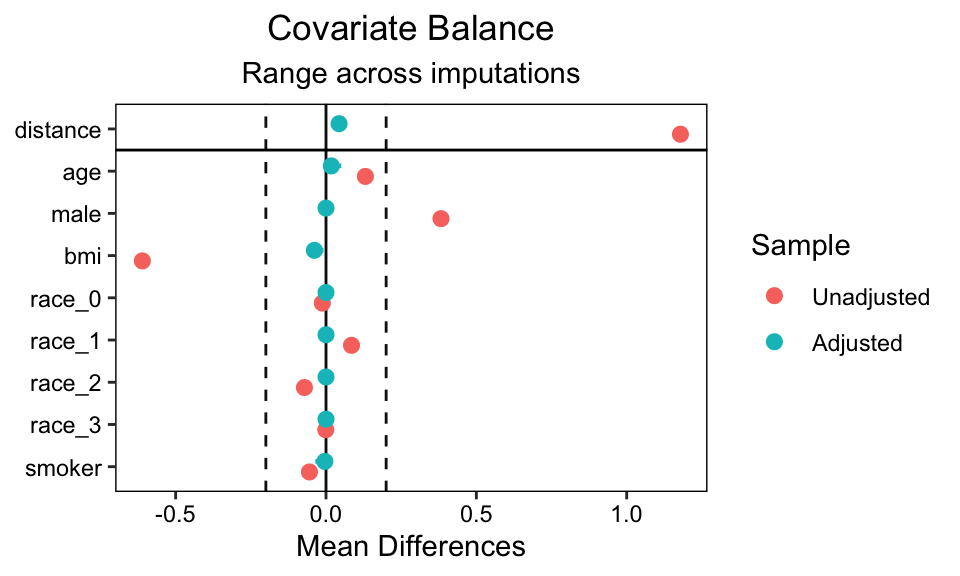
We can also get a plot representation of this table with a love plot via the love.plot() function. When working with MI data sets, you’ll want to set the which.imp argument which specifies which of the MI data sets get displayed in the plot. One way to do this is to feed a vector of integers. In this case, we set which.imp = 1:3 to plot the first three MI data sets.
love.plot(matched.datasets, which.imp = 1:3, thresholds = 0.2)

You have the contrasts on the x axis, and the various predictor variables on the y. The contrasts are color coded by whether they’re for the original unadjusted data, or the adjusted matched data. As with the bal.tab() tables above, the metrics of the contrasts differ based on whether the predictors are continuous or binary.
Another approach with these plots is to set which.imp = .none, which collapses across all MI data sets.
love.plot(matched.datasets, which.imp = .none, thresholds = 0.2)
Further, if you would like to separate the continuous and binary predictors, you can use the alternative formula syntax similar to the bal.tab() tables, above. Here’s an example with the continuous variables and the which.imp = 1:3 setting.
love.plot(osp ~ age + bmi,
          data = imputed.datasets,
          weights = matched.datasets,
          which.imp = 1:3, thresholds = 0.2) +
  xlim(-1, 1)
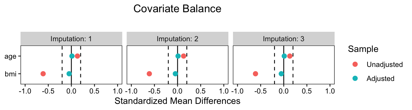
Notice how because love.plot() returns a ggplot object, we can further adjust the settings with other ggplot2 functions, like xlim().
You can continue to narrow your diagnostic focus by using bal.plot() to compare the distributions of specific variables by the treatment variable (osp) and whether the solutions are unadjusted or adjusted. As we are working with MI data sets, we’ll also want to continue setting the which.imp argument. Here we make overlaid density plots for propensity score distance for the first four MI data sets.
bal.plot(matched.datasets, var.name = 'distance', which = "both", which.imp = 1:4)
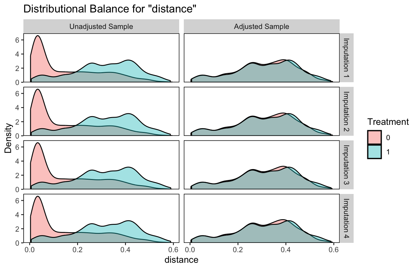
I find the similarity in the adjusted solutions pretty impressive.
Here we collapse across all the MI data sets and compare the male dummy with a faceted histogram.
bal.plot(matched.datasets, var.name = 'male', which = "both", which.imp = .none)
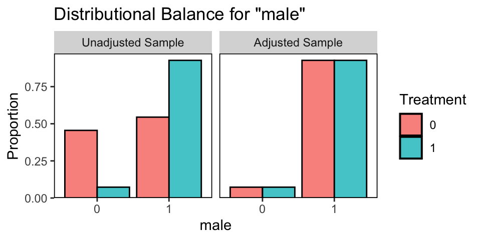
On average, the balance is perfect in the adjusted data.
But what have we done?
Before we move forward with fitting the substantive model, we might linger a while on the output of our matching step.
Much like we used the mice::complete() function to extract the imputed data sets from our imputed.datasets mids object above, the MatchThem package comes with a variant of the complete() function that extracts MI data sets from a mimids object. By setting action = "long", we extract all MI data sets in the long format, where each is indexed by an .imp column.
matched.datasets.long <- complete(matched.datasets, action = "long")

# What?
matched.datasets.long |>
  glimpse()
## Rows: 25,850
## Columns: 12
## $ .imp     <int> 1, 1, 1, 1, 1, 1, 1, 1, 1, 1, 1, 1, 1, 1, 1, 1, 1, 1, 1, 1, 1…
## $ .id      <int> 1, 2, 3, 4, 5, 6, 7, 8, 9, 10, 11, 12, 13, 14, 15, 16, 17, 18…
## $ age      <int> 69, 75, 72, 61, 76, 79, 68, 64, 64, 72, 62, 70, 72, 68, 73, 6…
## $ male     <dbl> 0, 1, 0, 0, 0, 0, 0, 0, 0, 0, 1, 1, 0, 0, 0, 1, 0, 1, 1, 0, 0…
## $ bmi      <dbl> 29.8, 23.5, 25.9, 36.5, 25.1, 31.8, 27.4, 36.0, 33.1, 30.0, 2…
## $ race     <fct> 1, 1, 1, 2, 1, 1, 1, 2, 1, 1, 1, 1, 1, 2, 1, 2, 1, 1, 1, 1, 1…
## $ smoker   <dbl> 1, 0, 0, 1, 1, 0, 1, 1, 1, 1, 1, 0, 1, 1, 1, 0, 0, 1, 0, 0, 0…
## $ osp      <fct> 0, 0, 0, 0, 0, 0, 0, 0, 0, 0, 0, 0, 0, 0, 0, 0, 0, 0, 0, 0, 0…
## $ koa      <dbl> 1, 0, 1, 1, 0, 1, 1, 0, 0, 0, 0, 1, 0, 0, 0, 1, 1, 0, 1, 0, 0…
## $ weights  <dbl> 0, 1, 0, 0, 0, 0, 0, 0, 0, 0, 0, 0, 0, 0, 0, 0, 0, 0, 0, 0, 0…
## $ subclass <fct> NA, 49, NA, NA, NA, NA, NA, NA, NA, NA, NA, NA, NA, NA, NA, N…
## $ distance <dbl> 0.028633357, 0.463091487, 0.051944199, 0.006169306, 0.0602663…
Note the three new columns at the end. The weights column includes the matching weights. In this case, the values are 0 for unmatched cases and 1 for matched cases.
matched.datasets.long |>
  distinct(weights)
##   weights
## 1       0
## 2       1
The subclass column contains the indices for the matched pairs, saved as a factor. Each level of the factor includes two cases from the data, and these were matched based on their covariate set with the genetic algorithm above.
matched.datasets.long |>
  filter(.imp == 1) |>
  count(subclass) |>
  glimpse()
## Rows: 480
## Columns: 2
## $ subclass <fct> 1, 2, 3, 4, 5, 6, 7, 8, 9, 10, 11, 12, 13, 14, 15, 16, 17, 18…
## $ n        <int> 2, 2, 2, 2, 2, 2, 2, 2, 2, 2, 2, 2, 2, 2, 2, 2, 2, 2, 2, 2, 2…
You’ll also note every time weights == 0, we have missingness for subclass. Those cases that were not matched (i.e., no subclass factor level) will have an exact zero weight in the substantive analyses to come.
matched.datasets.long |>
  filter(weights == 0) |>
  distinct(subclass)
##   subclass
## 1     <NA>
Finally, we have the distance column. Those values are the propensity scores, which range from zero to one. In a well-matched data set, the distance distributions for the two intervention groups mirror one another, and this was the case for our example based on the bal.plot() plot from a couple code blocks above.
To give a further sense of the matched pairs and their propensity scores, here’s a plot of the first 30 pairs from the first MI data set.
matched.datasets.long |>
  filter(.imp == 1) |>
  filter(subclass %in% 1:30) |>
  mutate(osp = factor(osp)) |>

  ggplot(aes(x = distance, y  = subclass, group = subclass)) +
  geom_line() +
  geom_point(aes(color = osp)) +
  scale_x_continuous("distance (i.e., propensity score)", limits = c(0, NA)) +
  scale_color_viridis_d(end = 0.6)

Each matched pair contains one of each of the two levels of the treatment variable osp. Look how closely the members of each of the pairs are on their propensity scores. The matching wasn’t exact, but it was very close.
Fit the primary model
We’re finally ready to fit the substantive model. Technically we could just fit a simple univariable model. In formula syntax, that would be
koa ~ osp,
which is sometimes called an ANOVA in the methods literature. This simple model would be valid because we have already attempted to account for confounders with our matching procedure. However, there’s no inherent reason for us not to condition the substantive model on the covariate set. Doing so can help further control for confounding, particularly in the presence of imperfect matching, and it can also increase the precision of the estimate9 (see Greifer & Stuart, 2021b). One approach would be the simple expansion
koa ~ osp + age + male + bmi + race + smoker,
which is often described as an ANCOVA. But we could go even further to protect against any treatment-by-covariate interactions with the fuller
koa ~ osp * (age + male + bmi + race + smoker).
In some of the more recent literature, this has been called an ANHECOVA, an analysis of heterogeneous covariance (e.g., Ye et al., 2022).
In practice, we use the with() function to fit the substantive model to the matched MI data sets. Given the criterion variable koa is binary, we use the glm() function with family = binomial to use logistic regression.
matched.models <- with(
  data = matched.datasets,
  expr = glm(koa ~ osp * (age + male + bmi + race + smoker),
             family = binomial))
The output is an object of class mimira and mira, which is a list of 4.
class(matched.models)
## [1] "mimira" "mira"
str(matched.models, max.level = 1, give.attr = FALSE)
## List of 4
##  $ call    : language with.mimids(data = matched.datasets, expr = glm(koa ~ osp * (age + male +      bmi + race + smoker), family = binomial))
##  $ called  : language matchthem(formula = osp ~ age + male + bmi + race + smoker, datasets = imputed.datasets,      method = "genetic",| __truncated__
##  $ nmis    : NULL
##  $ analyses:List of 10
The results of each of fit for each of the MI data sets can be found in the analyses section of the object.
matched.models$analyses |>
  str(max.level = 1)
## List of 10
##  $ :List of 30
##   ..- attr(*, "class")= chr [1:2] "glm" "lm"
##  $ :List of 30
##   ..- attr(*, "class")= chr [1:2] "glm" "lm"
##  $ :List of 30
##   ..- attr(*, "class")= chr [1:2] "glm" "lm"
##  $ :List of 30
##   ..- attr(*, "class")= chr [1:2] "glm" "lm"
##  $ :List of 30
##   ..- attr(*, "class")= chr [1:2] "glm" "lm"
##  $ :List of 30
##   ..- attr(*, "class")= chr [1:2] "glm" "lm"
##  $ :List of 30
##   ..- attr(*, "class")= chr [1:2] "glm" "lm"
##  $ :List of 30
##   ..- attr(*, "class")= chr [1:2] "glm" "lm"
##  $ :List of 30
##   ..- attr(*, "class")= chr [1:2] "glm" "lm"
##  $ :List of 30
##   ..- attr(*, "class")= chr [1:2] "glm" "lm"
Here’s the summary of the pooled model parameters. As with a typical MI data analysis, you pool the results across the MI data sets with Rubin’s rules using the pool() function.
matched.models |>
  pool() |>
  summary()
##           term     estimate    std.error   statistic        df      p.value
## 1  (Intercept)  -4.33329495   2.30572094 -1.87936661  95.57790 6.324105e-02
## 2         osp1 -16.78892460 479.52834485 -0.03501133 939.91137 9.720781e-01
## 3          age   0.02515651   0.01877522  1.33987862 422.78756 1.810045e-01
## 4         male  -0.20564090   0.42972287 -0.47854307 109.85389 6.332148e-01
## 5          bmi   0.11604786   0.02733849  4.24485193 240.87284 3.124027e-05
## 6        race1  -0.32464880   1.49340345 -0.21738854  88.96382 8.284034e-01
## 7        race2  -0.03792124   1.50924147 -0.02512602 106.84098 9.800013e-01
## 8        race3  -1.59784236 139.64607263 -0.01144209 938.67648 9.908732e-01
## 9       smoker  -0.30575408   0.20746913 -1.47373285 324.83022 1.415219e-01
## 10    osp1:age   0.02171560   0.02650799  0.81920969 372.86920 4.131901e-01
## 11   osp1:male   0.77830353   0.59993486  1.29731338 160.21147 1.963884e-01
## 12    osp1:bmi  -0.02307764   0.03668963 -0.62899629 340.77566 5.297729e-01
## 13  osp1:race1  14.81110394 479.52163116  0.03088725 939.91137 9.753660e-01
## 14  osp1:race2  15.07286024 479.52179890  0.03143311 939.91137 9.749308e-01
## 15  osp1:race3  17.71192964 499.44300859  0.03546336 939.90451 9.717178e-01
## 16 osp1:smoker   0.37223668   0.28803087  1.29234998 498.31354 1.968349e-01
However, in the ( 2025b) MatchIt: Getting Started vignette, Greifer cautioned:
The outcome model coefficients and tests should not be interpreted or reported.
But rather, one should only report and interpret the causal estimand, which leads us to the final major section of the blog…
Compute the estimand
Following the frameworks in Greifer & Stuart ( 2021a) and Chapter 8 of Arel-Bundock ( 2025), there are three primary causal estimands we might consider:10
- the average treatment effect (ATE),
- the average treatment effect in the treated (ATT), and
- the average treatment effect in the untreated (ATU).
The ATE is the causal estimand that most directly corresponds to what we get with a randomized experiment. It’s the average causal effect were we to give the intervention to all those in the target population, relative to what we’d expect from withholding the intervention.
The ATT is the average causal effect of those who received the treatment in the sample, and the broader subset of the population resembling that part of the sample. The ATT answers the question: How well did the treatment work for those who got it?
The ATU is the average causal effect of those who did not receive the treatment in the sample, and the broader subset of the population resembling that part of the sample. The ATU answers the question: How well would the treatment have worked for those who did not get it? But when we compute the ATU after using a matching procedure where some of those from the broader untreated sample were removed (as was the case here), then the ATU comes with the caveat that it is the average treatment effect of those who did not get the treatment, in a sample matched to target the ATT, which is a bit of a strange caveat and may or may not be the kind of caveat you’d like to make in a white paper.
In my blog series on causal inference from randomized experiments, were were all about that ATE. But here I think it’s better to focus on the ATT, and this is also what Greifer recommend for my real-world use case.
Importantly, none of these estimands correspond directly to any of the beta coefficients from the summary() output in the previous section. Rather, we compute our causal estimands with the statistical model as a whole using the g-computation method. If you’re not familiar with g-computation, boy do I have the blog series for you. Start
here. You’ll want to read the first three posts.11 You can also browse through
Chapter 8 of Arel-Bundock (
2025), as referenced just above.
In code, we can do g-computation using the avg_comparisons() function from the marginaleffects package. Note how we can request cluster-robust standard errors with pair membership as the clustering variable by setting vcov = ~subclass. By setting by = "osp",12 we compute both the ATU13 and the ATT.
avg_comparisons(matched.models,
                variables = "osp",
                # cluster-robust standard errors for most analyses,
                # with pair membership as the clustering variable
                vcov = ~subclass,
                by = "osp")
## Warning in get.dfcom(object, dfcom): Infinite sample size assumed.

##
##  Term osp Estimate Std. Error     t Pr(>|t|)   S  2.5 % 97.5 %  Df
##   osp   0  -0.0403     0.0328 -1.23     0.22 2.2 -0.105 0.0241 595
##   osp   1  -0.0390     0.0324 -1.20     0.23 2.1 -0.103 0.0247 632
##
## Type:  response
## Comparison: 1 - 0
## Columns: term, contrast, osp, estimate, std.error, s.value, df, statistic, p.value, conf.low, conf.high
The second row of the output, for which osp == 1, is where we see the summary for the ATT. By default, avg_comparisons() puts this in a probability-difference metric, though other metrics can be called with the comparison and/or transform arguments. My understanding is this summary also automatically pools the results using Rubin’s rules. Substantively, the probability difference is -0.04, 95% CI [-0.10, 0.02], which is about as close to zero as you could ask for. This is the effect size you would report in a white paper.
Thank the reviewers
I’d like to publicly acknowledge and thank
for their kind efforts reviewing the draft of this post. Do note the final editorial decisions were my own, and I do not think it would be reasonable to assume my reviewers have given blanket endorsements of the current version of this post.
Session info
sessionInfo()
## R version 4.4.2 (2024-10-31)
## Platform: aarch64-apple-darwin20
## Running under: macOS Ventura 13.4
##
## Matrix products: default
## BLAS:   /Library/Frameworks/R.framework/Versions/4.4-arm64/Resources/lib/libRblas.0.dylib
## LAPACK: /Library/Frameworks/R.framework/Versions/4.4-arm64/Resources/lib/libRlapack.dylib;  LAPACK version 3.12.0
##
## locale:
## [1] en_US.UTF-8/en_US.UTF-8/en_US.UTF-8/C/en_US.UTF-8/en_US.UTF-8
##
## time zone: America/Chicago
## tzcode source: internal
##
## attached base packages:
## [1] stats     graphics  grDevices utils     datasets  methods   base
##
## other attached packages:
##  [1] marginaleffects_0.24.0 cobalt_4.5.5           MatchThem_1.2.1
##  [4] mice_3.16.0            lubridate_1.9.3        forcats_1.0.0
##  [7] stringr_1.5.1          dplyr_1.1.4            purrr_1.0.2
## [10] readr_2.1.5            tidyr_1.3.1            tibble_3.2.1
## [13] ggplot2_3.5.1          tidyverse_2.0.0
##
## loaded via a namespace (and not attached):
##  [1] tidyselect_1.2.1  viridisLite_0.4.2 farver_2.1.2      fastmap_1.1.1
##  [5] blogdown_1.20     digest_0.6.37     rpart_4.1.23      timechange_0.3.0
##  [9] lifecycle_1.0.4   survival_3.7-0    magrittr_2.0.3    compiler_4.4.2
## [13] rlang_1.1.4       sass_0.4.9        tools_4.4.2       yaml_2.3.8
## [17] data.table_1.16.2 knitr_1.49        labeling_0.4.3    withr_3.0.2
## [21] nnet_7.3-19       grid_4.4.2        jomo_2.7-6        colorspace_2.1-1
## [25] scales_1.3.0      iterators_1.0.14  MASS_7.3-61       insight_0.20.4
## [29] cli_3.6.3         survey_4.4-2      rmarkdown_2.29    crayon_1.5.3
## [33] generics_0.1.3    rstudioapi_0.16.0 tzdb_0.4.0        minqa_1.2.6
## [37] DBI_1.2.3         cachem_1.0.8      splines_4.4.2     mitools_2.4
## [41] vctrs_0.6.5       WeightIt_1.3.2    boot_1.3-31       glmnet_4.1-8
## [45] Matrix_1.7-1      sandwich_3.1-1    jsonlite_1.8.9    bookdown_0.40
## [49] hms_1.1.3         mitml_0.4-5       foreach_1.5.2     jquerylib_0.1.4
## [53] glue_1.8.0        nloptr_2.0.3      pan_1.9           chk_0.10.0
## [57] codetools_0.2-20  stringi_1.8.4     shape_1.4.6.1     gtable_0.3.6
## [61] lme4_1.1-35.3     munsell_0.5.1     pillar_1.10.1     htmltools_0.5.8.1
## [65] R6_2.5.1          evaluate_1.0.1    lattice_0.22-6    backports_1.5.0
## [69] MatchIt_4.7.0     broom_1.0.7       bslib_0.7.0       Rcpp_1.0.13-1
## [73] nlme_3.1-166      checkmate_2.3.2   xfun_0.49         zoo_1.8-12
## [77] pkgconfig_2.0.3
References
Arel-Bundock, V. (2023). marginaleffects: Predictions, Comparisons, Slopes, Marginal Means, and Hypothesis Tests [Manual]. [https://vincentarelbundock.github.io/ marginaleffects/ https://github.com/vincentarelbundock/ marginaleffects]( https://vincentarelbundock.github.io/ marginaleffects/ https://github.com/vincentarelbundock/ marginaleffects)
Arel-Bundock, V. (2025). Model to meaning. https://marginaleffects.com/
Brumback, B. A. (2022). Fundamentals of causal inference with R. Chapman & Hall/CRC. https://www.routledge.com/Fundamentals-of-Causal-Inference-With-R/Brumback/p/book/9780367705053
Cohen, J. (1988). Statistical power analysis for the behavioral sciences. L. Erlbaum Associates. https://www.worldcat.org/title/statistical-power-analysis-for-the-behavioral-sciences/oclc/17877467
Collins, L. M., Schafer, J. L., & Kam, C.-M. (2001). A comparison of inclusive and restrictive strategies in modern missing data procedures. Psychological Methods, 6(4), 330–351. https://doi.org/10.1037/1082-989x.6.4.330
Cunningham, S. (2021). Causal inference: The mixtape. Yale University Press. https://mixtape.scunning.com/
Enders, C. K. (2022). Applied missing data analysis (Second Edition). Guilford Press. http://www.appliedmissingdata.com/
Gelman, A., Hill, J., & Vehtari, A. (2020). Regression and other stories. Cambridge University Press. https://doi.org/10.1017/9781139161879
Greifer, N. (2022, October 8). Genetic matching, from the ground up. https://ngreifer.github.io/blog/genetic-matching/
Greifer, N. (2024). cobalt: Covariate balance tables and plots [Manual]. https://CRAN.R-project.org/package=cobalt
Greifer, N. (2025a, January 11). Matching methods. https://CRAN.R-project.org/package=MatchIt/vignettes/matching-methods.html
Greifer, N. (2025b, January 11). MatchIt: Getting started. https://CRAN.R-project.org/package=MatchIt/vignettes/MatchIt.html
Greifer, N., & Stuart, E. A. (2021a). Choosing the causal estimand for propensity score analysis of observational studies. https://doi.org/10.48550/arXiv.2106.10577
Greifer, N., & Stuart, E. A. (2021b). Matching methods for confounder adjustment: An addition to the epidemiologist’s toolbox. Epidemiologic Reviews, 43(1), 118–129. https://doi.org/10.1093/epirev/mxab003
Hernán, M. A., & Robins, J. M. (2020). Causal inference: What if. Boca Raton: Chapman & Hall/CRC. https://www.hsph.harvard.edu/miguel-hernan/causal-inference-book/
Ho, D. E., Imai, K., King, G., & Stuart, E. A. (2011). MatchIt: Nonparametric preprocessing for parametric causal inference. Journal of Statistical Software, 42(8), 1–28. https://doi.org/10.18637/jss.v042.i08
Imbens, G. W., & Rubin, D. B. (2015). Causal inference in statistics, social, and biomedical sciences: An Introduction. Cambridge University Press. https://doi.org/10.1017/CBO9781139025751
Ismay, C., & Kim, A. Y. (2022). Statistical inference via data science; A moderndive into R and the tidyverse. https://moderndive.com/
Kazdin, A. E. (2017). Research design in clinical psychology, 5th Edition. Pearson. https://www.pearson.com/
Kontopantelis, E., White, I. R., Sperrin, M., & Buchan, I. (2017). Outcome-sensitive multiple imputation: A simulation study. BMC Medical Research Methodology, 17, 2. https://doi.org/10.1186/s12874-016-0281-5
Kruschke, J. K. (2015). Doing Bayesian data analysis: A tutorial with R, JAGS, and Stan. Academic Press. https://sites.google.com/site/doingbayesiandataanalysis/
Laqueur, H. S., Shev, A. B., & Kagawa, R. M. (2022). SuperMICE: An ensemble machine learning approach to multiple imputation by chained equations. American Journal of Epidemiology, 191(3), 516–525. https://doi.org/10.1093/aje/kwab271
Leyrat, C., Seaman, S. R., White, I. R., Douglas, I., Smeeth, L., Kim, J., Resche-Rigon, M., Carpenter, J. R., & Williamson, E. J. (2019). Propensity score analysis with partially observed covariates: How should multiple imputation be used? Statistical Methods in Medical Research, 28(1), 3–19. https://doi.org/10.1177/0962280217713032
Little, R. J., & Rubin, D. B. (2019). Statistical analysis with missing data (3rd ed., Vol. 793). John Wiley & Sons. https://www.wiley.com/en-us/Statistical+Analysis+with+Missing+Data%2C+3rd+Edition-p-9780470526798
McElreath, R. (2015). Statistical rethinking: A Bayesian course with examples in R and Stan. CRC press. https://xcelab.net/rm/statistical-rethinking/
McElreath, R. (2020). Statistical rethinking: A Bayesian course with examples in R and Stan (Second Edition). CRC Press. https://xcelab.net/rm/statistical-rethinking/
Nguyen, T. Q., & Stuart, E. A. (2024). Multiple imputation for propensity score analysis with covariates missing at random: Some clarity on “within” and “across” methods. American Journal of Epidemiology, 193(10), 1470–1476. https://doi.org/10.1093/aje/kwae105
Pishgar, F., Greifer, N., Leyrat, C., & Stuart, E. (2021). MatchThem:: Matching and weighting after multiple imputation. The R Journal. https://doi.org/10.32614/RJ-2021-073
R Core Team. (2022). R: A language and environment for statistical computing. R Foundation for Statistical Computing. https://www.R-project.org/
Roback, P., & Legler, J. (2021). Beyond multiple linear regression: Applied generalized linear models and multilevel models in R. CRC Press. https://bookdown.org/roback/bookdown-BeyondMLR/
Sekhon, J. S. (2011). Multivariate and propensity score matching software with automated balance optimization: The matching package for R. Journal of Statistical Software, 42(7), 1–52. https://doi.org/10.18637/jss.v042.i07
Shadish, W. R., Cook, T. D., & Campbell, D. T. (2002). Experimental and quasi-experimental designs for generalized causal inference. Houghton, Mifflin and Company.
Stuart, E. A. (2010). Matching methods for causal inference: A review and a look forward. Statistical Science: A Review Journal of the Institute of Mathematical Statistics, 25(1), 1–25. https://doi.org/10.1214/09-STS313
Sullivan, T. R., White, I. R., Salter, A. B., Ryan, P., & Lee, K. J. (2018). Should multiple imputation be the method of choice for handling missing data in randomized trials? Statistical Methods in Medical Research, 27(9), 2610–2626. https://doi.org/10.1177/0962280216683570
Taback, N. (2022). Design and analysis of experiments and observational studies using R. Chapman and Hall/CRC. https://doi.org/10.1201/9781003033691
van Buuren, S. (2018). Flexible imputation of missing data (Second Edition). CRC Press. https://stefvanbuuren.name/fimd/
van Buuren, S., & Groothuis-Oudshoorn, K. (2011). mice: Multivariate imputation by chained equations in R. Journal of Statistical Software, 45(3), 1–67. https://www.jstatsoft.org/v45/i03/
van Buuren, S., & Groothuis-Oudshoorn, K. (2021). mice: Multivariate imputation by chained equations [Manual]. https://CRAN.R-project.org/package=mice
Wickham, H. (2020). The tidyverse style guide. https://style.tidyverse.org/
Wickham, H. (2022). tidyverse: Easily install and load the ’tidyverse’. https://CRAN.R-project.org/package=tidyverse
Wickham, H., Averick, M., Bryan, J., Chang, W., McGowan, L. D., François, R., Grolemund, G., Hayes, A., Henry, L., Hester, J., Kuhn, M., Pedersen, T. L., Miller, E., Bache, S. M., Müller, K., Ooms, J., Robinson, D., Seidel, D. P., Spinu, V., … Yutani, H. (2019). Welcome to the tidyverse. Journal of Open Source Software, 4(43), 1686. https://doi.org/10.21105/joss.01686
Ye, T., Shao, J., Yi, Y., & Zhao, Q. (2022). Toward better practice of covariate adjustment in analyzing randomized clinical trials. Journal of the American Statistical Association, 1–13. https://doi.org/10.1080/01621459.2022.2049278
Zhang, J., Dashti, S. G., Carlin, J. B., Lee, K. J., & Moreno-Betancur, M. (2023). Should multiple imputation be stratified by exposure group when estimating causal effects via outcome regression in observational studies? BMC Medical Research Methodology, 23(1), 42. https://doi.org/10.1186/s12874-023-01843-6
Zhao, Q.-Y., Luo, J.-C., Su, Y., Zhang, Y.-J., Tu, G.-W., & Luo, Z. (2021). Propensity score matching with R: Conventional methods and new features. Annals of Translational Medicine, 9(9). https://doi.org/10.21037/atm-20-3998
-
Here I’m using the term quasi-experiment to mean an intervention that shares the major features of a randomized experiment, such as the causal intervention preceding the outcome, but that lacks random assignment to condition. For more background on this use of the term, see Chapter 1 in Shadish et al. ( 2002). ↩︎
-
Often called an exposure variable in the causal-inference literature. I don’t know for sure, but I imagine the term has its roots in the epidemiological literature. ↩︎
-
Technically this isn’t a pure default call since we’re setting
print = FALSEto suppress the print history. But this is small potatoes and all the other settings are at their defaults, some of which we’ll be changing shortly. ↩︎ -
I’m just going to continue paying homage to Pishgar et al. ( 2021) by reusing many of the object names from their paper. ↩︎
-
Though we don’t have randomly-assigned groups in this example, I believe the basic concern is the same. The two groups may have different correlations among the covariates, and we want an imputation method that can handle such a pattern. ↩︎
-
As a third option, you could also use random forests to addresses possible interactions and nonlinear effects (see Laqueur et al., 2022). ↩︎
-
2023 M2 chip MacBook Pro ↩︎
-
i.e., increase statistical power by decreasing the standard error. ↩︎
-
This list is not exhaustive, but I’m choosing to focus on the big hitters, here. Even Greifer & Stuart ( 2021a), for example, entertain a fourth estimand called the average treatment effect in the overlap (ATO). ↩︎
-
Yes, it takes that long to explain g-computation. Once you get it, it’s no big deal. But it can seem really odd at first, or at least that’s how it was for me. ↩︎
-
If you aren’t working with MI data sets, there’s a more streamlined syntax available for marginaleffects functions like
avg_comparisons(), but which does not currently work well for MI data sets. Right around the time I’m writing this blog post, the marginaleffects team are working on a promising fix, but that fix is not yet available for the official CRAN release of marginaleffects. For the insider details, see issue #1117 on GitHub. ↩︎ -
But again, this is with the caveat that because the matching procedure discarded many of the cases in the full untreated sample, this is more like the ATU in a sample matched to target the ATT. ↩︎
- Posted on:
- February 2, 2025
- Length:
- 40 minute read, 8348 words