Use emmeans() to include 95% CIs around your lme4-based fitted lines
By A. Solomon Kurz
December 16, 2021
Scenario
You’re an R ( R Core Team, 2022) user and just fit a nice multilevel model to some grouped data and you’d like to showcase the results in a plot. In your plots, it would be ideal to express the model uncertainty with 95% interval bands. If you’re a Bayesian working with Stan-based software, such as brms ( Bürkner, 2017, 2018, 2022), this is pretty trivial. But if you’re a frequentist and like using the popular lme4 package ( Bates et al., 2015, 2021), you might be surprised how difficult it is to get those 95% intervals. I recently stumbled upon a solution with the emmeans package ( Lenth, 2021), and the purpose of this blog post is to show you how it works.
I make assumptions.
You’ll want to be familiar with multilevel regression. For frequentist resources, I recommend the texts by Roback & Legler ( 2021), Hoffman ( 2015), or Singer & Willett ( 2003). For the Bayesians in the room, I recommend the texts by McElreath ( 2020, 2015) or Kruschke ( 2015).
All code is in R ( R Core Team, 2022), with healthy doses of the tidyverse ( Wickham et al., 2019; Wickham, 2022). Probably the best place to learn about the tidyverse-style of coding, as well as an introduction to R, is Grolemund and Wickham’s ( 2017) freely-available online text, R for data science. We will also make good use of the patchwork package ( Pedersen, 2022). Our two modeling packages will be the aforementioned lme4 and brms.
Load the primary R packages and adjust the plotting theme.
# load
library(tidyverse)
library(lme4)
library(brms)
library(patchwork)
library(emmeans)

# adjust the plotting theme
theme_set(
  theme_linedraw() +
  theme(panel.grid = element_blank(),
        strip.background = element_rect(fill = "grey92", color = "grey92"),
        strip.text = element_text(color = "black", size = 10))
)
We need data.
In this post we’ll use the base-R ChickWeight data.
data(ChickWeight)

glimpse(ChickWeight)
## Rows: 578
## Columns: 4
## $ weight <dbl> 42, 51, 59, 64, 76, 93, 106, 125, 149, 171, 199, 205, 40, 49, 58, 72, 84, 103, 122, 138, 162,…
## $ Time   <dbl> 0, 2, 4, 6, 8, 10, 12, 14, 16, 18, 20, 21, 0, 2, 4, 6, 8, 10, 12, 14, 16, 18, 20, 21, 0, 2, 4…
## $ Chick  <ord> 1, 1, 1, 1, 1, 1, 1, 1, 1, 1, 1, 1, 2, 2, 2, 2, 2, 2, 2, 2, 2, 2, 2, 2, 3, 3, 3, 3, 3, 3, 3, …
## $ Diet   <fct> 1, 1, 1, 1, 1, 1, 1, 1, 1, 1, 1, 1, 1, 1, 1, 1, 1, 1, 1, 1, 1, 1, 1, 1, 1, 1, 1, 1, 1, 1, 1, …
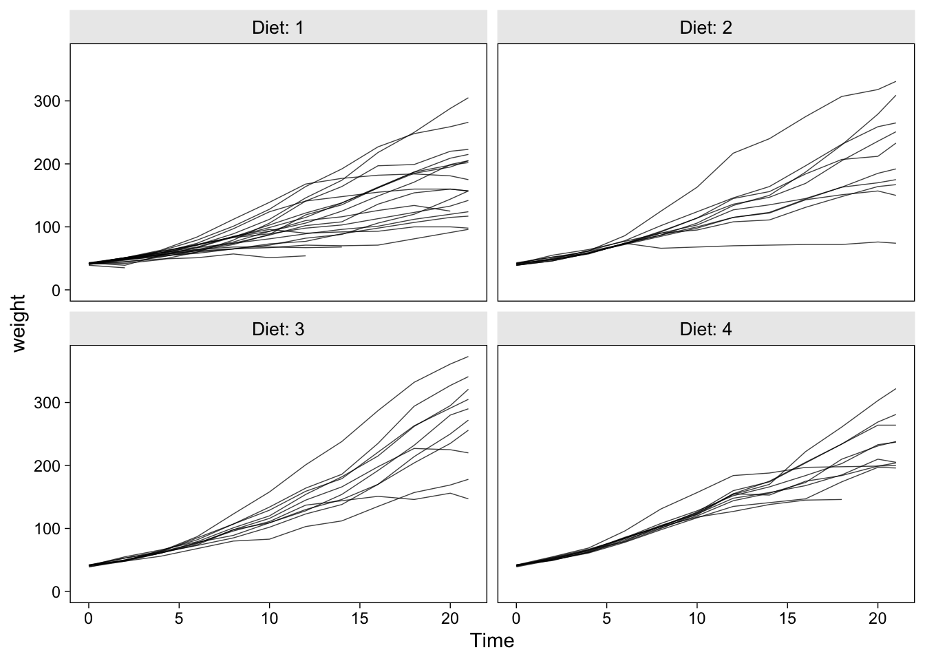
The ChickWeight data set contains the weight measurements in grams for 50 chicks, each of which was randomized into one of four experimental diets. To get a sense of the data, here are their weight values plotted across Time, separated by the levels of Diet.
ChickWeight %>%
  ggplot(aes(x = Time, y = weight, group = Chick)) +
  geom_line(alpha = 3/4, linewidth = 1/4) +
  ylim(0, NA) +
  facet_wrap(~ Diet, labeller = label_both)
Our goal will be to fit a couple models to these data and practice plotting the model-based trajectories at both the population- and chick-levels.
Models
Our first model with be the unconditional linear growth model
$$
\begin{align*} \text{weight}_{ij} & \sim \operatorname{Normal}(\mu_{ij}, \sigma_\epsilon^2) \\ \mu_{ij} & = a_i + b_i \text{Time}_{ij} \\ a_i & = \alpha_0 + u_i \\ b_i & = \beta_0 + v_i \\ \begin{bmatrix} u_i \\ v_i \end{bmatrix} & \sim \operatorname{Normal} \left ( \begin{bmatrix} 0 \\ 0 \end{bmatrix}, \begin{bmatrix} \sigma_u^2 & \\ \sigma_{uv} & \sigma_v^2 \end{bmatrix} \right ), \end{align*}
$$
where \(i\) indexes the different levels of Chick and \(j\) indexes the various measurements taken across Time. The \(a_i\) intercepts and \(b_i\) slopes are both random with a level-2 covariance \(\sigma_{uv}\). The second model will be the conditional quadratic growth model
$$
\begin{align*} \text{weight}_{ij} & \sim \operatorname{Normal}(\mu_{ij}, \sigma_\epsilon^2) \\ \mu_{ij} & = a_i + b_i \text{Time}_{ij} + c_i \text{Time}_{ij}^2 \\ a_i & = \alpha_0 + \alpha_1 \text{Diet}_i + u_i \\ b_i & = \beta_0 + \beta_1 \text{Diet}_i + v_i \\ c_i & = \gamma_0 + \gamma_1 \text{Diet}_i + w_i \\ \begin{bmatrix} u_i \\ v_i \\ w_i \end{bmatrix} & \sim \operatorname{Normal} \left ( \begin{bmatrix} 0 \\ 0 \\ 0 \end{bmatrix}, \begin{bmatrix} \sigma_u^2 & & \\ \sigma_{uv} & \sigma_v^2 & \\ \sigma_{uw} & \sigma_{vw} & \sigma_w^2 \end{bmatrix} \right ), \end{align*}
$$
which adds a new quadratic growth parameter \(c_i\), which varies across chicks. The random intercepts, linear slopes, and quadratic slopes all covary in a \(3 \times 3\) level-2 variance/covariance matrix and all three parameters are conditioned on the experimental variable Diet.
Here’s how to fit the two models with lme4::lmer().
# unconditional linear growth model
fit1 <- lmer(
  data = ChickWeight,
  weight ~ 1 + Time + (1 + Time | Chick)
)

# conditional quadratic growth model
fit2 <- lmer(
  data = ChickWeight,
  weight ~ 1 + Time + I(Time^2) + Diet + Time:Diet + I(Time^2):Diet + (1 + Time + I(Time^2) | Chick)
)
## boundary (singular) fit: see help('isSingular')
If you fit the second model, you probably got the warning message reading boundary (singular) fit: see ?isSingular. That often pops up when one or more of your level-2 variance parameters are zero or close to zero, which isn’t necessarily a problem but it’s just something to take note of. Unless there are other problems with the model, I wouldn’t worry about it.
As this post isn’t a full multilevel growth model tutorial, I’m not going to go through the model summary() output. If you’re new to models like this, it’s worth your time to inspect the model parameters with care.
Plot
There are many ways to plot the results from models like these. If you do a quick web search, you’ll find a variety of other blog posts exploring how to model and visualize the ChickWeight data. In this post, I’m going to recommend a two-panel approach where you (a) plot the chick-level trajectories, (b) plot the population average trajectory, and (c) combine the two plots with patchwork syntax. You can then generalize from there to suit your own needs.
Chick-level trajectories w/o uncertainty with predict().
If you’re tricky, there are many post-processing methods you can use to compute and plot the chick-level trajectories. In this post, we’ll focus on the predict() method. For simple models fit with the lmer() function, I recommend the following steps.
- Insert your model fit object into
predict(). - Covert the results into a data frame.
- Rename the vector of predicted values something generic like
y_hat. - Append the original data set with
bind_cols(). - Save the results with a descriptive name.
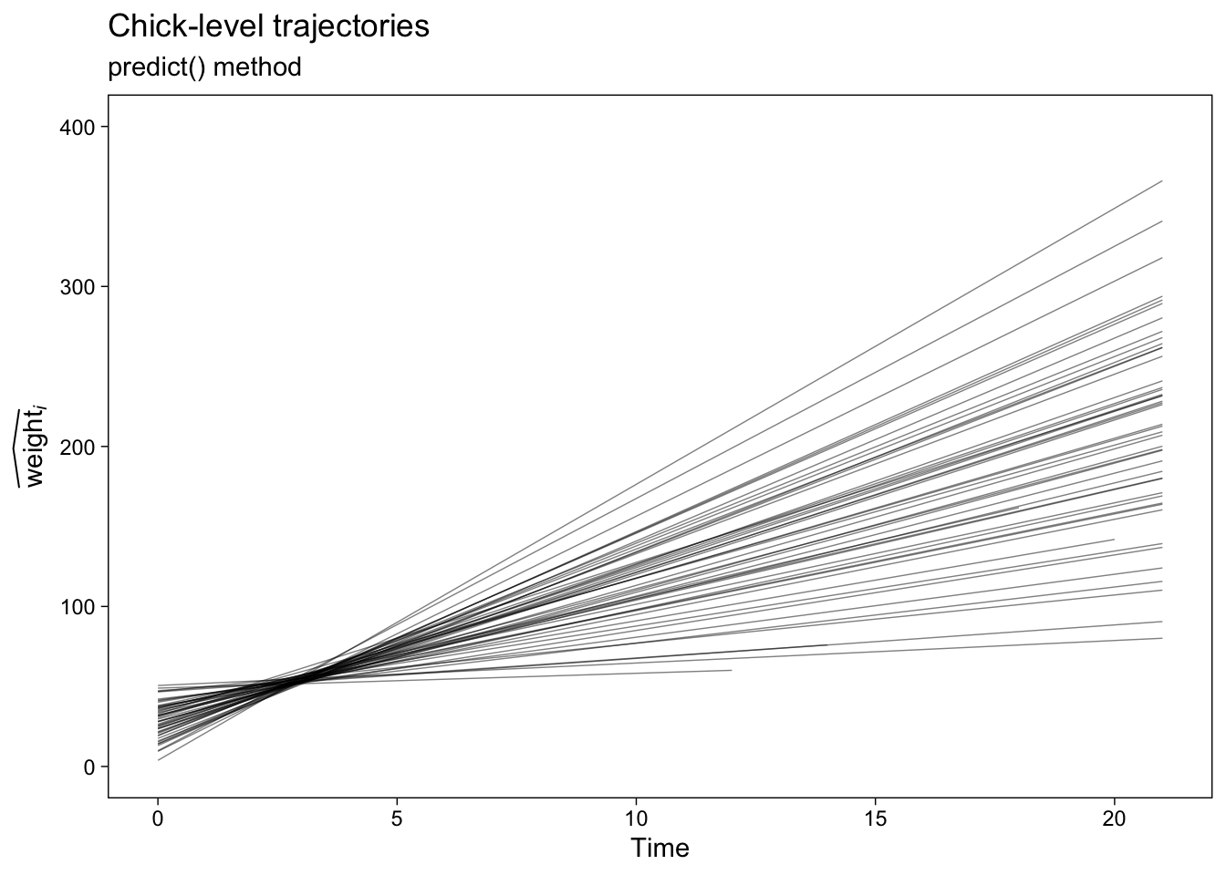
Here’s what those steps look like in action with fit1.
fit1.predict.chicks <- predict(fit1) %>%
  data.frame() %>%
  set_names("y_hat") %>%
  bind_cols(ChickWeight)

# what have we done?
glimpse(fit1.predict.chicks)
## Rows: 578
## Columns: 5
## $ y_hat  <dbl> 29.64524, 45.01241, 60.37958, 75.74675, 91.11392, 106.48109, 121.84826, 137.21543, 152.58260,…
## $ weight <dbl> 42, 51, 59, 64, 76, 93, 106, 125, 149, 171, 199, 205, 40, 49, 58, 72, 84, 103, 122, 138, 162,…
## $ Time   <dbl> 0, 2, 4, 6, 8, 10, 12, 14, 16, 18, 20, 21, 0, 2, 4, 6, 8, 10, 12, 14, 16, 18, 20, 21, 0, 2, 4…
## $ Chick  <ord> 1, 1, 1, 1, 1, 1, 1, 1, 1, 1, 1, 1, 2, 2, 2, 2, 2, 2, 2, 2, 2, 2, 2, 2, 3, 3, 3, 3, 3, 3, 3, …
## $ Diet   <fct> 1, 1, 1, 1, 1, 1, 1, 1, 1, 1, 1, 1, 1, 1, 1, 1, 1, 1, 1, 1, 1, 1, 1, 1, 1, 1, 1, 1, 1, 1, 1, …
We can plot the results like so.
p1 <- fit1.predict.chicks %>%
  ggplot(aes(x = Time, y = y_hat, group = Chick)) +
  geom_line(alpha = 2/4, linewidth = 1/4) +
  labs(title = "Chick-level trajectories",
       subtitle = "predict() method",
       y = expression(widehat(weight)[italic(i)])) +
  ylim(0, 400)

p1
Now here’s how to follow the same steps to get the chick-level trajectories for the conditional quadratic growth model, fit2.
# compute
fit2.predict.chicks <- predict(fit2) %>%
  data.frame() %>%
  set_names("y_hat") %>%
  bind_cols(ChickWeight)

# plot
p2 <- fit2.predict.chicks %>%
  ggplot(aes(x = Time, y = y_hat, group = Chick)) +
  geom_line(alpha = 2/4, linewidth = 1/4) +
  labs(title = "Chick-level trajectories",
       subtitle = "predict() method",
       y = expression(widehat(weight)[italic(i)])) +
  ylim(0, 400) +
  facet_wrap(~ Diet, labeller = label_both)

p2
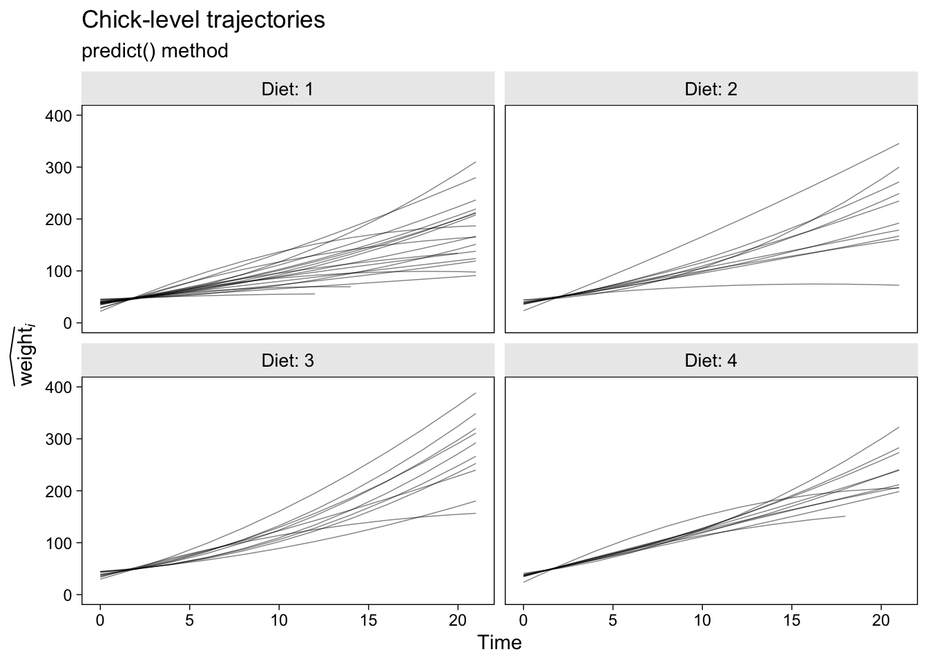
I should point out that this variant of the predict() method will break down if you have markedly non-linear trajectories and relatively few points the are defined over on the \(x\)-axis. In those cases, you’ll have to generalize with skillful use of the newdata argument within predict(). But that’s an issue for another tutorial.
A limitation with both these plots is there is no expression of uncertainty for our chick-level trajectories. My go-to approach would be to depict that with 95% interval bands. However, to my knowledge there is no good way to get the frequentist 95% confidence intervals for the chick-level trajectories with a model fit with lme4. You’re just SOL on that one, friends. If you really need those, switch to a Bayesian paradigm.
Population-level trajectories w/o uncertainty with predict().
The click-level trajectories are great and IMO not enough researchers make plots like that when they fit multilevel models. Show us the group-level differences implied by your level-2 variance parameters! But the motivation for this blog post is to show how you can use emmeans to improve your population-level plots. Before we get to the good stuff, let’s first explore the limitations in the predict() method.
When using predict() to compute population-level trajectories, we’ll need to adjust our approach in two important ways. Instead of simply computing the fitted values for each case in the original data set, we’re going to want to define the predictor values beforehand, save those values in a data frame, and then plug that data frame into predict() via the newdata argument. Our second adjustment will be to explicitly tell predict() we only want the population-level values by setting re.form = NA.
Here’s what that adjusted workflow looks like for our unconditional model fit1.
# define and save the predictor values beforehand
nd <- tibble(Time = 0:21)

fit1.predict.population <-
  predict(fit1,
          # notice the two new lines
          newdata = nd,
          re.form = NA) %>%
  data.frame() %>%
  set_names("y_hat") %>%
  bind_cols(nd)

# what have we done?
glimpse(fit1.predict.population)
## Rows: 22
## Columns: 2
## $ y_hat <dbl> 29.17800, 37.63105, 46.08410, 54.53716, 62.99021, 71.44326, 79.89631, 88.34936, 96.80241, 105.…
## $ Time  <int> 0, 1, 2, 3, 4, 5, 6, 7, 8, 9, 10, 11, 12, 13, 14, 15, 16, 17, 18, 19, 20, 21
When you compare this output to the corresponding output from our fit1.predict.chicks data frame, you’ll notice the results have fewer rows and columns. If it’s not clear to you why that would be, spend some time pondering the difference between group-level and population-level effects. This can be easy to lose track of when you’re new to multilevel models.
Now we’re all ready to make the predict()-based population-level plot, save it as p3, and use patchwork syntax to display those results along with the chick-level trajectories from before.
p3 <- fit1.predict.population %>%
  ggplot(aes(x = Time, y = y_hat)) +
  geom_line(linewidth = 1) +
  labs(title = "Population-level trajectory",
       subtitle = "predict() method",
       y = expression(widehat(weight))) +
  ylim(0, 400)

# combine the two ggplots
p1 + p3 &
  # add an overall title
  plot_annotation(title = "Unconditional linear growth model")
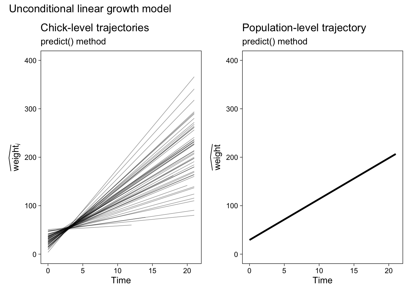
Our population-level plot on the right is okay at showing the expected values, but it’s terrible at expressing the uncertainty we have around those expectations. Before we learn how to solve that problem, let’s first practice this method a once more with our conditional model fit2.
# define and save the predictor values beforehand
nd <- ChickWeight %>% distinct(Diet, Time)

# compute the expected values
fit2.predict.population <-
  predict(fit2,
          newdata = nd,
          re.form = NA) %>%
  data.frame() %>%
  set_names("y_hat") %>%
  bind_cols(nd)

# make and save the plot
p4 <- fit2.predict.population %>%
  ggplot(aes(x = Time, y = y_hat)) +
  geom_line(linewidth = 1) +
  labs(title = "Population-level trajectories",
       subtitle = "predict() method",
       y = expression(widehat(weight))) +
  ylim(0, 400) +
  facet_wrap(~ Diet, labeller = label_both)

# combine the two ggplots
p2 + p4 &
  # add an overall title
  plot_annotation(title = "Conditional quadratic growth model")
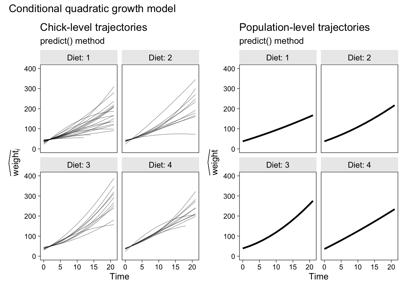
This plot’s okay if you’re starting out, but careful scientists can do better. In the next section, we’ll finally learn how.
Population-level trajectories with uncertainty with emmeans().
Our goal is to use the emmeans::emmeans() function to compute 95% confidence intervals around our fitted values. Here are the fine points:
- The first argument,
object, takes our model object. Here we start with unconditional growth modelfit1. - The
specsargument allows us to specify which variable(s) we’d like to condition our expected values on. For the unconditional growth model, we just want to condition onTime. - The
atargument allows to specify exactly which values ofTimewe’d like to condition on. In this context, theatargument functions much the same way thenewdataargument functioned withinpredict(). Here, though, we define ourTimevalues within a list. - The
lmer.dfargument is not necessary, but I recommend giving it some thought. The default approach to computing the 95% confidence intervals uses the Kenward-Roger method. My understanding is this method is generally excellent and is probably a sensible choice for the default. However, the Kenward-Roger method can be a little slow for some models and you should know about your options. Another fine option is the Satterthwaite method, which is often very close to the Kenward-Roger method, but faster. For the sake of practice, here we’ll setlmer.df = "satterthwaite". To learn more about the issue, I recommend reading through Kuznetsova et al. ( 2017) and Luke ( 2017). - Finally, we convert the output to a data frame and save it with a descriptive name.
fit1.emmeans.population <- emmeans(
  object = fit1,
  specs = ~ Time,
  at = list(Time = seq(from = 0, to = 21, length.out = 30)),
  lmer.df = "satterthwaite") %>%
  data.frame()

# what is this?
glimpse(fit1.emmeans.population)
## Rows: 30
## Columns: 6
## $ Time     <dbl> 0.0000000, 0.7241379, 1.4482759, 2.1724138, 2.8965517, 3.6206897, 4.3448276, 5.0689655, 5.7…
## $ emmean   <dbl> 29.17800, 35.29918, 41.42035, 47.54153, 53.66270, 59.78388, 65.90505, 72.02623, 78.14740, 8…
## $ SE       <dbl> 1.9572766, 1.6274605, 1.3315708, 1.0974018, 0.9706994, 0.9934691, 1.1569189, 1.4130459, 1.7…
## $ df       <dbl> 49.13050, 49.27943, 49.47338, 49.56893, 49.12761, 48.30421, 47.99833, 48.07510, 48.20401, 4…
## $ lower.CL <dbl> 25.24497, 32.02914, 38.74511, 45.33685, 51.71214, 57.78670, 63.57891, 69.18522, 74.68756, 8…
## $ upper.CL <dbl> 33.11103, 38.56921, 44.09560, 49.74620, 55.61327, 61.78106, 68.23120, 74.86723, 81.60724, 8…
The expected values are in the emmean column. See those values in the SE, df, and .CL columns? Those are what we’ve been building up to. In particular, the values in the lower.CL and upper.CL columns mark off our 95% confidence-interval bounds. Let’s show those off in a plot.
p5 <- fit1.emmeans.population %>%
  ggplot(aes(x = Time, y = emmean, ymin = lower.CL, ymax = upper.CL)) +
  geom_ribbon(alpha = 1/2, fill = "red3") +
  geom_line(linewidth = 1) +
  labs(title = "Population-level trajectory",
       subtitle = "emmeans() method",
       y = expression(widehat(weight))) +
  ylim(0, 400) +
  theme(plot.subtitle = element_text(color = "red4"))

# combine the two ggplots
p1 + p5 &
  # add an overall title
  plot_annotation(title = "Unconditional linear growth model")
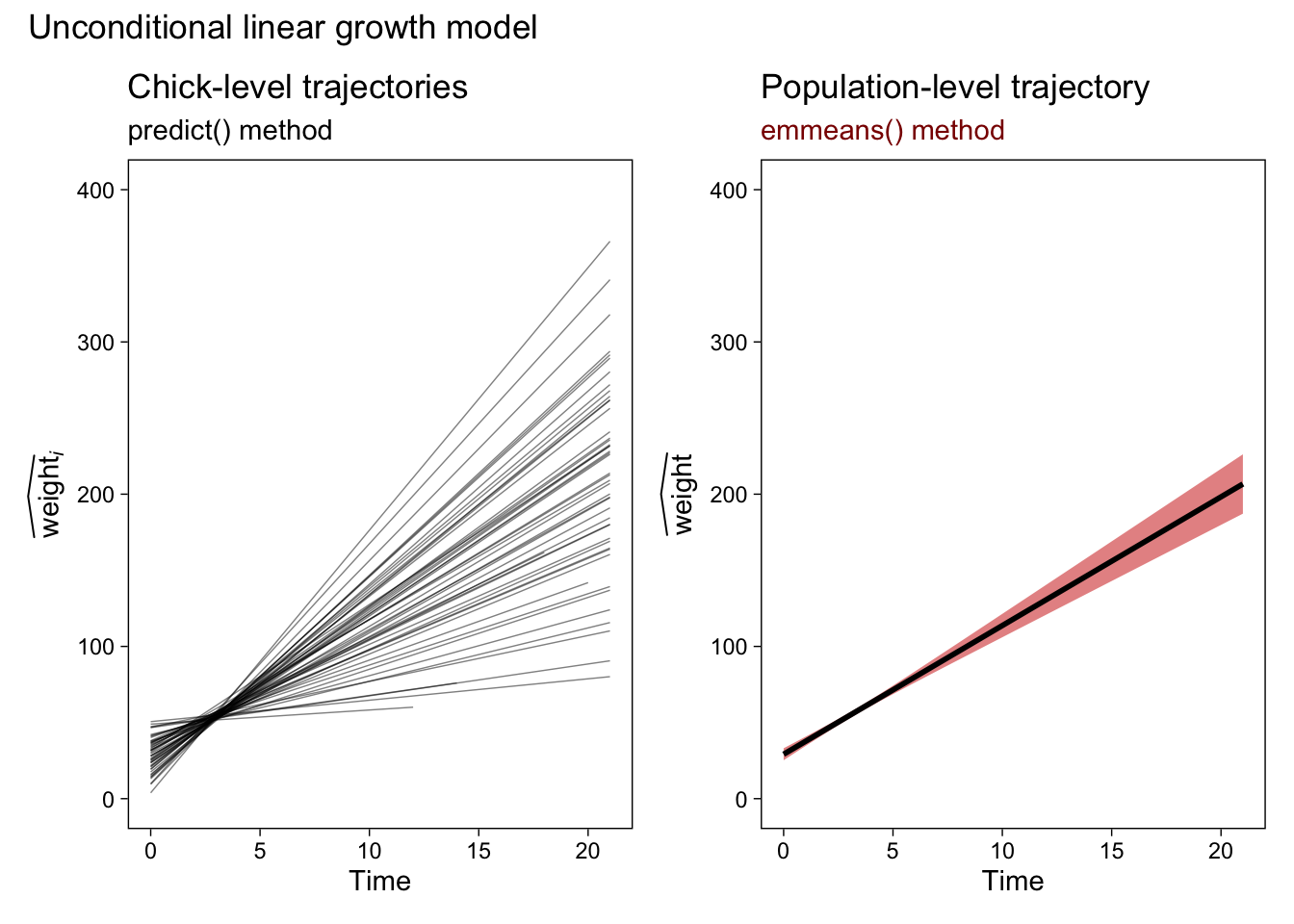
Now our population-level plot explicitly expresses the uncertainty in our trajectory with a 95% confidence-interval band. The red shading is a little silly, but I wanted to make sure it was easy to see the change in the plot. Here’s how to extend our emmeans() method to the more complicated conditional quadratic growth model. Note the changes in the specs argument.
fit2.emmeans.population <- emmeans(
  object = fit2,
  # this line has changed
  specs = ~ Time : Diet,
  at = list(Time = seq(from = 0, to = 21, length.out = 30)),
  lmer.df = "satterthwaite") %>%
  data.frame()

# what is this?
glimpse(fit2.emmeans.population)
## Rows: 120
## Columns: 7
## $ Time     <dbl> 0.0000000, 0.7241379, 1.4482759, 2.1724138, 2.8965517, 3.6206897, 4.3448276, 5.0689655, 5.7…
## $ Diet     <fct> 1, 1, 1, 1, 1, 1, 1, 1, 1, 1, 1, 1, 1, 1, 1, 1, 1, 1, 1, 1, 1, 1, 1, 1, 1, 1, 1, 1, 1, 1, 2…
## $ emmean   <dbl> 37.53433, 41.26093, 45.04110, 48.87484, 52.76214, 56.70301, 60.69745, 64.74545, 68.84702, 7…
## $ SE       <dbl> 1.6868681, 1.2258006, 0.9062629, 0.8356543, 1.0232620, 1.3408419, 1.7023042, 2.0762953, 2.4…
## $ df       <dbl> 56.00845, 71.36390, 162.12707, 120.87857, 55.54711, 47.95749, 46.83404, 46.67509, 46.67226,…
## $ lower.CL <dbl> 34.15514, 38.81697, 43.25150, 47.22043, 50.71193, 54.00701, 57.27253, 60.56771, 63.91091, 6…
## $ upper.CL <dbl> 40.91352, 43.70490, 46.83071, 50.52926, 54.81235, 59.39902, 64.12236, 68.92318, 73.78313, 7…
Note how our output now has a Diet column and that there are four times as many rows as before. That’s all because of our changes to the specs argument. Here’s the plot.
p6 <- fit2.emmeans.population %>%
  ggplot(aes(x = Time, y = emmean, ymin = lower.CL, ymax = upper.CL)) +
  geom_ribbon(alpha = 1/2, fill = "red3") +
  geom_line(linewidth = 1) +
  labs(title = "Population-level trajectories",
       subtitle = "emmeans() method",
       y = expression(widehat(weight))) +
  ylim(0, 400) +
  facet_wrap(~ Diet, labeller = label_both) +
  theme(plot.subtitle = element_text(color = "red4"))

# combine the two ggplots
p2 + p6 &
  # add an overall title
  plot_annotation(title = "Conditional quadratic growth model")
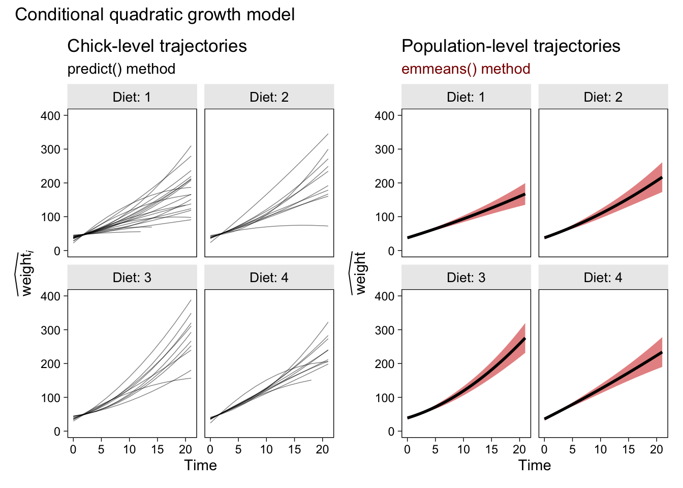
Glorious.
But that Bayes, though
The Bayesians in the room have been able to compute 95% intervals of this kind all along. They just set their priors, sample from the posterior, and summarize the posterior samples as needed. It’s no big deal. Which brings us to an important caveat:
Whether you use emmeans() to compute 95% confidence intervals by the Kenward-Roger method or the Satterthwaite method, both approaches are approximate and will occasionally return questionable results. Again, see Kuznetsova et al. (
2017) and Luke (
2017) for introductions to the issue.
It’s wise to inspect the quality of your emmeans()-based Kenward-Roger or Satterthwaite intervals against intervals computed using the parametric bootstrap, or with Bayesian software. Though it’s my understanding that emmeans() is capable of bootstrapping, I have not explored that functionality and will have to leave that guidance up to others. I can, however, give you an example of how to compare our Satterthwaite intervals to those from a Bayesian model computed with the brms package. Here we’ll use brms::brm() to fit the Bayesian version of our unconditional growth model. For simplicity, we’ll use the default minimally-informative priors1.
fit3 <- brm(
  data = ChickWeight,
  family = gaussian,
  weight ~ 1 + Time + (1 + Time | Chick),
  cores = 4, seed = 1
)
When working with a brms model, it’s the fitted() function that will most readily take the place of what we were doing with emmeans().
nd <- tibble(Time = 0:21)

fit3.fitted.population <- fitted(
  fit3,
  newdata = nd,
  re_formula = NA) %>%
  data.frame() %>%
  bind_cols(nd)

# what is this?
glimpse(fit3.fitted.population)
## Rows: 22
## Columns: 5
## $ Estimate  <dbl> 29.21441, 37.65529, 46.09618, 54.53707, 62.97796, 71.41885, 79.85973, 88.30062, 96.74151, …
## $ Est.Error <dbl> 2.021475, 1.564884, 1.199970, 1.029351, 1.143576, 1.478018, 1.920905, 2.413252, 2.930232, …
## $ Q2.5      <dbl> 25.26062, 34.64450, 43.77749, 52.54076, 60.71001, 68.49214, 76.10985, 83.63797, 91.21743, …
## $ Q97.5     <dbl> 33.26492, 40.71766, 48.43553, 56.53052, 65.18467, 74.32911, 83.64334, 93.01031, 102.54640,…
## $ Time      <int> 0, 1, 2, 3, 4, 5, 6, 7, 8, 9, 10, 11, 12, 13, 14, 15, 16, 17, 18, 19, 20, 21
The Estimate column is our posterior mean, which roughly corresponds to the expectations from our frequentist models. The percentile-based 95% Bayesian interval bounds are listed in the Q2.5 and Q97.5 columns. Here’s how you can compare these results with the Satterthwaite-based intervals, from above.
fit3.fitted.population %>%
  ggplot(aes(x = Time)) +
  geom_ribbon(aes(ymin = Q2.5, ymax = Q97.5),
              alpha = 1/2, fill = "blue3") +
  geom_ribbon(data = fit1.emmeans.population,
              aes(ymin = lower.CL, ymax = upper.CL),
              alpha = 1/2, fill = "red3") +
  labs(title = "The Satterthwaite intervals versus the Bayesian intervals",
       subtitle = "The Bayesian percentile-based intervals are in semitransparent blue.\nThe frequentist Satterthwaite-based intervals are in semitransparent red.\nIt appears as if there's just a purple band because the two interval types largely overlap.")
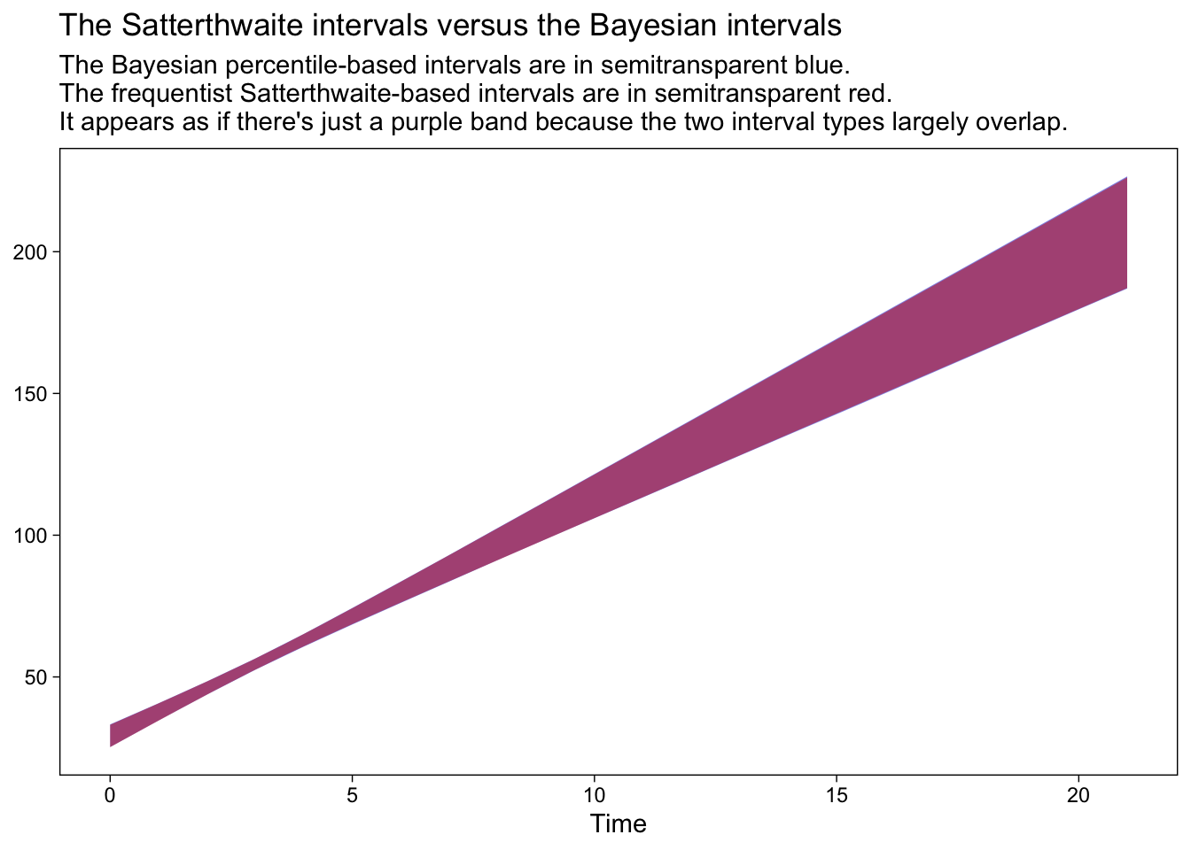
In this case, the two sets of 95% intervals are in near perfect agreement. On the one hand, this is great and it suggests that we’re on good footing to move ahead with our emmeans() approach. On the other hand, be cautioned: Though Bayesian and frequentist intervals often times overlap, this won’t always be the case and it’s not necessarily a problem when they don’t. Remember that Bayesian models are combinations of the likelihood AND the prior and if you fit your Bayesian models with informative priors, the resulting posterior might well be different from the frequentist solution.
Another thing to consider is that if we’re using Bayesian intervals as the benchmark for quality, then why not just switch to a Bayesian modeling paradigm altogether? Indeed, friends. Indeed.
Afterward
Since I released this blog post, the great Vincent Arel-Bundock has responded by building these capabilities into the marginaleffects package (
Arel-Bundock, 2022). Arel-Bundock specifically referenced this blog post in
one of his vignettes. Now I’ve had some time to work with marginaleffects, I really like the syntax and I fully recommend you check it out as an alternative to emmeans() approach, above.
Session info
sessionInfo()
## R version 4.2.0 (2022-04-22)
## Platform: x86_64-apple-darwin17.0 (64-bit)
## Running under: macOS Big Sur/Monterey 10.16
##
## Matrix products: default
## BLAS:   /Library/Frameworks/R.framework/Versions/4.2/Resources/lib/libRblas.0.dylib
## LAPACK: /Library/Frameworks/R.framework/Versions/4.2/Resources/lib/libRlapack.dylib
##
## locale:
## [1] en_US.UTF-8/en_US.UTF-8/en_US.UTF-8/C/en_US.UTF-8/en_US.UTF-8
##
## attached base packages:
## [1] stats     graphics  grDevices utils     datasets  methods   base
##
## other attached packages:
##  [1] emmeans_1.8.0   patchwork_1.1.2 brms_2.18.0     Rcpp_1.0.9      lme4_1.1-31     Matrix_1.4-1
##  [7] forcats_0.5.1   stringr_1.4.1   dplyr_1.0.10    purrr_0.3.4     readr_2.1.2     tidyr_1.2.1
## [13] tibble_3.1.8    ggplot2_3.4.0   tidyverse_1.3.2
##
## loaded via a namespace (and not attached):
##   [1] readxl_1.4.1         backports_1.4.1      plyr_1.8.7           igraph_1.3.4         splines_4.2.0
##   [6] crosstalk_1.2.0      TH.data_1.1-1        rstantools_2.2.0     inline_0.3.19        digest_0.6.30
##  [11] htmltools_0.5.3      lmerTest_3.1-3       fansi_1.0.3          magrittr_2.0.3       checkmate_2.1.0
##  [16] googlesheets4_1.0.1  tzdb_0.3.0           modelr_0.1.8         RcppParallel_5.1.5   matrixStats_0.62.0
##  [21] xts_0.12.1           sandwich_3.0-2       prettyunits_1.1.1    colorspace_2.0-3     rvest_1.0.2
##  [26] haven_2.5.1          xfun_0.35            callr_3.7.3          crayon_1.5.2         jsonlite_1.8.3
##  [31] survival_3.4-0       zoo_1.8-10           glue_1.6.2           gtable_0.3.1         gargle_1.2.0
##  [36] distributional_0.3.1 pkgbuild_1.3.1       rstan_2.21.7         abind_1.4-5          scales_1.2.1
##  [41] mvtnorm_1.1-3        DBI_1.1.3            miniUI_0.1.1.1       xtable_1.8-4         stats4_4.2.0
##  [46] StanHeaders_2.21.0-7 DT_0.24              htmlwidgets_1.5.4    httr_1.4.4           threejs_0.3.3
##  [51] posterior_1.3.1      ellipsis_0.3.2       pkgconfig_2.0.3      loo_2.5.1            farver_2.1.1
##  [56] sass_0.4.2           dbplyr_2.2.1         utf8_1.2.2           labeling_0.4.2       tidyselect_1.1.2
##  [61] rlang_1.0.6          reshape2_1.4.4       later_1.3.0          munsell_0.5.0        cellranger_1.1.0
##  [66] tools_4.2.0          cachem_1.0.6         cli_3.4.1            generics_0.1.3       broom_1.0.1
##  [71] ggridges_0.5.3       evaluate_0.18        fastmap_1.1.0        yaml_2.3.5           processx_3.8.0
##  [76] knitr_1.40           fs_1.5.2             nlme_3.1-159         mime_0.12            projpred_2.2.1
##  [81] xml2_1.3.3           compiler_4.2.0       bayesplot_1.9.0      shinythemes_1.2.0    rstudioapi_0.13
##  [86] gamm4_0.2-6          reprex_2.0.2         bslib_0.4.0          stringi_1.7.8        highr_0.9
##  [91] ps_1.7.2             blogdown_1.15        Brobdingnag_1.2-8    lattice_0.20-45      nloptr_2.0.3
##  [96] markdown_1.1         shinyjs_2.1.0        tensorA_0.36.2       vctrs_0.5.0          pillar_1.8.1
## [101] lifecycle_1.0.3      jquerylib_0.1.4      bridgesampling_1.1-2 estimability_1.4.1   httpuv_1.6.5
## [106] R6_2.5.1             bookdown_0.28        promises_1.2.0.1     gridExtra_2.3        codetools_0.2-18
## [111] boot_1.3-28          colourpicker_1.1.1   MASS_7.3-58.1        gtools_3.9.3         assertthat_0.2.1
## [116] withr_2.5.0          shinystan_2.6.0      multcomp_1.4-20      mgcv_1.8-40          parallel_4.2.0
## [121] hms_1.1.1            grid_4.2.0           coda_0.19-4          minqa_1.2.5          rmarkdown_2.16
## [126] googledrive_2.0.0    numDeriv_2016.8-1.1  shiny_1.7.2          lubridate_1.8.0      base64enc_0.1-3
## [131] dygraphs_1.1.1.6
References
Arel-Bundock, V. (2022). marginaleffects: Marginal effects, marginal means, predictions, and contrasts [Manual]. [https://vincentarelbundock.github.io/ marginaleffects/ https://github.com/vincentarelbundock/ marginaleffects]( https://vincentarelbundock.github.io/ marginaleffects/ https://github.com/vincentarelbundock/ marginaleffects)
Bates, D., Mächler, M., Bolker, B., & Walker, S. (2015). Fitting linear mixed-effects models using lme4. Journal of Statistical Software, 67(1), 1–48. https://doi.org/10.18637/jss.v067.i01
Bates, D., Maechler, M., Bolker, B., & Steven Walker. (2021). lme4: Linear mixed-effects models using Eigen’ and S4. https://CRAN.R-project.org/package=lme4
Bürkner, P.-C. (2017). brms: An R package for Bayesian multilevel models using Stan. Journal of Statistical Software, 80(1), 1–28. https://doi.org/10.18637/jss.v080.i01
Bürkner, P.-C. (2018). Advanced Bayesian multilevel modeling with the R package brms. The R Journal, 10(1), 395–411. https://doi.org/10.32614/RJ-2018-017
Bürkner, P.-C. (2022). brms: Bayesian regression models using ’Stan’. https://CRAN.R-project.org/package=brms
Grolemund, G., & Wickham, H. (2017). R for data science. O’Reilly. https://r4ds.had.co.nz
Hoffman, L. (2015). Longitudinal analysis: Modeling within-person fluctuation and change (1 edition). Routledge. https://www.routledge.com/Longitudinal-Analysis-Modeling-Within-Person-Fluctuation-and-Change/Hoffman/p/book/9780415876025
Kruschke, J. K. (2015). Doing Bayesian data analysis: A tutorial with R, JAGS, and Stan. Academic Press. https://sites.google.com/site/doingbayesiandataanalysis/
Kuznetsova, A., Brockhoff, P. B., & Christensen, R. H. (2017). lmerTest package: Tests in linear mixed effects models. Journal of Statistical Software, 82(13), 1–26. https://doi.org/10.18637/jss.v082.i13
Lenth, R. V. (2021). emmeans: Estimated marginal means, aka least-squares means [Manual]. https://github.com/rvlenth/emmeans
Luke, S. G. (2017). Evaluating significance in linear mixed-effects models in R. Behavior Research Methods, 49(4), 1494–1502. https://doi.org/10.3758/s13428-016-0809-y
McElreath, R. (2020). Statistical rethinking: A Bayesian course with examples in R and Stan (Second Edition). CRC Press. https://xcelab.net/rm/statistical-rethinking/
McElreath, R. (2015). Statistical rethinking: A Bayesian course with examples in R and Stan. CRC press. https://xcelab.net/rm/statistical-rethinking/
Pedersen, T. L. (2022). patchwork: The composer of plots. https://CRAN.R-project.org/package=patchwork
R Core Team. (2022). R: A language and environment for statistical computing. R Foundation for Statistical Computing. https://www.R-project.org/
Roback, P., & Legler, J. (2021). Beyond multiple linear regression: Applied generalized linear models and multilevel models in R. CRC Press. https://bookdown.org/roback/bookdown-BeyondMLR/
Singer, J. D., & Willett, J. B. (2003). Applied longitudinal data analysis: Modeling change and event occurrence. Oxford University Press, USA. https://oxford.universitypressscholarship.com/view/10.1093/acprof:oso/9780195152968.001.0001/acprof-9780195152968
Wickham, H. (2022). tidyverse: Easily install and load the ’tidyverse’. https://CRAN.R-project.org/package=tidyverse
Wickham, H., Averick, M., Bryan, J., Chang, W., McGowan, L. D., François, R., Grolemund, G., Hayes, A., Henry, L., Hester, J., Kuhn, M., Pedersen, T. L., Miller, E., Bache, S. M., Müller, K., Ooms, J., Robinson, D., Seidel, D. P., Spinu, V., … Yutani, H. (2019). Welcome to the tidyverse. Journal of Open Source Software, 4(43), 1686. https://doi.org/10.21105/joss.01686
-
Often times, default priors will return posterior distributions that closely resemble the solutions from their frequentist counterparts. But this won’t always be the case, so do keep your wits about you when comparing Bayesian and frequentist models. ↩︎
- Posted on:
- December 16, 2021
- Length:
- 20 minute read, 4251 words